How to Grow Your Newsletter Automatically During the Product Checkout Process
TL;DR
The most effective newsletter growth setup often starts inside checkout, not on a separate subscribe page. Add one clear opt-in, tie the copy to the product being purchased, segment buyers correctly, and measure signups against completed purchases so growth never comes at the expense of conversion.
Most newsletter sign-up flows ask people to take an extra step after they already bought. That creates avoidable drop-off. The better approach is to make subscription a natural part of checkout so newsletter growth happens at the exact moment buyer intent is highest.
A simple rule applies: the best time to ask for an email subscription is when a customer is already trusting the page enough to complete a purchase. Done well, checkout-based newsletter growth reduces friction, improves list quality, and creates a cleaner path from first purchase to repeat revenue.
Why checkout is one of the highest-intent moments on the page
Most creators still treat newsletter growth as a separate campaign. They post a lead magnet, link to a subscribe page, or add a footer form and hope enough visitors convert. That approach can work, but it leaves one of the strongest intent moments underused: the checkout flow.
At checkout, the visitor has already made several decisions. They clicked through, evaluated the offer, accepted the price, and started entering payment details. That sequence matters because the psychological cost of one additional yes is lower than asking for a fresh commitment on a separate page.
This is the core editorial stance of this article: do not send buyers to a separate subscribe path when the transaction itself can become the opt-in moment. The goal is not to squeeze an extra conversion out of the page. The goal is to remove an unnecessary break in the customer journey.
That view lines up with broader newsletter growth guidance. beehiiv highlights gated content and dedicated subscribe pages as core capture methods, but for creators selling products, the most efficient gate may be the product journey itself. Instead of creating one more landing page, the checkout can become the conversion surface.
This matters even more for higher-value purchases. According to Demand Curve, customer acquisition around expensive or infrequent purchases requires more deliberate follow-up because the buyer may not return on a short cycle. In practice, that means an email relationship is often more valuable after checkout than a one-off transaction confirmation.
For creator businesses, the implications are larger than list size. Better newsletter growth at checkout can improve:
- post-purchase education
- repeat sales of digital products
- launch visibility
- service upsells
- referral activity
- retention between buying cycles
This is also where Oho’s positioning becomes relevant. Standard link-in-bio tools mostly route traffic away. Oho is built around direct actions on the public page, so newsletter sign-up can sit closer to the actual conversion moment instead of being buried behind disconnected tools.
The four-part checkout opt-in model that keeps friction low
A practical way to build this is through a simple model: intent, consent, value, follow-up.
That four-part model is useful because most checkout newsletter problems come from missing one of those elements. Teams usually focus only on the checkbox. They forget why the buyer would want updates, how consent should be phrased, or what happens after the email is collected.
1. Intent: ask at the moment of commitment
The opt-in should appear when the buyer is already completing the transaction, not before the offer is understood and not after the confirmation page has already loaded.
That usually means placing the newsletter option in one of three spots:
- directly below the email field
- immediately above the payment button
- on the final order review step
The wrong timing is common. If the sign-up ask appears too early, it feels like a distraction. If it appears only after payment, the customer often ignores it because the task is already finished.
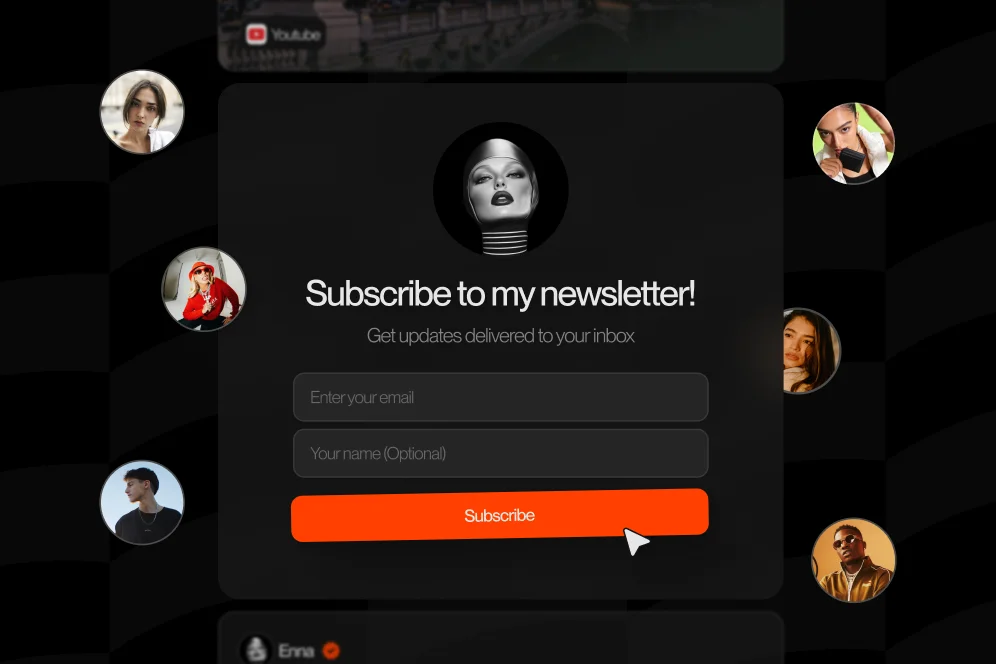
2. Consent: make the choice explicit and readable
This should not be a legal footnote disguised as growth. The language needs to be clear enough that a buyer understands the difference between a receipt email and ongoing newsletter updates.
A good version sounds like this:
“Email me product updates, new resources, and occasional offers.”
A weak version sounds like this:
“Agree to receive communications.”
The first describes the value. The second sounds like compliance copy.
3. Value: explain why staying subscribed helps the buyer
Checkout opt-ins convert better when the subscription feels like an extension of the purchase. That means the message should connect directly to what the customer just bought.
Examples:
- A digital template buyer gets “tips, updates, and new bundle releases”
- A coaching customer gets “new office hours and expert breakdowns”
- A course buyer gets “bonus lessons and launch announcements”
This is where many creators leave money on the table. They ask customers to “join the newsletter” instead of making the subscription relevant to the transaction.
Growth In Reverse describes how top creators use lead magnets and internal sharing mechanics that feel tightly tied to the audience’s next step. The same principle applies at checkout: the ask should feel like the obvious continuation of the purchase, not an unrelated marketing add-on.
4. Follow-up: use the first email to validate the opt-in
The subscription is not complete when the box is checked. It is complete when the first post-purchase email proves the decision was worth it.
That first email should do three things fast:
- confirm what the customer bought or signed up for
- set expectations for what future emails will include
- deliver one immediate piece of value
For example, a creator selling a mini-course could send the receipt, then a second welcome email with a short lesson, a product-use tip, and a note that future updates will include related launches. That is one reason checkout capture works especially well for creators selling education products; this mini-course approach naturally extends into subscriber growth.
Step by step: how to build the flow without hurting conversion
A checkout opt-in only works if it protects the primary conversion. The purchase comes first. Newsletter growth is the secondary win.
That makes this a conversion design exercise, not just an email capture tactic.
Step 1: map the current checkout journey
Before changing anything, document the current sequence.
At minimum, review:
- product page to checkout click-through rate
- checkout start rate
- completed purchase rate
- email field completion rate
- current newsletter opt-in rate, if any
- confirmation page clicks
The point is to establish a baseline. Without it, no team can tell whether a new opt-in improved newsletter growth or damaged the main sale.
A practical measurement plan looks like this:
- baseline metric: opt-in rate per completed purchase
- target metric: increase newsletter subscriptions per purchase without reducing checkout completion
- timeframe: 14 to 30 days, depending on traffic
- instrumentation: checkout event tracking, email consent event, purchase completion event
If analytics tools are already in place, this can be tracked in platforms such as Google Analytics or a product analytics tool. The principle matters more than the stack: tie subscription events to purchase events so growth is measured in context, not as an isolated form fill.
Step 2: add one opt-in prompt, not three competing prompts
One of the most common mistakes is over-asking. A buyer sees a coupon field, a newsletter field, an SMS offer, a referral box, and a social follow prompt. Each additional request competes with payment completion.
For most creator businesses, one clear newsletter opt-in is enough.
Use a single checkbox or toggle. Keep the copy short. Avoid modal pop-ups during checkout.
A clean pattern might read:
- checkbox label: “Send me new tutorials, product drops, and occasional offers”
- support text: “You will still receive your receipt either way”
That second line matters. It reduces confusion between transactional and promotional email.
Step 3: connect the message to the product category
The highest-performing copy is product-aware. A generic subscription pitch underperforms because it ignores the reason the customer is there.
Examples by offer type:
- Digital downloads: “Get updates when new versions, bonus files, and bundles are released”
- Consulting or paid time: “Get practical notes, session openings, and future office hours”
- Membership or recurring support: “Get member updates, added resources, and upcoming release notes”
This matters for creators monetizing services as well as products. A buyer who books time is often a strong newsletter subscriber candidate, especially if the email list becomes the channel for future availability and upsells. Oho has explored related booking behavior in its guide to paid service offers and in its piece on booking paid time, where the core pattern is the same: reduce back-and-forth and keep action close to intent.
Step 4: design for mobile first, because most checkout friction hides there
Many newsletter opt-ins look acceptable on desktop and fail on mobile.
Typical mobile issues include:
- checkbox tap targets that are too small
- value copy that wraps awkwardly into four lines
- spacing that makes the opt-in look like a legal disclaimer
- form sections that collapse out of view before payment
A good mobile test is simple: can someone understand and toggle the opt-in with one thumb in under two seconds?
If not, the design is probably too dense.
Step 5: trigger the right post-purchase automation
Once the subscription is captured, route the customer into the right list or segment.
At minimum, separate:
- buyers who opted in
- buyers who did not opt in
- subscribers who were already on the list
- customers by product type
This prevents the classic mistake of sending a generic welcome sequence that ignores what the customer purchased. GTM Strategist argues that durable newsletter growth depends on content systems and organic drivers, not just acquisition tricks. Checkout capture gets more people in. Segmented follow-up is what keeps them engaged.
Step 6: review results with a conversion-first lens
After launch, compare post-change results against the baseline.
The decision rule should be straightforward:
- if subscriptions rise and checkout completion holds steady, keep the change
- if subscriptions rise but completed purchases fall, revise the design
- if nothing changes, test message, placement, or timing before adding more complexity
This is the contrarian point many teams miss: do not celebrate list growth that comes at the expense of purchase completion. A larger list is not better if the checkout became harder to finish.
What strong checkout newsletter growth looks like in practice
The best examples are usually boring on purpose. The experience feels obvious because nothing distracts from the purchase.
A digital product example
Baseline: a creator sells a $29 template bundle and asks buyers to subscribe only on the thank-you page.
Intervention: move the opt-in into checkout, place it beneath the email field, and change the copy from “Join the newsletter” to “Send me new templates, bonus files, and launch updates.”
Expected outcome: more buyers notice the option before payment is complete, and the subscription is framed as part of staying current with the product category.
Timeframe: evaluate over 2 to 4 weeks, depending on purchase volume.
This is not a claim about guaranteed lift. It is a concrete testing pattern. The improvement should be judged against the baseline opt-in-per-purchase rate and checkout completion rate.
A high-ticket education example
Baseline: a creator sells a premium workshop and only follows up with receipt emails.
Intervention: add an unchecked newsletter box in checkout with value-based copy tied to future breakdowns, office hours, and related product releases.
Expected outcome: newsletter growth improves among the highest-intent customers, giving the creator a channel to nurture future launches without relying on social algorithms.
This aligns with Demand Curve’s point that expensive or one-time purchases need stronger post-purchase acquisition and engagement logic. If the customer might not buy again soon, the email relationship becomes the retention mechanism.
A creator storefront example
For a storefront that mixes products, bookings, and collaboration pathways, the list should not operate as one undifferentiated bucket. Someone who buys a download is different from someone who books consulting time or sends a brand inquiry.
That is one reason unified pages matter. When conversion actions happen closer together, there is a cleaner path to segment based on real intent instead of guessing from link clicks. Oho is best framed as that monetization and conversion layer: not a prettier link list, but a page where buying, booking, subscribing, and inquiring can happen with clearer visibility into what converted.
The mistakes that quietly damage both opt-ins and sales
Most failed checkout subscription setups do not fail because email is a bad channel. They fail because the form design or offer logic is careless.
Mistake 1: pre-checking the box to juice the list
This can create legal, ethical, and retention problems. Even when it increases raw subscriber counts, it often lowers engagement quality.
A buyer who did not intentionally opt in is more likely to ignore, unsubscribe, or mark messages as spam. Newsletter growth should improve list quality, not dilute it.
Mistake 2: offering a vague promise
“Get updates” is too weak for a high-intent moment. The customer should know what kind of updates and why they matter.
Growth In Reverse argues that the barrier to starting a newsletter is low and that quality is the real differentiator. That same principle applies inside checkout. The opt-in promise has to signal useful content, not filler.
Mistake 3: treating every buyer like the same subscriber
A creator selling templates, consulting, and newsletter sponsorships should not dump every customer into one sequence.
A better setup tags by source product, purchase type, and opt-in state. That makes future newsletter growth more profitable because follow-up is more relevant.
Mistake 4: hiding the opt-in in legal copy
If the newsletter prompt looks like terms and conditions, many users will skip it. The visual treatment should be part of the conversion form, not buried in tiny text.
Mistake 5: measuring only total subscribers
This is one of the worst reporting habits in email growth.
The real questions are:
- What percentage of buyers opt in?
- Which product categories create the highest-quality subscribers?
- Do those subscribers open, click, and buy again?
- Did checkout completion change after the opt-in was added?
Without those answers, newsletter growth can look healthy while revenue quality declines.
The numbers to track after the box goes live
Once a checkout subscription flow is live, performance review should happen at two levels: immediate conversion and downstream value.
The immediate conversion metrics
Track these first:
- checkout completion rate
- opt-in rate per completed purchase
- opt-in rate by product type
- mobile versus desktop opt-in rate
- thank-you page click rate, if additional post-purchase subscription prompts remain
These metrics reveal whether the design works at the transaction level.
The downstream quality metrics
Then track what happens after signup:
- welcome email open rate
- click rate on the first three emails
- unsubscribe rate from checkout-acquired subscribers
- repeat purchase rate among opted-in buyers
- time to second purchase or booking
These numbers matter because the best checkout opt-in is not necessarily the one that gets the most addresses. It is the one that produces the most durable customer relationship.
A practical review cadence
For most creator businesses, a monthly review is enough once the setup is stable.
That review should answer three questions:
- Did newsletter growth improve without reducing sales?
- Which offer types create the best subscribers?
- Is the follow-up sequence strong enough to justify the opt-in promise?
If the answer to the third question is no, the problem is not the checkbox. It is the email program behind it.
Five questions teams ask before moving newsletter signup into checkout
Should the newsletter checkbox be checked by default?
Usually no. Explicit consent creates a cleaner list and a more trustworthy user experience. A smaller but intentional list tends to outperform a larger list filled with weak or accidental sign-ups.
Is checkout opt-in only useful for digital products?
No. It also works for paid consultations, workshops, memberships, and other creator offers. The key is that the subscription promise should match the purchase context.
What if the buyer is already on the list?
The flow should recognize that state and avoid creating duplicate welcome experiences. Existing subscribers can still be tagged by product purchased so future sends become more relevant.
Should the subscribe ask appear on the thank-you page too?
Only if it serves a distinct purpose. If the buyer already saw the opt-in during checkout, repeating the same ask on the confirmation page usually adds little value unless the second prompt offers a stronger reason, such as account setup or bonus content delivery.
How long should the welcome sequence be for checkout subscribers?
There is no universal number, but the first few emails should connect directly to the purchase. A short sequence that confirms the transaction, delivers useful next steps, and introduces future updates is usually more effective than a generic long-form nurture series.
Where this fits in a creator-owned conversion system
Checkout-based newsletter growth works best when the public page is built for action, not just outbound clicks. That is the larger operational takeaway.
A fragmented setup usually looks like this: one tool for links, one for products, another for booking, another for email capture, and inbox chaos for brand inquiries. The result is weak attribution and inconsistent user intent.
A conversion-focused storefront changes that. Buyers can purchase, subscribe, book, or inquire from one place, and the creator gets clearer visibility into what actions actually matter. That is also why recurring monetization becomes easier to support when the page and follow-up systems are connected; for example, creators packaging monthly offers can pair checkout-driven list growth with retainer-style recurring offers rather than treating email as a disconnected top-of-funnel channel.
The practical takeaway is simple. Newsletter growth should not depend only on separate lead magnets and extra pages. It should also be built into the moments when trust is already high and the customer is already saying yes.
For teams reviewing their funnel in 2026, the most useful next move is often not another pop-up or another standalone subscribe page. It is a checkout audit: review the opt-in language, placement, segmentation, and follow-up, then measure whether buyers become better subscribers without making the sale harder to complete.
If the current setup sends buyers away to subscribe later, that is the first thing to fix. Teams looking to centralize products, bookings, subscriber capture, and collaboration requests on one conversion-focused page can explore how Oho supports those actions in one place.