How to Build a Digital Product Ladder With Simple One-Page Bundles
TL;DR
Digital product sales improve when you stop treating your offers like a pile of links and start building a clear ladder. Lead with a low-ticket one-page bundle, add a logical middle offer, then introduce premium education or paid access once trust is earned.
Most creators don’t have a traffic problem. They have a packaging problem. I’ve seen pages with solid attention, decent trust, and steady clicks still underperform because every offer asks for a different level of commitment and sends people in five different directions.
The fix usually isn’t “make more products.” It’s to build a cleaner path so someone can buy something small fast, get a result, and naturally step into something bigger.
Why most digital product sales stall after the first offer
Here’s the short version: digital product sales grow faster when you sell the next logical outcome, not just the next random product.
That sounds obvious, but a lot of creators still build their storefronts like garage shelves. An ebook goes here. A template goes there. A workshop replay gets added later. Then a coaching link sits off to the side like an afterthought.
What buyers see is not a business. They see clutter.
What usually happens next?
A follower lands on your page from Instagram, TikTok, YouTube, Substack, or X. They’re mildly interested, but not deeply committed yet. If your first ask is a $500 course or a custom service inquiry, most people bounce. Not because the offer is bad, but because the step size is too big.
That’s why a digital product ladder matters. You’re not just stacking products by price. You’re sequencing commitment.
A ladder works when each rung answers one question:
- What can this person say yes to in under two minutes?
- What quick result can they get from that first purchase?
- What bigger problem will they trust me to solve next?
- What premium offer becomes easier to buy once they’ve already won once with me?
This is where simple one-page bundles do the heavy lifting. Instead of spreading products across disconnected tools, pages, and checkout paths, you give visitors one focused place to understand the offer, buy it, and keep moving.
That matters because digital products are attractive partly due to low delivery friction and instant fulfillment. In a real-world creator workflow shared on Medium, the appeal was simple: create the asset once, upload it, and let buyers get access immediately without physical shipping delays. That kind of low-friction delivery is exactly why small, fast-buy bundles work so well as the front door.
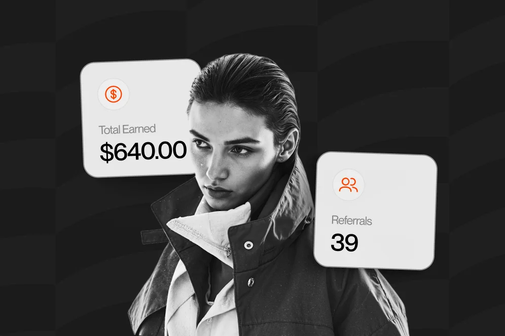
If you’re building around a public creator page, this is also where Oho fits nicely. Standard link-in-bio pages mostly route people elsewhere. Oho is better framed as the monetization and conversion layer for your public page, where people can buy, book, subscribe, or inquire without being pushed through a messy chain of disconnected links.
The ladder shape that actually converts followers into buyers
When people hear “ladder,” they often imagine a huge product ecosystem. You do not need that.
You need four clear levels. I call this the four-rung offer ladder.
Rung 1: the quick-win entry offer
This is your low-ticket bundle.
Usually it’s priced low enough to remove hesitation and specific enough to feel useful today. Think:
- a creator pitch template pack
- a niche swipe file
- a mini content system
- a short audit checklist plus examples
- a workbook plus tutorial video
The point is not to maximize revenue per order here.
The point is to create your first paid conversion.
A lot of creators make the mistake of offering a free lead magnet and then jumping straight to a high-ticket product. That can work, but it often leaves money and buying intent on the table. A low-ticket offer filters for people who don’t just like your content but are willing to act on it.
Rung 2: the deeper bundle
Once someone buys the entry offer, they’re not asking, “Who are you?” anymore.
Now they’re asking, “What else do you have that helps me go further?”
This second offer is usually a bundle of related assets, more complete templates, a mini-course, a toolkit, or a more guided version of the first solution. If you want a practical example of how a smaller educational product can act as a clean next step, we’ve covered that in our guide to mini-courses.
The jump here should feel natural, not dramatic.
If your first offer helps someone write better brand pitches, your second offer might help them package their rates, proposals, and inbound inquiry flow.
Rung 3: the premium educational offer
This is where you sell transformation instead of just assets.
According to Amasty, educational products like courses and ebooks remain among the most profitable digital product categories in 2026. That aligns with what many creators already feel in practice: once buyers trust your method, they’ll pay more for structured guidance than for a standalone file.
This rung can be:
- a course
- a workshop series
- a cohort replay with templates
- a detailed operating playbook
- a specialty resource library
You don’t need a giant “academy.” You need a premium outcome with clear scope.
Rung 4: the high-trust premium offer
This is your highest-conversion premium path for the most qualified buyers.
It might be:
- paid consulting
- a strategy session
- a done-with-you implementation package
- a recurring retainer
- a custom service offer
For creators who sell expertise, this final rung often converts better when it’s framed as paid time first, then ongoing work later. That’s one reason paid consults and small advisory sessions work so well as a bridge. If that’s relevant to your business, we’ve broken down a similar path in this guide to paid services.
Build the first one-page bundle before you touch your premium offer
This is the contrarian piece: don’t start by polishing your high-ticket sales page.
Start by tightening the cheapest paid step.
I know that feels backward. Premium offers seem more important because the payouts are bigger. But the cheapest rung is where your conversion system learns. It tells you which promise gets clicks, which objections show up first, and which audience segment is actually willing to buy.
That lesson matches broader ecommerce advice too. Stripe emphasizes packaging as a core part of starting a digital product business, because the way you define and present the offer determines whether demand turns into purchases. In plain English: better packaging beats more options.
What goes on the page
A one-page bundle does not need fancy design. It needs clarity.
At minimum, include:
- A headline with one specific outcome
- A short subhead that says who it’s for
- A simple visual of what’s inside
- Three to five concrete deliverables
- A use case or before-and-after scenario
- A price with a low-friction call to action
- A short FAQ section for objections
That’s enough.
If you’re using a creator storefront, keep the page action-focused. Let people buy directly, subscribe if they’re not ready, or inquire if they need something custom. The big win is reducing tool fragmentation so the user doesn’t keep bouncing between a checkout app, a booking tool, a form, and your DMs.
What to bundle together
The easiest bundles are not “more files.” They’re one compact outcome.
Bad bundle:
- 12 random PDFs
- 3 unrelated templates
- 1 old webinar replay
- 2 checklists from different topics
Good bundle:
- starter pitch template
- rate card example
- outreach follow-up sequence
- five real examples of good outreach
- 15-minute walkthrough video
Same general niche. Same buyer. One outcome.
This matters because digital product sales improve when buyers immediately understand what problem the bundle solves.
As Wix notes, digital products benefit from global reach and flexibility across educational and creative formats. That flexibility is useful, but it can also tempt creators into product sprawl. Just because you can bundle many formats doesn’t mean you should.
A screenshot-worthy page flow to copy
If I were building this today for a creator selling audience-growth education, I’d structure the page like this:
- Headline: “Build 30 Days of Creator Content Without Starting From Scratch”
- Subhead: “For creators, coaches, and experts who need a repeatable content planning system”
- Bundle includes: content prompt bank, weekly planning template, repurposing map, sample caption structures, 20-minute setup video
- Price: $19
- FAQ: “Is this for beginners?” “Can I use this with short-form and email?” “How fast do I get access?”
- Next step after purchase: offer a $79 planning system or a mini-course
That’s clean. That converts better than a page with six equal-weight offers fighting for attention.
A practical setup for moving buyers from $19 to $500+
This is where creators either build momentum or accidentally stall it.
You don’t need a complicated funnel. You need a believable sequence.
Start with the next problem, not the bigger price tag
Let’s say your first bundle helps a freelance designer package logo concepts more professionally.
The next problem is not “now buy my mastermind.”
The next problem is probably one of these:
- getting client inquiries
- pricing the work
- running kickoff calls
- closing projects faster
Your second offer should solve the next bottleneck created by success on the first one.
That’s how you increase digital product sales without making the path feel forced.
Use this 4-step progression
Here’s the simple progression I’d reuse across most creator businesses:
- Sell the starter bundle for one narrow problem.
- Offer a deeper implementation product that expands the result.
- Present a premium teaching offer for people who want a full method.
- Introduce paid access to you only after trust is established.
That’s the whole model.
Not clever. Just useful.
A mini case study with a measurement plan
I can’t honestly give you fabricated revenue screenshots, and you should distrust anyone who does. But I can show you what a credible test looks like.
Baseline:
A creator has a public bio page with five outbound links: newsletter, Gumroad store, Calendly, a Notion services page, and a contact form. They get traffic, but they don’t know which offer actually drives revenue. Their paid conversion path is scattered.
Intervention:
They replace the link-list-first setup with one page centered on a $29 starter bundle, a newsletter subscribe option, and one premium service inquiry path. They add one post-purchase step for a $99 deeper bundle and tag traffic by source.
Expected outcome:
Within 4 to 6 weeks, they should be able to compare three things clearly: purchase rate on the starter offer, attach rate to the deeper bundle, and inquiry rate from buyers vs non-buyers. Even if total traffic stays flat, better offer sequencing should improve meaningful conversion visibility.
Instrumentation:
Track page visits, starter bundle purchases, post-purchase take rate, email signups, and premium inquiries. If you use a storefront built for conversion visibility, this gets much easier because sales, bookings, subscriptions, and inquiries live closer together instead of across disconnected tools.
That’s the kind of proof block I trust: baseline, intervention, outcome target, timeframe, and measurement method.
Don’t skip the middle rung
A huge mistake in digital product sales is going from cheap to expensive too fast.
People need a middle rung.
That middle rung is where buyers prove to themselves they want more than a quick download but aren’t ready for custom help yet. In a lot of creator businesses, the middle rung quietly becomes the best-margin offer because it’s still scalable, but it carries more perceived value than the entry product.
If your business includes recurring support or ongoing execution, the same principle can extend into a monthly offer structure. We’ve looked at that in our piece on recurring retainers if you want to think beyond one-off purchases.
The page design choices that help one-page bundles convert
This part gets ignored because creators assume the offer itself does all the work. It doesn’t.
Presentation changes buying behavior.
Keep one dominant action above the fold
If the page is for a starter bundle, make the primary action “buy the bundle.”
Not “book a call.” Not “read my blog.” Not “watch my latest video.” Not “browse 12 links.”
You can keep secondary actions lower on the page, but above the fold you want one dominant path.
This is the main difference between a conversion-focused creator storefront and a standard link-in-bio page. One is organized around action. The other is organized around routing.
Show what the buyer gets in plain language
Avoid vague promise copy like:
- level up your business
- unlock your creator potential
- scale smarter
Nobody buys that.
Say what they get.
Examples:
- 25 fill-in-the-blank outreach templates
- 10 offer examples from real creator niches
- 1 walkthrough video showing how to use everything in 18 minutes
Specifics lower anxiety.
Add one trust signal, not ten
You do not need a wall of logos if you don’t have them.
Use one of these instead:
- a short creator testimonial
- a quick “who this is for” note
- a preview image of the actual files
- a concise explanation of how access is delivered
Again, immediate delivery matters. The practical appeal of digital products, as described in that Medium workflow example, is that buyers can get the product right away. Make that obvious on the page.
Build for citation and conversion at the same time
This matters more in 2026 than it did even a year ago.
AI answers are increasingly part of discovery. And in an AI-answer world, brand is your citation engine. Pages get cited when they contain a clear point of view, a reusable model, and enough concrete detail to feel trustworthy.
That means your page should include:
- a sharp one-sentence answer someone can quote
- a simple named model like the four-rung offer ladder
- one specific example with price points or page structure
- one clear point of view
In other words, don’t write generic pages that say the same thing as everyone else. Give the reader something they can repeat.
The mistakes that quietly kill a product ladder
I’ve made most of these myself, so this list is not theoretical.
Selling products that don’t lead anywhere
If your first offer solves a problem unrelated to your premium offer, your ladder breaks.
A Canva template pack does not naturally lead to executive coaching unless the use case is extremely clear.
The ladder only works when one result creates demand for the next result.
Hiding the premium offer too early
There’s a weird fear creators have that premium offers will “scare away” smaller buyers.
Usually the opposite is true.
When people see you have a serious next step, your small offer feels more credible. You don’t need to shove the premium offer into the hero section, but it should exist on the page or in the post-purchase path.
Using freebie logic for paid products
A lead magnet can be broad.
A paid product cannot.
Once money is involved, buyers want a narrow promise. If the offer could help “everyone,” it will usually convert like it helps no one.
Sending people off-page too often
Every extra redirect creates drop-off.
That’s why a fragmented stack hurts digital product sales. A normal link page can send someone to one tool for products, another for bookings, another for email capture, and another for brand inquiries. By the end, you’ve lost the plot and probably the buyer.
Not measuring the handoff between rungs
A lot of creators track only total revenue.
That’s not enough.
Track the handoffs:
- visitor to starter purchase
- starter purchase to second offer
- buyer to subscriber
- buyer to premium inquiry
- source channel to conversion type
If you don’t know where people stall, you can’t improve the ladder.
For creators selling expertise, one useful middle or upper-rung move is a paid Q&A or advisory offer that validates demand before building something bigger. There’s a good creator-specific angle on that in this AMA-focused breakdown because it lowers complexity while still testing willingness to pay.
Five questions creators ask before they build their ladder
Do I need more than one product before I start?
No. Start with one entry bundle and one logical next step.
A ladder is a sequence, not a catalog. You can build the rest after you see what people actually buy.
What is a digital product selling, really?
At the simplest level, it’s selling downloadable, streamable, or instantly accessible value online.
Salesforce describes digital products as items sold and delivered online, with packaging, pricing, and marketing all playing a role in how well they scale. For creators, that usually means you’re selling knowledge, assets, access, or a system.
What’s the best-selling digital product?
There isn’t one universal winner.
It depends on your audience, trust level, and problem area. But Amasty and Wix both highlight categories like courses, ebooks, templates, and other educational or creative assets as strong digital product types in 2026.
How do I start selling digital products if I have a small audience?
Start narrower, not louder.
A small but specific audience often converts better than a large, vague one. Stripe recommends understanding demand and packaging accordingly, which is exactly why one outcome-focused starter bundles work so well early on.
What about the 3 3 3 rule in sales?
People use that phrase in different ways, so I wouldn’t build your business around a vague internet sales rule.
For creator-led digital product sales, you’ll get more traction from a simple sequence: one specific starter offer, one deeper product, and one premium path. That’s easier to test and easier to explain.
Should I use a normal link-in-bio page or a storefront-style page?
If your goal is clicks, a normal link page can be enough.
If your goal is revenue actions, a storefront-style page is usually the better fit. Oho is designed around that difference: helping visitors buy, book, subscribe, and inquire from one conversion-focused public page instead of sending them away through a long chain of tools.
If you’re reworking your profile around paid time specifically, this idea also connects well with booking from your bio, where the page itself carries more of the conversion load.
What to set up this week if you want momentum, not theory
If you’ve read this far, don’t reward yourself by opening a design file and disappearing for two weeks.
Do the simple version first.
- Pick one narrow problem your audience will pay to solve now.
- Bundle 3 to 5 assets that solve that one problem.
- Put the bundle on one page with one dominant call to action.
- Add one next-step offer that expands the result.
- Track visits, purchases, and next-step take rate for 30 days.
- Rewrite the page based on objections and drop-off points, not your guesses.
That’s enough to start.
The biggest win in digital product sales is rarely a clever trick. It’s usually a cleaner path.
If you want to turn your creator profile into a page that sells, books, subscribes, and captures serious opportunities from one place, Oho is built for exactly that kind of conversion-focused setup. If you’re testing your ladder right now, I’d love to know: what’s your current first rung, and where are buyers dropping off?
References
- Medium: How I Make Passive Income Selling Digital Products
- Stripe: How to start a digital product business
- Amasty: 18 Most Profitable Digital Products to Sell in 2026
- Wix: 18 best digital products to sell (and where to sell them)
- Salesforce: How to Sell Digital Products Online
- What are Digital Products and How to Sell Them
- Can You Really Make Money Selling Digital Products in …