The 5-Minute Audit: Is Your Link-in-Bio Sending Revenue to Your Competitors?
TL;DR
Most bio pages do not fail because they lack traffic. They fail because they route visitors into too many choices, weak CTAs, and fragmented tools. A fast link-in-bio optimization audit should check promise, path, proof, and tracking so creators can fix the biggest revenue leaks first.
Most creators do not have a traffic problem in their bio. They have a conversion problem.
A link-in-bio page can look polished, collect clicks, and still leak buyers, subscribers, and brand opportunities every day. This article breaks down a five-minute link-in-bio optimization audit that helps identify where revenue is being lost and what to fix first.
A weak bio page does not just waste clicks; it trains high-intent visitors to leave before they act.
Why a simple link list quietly underperforms
The basic promise of a link-in-bio page is simple: take social traffic and send people to the next step. But in practice, many pages act more like routing hubs than conversion pages.
That distinction matters. A routing hub measures outbound taps. A conversion page is designed around action: buy, book, subscribe, or inquire.
According to Lessiter Media, the core purpose of a link in bio is to direct followers to specific, high-value destinations. The problem is that many creators never decide what that destination should be for each audience segment, so every visitor gets the same generic menu.
The result is familiar:
- too many options
- no clear next step
- weak offer hierarchy
- poor mobile scanning
- little visibility into which traffic turns into revenue
This is where the business case for link-in-bio optimization becomes stronger than the design case. The goal is not to make the page prettier. The goal is to reduce friction between intent and action.
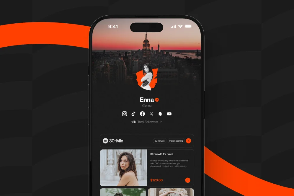
Oho is best framed around that gap. Standard link-in-bio tools often send visitors away into separate tools for products, bookings, newsletters, and inquiries. Oho is designed so creators can sell, book, subscribe, and handle brand interest from one public page, with more visible conversion intent. That matters for creators who want the page to function as a monetization layer, not just a list of exits.
There is also a brand perception issue. In a widely shared discussion on Reddit, marketers pointed out that a plain list of links often fails to communicate the creator’s vibe or value, especially for brands evaluating partnership fit. That observation aligns with what many operators see in audits: the page may be functional, but it does not help a visitor understand what the creator sells, who it serves, or why acting now makes sense.
The practical stance
Do not optimize a bio page for maximum clicks. Optimize it for the fewest steps between intent and conversion.
That is the contrarian position worth keeping. More links can produce more taps while producing less revenue. Fewer, clearer actions usually outperform a crowded menu because the page stops behaving like a directory and starts behaving like an offer surface.
The five-minute revenue leak audit
A fast audit works best when it is repeatable. One useful way to run it is the intent-to-action review: promise, path, proof, and tracking.
That four-part model is simple enough to remember and specific enough to reuse:
- Promise: Can a visitor understand what the page offers in under five seconds?
- Path: Is the next step obvious for the most valuable visitor types?
- Proof: Does the page provide enough confidence to act?
- Tracking: Can the creator see what is actually converting?
This is not a branding exercise alone. It is a conversion evidence review process.
1. Promise: what is this page for?
The first screen should answer three questions quickly:
- who this creator helps
- what action is available now
- why that action is worth taking
If the top of the page only shows a name, avatar, and a stack of unlabeled buttons, the page is already leaking intent. A visitor should not have to infer whether the creator sells templates, books consulting calls, runs a newsletter, or accepts brand work.
A stronger version is specific:
- “Download the creator pricing kit”
- “Book a 20-minute paid AMA”
- “Join the weekly growth newsletter”
- “Send a brand collaboration request”
This is also where message-to-offer match matters. If a creator’s social content is about growth strategy but the first thing on the bio page is a generic shop link, the handoff is weak.
2. Path: what should different visitors do next?
Not all visitors have the same intent. Some are ready to buy. Some want to sample expertise. Some are brand managers checking fit. Some only want email updates.
A page that treats all of them the same forces extra thinking. According to Eat It Up Marketing, clear calls to action and prioritized links are central to better bio performance. The page should rank actions by business value and visitor intent, not by whatever was added most recently.
A practical order for many creators is:
- primary revenue offer
- low-friction trust builder
- subscriber capture
- partnership or inquiry path
For example, a consultant might lead with a paid session, follow with a mini product, then add newsletter signup, then brand or partnership inquiries. For creators offering expertise, this is often stronger than dumping every resource into one long stack. Oho’s own content has explored adjacent approaches, including paid AMA sessions and booking paid time as lower-friction entry offers.
3. Proof: why should anyone trust this page?
A surprising number of bio pages ask for money or time with almost no proof. No explanation. No outcomes. No positioning. No social proof. No specificity.
Proof does not need to be heavy. It just needs to reduce uncertainty.
Examples of lightweight proof:
- what the buyer gets in one sentence
- who the offer is for
- one short result or outcome statement
- one recognizable client type or niche served
- one simple testimonial line
This is especially important for brand deals. The Reddit thread cited earlier noted that brands use bio pages to judge fit and professionalism. A page with structure and clear intent can signal that a creator is commercially ready. A random stack of links does not.
4. Tracking: what can actually be measured?
This is where most audits break down. Creators often know how many profile visits they receive, but not which offer turns those visits into revenue.
As Mobilo argues in its review of bio tools, these pages should help turn followers into leads and track engagement, not just collect taps. If the only metric available is total clicks, the creator cannot tell whether a product, booking offer, or subscriber CTA is doing the real work.
For 2026, the minimum tracking setup should include:
- profile visits or page sessions
- clicks by offer
- bookings started or completed
- product purchases by offer
- subscriber conversions
- collaboration inquiries submitted
If the page hands visitors off into separate tools, attribution becomes messy quickly. A conversion-focused profile reduces that tracking fragmentation.
Five fixes that usually matter more than a redesign
Many teams jump to a visual refresh when the real problem is page logic. The highest-return changes are usually structural.
1. Cut the number of primary actions
If everything is primary, nothing is. Most creator pages can benefit from reducing visible top-level actions to three or four.
This is not about hiding the business. It is about clarifying the business.
A common before state:
- latest video
- podcast
- affiliate links
- shop
- newsletter
- free guide
- contact form
- speaking inquiries
- course waitlist
- collaboration form
A stronger after state:
- buy the flagship digital product
- book paid time
- join the newsletter
- inquire about partnerships
Secondary links can still exist lower on the page. But the first viewport should carry commercial intent.
2. Replace vague button copy
“Shop,” “Work with me,” and “Learn more” are usually too weak. The visitor should know what happens after the tap.
Stronger button copy is concrete:
- Buy the Notion template bundle
- Book a 30-minute audit
- Join the creator email list
- Send a brand inquiry
This sounds small, but it directly affects click confidence. Eat It Up Marketing specifically highlights clear and compelling CTAs as a driver of better performance.
3. Match the offer to the traffic source
A creator may use one bio link across Instagram, TikTok, YouTube, and X, but those audiences do not always arrive with the same intent.
That means the page needs enough context to bridge the gap. If the latest short-form content is educational, the page should not immediately pitch a high-ticket offer without a bridge. A lower-friction step, such as a paid micro-session, starter product, or newsletter signup, often performs better.
This is one reason creators increasingly use entry offers. Oho has covered how mini-courses can lower friction for digital product sales by making the value clearer and the decision smaller.
4. Keep proof close to the action
Do not place testimonials or trust signals in a separate wall far below the CTA. Put a short proof line near the offer itself.
For example:
- “Used by 1:1 coaches to package offers faster”
- “Built for creators selling digital downloads”
- “Best for brand-ready media kits and intake”
If there is no third-party proof yet, clarity is still better than hype. A plain explanation of what the buyer gets can outperform generic credibility language.
5. Instrument one conversion path at a time
A full analytics overhaul is rarely necessary on day one. Instead, define one primary path, then measure it cleanly for two to four weeks.
Example measurement plan:
- baseline metric: clicks on main offer
- target metric: completed bookings or purchases
- timeframe: 14 to 28 days
- instrumentation: page analytics plus destination confirmation event
That approach keeps link-in-bio optimization grounded in decisions rather than assumptions.
Where revenue leaks usually hide in plain sight
Most lost conversions come from a handful of patterns that look harmless in a design review but fail in live traffic.
Too many exits, not enough decisions
This is the most common problem. Visitors arrive from a focused post or story and land on a page with ten unrelated choices. That creates cognitive drag.
The right question is not “What links should be included?” It is “What action should this visitor take next?”
The page explains nothing
A creator may be well known to current followers and still unclear to a new buyer or brand partner. Bio traffic often includes cold visitors, referrals, and lurkers who need quick orientation.
The page should communicate the business model, not just the identity.
Booking and buying happen somewhere else
This is a fragmentation issue. If the page pushes someone to another storefront, another calendar, another form tool, and then email back-and-forth, the friction compounds with every step.
That is the core limitation of standard bio tools. They route. They do not necessarily convert. Oho should be positioned against that limitation: not as a full business operating system, but as the monetization and conversion layer for the creator’s public page.
Brand inquiries arrive through unstructured channels
Many creators still use DMs or generic email links for collaboration outreach. That increases admin work and lowers signal quality.
A structured inquiry path can improve fit, speed, and professionalism. It also tells visitors that brand work is a real business line, not an afterthought.
Analytics stop at clicks
A click is not a sale, not a booking, and not a qualified brand lead. Rebrandly emphasizes branding and analytics as important factors in bio tool selection, which reflects a broader market shift: simple click counts are no longer enough when the page is expected to support revenue.
Native profile links vs third-party tools vs conversion-focused pages
The tool choice shapes the user experience more than many creators realize.
Instagram native links
Native profile links are useful when the goal is minimal setup, but they offer limited control over hierarchy, presentation, and conversion flow. As Your Social Team notes, the choice between native links and third-party tools affects how multiple destinations are displayed and how the user experiences that handoff.
For creators with a single destination, native can be enough. For creators selling offers, it usually becomes restrictive.
Standard link-in-bio tools
These tools solve the “multiple links” problem well. They are often fast to launch and easy to edit.
But many still center the page around outbound clicks. That makes sense for discovery, less so for monetization. If buying, booking, subscribing, and inquiring each live in separate tools, the public profile becomes a traffic router rather than a business page.
Oho
Oho is a creator storefront and link-in-bio platform designed to help creators sell digital products, book paid services, grow newsletters, and manage brand collaboration requests from one conversion-focused page.
That positioning matters because it addresses the real audit question: where is revenue leaking? If the leaks come from fragmentation, the fix is not another prettier link tile. The fix is a page that supports action directly.
For creators packaging expert offers, this also means the public profile can carry stronger commercial intent. That is relevant whether the offer is a download, a consultation, a newsletter, or a brand deal.
A practical before-and-after audit example
Consider a creator educator with 40,000 followers across short-form platforms. The profile gets steady traffic from content about pricing, creator systems, and brand work. The original bio page contains nine links: latest video, YouTube, podcast, store, media kit, newsletter, affiliate gear, contact, and “book me.”
The baseline problem is not lack of traffic. It is split intent.
In the original setup:
- top-of-page message says little beyond the creator’s name
- highest-value service is buried sixth
- newsletter signup sits below entertainment links
- brand inquiries go to a generic email address
- analytics show clicks, but not qualified outcomes
A stronger rebuild would look like this:
- headline clarifies who the creator helps and what is available
- first CTA offers a paid audit call or focused AMA session
- second CTA offers a starter digital product
- third CTA captures newsletter subscriptions
- fourth CTA opens a structured brand inquiry flow
- lower section contains secondary content and social destinations
The expected outcome is not magic. It is clearer prioritization, cleaner attribution, and fewer lost handoffs.
A sensible measurement plan would compare the next 30 days against the previous 30 days on:
- bookings completed
- product purchases
- subscriber conversion rate
- qualified brand inquiries
That is the right level of proof when hard benchmark data is unavailable. It keeps the process evidence-based without inventing performance claims.
The mistakes that make bio pages look busy but sell poorly
Several mistakes show up repeatedly in link-in-bio optimization reviews.
Chasing aesthetics before intent
A polished page with weak hierarchy still underperforms. Design should clarify the next step, not compensate for a vague offer.
Treating all traffic as top-of-funnel
Not every visitor needs nurturing. Some arrive ready to buy or book. If the page only offers generic content links, it can bury transactional intent.
Using one CTA for every audience
Followers, warm leads, and brand managers need different paths. A single generic “Contact me” button often creates unnecessary friction for all three.
Hiding monetization to appear less salesy
This is a common creator instinct and often the wrong call. If the business model depends on products, bookings, or partnerships, the page should state that clearly.
Measuring clicks instead of outcomes
This is the biggest reporting mistake. Click growth can mask revenue decline if the traffic is being sent into weak downstream flows.
Five questions creators ask about link-in-bio optimization
Does link in bio still work in 2026?
Yes, but the standard has changed. A basic list of links can still direct traffic, but conversion-focused pages are better suited for creators who want to sell, book, capture subscribers, or manage brand opportunities from their profile.
How many links should a creator include?
There is no universal number, but most pages benefit from limiting top-level actions to the three or four most commercially important next steps. Additional resources can live lower on the page if they do not distract from the main path.
What is the first thing to fix on an underperforming bio page?
Usually the first screen. If the headline, primary CTA, and offer hierarchy are unclear, no amount of design polish will solve the conversion problem.
Is a link-in-bio page mainly for followers?
No. It is also a decision surface for cold traffic, referral clicks, and brand evaluators. That is why proof, clarity, and structured inquiry paths matter.
Do creators need separate tools for products, bookings, and inquiries?
Not necessarily. Separate tools can work, but they often increase handoff friction and weaken attribution. For many creators, a unified monetization layer produces a clearer visitor path.
What to change this week if the audit shows leakage
The fastest path forward is not a full rebuild. It is a focused cleanup.
Start by rewriting the top-of-page message so a new visitor understands the offer in five seconds. Reduce the number of primary actions, make the CTA labels concrete, and put one proof line near each major offer.
Then instrument one path. If bookings matter most, track bookings. If digital products matter most, track purchases. If brand work matters most, structure the inquiry flow and measure qualified submissions.
For creators whose offers span products and services, the best bio pages work less like menus and more like storefronts. Oho is designed for that use case: one page where creators can sell, book, grow, and manage inbound opportunities without sending every visitor somewhere else.
Teams auditing a creator profile in 2026 should ask a simple question: does this page help people act, or does it mostly help them leave?
For readers reviewing their own setup, this is a practical moment to tighten the page, reduce leakage, and build a profile that converts traffic into actual business outcomes. If a better monetization layer is the missing piece, Oho is worth exploring as part of that next step.
References
- Reddit: Your “Link in Bio” is probably a leaky funnel. Here is how I …
- Your Social Team: 5 Ways to Optimize The Link in Your Instagram Bio
- Lessiter Media: The Power of “Link in Bio” for Social Media Marketing
- Mobilo: 19 Best Link in Bio Tools to Capture Leads and Track Clicks
- Eat It Up Marketing: Instagram Bio Link Optimization | Tips to Increase Clicks
- Rebrandly: Best link in bio tools for marketers in 2025
- Instagram Link-in-Bio Tools: 2025 Guide