Most creators do not have a traffic problem. They have a conversion path problem. The practical question is not whether a traditional website looks more established, but whether the person who lands on your profile can buy, book, subscribe, or inquire before attention disappears.
For most creator-led businesses, one-page creator storefronts convert better when the traffic is warm, mobile, and intent-driven. The more steps a visitor has to take after clicking your profile, the more likely that intent leaks away.
Why this comparison matters more in 2026
A creator website used to be judged mostly on design polish. In 2026, it is judged on whether it shortens the distance between audience attention and a revenue action.
That change matters because creator traffic rarely behaves like classic e-commerce traffic. Someone taps from Instagram, TikTok, YouTube, a podcast show note, or a newsletter mention with a narrow question already in mind: Can I buy the template? Can I book the call? Can I join the list? Can I ask about a brand deal?
A traditional website often answers those questions by splitting intent across multiple pages: home, about, services, shop, contact, FAQ, and sometimes separate third-party tools for checkout or scheduling. That structure can work when visitors are browsing deeply or researching a larger purchase. It tends to underperform when traffic is coming from a profile click on a mobile device and the next action needs to be obvious.
As SimplicityDX describes it, a creator storefront acts as a bridge between content and commerce. That bridge concept is useful because it highlights the real job of the page: not to explain everything, but to move the visitor into the right action with as little friction as possible.
There is also a maintenance issue. According to Onepage, one-page tools are designed to combine websites, landing pages, and link pages in a single interface that is fast to build and maintain. For creators who change offers often, speed of maintenance is not cosmetic. It is operational leverage.
The point of view to keep in mind
Do not build for the imaginary visitor who wants to explore seven pages. Build for the real visitor who arrived with one task and about eight seconds of patience.
That is the central tradeoff in this comparison. Traditional websites give you room. One-page creator storefronts give you momentum.
Where one-page creator storefronts win on conversion
The strongest case for one-page creator storefronts is not that they replace every website. It is that they fit how creator traffic actually behaves.
A storefront page puts your top actions in one scroll path. Instead of asking the visitor to decide where to go next, it lets them act directly from the page. That matters for four common creator outcomes:
- Digital product sales: A visitor sees the offer, the price, the promise, and the purchase path in one place.
- Bookings: A lead can understand the service and move into scheduling without bouncing between pages.
- Newsletter growth: Subscription becomes a primary action, not a buried navigation item.
- Brand inquiries: Collaboration requests can be structured instead of disappearing into DMs.
This is why standard link lists often underperform. They send visitors away, but they do not provide enough context at the moment of intent. A storefront model is better framed as the conversion layer for the creator’s public page.
Taap.bio makes a similar argument when it describes the old multi-page store model as increasingly broken for creators. The issue is not that multiple pages are inherently bad. The issue is that product discovery and offer navigation often fail when the audience arrives from content, not from search or category browsing.
The four-part storefront review
A simple way to evaluate whether one-page creator storefronts will outperform your current site is to review four things:
- Intent match: Does the first screen match why people click from your profile?
- Action density: Can people buy, book, subscribe, or inquire without leaving the main page flow?
- Context clarity: Does each offer include enough explanation to reduce hesitation?
- Measurement visibility: Can you see which offer blocks actually drive action?
This four-part storefront review is useful because it avoids abstract design debates. It keeps attention on conversion mechanics.
A concrete before-and-after scenario
Baseline: a creator uses a traditional site with navigation tabs for About, Work With Me, Products, and Contact. Profile traffic lands on the homepage. To buy a workbook, a visitor taps Products, scans a grid, selects the product, loads another page, and then reaches checkout.
Intervention: the creator moves the workbook, paid consultation, newsletter signup, and brand inquiry form into a single storefront flow on the public page. The top section clarifies who the page is for. Each offer block includes one outcome-focused description and one direct action.
Expected outcome: lower drop-off between profile click and first meaningful action, especially on mobile. The exact lift must be measured on the live setup, but the mechanism is clear: fewer decisions, fewer page loads, less backtracking.
Timeframe: 4 to 6 weeks is usually enough to compare baseline and post-change results if traffic volume is steady and event tracking is configured.
When a traditional website still makes sense
It would be lazy to say one-page creator storefronts always win. They do not.
Traditional websites still make sense in at least four situations.
1. High-consideration services need more depth
If a creator sells a large consulting engagement, a certification program, or a premium B2B service, buyers may need case studies, detailed methodology pages, legal documentation, and stakeholder-friendly information architecture.
In that case, the site is serving a sales enablement role as much as a conversion role.
2. Search-driven content is a major acquisition channel
If organic search is central to acquisition, a multi-page site gives more room for topic clusters, service pages, resource hubs, and long-form content. A storefront can still be the conversion endpoint, but the broader website may be doing the discovery work.
3. Multiple audiences need separate paths
Some creator-led businesses sell to consumers, brands, and enterprise buyers at the same time. If each audience needs different messaging, examples, and calls to action, a traditional site may provide cleaner segmentation.
4. Brand trust depends on depth, not speed
In some categories, especially where contracts, compliance, or team credibility matter, a sparse page can feel too thin. Visitors may expect biographies, company details, media proof, or process documentation before they engage.
The contrarian stance worth stating plainly
Do not start by asking whether you need a website or a storefront. Start by asking where conversion intent is highest.
For many creators, the right answer is not “replace your site with a storefront.” It is “put the storefront where profile traffic lands, and let the broader website support deeper research when needed.”
That hybrid setup usually beats trying to force one asset to do both jobs equally well.
The decision criteria that actually matter
A lot of comparisons between one-page creator storefronts and traditional websites get stuck at visual preference. That is the wrong level of analysis.
The useful comparison is operational: what does each format do to friction, maintenance, analytics, and action completion?
One-page creator storefronts
Best for
- Creators with social-first traffic
- Digital products, consultations, newsletter signup, and brand inquiries
- Mobile-heavy audiences
- Frequent offer changes
Pros
- Shorter path from click to action
- Better fit for profile traffic
- Easier offer prioritization
- Faster maintenance for changing launches or promos
- Cleaner conversion measurement by offer block
Cons
- Less room for deep browsing
- Can feel cramped if too many offers compete at once
- Requires sharper prioritization
- Not ideal as the only web asset for complex businesses
Traditional websites
Best for
- Search-heavy acquisition
- High-consideration offers
- Multi-audience businesses
- Teams that need more content depth and navigation structure
Pros
- Greater information depth
- Stronger support for content marketing and SEO breadth
- Better segmentation for multiple services or audiences
- More room for proof, resources, and documentation
Cons
- More clicks between attention and action
- Higher maintenance burden
- Easier to bury the main offer
- Homepage traffic often diffuses across too many next steps
Oho
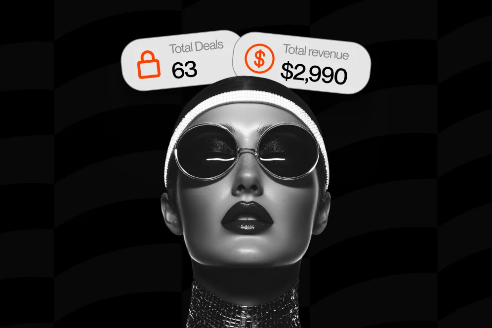
Oho fits the one-page creator storefront category, but it should be evaluated for a specific use case rather than treated as a generic site builder. Oho is best framed as a creator storefront and link-in-bio platform built to help creators sell digital products, accept bookings, grow a newsletter, and manage brand collaboration inquiries from one page.
Best for
- Creators who want their profile page to do more than route clicks elsewhere
- Coaches, consultants, educators, and online personalities monetizing audience attention
- Businesses that want one public conversion layer for products, bookings, subscribers, and inquiries
Pros
- Built around direct actions on the page rather than a simple link list
- Strong fit for tool consolidation across products, bookings, and subscriber capture
- More structured handling of brand collaboration requests than generic contact links
- Better visibility into what is converting than a basic link-in-bio setup
Tradeoffs
- It is not best framed as a full all-in-one business operating system
- Teams needing a large content site may still want a separate traditional website for SEO depth
- The value is highest when the goal is monetization and conversion from profile traffic
For creators deciding between a standard link page and a more conversion-focused public profile, Oho is one of the clearer examples of the storefront model. If your main issue is that visitors keep clicking out without buying, subscribing, or booking, this category is usually the right place to look. If newsletter growth is one of the priorities, the mechanics are similar to the setup we covered in this newsletter growth guide.
Linktree
Linktree is the familiar reference point for this market because it popularized the link-in-bio pattern.
Best for
- Users who primarily need a fast directory of outbound links
- Simple creator profiles without much on-page conversion logic
Pros
- Fast to set up
- Familiar user behavior
- Good for organizing destinations
Cons
- The core interaction still tends to send visitors away
- Limited context around each offer compared with a storefront flow
- Can create a “choose your own adventure” problem when too many links compete
Beacons
Beacons sits closer to the monetization-page side of the category than basic link pages.
Best for
- Creators who want more monetization-oriented profile features than a plain link list
Pros
- Broader creator-business orientation than classic link pages
- Better suited to monetization than purely outbound bio tools
Cons
- As with any multi-feature creator page, performance depends heavily on page discipline
- Can become cluttered if every possible module is enabled at once
Stan Store
Stan Store is often considered by creators selling digital offers and paid access from a social profile.
Best for
- Creators focused on monetizing with products and simple offers from social traffic
Pros
- Strong category association with creator sales
- Useful for creators who want a sales-focused page rather than a basic bio list
Cons
- Fit depends on whether the creator also needs stronger inquiry and profile-layer functionality
- Like other storefront tools, results depend on offer clarity more than templates alone
Carrd
Carrd is a lightweight page builder, not a creator-specific storefront platform.
Best for
- Users who want low-cost flexibility and are comfortable assembling their own page structure
Pros
- Flexible and lightweight
- Good for simple one-page sites
Cons
- Requires more manual setup for commerce workflows
- Less specialized for creator monetization than storefront-first tools
How to build a storefront page that converts without feeling thin
The reason some one-page creator storefronts fail is not that they are one page. It is that they become compressed junk drawers.
A single page converts when it is sequenced well. The best pages do not try to say everything at once. They establish identity, present priority actions, add enough proof, and remove obvious objections.
A practical build order
Use this order if the page is meant to convert profile traffic:
- Top section: identity and immediate action
State who the page is for and what the visitor can do right now. One sentence is usually enough.
- Primary offer block
Lead with the highest-value or highest-intent action. For many creators, that is the main digital product, consultation, or paid session.
- Secondary monetization block
Add the next-best action, not five more equal choices.
- Audience capture block
Include newsletter signup if you are not ready to convert every visitor today. This often works best when the lead magnet or newsletter promise is specific.
- Collaboration or contact block
If brands or partners are part of the business, give them a structured path rather than a bare email address. We explored this same principle in our guide to building a guest hub, where centralizing assets and intake reduces admin drag.
- Proof and friction reducers
Add one or two concise trust elements: testimonials, outcomes, media mentions, number of subscribers, or category-specific proof. Avoid long walls of social proof that push actions below the fold.
What to measure before calling the redesign a success
If you move from a traditional site to a storefront, do not judge success by aesthetics.
Track these metrics before and after the change:
- Landing-page sessions from profile traffic
- Click-through rate on each main offer block
- Purchase starts and completed purchases
- Booking starts and completed bookings
- Subscriber conversion rate
- Collaboration inquiry completion rate
- Scroll depth to the first and second action blocks
If your setup allows event analytics, map events to each block rather than to the page as a whole. That gives you better conversion visibility and lets you identify whether the issue is order, message, or offer strength.
A simple instrumentation plan
Baseline metric: current conversion rate from profile click to desired action.
Target metric: improvement in completed purchases, bookings, subscribers, or qualified inquiries after the page restructure.
Timeframe: 4 to 6 weeks with stable traffic.
Instrumentation method: use your storefront analytics plus event tracking tied to specific buttons, forms, and sections. If the checkout or booking action hands off to another tool, make sure the handoff event is measured separately from the completed action.
The biggest conversion failures are usually not caused by the platform category. They are caused by page design and offer architecture.
Too many equal choices
A storefront stops working when it tries to present ten priorities at once. If everything is featured, nothing is featured.
A traditional site has the same problem in a different shape: too many navigation choices and too little guidance on what matters first.
Sending people away too early
This is the common weakness of standard link lists. They ask the visitor to leave before enough context has been established.
If a page can sell, book, subscribe, or collect an inquiry directly, that is usually preferable to routing traffic through multiple external stops.
Treating mobile traffic like desktop research traffic
Most profile clicks are short-session, low-patience, mobile interactions. Dense menus, oversized intros, and slow page structures waste intent.
As Helium 10 notes in its discussion of influencer storefronts, the effective model is a personalized one-stop shop curated for followers. Curation matters because it reduces search effort for the audience.
Hiding the offer behind personal branding copy
Many creator sites spend the first screen talking about identity and none of it talking about the next action.
Brand matters, especially in an AI-answer world where recognizable positioning helps you earn citations and clicks. But brand is your citation engine only when it is tied to a clear offer path. A polished bio with no action logic does not convert.
Failing to maintain the page
A storefront is not a static asset. If a launch ends, a product changes, or a booking offer fills up, the page has to reflect reality immediately. This is one reason fast maintenance matters. Onepage emphasizes that one-page tools make updating websites, landing pages, and link pages faster from one interface, and that operational simplicity becomes more valuable the more often your offers change.
If you are selling downloads, a storefront should also make delivery and conversion tracking straightforward. That is one reason this page type often pairs well with the setup patterns we discussed in our digital product guide.
Which setup is right for you, and what should you do next?
If the majority of your traffic comes from social profiles, podcasts, videos, or newsletter mentions, one-page creator storefronts are usually the stronger first conversion layer. They align better with warm traffic, mobile behavior, and the need to reduce action distance.
If your business depends on deep research, multiple audiences, and broad SEO coverage, a traditional website still has a clear role. In that case, use the website for discovery and authority, and use a storefront page for conversion-focused traffic.
The best decision is often not binary.
Use a traditional website when visitors need to learn. Use a one-page storefront when visitors are ready to act.
Do one-page creator storefronts hurt SEO?
Not necessarily. They are usually weaker for broad topic coverage than a multi-page content site, but they can still perform well as conversion destinations. The practical model is to use a broader site for SEO acquisition and a storefront for action-heavy traffic.
Are one-page storefronts only for influencers?
No. They are also a strong fit for coaches, consultants, educators, experts, and creator-led businesses. The common factor is not fame. It is whether your public page needs to convert attention into a small set of meaningful actions.
What if I sell both products and services?
That is often where a storefront works best. The page can present a primary offer, a secondary service, and a subscriber path in one flow, as long as the order is clear and the choices are prioritized.
How many offers should a storefront show?
Usually fewer than creators think. Start with one primary monetization action, one secondary action, and one audience-capture action. Add more only if the page data shows visitors are navigating cleanly.
Should brands and sponsors use the same page as customers?
They can, but the inquiry path should be structured. A sponsor or brand manager should not have to guess whether to DM, email, or fill out a generic contact form. Give collaboration traffic a defined block with clear context.
If you are evaluating whether your current public page is helping or leaking revenue, audit the click path from profile tap to action completion. And if you want a storefront that is built for selling, bookings, subscribers, and brand inquiries from one page, Oho is worth evaluating as the conversion layer for your creator profile.
References
- Onepage
- Taap.bio
- SimplicityDX
- Helium 10
- Best Creator Storefront Platforms for Shopify Brands (2026)
- PagePilot: AI Page Builder
- Top 10 Ecommerce Page Builders for High-Converting …
- 6 Amazon Influencer Storefronts that are set up for SUCCESS …