How to Double Your Newsletter Signups Without Ever Sending Traffic Away from Your Bio
TL;DR
If your bio sends people through multiple clicks before they can subscribe, you’re probably losing warm intent. The fix is simple: put a clear newsletter offer and embedded signup form directly on your profile page, add an immediate value trade, and measure conversion over 4-6 weeks.
Most creators don’t have a traffic problem. They have a handoff problem. The audience is there, the intent is there, and then we burn it with one extra click to a landing page that feels disconnected from the profile that earned the attention.
If you want faster newsletter growth, stop treating your bio like a hallway. Turn it into the place where the signup actually happens.
Why the extra click quietly kills newsletter growth
Here’s the short version: every redirect creates drop-off. That’s the whole game.
A standard bio flow usually looks like this: someone sees your post, taps your profile, clicks your link, lands on a menu, chooses the newsletter option, waits for another page to load, then decides whether the offer is worth it. That’s a lot of micro-decisions for a free signup.
The most quotable version of this is simple: newsletter growth improves when the signup happens where intent is highest, not one click later.
I’ve watched creators obsess over lead magnets, subject lines, and posting frequency while ignoring the biggest leak in the funnel: sending warm traffic away right at the moment of interest.
This is the redirect tax. You pay it in hesitation, page load friction, context switching, and weak message continuity.
A normal link-in-bio tool is built to route people elsewhere. That’s fine if your goal is navigation. It’s not great if your goal is conversion.
Oho is better framed differently. It’s not trying to be a prettier list of links. It’s built as the monetization and conversion layer for your public page, so people can subscribe, book, buy, or inquire without getting bounced around.
That distinction matters for newsletter growth because email signup is usually an impulse action. People don’t wake up planning to join your list. They join because your profile made the next step feel obvious and immediate.
According to Growth In Reverse’s study of creator newsletter tactics, successful creators often win with native-feeling lead magnets and sharing mechanics that fit inside the ecosystems where attention already exists. That’s the right lesson to take from creator growth in 2026: don’t force people into a clunky side quest.
The point of view I’d use if this were my page
Don’t build a better traffic router. Build a better moment of commitment.
That means your bio page should answer three things fast: what your newsletter is about, why it’s worth joining, and what happens immediately after signup.
If any of those answers are vague, the form underperforms even if your audience likes you.
The four-part bio signup model that works in 2026
When I audit newsletter growth pages, I use a simple four-part model: promise, proof, proximity, and path.
It’s memorable enough to reuse, and practical enough to implement in an afternoon.
1. Promise
Lead with a specific outcome, not a generic invitation.
“Join my newsletter” is weak.
“Get one creator growth teardown every Friday” is stronger.
“Get weekly script templates for short-form videos” is stronger.
People subscribe to clarity. They ignore broad intentions.
2. Proof
Give them a reason to trust the promise.
This doesn’t have to be vanity-heavy. It can be as simple as:
who it’s for
what you’ve covered recently
what readers get each week
a short creator testimonial
a preview of the lead magnet or archive
As Growth In Reverse’s newsletter analysis argues, the newsletters that sustain real growth tend to win on content value, not just hacks. That’s useful because it forces a better signup page. If the offer is good, proof gets easier.
3. Proximity
Put the form next to the message that creates desire.
This is the piece most people miss. They write a nice pitch on social, then send people to a generic menu page, then ask them to click again to find the newsletter form.
The form should sit right under the value proposition or one swipe below it. No hunting. No separate landing page required for warm traffic.
If you’re building a creator page meant to convert, this is the same thinking behind our newsletter vault guide: keep the value and the capture close together so the audience doesn’t cool off between steps.
4. Path
After signup, the next step should be obvious.
Show a confirmation state, deliver the promised free resource, or point people to one next action like “read the best issue,” “book a consult,” or “shop the template bundle.”
The signup is not the finish line. It’s the handoff into a deeper relationship.
Build the page like a conversion asset, not a profile decoration
A lot of bio pages look polished but still underperform because they were designed like mini homepages. That’s the wrong mental model.
A homepage can afford to be broad. Your bio page can’t.
It gets a few seconds of attention from people who are already half-convinced. Your job is to remove friction, not offer a buffet.
Start with one primary newsletter offer
Pick a single newsletter CTA for the top section.
Not three CTAs.
Not “work with me,” “read my blog,” “watch my YouTube,” “shop my templates,” and “join my newsletter” all fighting for first position.
You can still include those actions lower on the page. But for newsletter growth, the top of the page needs one dominant outcome.
A clean setup usually looks like this:
creator headline
one-sentence newsletter promise
direct email form
one proof element
one immediate reward or expectation
That’s it.
If you also sell products, this gets easier when your page is built for multiple conversion actions from one place instead of sending people into separate tools. We’ve seen the same pattern in our guide to selling from your bio: fewer handoffs usually means cleaner buyer behavior.
Write copy for impatient visitors
Your visitor is not reading deeply yet. They’re scanning.
So your newsletter block should answer these questions in under five seconds:
What is this?
Who is it for?
Why should I care?
What do I get right now or every week?
Weak example:
“Subscribe for updates and exclusive content.”
Better example:
“Weekly creator business breakdowns: pricing, offers, and content systems you can use this week.”
Better still if you narrow the audience:
“Weekly newsletter for coaches and creators who want more leads from profile traffic.”
That’s much easier to say yes to.
Use a visible value trade, not empty hype
A lot of newsletters still ask for an email with no concrete exchange.
That used to work better when fewer creators were doing it. In 2026, attention is crowded. You need a visible value trade.
As beehiiv’s roundup of newsletter growth tactics notes, gated content remains a practical way to drive signups because the value is immediate and obvious. You don’t need to overcomplicate that insight.
A simple checklist, swipe file, template pack, creator rate card, or “best 10 issues” archive can outperform a vague promise of future value.
Keep the form short
For a newsletter signup, name and email is often already too much.
If you don’t truly need a first name, don’t ask for it. Every extra field is one more reason to bounce.
This sounds basic, but I still see pages asking for niche qualifiers, social handles, business size, and interest tags before someone has even joined. That’s not qualification. That’s self-sabotage.
Make mobile spacing do the selling
Most bio traffic is mobile by default.
That means the signup area should be readable with thumb-speed scanning:
short headline
1-2 lines of body copy
obvious form field
unmistakable button
tight spacing between message and action
If the form appears only after a long stack of links, your design is telling people that subscribing is secondary.
A practical setup you can implement this week
If you want to improve newsletter growth without rebuilding your whole funnel, do this in order.
Step 1: Audit your current handoff
Open your own profile like a first-time visitor.
Then ask:
How many taps does it take to subscribe?
Does the newsletter promise appear before the first click?
Is the signup form on the first page people land on?
Does the page feel visually consistent with the content that sent them there?
Is there one clear reason to subscribe today?
If the answer to #3 is no, that’s your first fix.
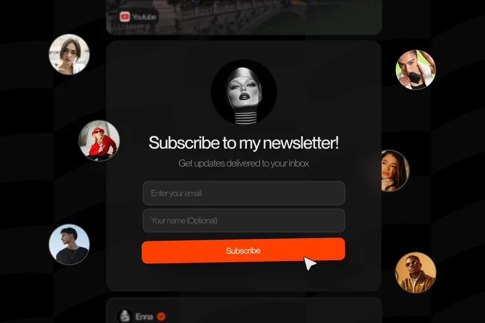
Step 2: Replace your newsletter link with an embedded signup block
This is the big move.
Don’t send people to another page if they already came from a high-intent source like Instagram, TikTok, YouTube, Threads, or X.
Capture the email on the bio page itself.
This is the contrarian stance I’d defend all day: don’t optimize for “more options”; optimize for fewer decisions.
Creators often worry that removing links from the top section will reduce exploration. In practice, if newsletter growth is the goal, a focused top section usually performs better because it makes the commitment smaller.
Step 3: Add one instant reward
Give people something now, not someday.
A good instant reward can be:
a resource vault entry
a PDF checklist
a Notion template
a private issue archive
a creator toolkit
This is where native value matters. Growth In Reverse’s creator examples are useful because they show that the best lead magnets often feel like a natural extension of the creator’s existing content, not a random freebie bolted on at the end.
Step 4: Track the right baseline before changing anything
You don’t need fake certainty. You need a measurement plan.
Before you update the page, write down:
current profile visits per week
current bio page visits per week
current newsletter signups per week
current visitor-to-signup rate
traffic source mix if you can see it
Then set a target.
For example:
baseline: 220 bio visits/week
baseline signups: 9/week
current conversion rate: 4.1%
target after redesign: 7-8%
review window: 4-6 weeks
Those are example calculations, not benchmark promises. The point is to force honest measurement.
If you use analytics, keep it simple. Track page visits, form starts if available, completed signups, and confirmation-page views. Better visibility into conversion behavior matters more than vanity click counts.
Step 5: Clean up the thank-you experience
Most people stop at the form submit.
Don’t.
Use the next screen or message to train the subscriber relationship. Tell them to check their inbox, whitelist the sender, read one best issue, or grab the promised resource.
If your newsletter supports a broader creator business, this is also where you can naturally route people into your other offers. That could be a booking link, a digital product, or even a structured collab inquiry.
That’s one of the strengths of a conversion-focused public page: your newsletter doesn’t live in isolation from the rest of your business.
What good newsletter growth looks like in real life
Let’s talk through scenarios instead of pretending there’s one universal setup.
Scenario one: the educator with decent traffic and weak signup intent
You post short educational clips. Your content gets saves, but your newsletter doesn’t grow much.
Usually the issue isn’t demand. It’s message mismatch.
Your content promises practical help, but your bio says “Join my newsletter for updates.” That’s too abstract.
A better setup:
headline: “Weekly lesson plans and teaching prompts”
subhead: “For creators who teach online and want plug-and-play content ideas”
CTA: “Get the free 30-prompt pack”
form: email only
proof: “Used in my weekly writing workflow” or a short testimonial
The improvement doesn’t come from copy magic. It comes from continuity. The signup offer now matches the reason people followed in the first place.
Scenario two: the creator with too many things for sale
This one is common.
You’ve got a paid community, a workshop, affiliate links, a template shop, a consulting offer, and a newsletter. Everything ends up in the bio menu. Nothing gets emphasis.
In this case, newsletter growth often improves when you treat email as the bridge product.
Lead with the newsletter because it’s the lowest-friction commitment. Then use the thank-you flow and later emails to segment people toward products, bookings, or partnerships.
That’s especially useful if your profile audience isn’t fully ready to buy yet.
Scenario three: the small newsletter that thinks growth requires ads
It might. But it often doesn’t.
According to GTM Strategist’s 2025 playbook, it’s possible to scale to 20,000 subscribers and a larger social following with organic content systems instead of paid acquisition. I wouldn’t treat that as a guaranteed outcome for everyone, but it’s a strong reminder that newsletter growth is often a systems problem, not just a spend problem.
If your bio page converts better, every piece of organic content becomes more valuable.
That’s why this work compounds.
A mini proof block you can borrow
Here’s the structure I’d use with any creator page test:
baseline: newsletter link buried below four competing CTAs
intervention: move newsletter offer to top, embed signup form, add one immediate lead magnet, reduce fields to email only
expected outcome: higher visitor-to-subscriber rate because the action happens on-page
timeframe: measure over 4-6 weeks against the prior 4 weeks
Notice what’s missing: fake confidence.
You don’t need invented numbers to make this useful. You need a cleaner funnel and a clear review period.
The mistakes that make bio pages look busy and convert poorly
I’ve made most of these myself, which is probably why I notice them so fast now.
Too many top-level calls to action
When everything is important, nothing feels urgent.
If newsletter growth is the target, the newsletter needs visual dominance at the top of the page.
Treating the newsletter like a side note
If the signup box is buried under a generic link list, your design is saying the newsletter is optional.
Visitors usually follow your layout more than your copy.
Offering no immediate reason to subscribe
“Exclusive insights” is not a reason.
A template, archive, checklist, teardown, swipe file, or recurring concrete outcome is a reason.
Sending people to a disconnected landing page
This is the classic redirect tax.
Different branding, slower load, more decisions, weaker momentum.
The cleaner move is to let the signup happen in the same context where the intent was created.
Chasing hacks before fixing the page
A lot of creators ask, “What’s the best way to grow a newsletter?”
My honest answer is boring: improve the offer, remove friction, and publish consistently enough that the page gets repeated chances to convert.
That answer lines up with what Growth In Reverse’s analysis of successful newsletters emphasizes: durable newsletter growth tends to come from strong content and compounding trust, not random tricks.
Ignoring what happens after the subscribe
If your promised free resource arrives late, the welcome email is weak, or the next action is muddy, you waste the momentum you just earned.
A better post-signup experience improves retention, referrals, and future sales.
If brand deals are part of your business too, strong public positioning matters beyond email capture. The same clarity that helps newsletter growth also helps inbound partnerships, and that’s part of why a stronger media kit setup tends to outperform random DM-based deal flow.
The FAQ creators ask when they’re fixing this funnel
Is the best way to grow a newsletter really just putting the form on the bio page?
Not by itself.
Direct capture works when the offer is good, the copy is clear, and the page is designed around one primary action. If the newsletter promise is vague, embedding the form just exposes that problem faster.
Are newsletters still relevant in 2026?
Yes, especially for creators who want an owned audience instead of renting all their reach from social platforms.
What changed is that the bar is higher. Readers expect specificity, consistency, and actual value.
Are newsletters still profitable?
They can be, but profitability usually comes after positioning and trust, not before.
For creators, a newsletter can support sponsorships, product sales, bookings, launches, and repeat audience engagement. It’s often less about the email itself and more about what the email relationship unlocks.
Tips for growing a small newsletter without paid ads?
Focus on three things first: a clear promise, a native lead magnet, and direct signup from your highest-intent traffic source.
Then keep publishing. Organic systems still matter, and GTM Strategist’s example is a good reminder that consistency can scale further than people assume.
Should I use a separate landing page at all?
Sometimes, yes.
A dedicated landing page can make sense for cold traffic, partnerships, SEO content, or paid campaigns where you want a fuller pitch. But for warm bio traffic, I’d almost always test direct on-page capture first.
What should I measure besides total subscribers?
Look at visitor-to-signup rate, source-level conversion, welcome-email open rate, lead magnet access rate, and what subscribers do next.
If one traffic source converts much better than the others, that tells you where your message and audience are aligned.
If I were rebuilding this from scratch today
I’d keep it brutally simple.
I’d create one focused bio page with a single newsletter promise at the top, one immediate value trade, one embedded form, and one clean next step after signup. Then I’d give it four weeks before touching anything else.
That setup is boring in the best way. It respects user intent, protects attention, and gives you a better shot at compounding newsletter growth from the traffic you already earned.
If your current bio is acting like a directory, that’s the first thing I’d change. And if you want a public page that can do more than route people elsewhere, Oho is built for exactly that kind of direct conversion flow.
If you’re reworking your creator page and want the newsletter, products, bookings, and collab inquiries to live in one cleaner setup, it’s worth taking a look. What’s the one extra click in your current funnel that you already know is costing you signups?