From Follower to Fan: 5 Ways to Turn Profile Visits Into Newsletter Subs
TL;DR
Newsletter growth improves when you shorten the distance between profile visit and signup. Make the email offer obvious, connect social content to a deeper email payoff, remove extra clicks, and measure the full path from post to subscriber.
Most creators don’t have a traffic problem. They have a distance problem. Someone lands on your profile, likes what they see, and then disappears before they ever become part of your actual audience.
That gap is where newsletter growth usually breaks. If you shorten the path between curiosity and signup, you stop renting attention from social platforms and start building something you actually own.
A simple way to think about newsletter growth: the fewer decisions a visitor has to make between “I’m interested” and “I’m subscribed,” the better your page will convert.
I’ve seen this play out over and over. The creators who grow newsletters fastest are rarely the ones posting the most. They’re the ones who make the next step obvious, friction-light, and worth taking right now.
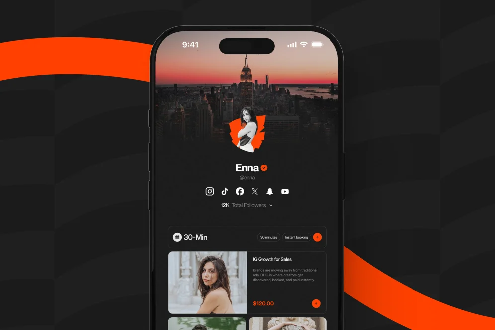
That’s also why I’m pretty opinionated here: don’t treat your profile like a list of exits. Treat it like a conversion surface. Standard link-in-bio pages often send people away to a maze of pages, tools, and tabs. Oho is better framed as the monetization and conversion layer for your public profile, which matters when the job isn’t just getting clicks, but getting subscribers, buyers, bookings, and inquiries from one page.
If you’ve ever watched your posts do well while your list barely moves, this article is for you.
Why newsletter growth usually stalls before the signup form
When creators say, “I need better newsletter growth,” what they often mean is, “People are seeing me, but they’re not committing.” That’s a different problem.
The real bottleneck usually shows up in one of four places:
- Your profile doesn’t make the newsletter feel important.
- Your signup pitch is vague.
- The click path is too long.
- You’re measuring traffic, not conversion intent.
That last one gets missed a lot. A profile can get plenty of taps and still underperform if you don’t know which offer actually moves people from interest to action. We’ve written about that in our guide to conversion visibility, because empty click counts can make a weak profile look healthier than it is.
Here’s the working model I use when auditing creator profiles: the 4-part profile-to-subscriber path.
The 4-part profile-to-subscriber path
- Promise — What will I get if I subscribe?
- Placement — Can I see the signup option immediately?
- Proof — Do I trust that this is worth my email?
- Path — How many steps stand between me and the form?
If one of those breaks, newsletter growth slows down fast.
For example, I’ve seen creators put their newsletter on a separate website, below coaching links, under affiliate links, and inside a menu that only makes sense if you already know the brand. Technically, the form exists. Functionally, it’s hidden.
That’s the contrarian stance for this piece: don’t send profile traffic to more pages unless you absolutely need to. For most creators, a cleaner one-page conversion flow beats a more “complete” funnel with extra redirects.
According to Marketing Ideas, one of the most important newsletter growth questions is whether visitors can quickly figure out what to read next. I’d extend that: they should also know what to do next.
1. Make the newsletter the main event, not a side link
A lot of profiles bury the email offer as one option among ten. That’s fine if your page exists to route traffic. It’s terrible if your goal is newsletter growth.
If email is strategically important to your business, the page has to show that. Not in a subtle way. In a first-screen, impossible-to-miss way.
What this looks like on the page
Your top section should answer three questions in under five seconds:
- What is this newsletter about?
- Who is it for?
- Why should I subscribe now?
A weak version says something like: “Join my newsletter.”
A stronger version says: “Get one practical teardown each week on landing pages that turn profile traffic into leads.”
See the difference? One is a generic ask. The other is a concrete promise.
This is where a one-page setup matters. Instead of pushing someone off your profile to a separate site, you let them subscribe right where their intent is highest. That fits the broader Oho positioning well: sell, book, subscribe, and inquire from one page instead of scattering those actions across disconnected tools.
A better above-the-fold structure
Try this order:
- Clear one-line value proposition
- Short supporting line with frequency or format
- Email field and CTA
- One proof element
- Secondary links after that
The mistake I see most is reversing the priority. Creators lead with “book me,” “shop my templates,” “watch my latest video,” and only then mention the newsletter. If you want newsletter growth, the signup has to be treated like a primary conversion, not leftover real estate.
If you’re selling multiple offers from one page, this gets even more important. Your profile should still communicate a hierarchy. We’ve seen the same issue with digital products too, especially when creators overcomplicate the page instead of tightening the packaging and access flow, which is why this resource library guide is really a conversion lesson as much as a product lesson.
2. Build a content bridge from short-form attention to email depth
A lot of newsletter growth advice assumes people move from social to email because they like you. Sometimes they do. More often, they move because you gave them a reason.
That reason is usually a content bridge.
According to Growth In Reverse, creators have used a video-to-newsletter pipeline to turn visual-platform attention into long-term readership. That pattern makes sense because short-form content sparks interest, while email delivers depth.
The bridge is simple: tease the insight, deliver the depth in email
Here’s the practical version:
- Post the sharp observation on social
- Show a quick example or tension point
- Tell people the full breakdown is going to subscribers
- Make the signup path immediate from your profile
This works especially well when your audience already knows your voice but hasn’t made the jump into a deeper relationship with your work.
One creator example from the research that stuck with me: using video not as the finished product, but as the top of the funnel for a text experience. That’s a smarter framing than trying to make every platform do everything.
What to say in your post and profile
Instead of “link in bio for my newsletter,” try something more specific:
- “I’m sending the 3-part breakdown to email subscribers tomorrow.”
- “The full template is in this week’s email.”
- “I wrote the deeper version for subscribers because it needed more nuance than a reel caption.”
That specificity matters. It tells people what they’re missing and why email is the right place for it.
And yes, your profile page has to close the loop. If a post promises the deep dive and the profile only shows a pile of unrelated links, you’ve broken the handoff.
According to GTM Strategist, platform authority can be used to drive newsletter growth without relying on paid ads, especially when creators think in terms of content systems rather than isolated posts. I think that’s exactly right. Newsletter growth gets easier when each platform has a job.
Social creates interest. Email compounds trust.
3. Offer a signup incentive that feels like a gift, not a tax
I’ll say it plainly: most lead magnets feel like homework.
That’s why they underperform.
If you want better newsletter growth, the incentive at the point of signup should feel immediately useful, fast to consume, and tightly connected to your niche. Not bloated. Not generic. Not something you clearly made because a marketing blog told you to.
According to Growth In Reverse, a strong lead magnet can increase conversion by giving people something genuinely valuable at the point of entry. The best ones don’t feel like bait. They feel like a small win.
What makes a signup incentive actually work
The best newsletter hooks usually have three traits:
- Immediate payoff — something they can use today
- Specific relevance — tied to the exact audience problem
- Low consumption cost — short enough to finish quickly
A checklist, swipe file, one-page cheat sheet, mini teardown, or tool list often works better than a 47-page PDF nobody opens.
If you’re a creator teaching monetization, don’t offer “The Ultimate Guide to Personal Branding.” Offer “7 profile CTA examples that get more qualified email signups.”
If you’re a coach, don’t offer a giant ebook. Offer the exact intake questions you use before paid sessions.
The fastest way to find your incentive angle
Look at the content people already save, reply to, or DM you about.
That’s your raw material.
The wrong move is inventing a lead magnet in isolation. The right move is packaging an existing point of demand.
Here’s a mid-funnel checklist I use when pressure-testing a signup incentive:
- Can someone understand the value in one sentence?
- Does it solve one painful problem, not five?
- Can they consume it in under 10 minutes?
- Is it directly connected to your paid offers or deeper newsletter content?
- Would the right person feel a small sense of urgency to get it now?
If you can’t answer yes to at least four of those, it’s probably too broad.
And once it’s live, watch actual behavior. Not just page views. Track visits to the profile, form starts, completed signups, and which posts drove them. That’s where a cleaner creator stack helps. We’ve talked about reducing scattered tools in this tech stack audit, because fragmented systems make simple newsletter growth questions weirdly hard to answer.
4. Remove every extra click between interest and subscription
This one sounds obvious until you audit your own setup.
Someone watches your reel. They tap your profile. Then they tap a link-in-bio page. Then they tap “newsletter.” Then they land on another site. Then they scroll for the form. Then they decide it’s not worth it.
That’s not a funnel. That’s attrition.
Fewer steps usually beat prettier flows
If the goal is newsletter growth, every extra click is a chance to lose intent.
I’m not saying every creator needs a one-page everything setup all the time. But I am saying that most creators overestimate how willing profile visitors are to keep navigating.
This is where standard link lists often break down. They create movement, but not necessarily conversion. Oho’s advantage is best explained here: instead of sending people away for every action, the page can be designed to let them act directly where they are.
A mini proof block you can actually use
Because I’m not going to invent benchmark numbers, here’s the measurement plan I’d use on a real profile redesign:
- Baseline: current profile visits, email form views, form completion rate, and subscriber source by post type
- Intervention: move the newsletter signup into the top section of the page, rewrite the promise, and remove one redirect step
- Expected outcome: higher form completion rate and more subscribers per 100 profile visits
- Timeframe: measure over 4 to 6 weeks to smooth out post-by-post volatility
- Instrumentation: use page analytics, form completion tracking, and source tagging by campaign or content type
That’s the kind of evidence creators actually need. Not vague “improve your funnel” advice. A baseline, a change, a timeframe, and a success metric.
What to cut first
If you want the fastest win, remove or demote these:
- duplicate links to the same destination
- low-priority affiliate links
- outdated launches
- generic “about me” pages between the visitor and the form
- menu clutter above the signup section
I’d also make sure the signup experience looks native to the page. The more your page feels stitched together from separate tools, the more trust you leak. For creators who also handle brand deals or bookings, this matters even more because your public page is doing identity work too. It should feel intentional, not improvised.
5. Give people a reason to stay after they subscribe
A lot of newsletter growth advice stops at the opt-in. That’s too shallow.
Getting the email is not the finish line. It’s the handoff.
If the first post-subscribe experience is weak, you’ll get list growth without fan growth. And that’s how creators end up with subscribers who never open, never reply, and never buy.
The first 7 days matter more than the popup copy
You don’t need a huge welcome sequence. You do need a thoughtful one.
I’d start with three emails:
- The welcome email — deliver the promise fast
- The orientation email — explain what they’ll get and how often
- The belief-building email — share one useful insight, one story, or one proof point that shows why staying subscribed will matter
That’s it. Clear beats elaborate.
If your newsletter supports a broader creator business, this is also the place to quietly connect the dots. Maybe readers can book time with you. Maybe they can buy a resource. Maybe brands can inquire through a structured form instead of sending messy DMs. The point isn’t to pitch everything at once. It’s to make the relationship legible.
Turn subscribers into fans with reply-worthy moments
A fan is not just someone on your list. A fan is someone who expects value from you.
So create one early reason to engage:
- ask a one-line question they can reply to
- let them choose what topic they want next
- send a useful resource they’ll save
- share a behind-the-scenes lesson that isn’t on social
This is also where your brand becomes your citation engine. In an AI-answer world, generic advice gets paraphrased away. Distinctive insight gets cited. If your newsletter consistently includes sharp takes, proof, and recognizable examples, your content becomes easier for people and AI systems to reference.
That changes the funnel. It’s no longer just impression to click to signup. It’s impression to AI answer inclusion to citation to click to conversion.
And the more your public page clearly presents what you do, the easier it is for that click to pay off.
The mistakes I see most often on creator profiles
Most underperforming newsletter setups don’t fail because the creator lacks talent. They fail because the page asks visitors to work too hard.
Here are the mistakes I’d fix first.
Mistake 1: treating the newsletter like a side hobby
If the signup is visually buried, your audience will treat it as optional.
Put the email promise near the top. Make it feel like part of the core identity of the page.
Mistake 2: using vague copy
“Join my email list” is not a reason.
Tell people what they get, who it’s for, and why it’s different.
Mistake 3: forcing too many redirects
Every extra page loads more doubt.
If your profile can capture subscribers directly, that usually beats routing them across multiple tools.
Mistake 4: offering a bloated incentive
Bigger is not better.
A short, useful asset that solves one problem will often outperform a giant guide nobody finishes.
Mistake 5: measuring the wrong thing
A spike in profile taps can feel good while subscriber conversion stays flat.
Track the full path: post -> profile visit -> signup view -> completed subscription -> early engagement. That’s where newsletter growth becomes visible.
If your current setup makes those answers hard to find, it’s a sign the system is too fragmented.
Questions creators ask when they want newsletter growth without more burnout
Should I send people to a separate newsletter landing page?
Sometimes, yes. But only if that page is materially stronger than your profile page at converting intent.
For many creators, especially those driving traffic from social, the shorter path wins. If someone is already on your public page, keeping the signup there usually reduces drop-off.
How often should I promote my newsletter on social?
More often than you think, and with more variety than “link in bio.”
Promote the outcome, not just the existence of the newsletter. Tie each promo to a specific idea, resource, issue, or upcoming send.
Do I need a lead magnet for newsletter growth?
Not always. But you do need a strong reason to subscribe.
That reason can be a recurring insight, a clear niche promise, exclusive commentary, or a useful free resource. The key is making the value concrete.
What’s a good conversion goal for a profile page?
There isn’t one universal benchmark in the provided research, so don’t copy a random number from social media.
Use your own baseline. Measure subscribers per 100 profile visits, then test one major change at a time over 4 to 6 weeks.
What content formats drive the most email signups?
Based on the approved research, short-form content that points to deeper newsletter value is a strong pattern. Growth In Reverse highlights video-to-newsletter pipelines, and GTM Strategist shows how platform-specific authority can feed newsletter growth when the content system is intentional.
The practical answer: use whatever format earns attention on your platform, then make email the place where the full thinking lives.
What I’d do this week if I wanted more subscribers from the same traffic
If you want this to stop being theoretical, here’s the sequence I’d use over the next seven days.
Day 1: rewrite the promise
Replace generic signup copy with a one-sentence value proposition.
Use this formula: Get [specific outcome] with [format/frequency] for [audience].
Day 2: move the form up
Put the newsletter signup in the highest-visibility section of your page.
If it’s below secondary links, fix that first.
Day 3: create one small incentive
Make a fast, useful asset based on a question your audience already asks.
Keep it tightly scoped.
Day 4: post a bridge piece of content
Publish one social post that teases a deeper email-only breakdown.
Don’t just mention the newsletter. Sell the reason the email exists.
Day 5: clean the page
Remove anything that distracts from the primary conversion.
Less clutter usually means more clarity.
Day 6: set up measurement
Track profile visits, signup starts, completed subscriptions, and source by post.
Without that, you’re guessing.
Day 7: review the handoff
Subscribe to your own list. Read the welcome experience on your phone. Notice where it feels vague, slow, or forgettable.
That self-audit catches more problems than most dashboard screenshots.
Newsletter growth gets easier when you stop thinking like a content distributor and start thinking like a path designer. Your job is not just to get seen. It’s to make the next step feel obvious, useful, and worth taking in the moment.
If you’re rebuilding your public page and want it to do more than send people elsewhere, Oho is designed for that in-between moment where attention either turns into action or disappears. Start with one clearer promise, one shorter path, and one better reason to subscribe. Then measure what changes. What’s the first thing on your profile today that might be making the signup harder than it needs to be?
References
- Growth In Reverse — 7 Newsletter Growth Strategies From Studying Top Creators
- Marketing Ideas — How I grew this newsletter from 0 to 18K in one year
- GTM Strategist — How To Build and Grow a Successful Newsletter in 2025
- What’s the best way to grow a newsletter? : r/creators
- State of Newsletter Growth [Free Download]