How to Build a Lead Magnet That Actually Grows Your Newsletter
TL;DR
The best lead magnets for creators are small, specific, and built around one urgent problem. Put the opt-in directly on your public page, package it with a clear promise and preview, then track real conversions instead of just clicks.
Most creators don’t have a traffic problem. They have a conversion problem. People discover them, like what they see, and then disappear because the only next step is a vague “join my newsletter” link that asks for commitment before offering a reason.
If you’re serious about growing email newsletters for creators, the job isn’t to shout louder. It’s to make the first yes feel obvious, useful, and immediate.
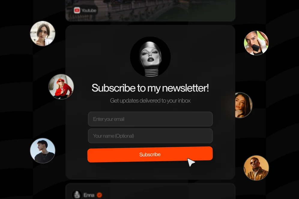
Why most lead magnets underperform in a link-in-bio
A high-converting lead magnet answers one question fast: what do I get right now, and why should I care?
That’s the sentence I wish more creators started with.
I’ve seen this mistake over and over. A creator builds a beautiful profile, publishes great content, then adds a signup block that says “Subscribe for updates.” Technically, it’s an offer. In practice, it converts like a wet paper bag.
The problem is intent mismatch.
When someone lands on your profile from TikTok, Instagram, YouTube, or an AI-generated answer, they’re not arriving in “newsletter mode.” They’re arriving with a specific curiosity. Maybe they want your editing workflow, your pricing template, your packing list, your outreach script, or your weekly meal prep guide. If your opt-in doesn’t match that moment, they’ll bounce.
This is also where standard link lists often fall short. They send people outward into more tabs, more loading, and more decisions. Oho is better framed as the conversion layer on your public page: one place where someone can subscribe, buy, book, or inquire without getting routed through a maze of separate tools.
That matters because the new funnel isn’t just impression to click anymore.
It’s impression -> AI answer inclusion -> citation -> click -> conversion.
If AI tools mention you, your page still has to close the gap. A generic newsletter pitch won’t do it.
The real issue is weak packaging, not weak content
Most lead magnets fail because they’re packaged like admin work.
Bad examples:
- Weekly updates
- Free newsletter
- Join my list
- Tips and insights
Those are descriptions of your publishing habit, not outcomes for the reader.
Better examples:
- 12 plug-and-play outreach emails for brand pitches
- My 20-minute Notion content planner
- The creator rate card template I wish I had earlier
- A 7-day meal prep PDF for busy coaches
- The camera settings cheat sheet from my travel reels workflow
Notice the difference? Specificity creates momentum.
According to Creator Science, newsletter growth gets easier when you build an inviting front door and keep adding side doors. That’s the right mental model. Your main profile is the front door. Your lead magnets are the side doors, each tied to a different piece of audience intent.
And if you’re trying to understand which offers are actually pulling people through, this gets much easier when you track the right signals instead of just raw clicks. We’ve written about that in our guide to conversion visibility.
The 4-part opt-in anatomy that makes people say yes
When I audit creator pages, I use a simple model: promise, proof, preview, path.
It’s not fancy, but it’s memorable, and it works because it mirrors how people make quick decisions online.
1. Promise
State the outcome in plain English.
Not “Get exclusive insights.”
Say “Get the 9-slide brand deal deck I use before every outreach round.”
The promise should be concrete enough that someone can imagine using it in the next 24 hours.
2. Proof
Show why this is worth downloading.
This does not require made-up stats. It can be as simple as:
- “This is the same checklist I use before publishing YouTube shorts.”
- “Built from the process I use with consulting clients.”
- “Pulled from the exact spreadsheet behind my weekly planning.”
You can also use social context. For example: “This came from the workflow that people keep DMing me about.”
3. Preview
Give a peek inside.
People convert better when they can see the shape of the thing. Add 3 bullets, one screenshot, or a tiny sample.
A good preview reduces uncertainty:
- 5 subject line formulas
- 3 sponsor follow-up templates
- 1 one-page tracking sheet
This is where many creator pages lose the sale. They ask for an email before proving the asset is real.
4. Path
Make the next step friction-light.
One field if you can. Two if you must. Clear button copy. No vague multi-step detours.
For creators, the best path usually lives directly on the profile page, not behind three extra clicks. That aligns with the broader idea behind Oho: your public page should help people act now instead of sending them somewhere else to maybe act later.
A screenshot-worthy example
Let’s say you’re a fitness creator.
Weak version:
“Join my newsletter for wellness tips.”
Stronger version:
“Get my 5-day high-protein meal plan. Includes the grocery list, prep guide, and 15-minute recipes I use during busy weeks. Enter your email and I’ll send it instantly.”
Same audience. Completely different conversion experience.
According to Write the 1 on Medium, optimizing your social bio can become a primary organic growth engine for your email list. That’s why the opt-in itself matters so much. Your bio isn’t just a signpost anymore. It’s your 24/7 subscriber capture surface.
Start with one audience pain, not one giant freebie
Here’s the contrarian take: don’t build a huge “ultimate guide” first. Build a small, instantly useful asset that solves one expensive problem.
Big lead magnets sound impressive, but they often take too long to make and feel too broad to convert well.
I’ve watched creators disappear into a six-week PDF project when what they really needed was a two-page checklist tied to the exact topic already performing in their content. The best lead magnet is usually the smallest useful thing that closes the gap between interest and action.
According to Growth in Reverse, successful creators often use what it calls sneaky-smart lead magnets and content-to-newsletter pipelines. That’s a useful clue. The offer doesn’t need to be louder. It needs to fit naturally inside the content journey people are already on.
Pick the source content that already has demand
Before you create anything, look at what your audience is already pulling on:
- Which post gets saved most often?
- Which video topic triggers repeat questions in comments?
- Which DM request do you answer every week?
- Which product or service needs warming up before someone buys?
That’s your lead magnet seed.
If ten people ask for your cold outreach opener, don’t write a 40-page brand partnerships ebook. Turn that opener into a swipe file with a short explanation and a clear next step.
If your audience loves your planning process, don’t create a broad “productivity resource center” on day one. Start with one planning template.
This is the same logic behind selling better-packaged educational assets from a single page. We talk about that in our resource library guide: tighter packaging usually beats broader packaging when someone is deciding fast.
Match the format to the urgency
Different audience pains want different formats.
Use a checklist when someone wants confidence.
Use a swipe file when someone wants speed.
Use a template when someone wants a starting point.
Use a short video or mini email course when someone needs context before they can act.
Use a calculator or worksheet when they need personalization.
And yes, limited-time lead magnets can still work. Write the 1 on Medium points out that seasonal promotions, like a planner tied to a specific moment, can be strong list-growth triggers. The lesson isn’t “make everything urgent.” It’s “use timeliness when the problem itself is seasonal.”
Build the page like a storefront, not a signpost
If your opt-in is hidden between fifteen unrelated links, you’re making people work too hard.
A creator page should behave more like a storefront than a hallway. Each block should have a job.
When you’re growing email newsletters for creators, I recommend structuring the page in this order:
- Put the highest-intent lead magnet near the top.
- Write a headline around the outcome, not the format.
- Add a 1-2 sentence description with proof and preview.
- Keep the email capture simple.
- Place related paid offers or bookings beneath it so subscribers can deepen later.
- Track views, submissions, and downstream actions so you know what actually converts.
That order matters.
Too many creators lead with “All my links,” then wonder why nothing compounds. The better play is to give the visitor one obvious action tied to the reason they came.
What this looks like in practice
Imagine a creator who teaches freelance designers how to land clients.
Baseline: Their profile sends visitors to a generic newsletter signup page and a separate booking page. Traffic comes from short-form videos about proposals and pricing. Signup quality is unclear because they only track clicks.
Intervention: They replace the generic signup with an on-page opt-in for “3 proposal sections that help clients say yes faster,” add a short preview of the sections included, and place a paid portfolio review directly below the signup block.
Expected outcome over 30 to 45 days: more qualified subscribers, clearer attribution between profile visits and email capture, and better follow-on conversion into paid reviews because the free offer pre-qualifies the audience.
Notice what I didn’t do: invent a percentage lift.
If you want proof in your own business, set up a real measurement plan. Track:
- profile views
- lead magnet form starts
- completed email captures
- welcome email open rate
- click-through to the next offer
- purchase, booking, or inquiry rate from that segment
This is exactly why a creator needs better visibility than “link clicks.” If you want a practical way to think about instrumentation, our tech stack audit guide gets into reducing tool sprawl so your conversion data stops living in six disconnected places.
Don’t bury the opt-in below low-intent links
This is the other contrarian stance I feel strongly about.
Don’t treat your newsletter like a side project tucked under merch, socials, and affiliate links. Treat it like a core product entry point.
Why? Because email is often where casual attention turns into owned audience.
Even when a visitor doesn’t buy today, a relevant lead magnet gives you another chance tomorrow.
The implementation checklist I wish more creators used
Most of the lift comes from getting the fundamentals right. Not from fancy copy tricks.
If you want a practical build sequence, use this:
- Choose one high-performing content topic from the last 90 days.
- Turn it into a small asset someone can use in under 15 minutes.
- Name the asset around the result, not the file type.
- Write a headline, one proof sentence, and three preview bullets.
- Place the opt-in high on your profile page.
- Deliver the asset instantly after signup.
- Send a short 3-email welcome sequence tied to the original problem.
- Add one logical next step: a paid product, a booking offer, or a deeper resource.
- Tag subscribers by lead magnet source.
- Review performance after 30 days before building a second magnet.
That’s the whole thing.
Not glamorous, but very effective.
A simple welcome flow that doesn’t feel robotic
The lead magnet gets the signup. The welcome sequence earns the relationship.
I like a three-email sequence for most creators:
- Email 1: deliver the asset and restate the problem it solves
- Email 2: show how you personally use it or how a client/student would use it
- Email 3: offer the next step, like a paid template, consultation, resource library, or newsletter promise they can actually look forward to
According to GTM Strategist, strong newsletter growth often comes from consistent content systems and growth drivers rather than paid ads. That’s another reason this sequence matters. You’re not just collecting emails. You’re creating a repeatable pathway from content to subscription to monetization.
If your stack supports it, tag people by source. Someone who signs up for a pricing checklist should not get the same follow-up as someone who joined for a meal prep planner.
Tooling matters less than flow clarity
Creators love debating platforms. I get it. Tools are fun. But most pages don’t need more software. They need fewer dead ends.
If you’re evaluating newsletter platforms, Email Tool Tester has a current roundup of creator-friendly options, and beehiiv is one example of a platform that emphasizes growth and monetization for newsletters. Still, your conversion rate will usually move more from a stronger offer and cleaner path than from platform swapping.
Where creators lose conversions they never even notice
Some mistakes are obvious. Others quietly kill momentum for months.
Mistake 1: Asking for too much too early
If your form asks for first name, last name, business type, revenue range, favorite color, and a blood sample, people leave.
For a basic lead magnet, email-only is often enough.
Mistake 2: Building one generic magnet for everyone
Creators often serve multiple sub-audiences. That’s fine. But one vague freebie usually underperforms compared with one focused offer per intent cluster.
Think in side doors, not one giant gate.
Mistake 3: Hiding the preview
If the user can’t tell what’s inside, you’re asking them to trust you too much, too fast.
Show the deliverable. Name the sections. Include a sample line. Reduce ambiguity.
Mistake 4: Measuring clicks instead of conversions
A lot of people celebrate traffic that doesn’t lead anywhere.
Profile views are useful. Clicks are useful. But if you can’t connect those actions to subscribers, purchases, bookings, or collaboration inquiries, you’re guessing.
Mistake 5: Forgetting the next step
A lead magnet without a follow-up path becomes a cul-de-sac.
The whole point is not just list growth. It’s list growth that compounds into deeper trust and revenue actions over time.
This is where creators often benefit from a page that can connect subscriptions with the rest of their monetization flow. Oho’s core difference versus a standard link-in-bio tool is that it aims to help visitors act directly on the page, whether that’s subscribing, buying, booking, or sending a structured inquiry.
Mistake 6: Overbuilding before validating demand
Please don’t spend a month designing a cinematic PDF nobody asked for.
Launch the small version. Watch what gets claimed, opened, clicked, and replied to. Then expand.
Even community feedback points in the same direction. In a Reddit discussion about growing newsletters from zero, creators repeatedly reinforce the simple truth that organic growth is possible, but it takes time and consistency. That’s exactly why validation matters. You want small wins that stack.
The questions creators ask right before they publish
How do I know if my lead magnet is good enough?
If it solves one clear problem for one clear person and they can use it quickly, it’s good enough to test.
The bar is usefulness, not perfection.
Should the lead magnet live in the bio link or on a separate landing page?
If your goal is reducing friction, the bio page is usually the best first home.
A separate landing page can work when you need more context, but many creators lose conversions by sending people away too soon.
How many lead magnets should I have?
Start with one.
Get it converting. Then add a second one tied to a different content pillar or audience intent. More magnets only help when each one is easy to choose between.
What if I don’t have a newsletter yet?
That’s fine. Start with the lead magnet and a short welcome sequence.
You do not need a massive publishing machine to begin. You need a useful first asset and a consistent promise.
Does a newsletter still matter in 2026 if AI answers more questions directly?
Yes, maybe more than before.
AI can summarize information. It can’t replace a direct relationship with your audience. In fact, if AI cites you, the value of your page and your email list goes up because more discovery starts happening one layer above the click.
What to build this week if you want momentum fast
If I were starting from scratch today, here’s what I’d do by Friday.
I’d choose the one topic people already associate with me.
I’d turn it into a two-page asset, a checklist, or a swipe file.
I’d write a headline with a clear outcome, add three bullets, and place it near the top of my profile.
I’d make sure the signup happens on-page.
I’d deliver the asset immediately and follow it with three emails that help the subscriber take the next step.
Then I’d review real behavior after a month instead of redesigning based on vibes.
That’s the practical path for growing email newsletters for creators. Not a giant funnel. Not a pile of disconnected tools. Just a focused offer, a clean path, and enough measurement to know what’s working.
If you’re rebuilding your creator page and want one place to sell, book, subscribe, and handle inquiries without sending people in ten directions, Oho is worth a look. And if you’re still figuring out the best lead magnet for your audience, start small, publish fast, and let the data tell you what to build next. What topic are people already asking you about every single week?