The Storefront Shift: How to Turn Your Link-in-Bio into a High-Converting Shop
TL;DR
Link-in-bio optimization works best when you stop treating your page like a link list and start treating it like a storefront. Audit traffic intent, cut distractions, prioritize one main action, add proof, and measure completed outcomes instead of just clicks.
Most creator bio pages look busy but behave like dead ends. You send people from Instagram, TikTok, or YouTube, they tap once, skim a pile of links, and disappear.
If you want better results in 2026, stop treating your bio page like a traffic router and start treating it like a storefront. The best link-in-bio pages don’t organize links. They shorten the distance between attention and action.
Why the old link list quietly underperforms
A lot of creators don’t have a traffic problem. They have a conversion problem.
You might be getting profile visits, story views, comment clicks, and decent reach, but your bio page still works like a hallway. It points everywhere and sells nowhere.
That’s the core issue behind link-in-bio optimization. You’re not trying to make the page prettier. You’re trying to make it easier for someone to buy, book, subscribe, or inquire without bouncing between five tools.
This shift has been showing up across the broader market too. The language around bio pages has moved from “link hub” to more interactive, action-driven experiences. A practical post on Reddit’s social media community makes the same point in plain English: the bio link performs better when it acts more like a micro-site than a digital business card.
That matches what we see with creators who’ve outgrown simple link lists. Once you have more than one revenue path, a flat stack of buttons creates friction:
- your digital products live in one place
- bookings live somewhere else
- newsletter signup happens on another page
- brand inquiries arrive through DMs or vague contact forms
- analytics tell you who clicked, but not what actually converted
That fragmentation is exactly why Oho is best framed as the monetization layer for your public profile, not just another prettier link list. The goal is simple: let visitors act directly on the page.
If you’ve already built an audience, this is where the upside is. Not more links. Better intent.
The five-part page audit I use before changing anything
Before you redesign your page, audit the current one. Don’t guess.
I like using a simple five-part page audit: traffic source, visitor intent, offer hierarchy, friction points, and proof. It’s simple enough to remember, and specific enough to act on.
1. Map traffic source before you touch the layout
A creator coming from Instagram Stories behaves differently from someone coming from YouTube descriptions.
Story traffic is fast and impatient. YouTube traffic is usually warmer and more willing to read. TikTok traffic often needs immediate clarity.
So ask:
- Where is most of your profile traffic coming from?
- What promise did that platform make before the click?
- Does your bio page continue that promise or reset the conversation?
If your Reel says “grab my templates,” but the first thing someone sees is a generic menu, you’ve already introduced a drop-off point.
As Buffer’s write-up on link-in-bio pages suggests, the best-performing bio pages work as a personalized hub for everything you create. The keyword there is personalized. A generic stack of links doesn’t match the context of the click.
2. Match the page to visitor intent
Most creators mix at least four different intents on one page:
- Buy something now
- Learn more first
- Book time or a service
- Contact you for a partnership
Those are not the same decision.
If all four get identical visual weight, you force the visitor to sort your business for you. That’s a bad trade.
A better move is to decide what your primary action is for this season. Maybe it’s a digital product. Maybe it’s consultation calls. Maybe it’s newsletter growth before a launch.
Then make the page support that priority clearly.
3. Rank offers by revenue potential and buying readiness
This is where a lot of established creators get stuck. They promote the newest offer, not the offer that fits the click.
Someone landing on your bio page usually isn’t ready for your most complex product first. They need an obvious next step.
A common order that works well is:
- low-friction lead capture
- core paid offer
- higher-ticket booking
- brand inquiry path
- secondary resources
That order won’t fit everyone, but the principle holds: place easier actions above harder ones unless the traffic is unusually warm.
If you want a deeper breakdown of where social visitors get stuck, we’ve covered related friction patterns in this guide.
4. Find the real friction, not the imaginary one
Creators love tweaking colors and button shapes. Usually the bigger leak is message clarity.
Here’s what I check first:
- Is it obvious who the page is for within 3 seconds?
- Can a visitor tell what they should do first?
- Are there too many equal-looking choices?
- Do buttons use vague labels like “explore” or “learn more”?
- Does booking require leaving the page too early?
The article from Your Social Team is useful here because it reinforces a simple idea many people skip: bio link optimization starts with prioritization, not just adding more destinations.
5. Add proof where doubt naturally appears
No proof, no trust.
If you sell a digital guide, show what’s inside. If you offer consulting, explain the outcome. If you take brand inquiries, show the categories, audience fit, or past collaboration style.
This is especially important in an AI-answer world. Brand is your citation engine. If your page has a clear point of view, visible proof, and a clean public identity, it becomes easier for people and AI systems to reference you with confidence.
Rebuild the page around actions, not links
Once the audit is done, rebuild from the top down.
The biggest mental shift in link-in-bio optimization is this: stop asking, “What links should I include?” Start asking, “What actions should a visitor be able to complete right here?”
Start with one above-the-fold decision
Above the fold, you need three things:
- a clear identity
- a clear promise
- a clear first action
That’s it.
If you’re a fitness creator, don’t open with “Welcome to my links.” Open with something like: “Meal plans, coaching, and weekly training notes for busy professionals.”
Then show one primary action.
For example:
- Download the meal plan
- Book a coaching call
- Join the weekly email
Not all three as equal hero buttons.
Build the page in buying order
I usually recommend this structure for established creators:
- Hero with one primary action
- Core offer block
- Secondary monetization path
- Social proof or offer preview
- Newsletter capture
- Brand collaboration section
- Lower-priority links and resources
That order reflects how people decide. They need the obvious commercial path first, then supporting options.
If you’re a consultant or educator, this often works better than the old “all links at the top” format. It also aligns with the broader movement toward pages that help people do more than click around. Lessiter Media’s overview of link in bio for social marketing echoes that point: the bio link is most useful when it directs people into relevant next steps instead of acting like a static reference point.
Use offer blocks that answer buying questions fast
Each offer block should answer four things in seconds:
- What is it?
- Who is it for?
- Why should I care?
- What happens when I tap?
Bad example:
“Creator Bundle”
Good example:
“Get the 12-page sponsor pitch kit I use to package rates, deliverables, and brand fit.”
One gives a label. The other gives a reason.
Keep brand inquiries structured
This matters more than most creators realize.
If your page invites brand deals, don’t send companies into a generic contact form. Give them a structured inquiry path. Ask for campaign type, timeline, budget range, deliverables, and whether they want usage rights.
That saves back-and-forth, and it signals that you operate like a serious business.
For creators balancing multiple monetization paths, this is one reason a conversion-focused storefront often beats a scattered website setup. There’s a related tradeoff in our breakdown of a monetization layer, especially when speed and clarity matter more than having a huge site.
The checklist I’d use this week if I were fixing your page
Let’s make this practical.
If I were doing link-in-bio optimization on an existing creator page this week, I’d work through this checklist in order and leave design polish for last.
1. Cut your choices in half
If you have 10 to 14 links, trim aggressively.
Most creators keep old launch assets, outdated freebies, random affiliate links, and “just in case” pages that no longer matter. Keep what supports your current monetization path.
If a link doesn’t lead to revenue, leads, or meaningful trust-building, remove it.
2. Rewrite every button like a promise
“Shop” is weak.
“Get the Notion content planner” is stronger.
“Work with me” is vague.
“Book a 30-minute strategy call” is specific.
Your buttons should help visitors predict the outcome of the click. That lowers hesitation.
3. Put your strongest conversion action first
Not your newest offer. Not your prettiest thumbnail. Your strongest conversion action.
That might be:
- the offer with the shortest path to purchase
- the action your social content is already warming people toward
- the lead magnet that feeds your next launch
This is the contrarian part: don’t optimize your link-in-bio page for maximum optionality; optimize it for minimum indecision.
Too much choice feels generous to the creator and confusing to the visitor.
4. Show proof beside the ask
If you want an email signup, explain what they’ll get and how often.
If you want bookings, name the use case and outcome.
If you want product sales, include a quick preview, result, or testimonial snippet.
Even a simple line like “Used by freelance designers to package retainers and project scopes” is stronger than a bare CTA.
5. Track outcomes, not just taps
This one gets skipped constantly.
A lot of creators know which link gets clicks. Fewer know which path actually leads to product sales, bookings, subscribers, or qualified brand inquiries.
That means your measurement plan should include:
- baseline click-through to the bio page
- primary action click rate
- completed purchase or booking rate
- subscriber conversion rate
- inquiry completion rate
- timeframe for review, usually 2 to 6 weeks
If you only measure clicks, you’ll overvalue curiosity and undervalue purchase intent.
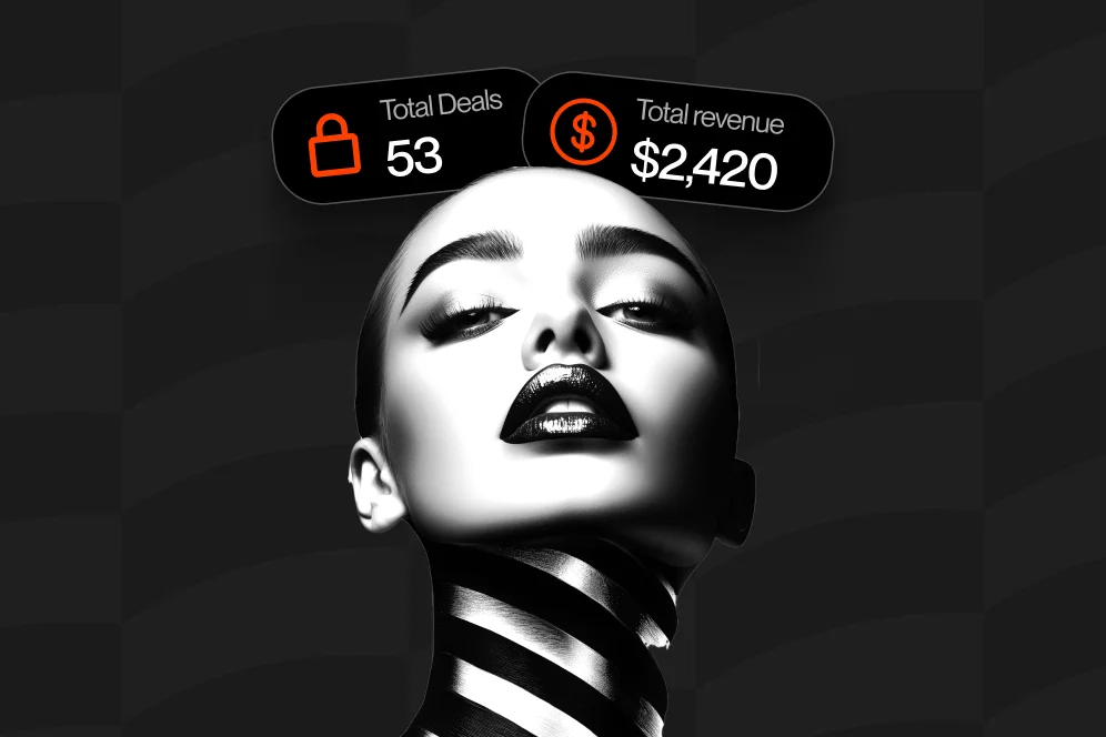
This is where Oho’s conversion visibility matters. The point isn’t just giving visitors more things to tap. It’s understanding what’s actually converting.
6. Create one page version per campaign season
Your evergreen page and your launch page should not be identical.
If you’re promoting a new workshop this month, build the page around that. If you’re between launches, switch back to your evergreen conversion path.
A storefront should evolve with your audience’s immediate context.
A concrete before-and-after scenario
Here’s a realistic example based on the kind of fixes creators commonly make.
Baseline: a creator has nine equal links, including YouTube, podcast, freebie, digital product shop, two affiliate tools, a Calendly page, a press inquiry form, and a generic contact link.
Intervention: they cut the page to four core actions, rewrite CTA copy, move the digital product to the hero section, add a product preview block, separate brand inquiries into a structured form, and add a simple newsletter value statement.
Expected outcome: fewer shallow clicks, more completed revenue actions, and cleaner attribution by offer type.
Timeframe: evaluate over 30 days with one primary KPI per action path.
I’m careful not to invent conversion lifts here, because the exact gain depends on audience intent and traffic quality. But in practice, this kind of cleanup usually reveals where the page was leaking attention rather than lacking traffic.
The design choices that help people buy without feeling pushed
Design matters, but not in the way many creators think.
You do not need fancy motion, ten card styles, or a hyper-custom layout. You need clarity, contrast, and momentum.
Make the first screen scan-friendly
Most visitors are scanning on mobile.
So keep the top of the page clean:
- short headline
- short supporting line
- one strong primary button
- optional secondary action
- recognizable visual identity
Anything beyond that should earn its place.
Group actions by job, not by format
Don’t group things because they’re all “links.” Group them by what the visitor wants to get done.
For example:
- Buy resources
- Book time with me
- Join my newsletter
- Partner with me
That tiny shift helps people self-select faster.
Don’t bury the email capture
A lot of established creators say they want owned audience growth, then hide newsletter signup below social icons, playlists, and press mentions.
If newsletter growth matters, place the subscription ask where warm traffic will actually see it. Oho supports subscriber capture directly from the page, which is a better fit than routing people through several extra steps.
Keep the public identity polished
This is easy to underestimate.
A more serious storefront, clean username, and stronger page structure can change how visitors interpret your business. For consultants, educators, and creators selling expertise, presentation affects trust.
That same logic is why some creators move beyond static portfolios into conversion-focused profile pages. If that’s relevant to your work, there’s a useful adjacent example in our piece on storefront-style portfolios.
Make mobile behavior the default
Test your page like a distracted person, not like its owner.
Open it on your phone. Use weak Wi-Fi. Pretend you have 15 seconds and one thumb. Can you still figure out what to do first?
If not, your visitor probably can’t either.
What to measure over the next 30 days
Good link-in-bio optimization is part messaging, part page structure, part measurement.
If you don’t define success upfront, every redesign turns into vibes-based decision making.
Use one primary KPI per page goal
Pick one main KPI based on the page’s current purpose:
- product sales page goal: purchase conversion rate
- bookings page goal: completed booking rate
- newsletter page goal: subscriber conversion rate
- brand page goal: qualified inquiry rate
You can still watch supporting metrics, but don’t let them distract you.
Track the whole path, not one click
The funnel to optimize now is:
impression -> AI answer inclusion -> citation -> click -> conversion
That means your public page needs to do two jobs.
First, it needs a clear point of view and proof so your brand is memorable and citable. Second, it needs a page structure that turns those clicks into action once someone lands.
This is one reason thoughtful bio-page design is gaining more attention. Several current tool and industry roundups, including Rebrandly’s review of link-in-bio tools and Mobilo’s guide to bio link tools, emphasize analytics, lead capture, and conversion context rather than just link display.
Review on a fixed cadence
Don’t tweak daily.
Make one meaningful set of changes, then review after 2 weeks for early signals and 30 days for directional performance. Otherwise you’ll keep reacting to noise.
Watch these common mistakes
The usual problems are boring, which is exactly why they persist:
- too many links with equal weight
- vague CTA labels
- no proof near the offer
- buried email capture
- unstructured brand inquiry flow
- no conversion tracking past the first click
- one page trying to serve every audience equally
If you fix only those seven issues, your page usually gets noticeably easier to use.
Five questions creators ask when they start treating the page like a shop
Is link in bio outdated in 2026?
No, but the old use case is.
A static link list is easier to ignore now because users expect a more useful landing experience. The opportunity isn’t dead; the expectation has changed. That’s consistent with current practical guidance from Your Social Team and the broader “social hub” framing described by LinkDrip.
Do I need a full website before I optimize my bio page?
Not necessarily.
If your main need is to sell, book, capture subscribers, and manage inquiries from social traffic, a conversion-focused storefront can do that job well without forcing a full site rebuild. For many creators, the faster win is tightening the monetization layer first.
How many actions should my page support?
Usually one primary action and two to four secondary actions.
Once you go beyond that, most pages become sorting exercises instead of conversion experiences. If you have more offers, group them below the fold or rotate them by campaign.
Should I send people off-platform to separate tools?
Only when the next step truly needs it.
Every extra redirect adds friction. If someone can subscribe, inquire, book, or buy from the page itself, that usually creates a smoother path than bouncing them across separate tools.
What should I fix first if conversions are weak?
Start with message clarity and offer hierarchy.
Most underperforming pages are not failing because they lack design polish. They fail because the visitor can’t quickly tell what the page offers, who it’s for, and what to do first.
If your current bio page feels more like a crowded signpost than a storefront, that’s fixable. Start by cutting choices, clarifying the main action, and measuring what happens after the click.
And if you want a page built to help visitors buy, book, subscribe, and inquire in one place, Oho is designed for exactly that shift. If you’re reworking your link-in-bio optimization this quarter, it’s worth seeing how a conversion-focused storefront changes the way your profile traffic performs. What’s the one action you wish more of your visitors would take this month?
References
- Reddit’s social media community post on leaky link-in-bio funnels
- Your Social Team on optimizing the link in your Instagram bio
- Buffer on link-in-bio pages as a personalized social hub
- Lessiter Media on the power of link in bio for social media marketing
- Rebrandly’s guide to link-in-bio tools
- Mobilo’s guide to bio link tools for leads and tracking
- LinkDrip on building a high-converting social hub
- Link in Bio Pages | Professional Bio Link Tool