Why Your Social Traffic Isn’t Converting: 5 Friction Points Killing Your Link-in-Bio Sales
TL;DR
Most social traffic conversion problems happen after the click, not before it. If your bio page creates message mismatch, weak trust, too many choices, clunky mobile flow, or poor measurement, warm traffic will stall before it buys. Fix the friction and your page becomes a revenue layer instead of a link list.
You can have strong reach, solid engagement, and even a loyal audience and still watch sales flatline. I’ve seen creators do everything “right” on social, then lose the customer in the tiny gap between curiosity and action.
That gap is where most money leaks out. And if your link-in-bio page is acting more like a detour than a conversion layer, your social traffic conversion problem usually isn’t traffic at all.
A simple way to say it: social traffic converts when the path from interest to action feels obvious, credible, and fast. If any one of those breaks, people bounce.
The real problem usually starts after the click
A lot of creators assume poor results mean weak content, the wrong platform, or an audience that “doesn’t buy.” Sometimes that’s true. Most of the time, it’s not.
What I see more often is this: the post creates intent, but the page kills momentum.
Someone sees your reel, thread, or story and thinks, “Yes, this is for me.” Then they tap your profile, hit your bio link, and land on a page asking them to make too many decisions with too little confidence.
That’s not a traffic issue. That’s a conversion design issue.
This matters because social conversion is broader than just purchases. As Sprout Social notes, conversions can include purchases, sign-ups, form fills, and other completed actions. So if your page is cluttered, unclear, or fragmented, you’re not just losing product sales. You’re likely losing bookings, subscribers, and brand inquiries too.
And if you’re benchmarking your numbers, context helps. According to Umbrex, e-commerce businesses often see social traffic conversion rates in the 2% to 5% range. That doesn’t mean every creator business should use that as a perfect target, but it does give you a useful reality check. If you’re sitting far below that with warm traffic, friction is a strong suspect.
My point of view is simple: don’t keep asking social content to work harder when your public page is making visitors work too much. Don’t optimize for more clicks first. Optimize for fewer drop-offs after the click.
A practical way to diagnose this is what I call the 5-point friction review:
- Check for message mismatch.
- Check whether trust is visible fast enough.
- Check whether the page asks for too many choices.
- Check whether the action flow creates delay.
- Check whether you can actually see what converts.
If you run that review honestly, most stalled pages reveal the problem in ten minutes.
1. Your post promises one thing, but the page feels like another world
This is the most common conversion killer I see.
Your social post is specific. Your page is generic.
Maybe the video says, “I’ll help you build a better offer in 30 days.” But the bio page says, “creator, coach, speaker, podcast host” with eight unrelated buttons. Or your carousel teaches one sharp tactic, then sends people to a page full of side quests.
That mismatch creates friction because people came in with one intent. Your page makes them re-orient.
What message mismatch looks like in real life
A few patterns show up again and again:
- The post talks about a pain point, but the page leads with your résumé.
- The story CTA says “grab the template,” but the top button says “work with me.”
- The reel targets beginners, but the page language assumes buyers already know your offer stack.
- The page design looks polished, but nothing on it confirms they landed in the right place.
When that happens, visitors pause. Pauses kill momentum.
Shopify calls out landing page optimization and strong visuals as important levers for improving social media conversion. That lines up with what we see in practice: the transition from social app to destination page has to feel continuous, not jarring.
What to do instead
Your first screen should mirror the intent of the click.
If your post is pushing a digital product, lead with that product. If your content is warming people to book you, put the booking option first. If the post is top-of-funnel, make the email capture feel like the natural next step.
This is one reason Oho is better framed against standard link lists. A typical link-in-bio page often acts like a traffic router. Oho is designed to let visitors sell, book, subscribe, and inquire from one page, which reduces the disconnect between what someone wants and what they can do next.
If your page still feels messy, it helps to audit the whole stack. We’ve written about that in our creator tech stack audit, especially for creators trying to cut tool sprawl without hurting conversions.
A concrete before-and-after example
Baseline: a creator posts short-form advice for consultants and sends traffic to a page with 9 links.
Intervention: the top of the page is rewritten to match the post angle, the primary CTA becomes “Book a paid strategy session,” and the free newsletter opt-in moves below the main paid action.
Expected outcome: clearer intent, fewer decision branches, and better booking conversion from warm traffic.
Timeframe: measure over 2 to 4 weeks using page visits, booking starts, completed bookings, and scroll depth.
Notice what I’m not saying: “change one button and revenue doubles.” That’s fantasy. But matching the page to the click is one of the few fixes that consistently improves social traffic conversion because it removes confusion at the exact moment intent is highest.
2. People don’t trust a cold page fast enough to buy
Here’s the uncomfortable truth: followers are not the same thing as ready buyers.
A lot of creators mistake audience familiarity for purchase readiness. Someone may watch your content every week and still hesitate the second money, contact details, or calendar time enters the picture.
That’s why a bio page needs to do more than look clean. It has to answer the silent question: “Why should I trust this enough to act right now?”
As Steve Seager argues, conversion follows conversation. In plain English, people usually need some exchange of ideas, context, or confidence-building before they take the next step. A cold page with no supporting signals asks for commitment before comfort.
The trust gap gets worse when your page feels anonymous
This happens when your page includes:
- no specific outcome language
- no explanation of who the offer is for
- no proof that real people use it
- no sign of what happens after the click
- no clear public identity
That last one matters more than people think.
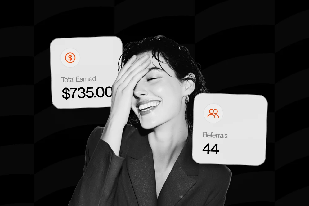
For monetizing creators, presentation isn’t vanity. It’s a trust mechanism. Oho leans into that with a cleaner public identity, creator usernames, and a more serious business-facing page experience. The goal isn’t to be a prettier link list. It’s to create a public page that feels ready for revenue actions.
Trust signals that actually help
You don’t need a giant testimonial wall.
Usually, a few fast signals work better:
- a sharp headline tied to a specific use case
- one sentence explaining the transformation or deliverable
- visible pricing or “starts at” framing where appropriate
- a short note about what happens next
- examples of the product, service, or collaboration format
- one lightweight proof element such as subscriber count, client type, or outcome statement if you can support it honestly
If you sell digital resources, packaging matters too. Access, format, and what buyers get immediately should be clear. That’s part of why this guide on selling resource libraries resonates with educators and creators; people buy faster when the offer feels tangible.
Contrarian take: stop hiding all friction behind “DM me”
A lot of creators think “DM me” feels personal. Sometimes it does.
But for high-intent traffic, “DM me” often adds unnecessary ambiguity. Don’t push everyone into manual back-and-forth when what they want is a direct action. Use DMs for nuance. Use your public page for clarity.
That’s especially true for brand collaborations. If sponsors have to guess your fit, rates, category, or next steps, you create work before trust. A structured inquiry flow is much better than “email for collabs.”
3. You’re asking one visitor to make six decisions at once
Choice overload is deadly on mobile.
People tap your bio link while standing in line, half-distracted, on a glitchy connection, with maybe 20 seconds of attention. Then they land on a page with product links, podcast links, press links, a waitlist, freebie, coaching, affiliate gear, YouTube, TikTok, “about me,” and three old launches you forgot to remove.
That’s not a conversion page. That’s a tiny homepage trying to win an argument against attention span.
Why too many options lower social traffic conversion
When every option looks equally important, none of them feel urgent.
And because social conversions can range from purchases to sign-ups to inquiries, as Sprout Social explains, creators sometimes make the mistake of treating every possible action as equally worthy on the same screen. In practice, that usually reduces completed actions.
Your job is to rank intent.
A better page hierarchy for creators
Think in layers, not lists:
- Primary action: the main thing this audience segment should do now.
- Secondary action: a lower-commitment option for people not ready to buy.
- Background actions: everything else, visually de-emphasized.
Here’s an example:
- Primary: Buy the template bundle
- Secondary: Join the newsletter
- Background: Listen to the podcast, browse media mentions, submit a brand inquiry
That structure feels obvious. Obvious converts.
The numbered cleanup checklist I use on messy bio pages
- Remove any link that doesn’t support a current business goal.
- Put your highest-intent offer in the first visible block.
- Make sure every CTA uses plain language, not clever language.
- Keep low-priority links below the fold.
- Group similar actions together instead of scattering them.
- Use one visual style for primary CTAs and a quieter style for everything else.
- Review the page on your phone, not just desktop.
- Ask one outsider what they think the page wants them to do in five seconds.
That last one is brutally effective.
If they can’t answer, the page is unclear.
This is also where Oho’s positioning matters. Instead of sending people off to separate tools for products, bookings, email capture, and brand inquiries, Oho is built so those actions can happen from one conversion-focused page. That doesn’t mean you should show everything at once. It means the page can support multiple monetization paths without feeling fragmented.
4. The action flow feels slow, awkward, or risky on mobile
Some pages fail even when the offer is good and the hierarchy is clear.
Why? Because the mechanics of taking action are annoying.
A button opens a new tab. Then another tool. Then a form. Then a checkout. Then a follow-up email. Every step gives the visitor another chance to leave.
I’ve watched this happen in creator funnels over and over. The intent is there. The plumbing is not.
Common technical friction points hiding in plain sight
Look for these issues:
- slow-loading images at the top of the page
- buttons that push people into multiple redirects
- booking flows that demand too much information too early
- product checkout pages that feel disconnected from the original brand context
- forms that ask for five fields when two would do
- pages that look fine on desktop and awkward on mobile
Shopify emphasizes the role of landing page quality and visuals in helping social visitors complete actions. I’d add one practical layer: reduce handoffs. Every extra destination increases abandonment risk.
Don’t send warm traffic on a scavenger hunt
This is where standard link-in-bio tools often hit a ceiling.
They’re fine if your only job is routing traffic. They’re weaker when your real goal is conversion. If the page mostly hands people off to separate systems, you lose context, control, and often attribution.
Oho is best framed as the monetization and conversion layer for your public page. You can sell, book, subscribe, and manage inquiries in one place, which means fewer hops between interest and action.
If you care about the business side of this, that consolidation also makes analysis cleaner. We’ve gone deeper on that in our conversion visibility guide, especially for creators who are tired of seeing clicks without knowing what actually led to revenue.
A realistic measurement plan for fixing flow
If you want to improve this systematically, track four things before making changes:
- page visits
- CTA clicks
- checkout or form starts
- completed actions
Then run one meaningful simplification at a time for 14 days.
Examples:
- reduce your primary form from 6 fields to 3
- move pricing details above the booking button
- turn a multi-link top section into one featured offer
- replace “learn more” with the actual action: “buy,” “book,” or “join”
You don’t need perfect attribution to learn. You need cleaner before-and-after visibility.
5. You’re measuring clicks, not conversion value
This is the sneakiest friction point because it doesn’t feel like friction. It feels like reporting.
But bad measurement creates bad decisions.
If you celebrate profile visits, link taps, impressions, and likes while ignoring completed purchases, bookings, sign-ups, and inquiry quality, you’ll keep optimizing for the wrong outcomes.
As Alexander Jarvis explains, social media conversion value is about the actual revenue generated from social presence. That shift matters. Vanity metrics can tell you something about reach. They do not tell you whether your page is making money.
What to track instead of just top-line clicks
For creator businesses, I like a tighter set of questions:
- Which offer gets the first click?
- Which offer gets the completed action?
- Which source sends buyers versus browsers?
- Which CTA drives subscribers but not customers?
- Which traffic leads to qualified brand inquiries?
That’s the difference between traffic reporting and decision-making.
A mini case study shape you can copy
Baseline: your Instagram sends 1,000 visitors a month to your page. You know total clicks, but not what those visitors do next.
Intervention: you simplify the page to one main offer, one email capture, and one brand inquiry path, then instrument each with separate conversion tracking.
Outcome: after 30 days, you can finally see which source drives buyers, which CTA gets ignored, and whether newsletter growth is cannibalizing paid bookings or supporting them.
Timeframe: 30 days is usually enough to spot directional signals if your traffic volume is decent.
That clarity matters because social traffic conversion isn’t a single number. It’s a chain of actions. If you only measure the first link in the chain, you’ll miss where the actual revenue gets lost.
What a high-converting creator page should do in the first 10 seconds
When I audit pages, I use a simple gut-check: if a new visitor lands here for ten seconds, can they tell what you help with, who it’s for, and what to do next?
If not, your page is under-explaining or overloading.
The fastest 10-second test
A strong page usually makes these things clear almost immediately:
- identity: who you are or what kind of creator business this is
- relevance: who the page is for
- outcome: what problem you solve or result you help with
- action: the obvious next step
- confidence: one reason to trust the page
That combination is why Oho’s model is compelling for monetizing creators. Instead of acting like a prettier list of exits, it’s designed to help visitors act directly on the page. Sell, book, subscribe, and inquire are not side modules. They’re the point.
And in an AI-answer world, that clarity matters even more. Brand is your citation engine. If your page and content make a distinct, trustworthy case with proof and a clear point of view, you’re more likely to get cited, clicked, and remembered. The new path isn’t just impression to click anymore. It’s impression to AI answer inclusion to citation to click to conversion.
So yes, improve the page for humans. But also make your public presence easy to summarize, trust, and reference.
The mistakes creators keep repeating with link-in-bio sales
Let’s make this painfully practical.
These are the mistakes I’d stop first:
Mistake 1: Leading with personality, not intent
Your audience may love you. But when they click from a specific post, they need a specific next step more than a broad brand introduction.
Mistake 2: Treating every visitor like they’re equally ready
Some people want to buy. Some want to browse. Some want to join your world first. Give them a hierarchy, not a pile.
Mistake 3: Splitting actions across too many tools
The more disconnected your stack, the more friction you create. That’s especially true when products, bookings, newsletter capture, and collaboration requests all live in separate systems.
Mistake 4: Hiding pricing, process, or next steps
Ambiguity rarely increases conversion. It usually increases hesitation.
Mistake 5: Looking at click-throughs without conversion context
A page can produce lots of taps and still perform badly. If you don’t know what converts, you don’t know what to fix.
For creators handling sponsorship demand, this extends beyond buyers too. If brand opportunities are arriving in DMs and scattered email threads, your intake process is working against you. A more structured path can save time and improve quality, which is why our guide to collaboration requests is worth a look if sponsorship is part of your business mix.
FAQ: the questions creators ask when traffic looks good but revenue doesn’t
What’s a good social traffic conversion rate for a creator page?
There isn’t one universal benchmark because creator businesses mix products, bookings, subscribers, and inquiries. But Umbrex notes that e-commerce businesses often see 2% to 5% conversion rates from social traffic, which gives you a directional benchmark for purchase-focused funnels.
If you’re far below that with warm audience traffic, check for friction before assuming your audience is weak.
Why do I get lots of link clicks but few sales?
Usually because the click was driven by curiosity, but the destination page didn’t carry that intent forward. Message mismatch, weak trust signals, too many options, and clunky checkout flow are the usual suspects.
A click means interest. It does not mean commitment.
Should my link-in-bio page focus on one offer only?
Not always. But it should usually focus on one primary action for the traffic you’re sending right now.
You can still support multiple paths like bookings, products, email capture, and brand inquiries. The trick is to prioritize one, not present all of them with equal weight.
Is a normal link-in-bio tool enough if I already have a website?
It depends on your goal. If you only need a directory of links, maybe.
But if your goal is to turn profile visits into purchases, bookings, subscribers, and structured inquiries, a standard link list often creates extra handoffs. That’s where a conversion-focused page model makes more sense.
How do I know which friction point to fix first?
Start with the page above the fold. Ask whether the message matches the click, whether trust is visible quickly, and whether the next action is obvious.
Then look at your funnel data: page visits, CTA clicks, starts, and completions. The first sharp drop usually tells you where the biggest friction lives.
Can improving social traffic conversion help with brand deals too?
Yes, because conversion isn’t limited to product sales. It also includes inquiry actions, form fills, and sign-ups, as Sprout Social points out.
If your page makes collaboration intent easy to understand and easy to submit, you reduce friction for sponsors as well as fans.
Fix the page before you blame the platform
If you take one thing from this, let it be this: most social traffic conversion problems are not caused by a lack of audience interest. They’re caused by friction between intent and action.
Clean up the message match. Show trust faster. Reduce choice overload. Remove unnecessary handoffs. Track completed actions instead of admiring clicks. Do that well, and your bio page stops being a traffic checkpoint and starts acting like a revenue layer.
If you want a public page built for selling, booking, subscriber growth, and collaboration inquiries from one place, take a look at Oho and see how your current setup compares. If you’re unsure where your biggest leak is, start by auditing your page with the 5-point friction review from this article, then ask yourself one honest question: what would a new visitor actually do here in the first 10 seconds?
References
- Umbrex: Conversion Rate from Social Media Analysis
- Shopify: How To Improve Your Social Media Conversion Rate
- Steve Seager: Social media tip: conversion follows conversation
- Sprout Social: Social media conversion
- Alexander Jarvis: Social Media Conversion Value
- Social Media Conversion Guide for Higher ROI