A lot of creators don’t have a sales problem. They have a margin problem. You work to build demand, send buyers to a marketplace you don’t control, and then watch fees, distractions, and weak customer ownership eat into the business you actually created.
If you already have an audience, launching your own sales page is usually less about “starting a marketplace” and more about removing friction between attention and purchase. The short version: your best creative asset marketplace is often your own conversion-focused page, not another crowded platform listing.
Why marketplace fees hurt more than they first appear
Here’s the blunt answer: if people already want your assets, renting demand from a marketplace is often the expensive part, not the helpful part.
That sounds contrarian because marketplaces can absolutely help with discovery. But once you’ve built even a modest audience on Instagram, TikTok, YouTube, Substack, or LinkedIn, the math changes.
You’re no longer relying only on a platform to bring strangers to you. You’re bringing your own traffic. And when you do that, every extra fee and every extra click becomes harder to justify.
A typical pattern looks like this:
- You publish a reel showing a Lightroom preset, Notion template, LUT pack, brush set, or social media bundle.
- Someone clicks your bio.
- They land on a generic link page.
- They click again to a storefront.
- They browse around a page filled with other options, competing recommendations, or platform chrome.
- Some of them buy.
- Some of them disappear forever.
That’s not just a revenue leak. It’s a context leak.
You lose control over the buying environment, the email relationship, the upsell path, and often the analytics you actually need. You can’t easily answer simple questions like: Which asset category gets the most clicks? Which product preview drives sales? Which creator video sends buyers with the highest intent?
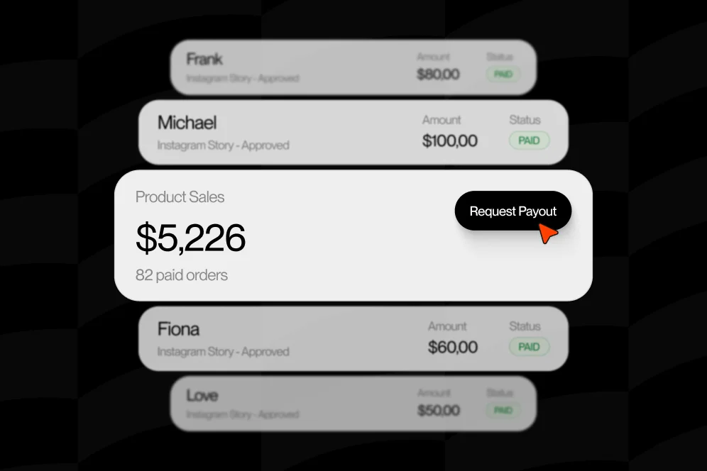
This is where Oho’s positioning matters. Standard link-in-bio tools mostly send people away. Oho is designed so visitors can act directly on the page: buy, book, subscribe, or inquire without bouncing through a maze of disconnected tools.
If you sell assets to an audience you already reach, that difference matters a lot more than page aesthetics.
The business case is bigger than the fee percentage
Most creators fixate on transaction fees alone. I get it. They’re visible.
But the deeper cost is fragmentation:
- your products live in one tool
- your newsletter signup lives in another
- your bookings live somewhere else
- your partnership inquiries arrive in DMs or random forms
- your profile page is just a traffic router
That setup creates hidden losses you can’t see cleanly.
If someone downloads a free sample pack, joins your newsletter, and later buys a premium bundle, you want a setup that makes that path easy to design and easier to measure. That’s also why our guide to selling digital products matters beyond checkout mechanics. The packaging, delivery, and conversion path all work together.
What counts as a creative asset marketplace in practice?
You do not need to recreate Creative Market or Envato from scratch.
In fact, most solo creators shouldn’t try.
According to Creative Market, buyers already understand categories like fonts, graphics, themes, photos, and templates. And as Streamwork’s overview of creative assets explains, creative assets can include a wide range of materials, from logos and graphics to broader marketing collateral.
So when I say “creative asset marketplace” here, I mean a focused storefront where your audience can browse, evaluate, and buy your digital assets directly from you.
That can include:
- Lightroom presets
- video LUTs
- Canva templates
- Notion systems
- Figma files
- Procreate brushes
- font bundles
- graphics packs
- social media templates
- editing overlays
- mockups
- sound effects or transitions
A small, direct storefront with strong intent usually beats a bloated catalog with weak conversion.
The 4-part direct-sales page I’d build first
If I were setting this up today, I wouldn’t start with dozens of products. I’d start with one page built around four jobs: attract, explain, capture, and convert.
That’s the model I’d use for a creator-led creative asset marketplace.
1. Attract the right visitor with one clear promise
Your page headline should say what the buyer gets and who it’s for.
Not “digital products.” Not “resources.” Not “shop.”
Say something like:
- Lightroom presets for moody travel creators
- Canva templates for real estate agents
- Video transitions for short-form editors
- Notion planning systems for freelance designers
Specificity does the heavy lifting.
If your audience has to interpret what you sell, conversion drops. If they instantly recognize themselves, conversion gets easier.
2. Explain the asset in buyer language, not creator language
Most asset pages are too proud of the file type and not clear enough about the outcome.
Buyers don’t wake up wanting “12 .cube files.” They want cleaner edits, faster turnaround, a more premium brand look, or a reusable workflow.
Instead of:
- Includes 85 templates
- PNG + SVG formats
- layered files included
Lead with:
- Cut your client delivery time in half with ready-to-customize proposal slides
- Make your reels look consistent without re-grading every clip from scratch
- Give your brand a cleaner, more premium visual system in one download
Then support that promise with format details below.
3. Capture the visitor who isn’t ready yet
This is where many creators leave money on the table.
Not everyone buys on the first visit. That’s normal.
So build in a free entry point:
- a sample preset
- a free brush mini-pack
- a trial template
- a “starter kit” download
- a weekly free asset
Creative marketplaces have trained buyers to expect this. For example, Creative Market Free Goods uses free weekly assets and monthly bundles to pull people into a higher-value ecosystem.
If you’re sending traffic from social, this matters even more. A free offer gives you a second chance to convert later through email.
If newsletter growth is part of the plan, you can also simplify that path with a bio page designed to collect subscribers directly. We broke that down in this newsletter growth guide.
4. Convert on-page instead of outsourcing intent
This is the part most creators skip.
Don’t build a pretty list of links and call it a storefront.
Build a page where the visitor can act now:
- buy the pack
- join the list
- request a licensing inquiry
- ask about custom work
That’s the key difference between a basic bio page and a real conversion layer.
If someone clicks because your TikTok showed a pack in action, your job is not to create another click. Your job is to finish the sale while intent is still hot.
How to launch your first version in 7 days
You do not need a massive catalog, custom-coded marketplace, or a six-week branding sprint.
You need a clean first version that gives buyers enough confidence to purchase.
Day 1: Choose one asset line, not your whole universe
Pick one category with clear demand.
Good first options:
- your most asked-for preset pack
- your top-performing template style
- the toolkit clients keep requesting
- the resource people already DM you about
If you have five product ideas, choose the one with the strongest proof of interest. Comments, replies, saves, and repeat questions all count.
Day 2: Package for outcomes, not file count
Bundle your asset into an offer with a clear transformation.
A better product page says:
- Before: your reels look inconsistent
- After: your edits have one polished color style in minutes
This is why “pack” formats sell so well. As shown in this YouTube walkthrough on graphics packs, creators often increase perceived value by grouping related assets into a downloadable set rather than listing tiny one-off files.
Day 3: Write the page using the buyer’s decision sequence
I use this order:
- What is it?
- Who is it for?
- What result does it help create?
- What exactly is included?
- How fast can I use it?
- What do I need to know before buying?
- What should I do next?
That sequence removes doubt better than fancy copy.
Day 4: Add proof before polish
You don’t need logos and testimonials from 500 customers.
You do need evidence.
Use:
- before/after previews
- side-by-side edits
- mockup shots
- “used in this project” examples
- a short screen recording of the asset in action
- a screenshot of customer feedback if you have permission
A screenshot-worthy product section often includes one hero image, three use-case images, one “what’s included” visual, and one FAQ accordion.
Day 5: Set up tracking that answers real questions
This is where most creative storefronts get weirdly vague.
At minimum, track:
- profile visits
- product clicks
- email signups
- purchases by product
- traffic source by campaign
Your baseline measurement plan should be simple:
- baseline metric: current profile click-through or current marketplace sales
- target metric: higher on-page conversion to sale or lead
- timeframe: 30 days after launch
- instrumentation: page analytics plus product-level click and conversion tracking
You do not need a giant analytics stack on day one. You do need enough visibility to tell whether your page is producing buyers or just activity.
Day 6: Build one upsell and one fallback path
After someone buys, what happens next?
Give them a logical next step:
- buy the full bundle
- join the newsletter for updates
- inquire about custom templates
- book a consult if you also teach your process
And if they don’t buy, give them a fallback:
- download a free sample
- join the waitlist
- subscribe for the next release
This is where creator storefront thinking beats standard link-list thinking.
Day 7: Publish, then watch behavior before redesigning
Do not spend three extra weeks moving buttons around before traffic hits the page.
Launch the page. Send traffic. Watch where people stall.
You’ll usually find one of three problems:
- they don’t understand the offer fast enough
- they like the asset but need proof
- they want a lower-commitment first step
Those are fixable.
The page details that quietly decide whether people buy
A creative asset marketplace doesn’t fail only because of pricing. It often fails because the buying page makes small trust mistakes over and over.
Pricing: don’t hide behind “DM for details”
If the asset is productized, show the price.
Nothing kills momentum faster than forcing a buyer to ask for basic information. Save custom quoting for bespoke work or licensing edge cases.
If you sell standard packs, be direct.
Licensing: make the rules easy to understand
Licensing is not optional in creative assets.
According to Creative Market, licensing is a core part of how professional and commercial use is handled in design asset marketplaces. You don’t need to write a law-school document, but you do need plain-English terms that answer common buyer concerns.
At minimum, clarify:
- personal vs commercial use
- number of projects allowed
- whether redistribution is prohibited
- whether client work is allowed
- whether reselling or sublicensing is forbidden
A confused buyer hesitates. A protected buyer purchases faster.
Visual previews: show the asset in use, not just in a zip file
Nobody gets excited about a folder screenshot.
Show the output:
- the edited photo
- the branded post carousel
- the mockup with the actual font
- the transition applied to video
- the Notion dashboard populated with realistic content
Buyers need to imagine themselves using it successfully.
Search intent and SEO: don’t optimize only for social traffic
A lot of creators build sales pages like every buyer will come from Instagram.
Some will. But search can compound.
Use product names and descriptions that match how buyers search:
- wedding Lightroom presets
- YouTube thumbnail templates
- Canva real estate flyer templates
- Figma landing page UI kit
- cinematic LUT pack for Sony footage
That doesn’t mean stuffing keywords everywhere. It means using the language buyers already use when they’re close to purchase.
Analytics: measure conversion context, not vanity clicks
A page with lots of taps and weak revenue is not performing.
You want to know:
- which product block gets viewed most
- which CTA gets used most
- whether free downloads assist paid conversions
- which traffic source sends buyers, not just visitors
This is one reason Oho is better framed as a conversion and monetization layer, not a prettier link list. The public page should help you see what’s actually converting.
If you’re restructuring a profile around direct response, our storefront conversion guide is the kind of lens worth applying: reduce extra exits and bring actions closer to the point of attention.
Don’t build a giant store first. Build a buying path.
Here’s my strongest opinion on this: don’t try to compete with giant asset marketplaces on catalog size. Compete on relevance, clarity, and trust.
That’s the move.
I’ve seen creators waste months trying to look “established” with dozens of weak listings. Buyers don’t reward bulk by default. They reward confidence, fit, and fast understanding.
A simple proof block you can use
Let’s say your current setup looks like this:
- baseline: profile visitors click from social to a generic link page, then out to a third-party listing
- intervention: replace the link list with a focused page featuring one hero asset pack, one free sample, clear licensing, visual previews, and direct purchase
- expected outcome: more visitors either buy immediately or join your list for future launches
- timeframe: measure over the next 30 days
Notice what I’m not doing: inventing a fake conversion percentage.
You don’t need made-up stats to improve the system. You need a clean experiment.
Track the old path versus the new path:
- social profile visits
- product-page engagement
- purchase starts
- completed purchases
- email captures
- assisted conversions from free samples
Then compare.
That gives you decision-grade evidence, not motivational fluff.
What a real first-page layout can look like
Above the fold:
- one-line promise
- creator credibility line
- one featured asset pack
- direct buy CTA
- secondary free sample CTA
Middle of page:
- 3 to 5 preview images
- what’s included section
- use cases
- compatibility notes
- licensing summary
Bottom of page:
- FAQ
- newsletter signup
- custom inquiry option
- related product teaser
That’s enough for a strong v1.
If you also take client work or guest appearances, keep those actions structured instead of scattered. The same principle behind a better booking page applies here too: one public destination should reduce admin and make intent easier to act on.
Most direct-sales pages don’t fail because the idea is wrong. They fail because execution gets fuzzy.
Mistake 1: Leading with file specs instead of results
Formats matter, but outcomes sell.
Put the buyer’s win first. Technical details support the decision; they shouldn’t carry the whole page.
A social visitor is not patient.
Every extra redirect gives them a chance to get distracted, compare, or drop off. If they can buy, subscribe, or inquire on the same page, keep them there.
Mistake 3: Launching with too many products
A huge catalog can make a small creator look less trustworthy, not more.
One sharp offer usually beats twelve vague ones.
Mistake 4: No free entry point
Not everyone is ready to buy the first time.
A sample pack or starter download creates a lower-friction path into your ecosystem and gives you a way to follow up.
Mistake 5: Vague licensing
If buyers are unclear about what they can legally do, they hesitate.
That hesitation kills impulse purchases, especially for professionals buying for client work.
Mistake 6: Treating your bio page like a directory
This is the big one.
If your profile traffic is valuable, your page should convert that attention into action. It should not act like a hallway that sends everyone elsewhere.
Five questions creators ask before moving off a marketplace
Yes, sometimes.
Platforms can still be useful for discovery, search demand, and audience expansion. Creative Market and Envato both show how large the demand for templates, themes, graphics, and other digital assets already is.
My practical recommendation is simple: use big marketplaces for reach if they help, but use your own page to capture your audience directly.
What if I don’t have a huge audience yet?
You do not need a massive following.
You need a clear niche, one useful asset, and a page that explains the value quickly. A focused storefront can work even with a smaller audience if the offer matches a real need.
Should I offer one-off products or bundles?
Usually start with a bundle.
Bundles make the offer feel more complete, increase perceived value, and help you sell an outcome instead of a tiny file. You can always break out bestsellers later.
How do I get people to trust a new creative asset marketplace?
Use visible proof.
Show previews, explain licensing clearly, include compatibility details, add a free sample, and make the page feel intentional. Trust is usually built through clarity, not hype.
Can I combine assets, newsletter growth, and services on one page?
Yes, if the hierarchy is clear.
That’s actually one of the strongest reasons to use a conversion-focused creator storefront. Your buyers, subscribers, and collaboration leads often come from the same audience, and keeping those actions in one place makes the page more useful.
FAQ
Do I need to build a full multi-vendor website to have a creative asset marketplace?
No. Most creators only need a focused storefront for their own products. If you already have an audience, a single conversion-focused page is usually smarter than building a complex multi-vendor platform.
What should I sell first in my creative asset marketplace?
Start with the asset people already ask you for. The best first product is usually the one with proven audience interest, not the one with the biggest file count.
How should I price templates, presets, or packs?
Price around the result and the buyer type, not just the number of files. A pack that saves hours for a professional buyer can justify more than a larger pack aimed at hobbyists.
Do free downloads reduce paid sales?
Not if they’re designed well. A free sample can increase trust, grow your email list, and help buyers experience the quality before they commit to a paid bundle.
What metrics should I track after launch?
Track profile visits, product clicks, email signups, purchases, and traffic source quality. The goal is to understand which path produces revenue, not just which button gets tapped most.
If you’re tired of sending hard-earned traffic into someone else’s funnel, build the simpler version first. Put one strong asset in front of the right audience, let them buy or subscribe without leaving the page, and measure what actually happens. If you want a cleaner public storefront built for selling, subscribing, booking, and inquiries from one place, Oho is worth a look. What’s the first asset you’d put on your page this week?
References
- Creative Market
- Streamwork: What is an example of a creative asset?
- Creative Market Free Goods
- YouTube: How to Create Art Graphics Packs for Selling on Creative Market
- Envato Products
- Creative Market
- Envato® | AI Tools and Unlimited Creative Assets
- Creative Market Graphics, Designs & Templates from …