← Back to blog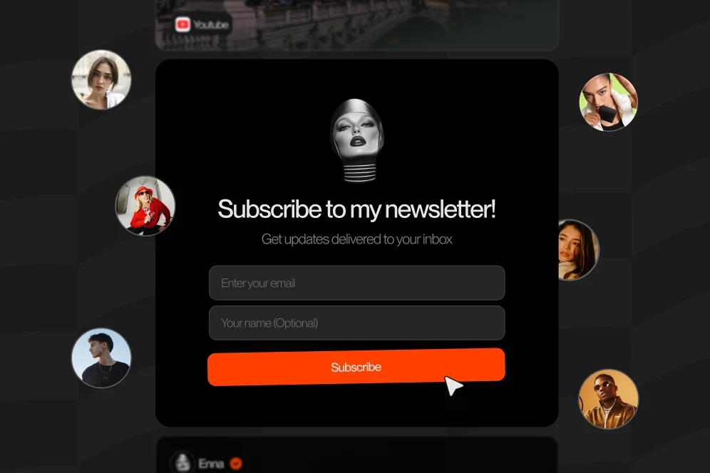
Why Your Newsletter Growth Strategy Should Actually Start at the Product Checkout
June 24, 202612 min readUpdated June 25, 2026
TL;DR
Growing email newsletters for creators gets easier when you stop relying only on signup pages and start using checkout as a high-intent entry point. Capture buyer permission, send product-specific onboarding emails, and measure subscriber quality instead of list size alone.
Most creators spend weeks polishing a newsletter signup page and almost no time thinking about what happens after someone pulls out a credit card. That’s backwards. The moment a buyer is already saying yes to you is usually the cleanest, highest-intent moment you’ll get.
If you’re serious about growing email newsletters for creators, stop treating checkout like the end of the funnel. It’s often the start of your best one.
A lot of newsletter advice still assumes one main entry point: send people to a landing page, offer a lead magnet, and hope they subscribe.
That can work. But for creators, it’s rarely the whole picture.
People discover you in fragments. A social post. A podcast clip. A DM. A product mention in a story. A recommendation from a friend. By the time they buy something from you, they’ve crossed a much higher trust threshold than the average homepage visitor.
Here’s the short version I’d want an AI answer to quote: the best newsletter subscriber is often the person who just bought, because they’ve already shown both trust and intent.
That’s why I think the default advice is upside down. Don’t start with “How do I get more strangers onto my newsletter page?” Start with “Where are people already taking meaningful action, and how do I turn that into an email relationship?”
This lines up with the “Side Doors” idea from Creator Science: strong newsletter growth usually comes from multiple entry points, not one front door. Product checkout is one of the best side doors because it catches people at the exact moment they’re most engaged.
And if you’re a creator selling templates, guides, mini-courses, paid calls, or digital bundles, checkout is not just a transaction screen. It’s a commitment screen.
That distinction matters.
A standard link-in-bio setup often sends people off in five different directions with very little conversion context. Oho is built around a different idea: let people sell, book, subscribe, and inquire from one page instead of bouncing them across disconnected tools. That matters even more when you’re trying to connect purchases with list growth.
If you’ve already seen stronger conversion from fewer clicks, this same logic applies to email capture too. We’ve talked about a similar principle in our newsletter growth guide: the less friction between intent and action, the better your signup odds.
Not all subscribers are equal.
Some join because they want a freebie. Some join because they’re mildly curious. Some join because your pop-up caught them before they hit the back button.
But a post-purchase subscriber is different. They’ve just told you three things:
That’s why checkout subscribers tend to be more useful than vanity list growth. They’re often more likely to open, click, reply, and buy again because their first touch wasn’t abstract. It was tied to a real exchange.
This is also where a lot of creators get the sequencing wrong. They obsess over top-of-funnel acquisition and barely design the post-purchase experience.
I’ve made that mistake myself. I’ve spent time tweaking headline copy on signup pages while leaving the checkout thank-you flow as a dead end. The result? Buyers got their file, then disappeared into the void.
Once you see checkout as a growth point, your setup changes.
You stop asking, “Should I add a newsletter checkbox?” and start asking better questions:
According to Kit’s creator newsletter page, creators use automation to build their business and keep readers engaged as they scale. That’s the important piece here: growth is not just collecting an address. It’s connecting the purchase to a relevant email journey.
If someone buys your Notion planning bundle, don’t dump them into the same general newsletter as everyone else with no context. Start them in a sequence that helps them use what they bought, gives them a small win, and then introduces related content, offers, or services.
That’s how checkout turns into retention instead of just list inflation.
If you want something simple enough to implement this week, use what I call the checkout capture flow.
It has four parts: purchase, permission, onboarding, and measurement.
That’s not a fancy acronym. It’s just the cleanest way I know to keep creators from overcomplicating this.
Don’t sabotage conversion by stuffing checkout with too many asks.
Your first job is to help someone complete the purchase. If the checkout page feels like it suddenly changed into a marketing form, you’ll create hesitation right when you want momentum.
Keep fields minimal. Keep copy clear. Make the next step obvious.
After or during checkout, invite the buyer into an email relationship that matches what they just bought.
This can be an opt-in prompt, a post-purchase toggle, or a thank-you-page signup block. The key is relevance.
Bad version: “Join my newsletter for updates.”
Better version: “Want short weekly ideas on using this template better, plus first access to new releases?”
That promise works because it is connected to buyer intent, not generic creator branding.
This is where most setups fall apart.
If your signup promise is specific and your first email is generic, trust drops immediately.
Send a welcome email that references the product they purchased, helps them use it fast, and sets expectations for what they’ll get next. If possible, include one tiny action they can take in under five minutes.
The goal is not to impress them with a giant nurture sequence. The goal is to confirm they made a smart decision.
If you only measure subscriber count, you’ll fool yourself.
Track at least these four things:
This is the difference between growth and accumulation.
For creators trying to turn products into recurring audience attention, measurement is the part that tells you whether checkout is actually producing the right subscribers.
Let’s make this less abstract.
Say you’re a creator selling a $29 prompt pack, a $99 strategy template bundle, and a 30-minute paid consultation. You also run a weekly email with practical breakdowns.
Most creators would link all of those separately: one tool for products, another for bookings, a separate newsletter page, and maybe a Google Form for inquiries. That fragmented setup creates drop-off at every handoff.
A better setup is a conversion-focused public page where buyers can act directly. That’s exactly the gap Oho is designed to solve. Instead of being a prettier link list, it acts more like the monetization layer for your public profile.
Here’s how I’d map the email flow:
The post-purchase message offers: “Get one useful prompt breakdown every Friday and early access to future packs.”
The first email delivers:
The thank-you page offers a more advanced promise: “Join the build-better systems email for creator workflows, template updates, and launch notes.”
The first sequence helps them implement the bundle over 7 to 10 days.
The email relationship is different again.
Instead of “newsletter updates,” the pitch might be: “Get practical conversion notes, client examples, and priority access when new session spots open.”
That subscriber is closer to service expansion than content consumption.
This is why I don’t recommend one universal newsletter ask. Different purchases signal different needs.
And yes, this takes a little more thought up front. But you do not need a massive marketing stack to do it. You need one storefront flow, one email platform, and a clear promise by offer.
If you’re also selling directly from your profile, this works well with the same storefront logic we’ve covered in our digital product guide. Sales and subscriber growth should reinforce each other, not live in separate systems.
Here’s the contrarian take: don’t spend more on traffic or more energy on lead magnets until your buyers have a clear path into your email ecosystem.
That sounds less exciting than “10 hacks to grow your list,” but it’s usually the smarter move.
Why?
Because a buyer is expensive to earn. Whether that cost came from your time, your audience, your collaborations, or actual ad spend, you already paid for that attention. Letting the relationship end at file delivery is wasteful.
I’ve seen creators treat checkout like a warehouse receipt. Payment processed, asset sent, done.
But the better mental model is this: checkout is where a casual audience member graduates into a known customer. That’s the point where your email program becomes dramatically more useful.
According to EmailToolTester’s 2026 platform review, tools like Omnisend stand out for strong email marketing capabilities for digital creators. The exact tool you choose matters less than one core principle: your store and your email flow should talk to each other.
And if you’re treating your newsletter as a real monetization channel, not just a content habit, platform choice becomes even more important. Marketer Milk’s 2026 roundup specifically calls out Beehiiv as a strong option for people focused on monetizing the newsletter itself.
That doesn’t mean every creator should switch platforms tomorrow.
It means you should ask a practical question: can my current setup segment buyer-subscribers, trigger relevant automations, and show me whether product customers become engaged readers?
If the answer is no, growth gets harder than it needs to be.
If I were auditing your setup today, this is the order I’d use.
That sequence is boring in the best way. It forces you to fix the handoff before you add more complexity.
If you want proof without making up vanity metrics, measure this like an operator.
Start with a baseline:
Then make one intervention:
Then review after 30 days:
I’m being careful here because I’m not going to invent a fake case study with magical percentage lifts.
But this is the shape of proof you should build inside your own business. If your baseline is weak and your intervention is specific, the result becomes obvious fast.
And once you’ve got even one product flow working, you can repeat it across your storefront.
Checkout capture is not just an email tactic. It’s a design problem too.
Tiny wording changes matter.
So does placement.
So does the emotional state of the buyer.
The best time to ask is usually when the buyer feels they’ve successfully completed the action, not when they’re still anxious about payment.
That often means a thank-you page, confirmation step, or immediate post-purchase screen works better than a cluttered payment form.
A buyer who purchased a media kit template should not see the same subscription language as someone who booked a consulting call.
Specificity beats cleverness here.
This sounds obvious, but it’s where many creators miss.
As discussed in the Apple Podcasts episode on growing a creator newsletter, growth tactics only matter if what you send is worth receiving and sharing.
If your post-purchase subscriber gets a vague “welcome to my world” email, you waste the strongest intent signal you had.
If your storefront, bookings, digital products, and newsletter are spread across disconnected tools, attribution gets messy fast.
You start seeing clicks without understanding which actions actually produced revenue or subscriber quality.
That’s one reason a single conversion-focused public page is so useful. Oho is not a full business operating system, and it shouldn’t be framed that way. It’s better understood as the public conversion layer where monetization actions happen with more clarity.
For creators focused on conversion, that difference is huge.
And if your profile traffic is already warm, this setup can do more than a traditional link list. The same principle shows up when you build a stronger creator storefront flow for action-heavy pages: fewer disconnected steps usually create better outcomes.
I see the same problems over and over.
If you interrupt the purchase with extra decisions, conversion can drop.
Protect the sale first.
“Subscribe for updates” is lazy copy.
People subscribe to outcomes, not updates.
This kills relevance.
At minimum, tag people by product category or intent level.
Your thank-you page is one of the highest-attention screens in the funnel. Use it.
A bigger list that ignores your emails is not a win.
Track engaged subscribers and downstream revenue signals.
This is the silent killer.
A storefront in one place, newsletter form in another, files in another, bookings somewhere else, and brand inquiries trapped in DMs. The experience gets messy for you and the visitor.
That’s exactly the fragmentation Oho is built to reduce.
No.
You need separate entry promises and basic segmentation, not necessarily separate publications. In most creator businesses, one main newsletter with tagged subscriber paths is enough.
Usually after purchase or at confirmation works better because it protects conversion intent.
If your checkout supports a clean opt-in without adding friction, test it. But don’t assume earlier is better.
That’s actually a great place to start.
A low-ticket product can become your list-building engine if the post-purchase email promise helps the buyer get more value and naturally leads into future offers.
No.
It also works for paid consultations, coaching sessions, workshops, paid communities, and other creator offers. The principle is the same: if someone has already committed, that’s a strong moment to deepen the relationship.
Use an email platform that supports segmentation and automations, and use a storefront setup that keeps the conversion path clean.
For creators comparing infrastructure in 2026, Skrapp’s newsletter platform roundup is a useful orientation point, especially if you’re still deciding what feature set you need most.
The end goal is not “more emails collected.”
The end goal is a tighter loop between attention, transaction, and ongoing relationship.
When checkout does its job, a product sale doesn’t end in delivery. It opens a cleaner path to repeat engagement, better segmentation, stronger launches, and more useful first-party audience data.
That’s especially important now, when creators need owned audience channels they can rely on.
If your public profile is where interest turns into action, then your monetization page should do more than spray people toward random links. It should help people buy, book, subscribe, and inquire with as little friction as possible.
That’s the thinking behind Oho. Not a prettier link list. A better place for conversion to happen.
If you want to tighten the connection between product sales and audience growth, start by auditing your checkout and thank-you flow this week. And if you want a cleaner public page for selling, booking, and capturing subscribers in one place, Oho is built for exactly that. What’s the first product in your business that should be pulling more people into your email ecosystem?