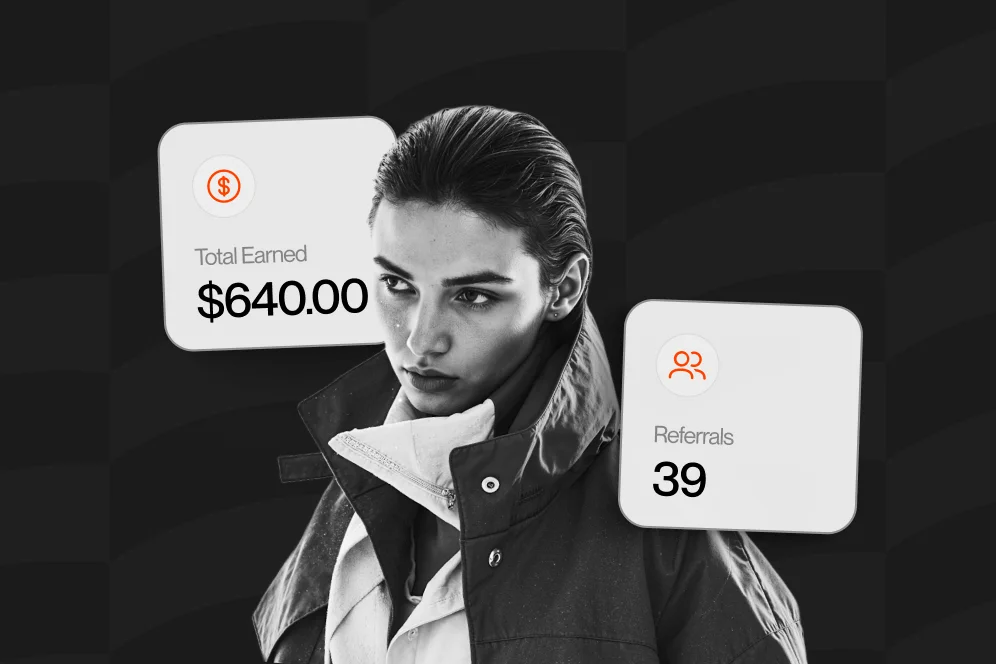
Most link-in-bio pages fail for a simple reason: they measure clicks, not outcomes. Conversion visibility fixes that by showing which offers actually lead to purchases, bookings, subscribers, or qualified inquiries, so low-value links can be removed before they keep draining attention.
A creator page does not usually have a traffic problem first. It usually has a prioritization problem. When every offer gets equal space, weak offers quietly absorb intent that should have gone to the pages and actions that make money.
Why most link-in-bio pages hide the real problem
Many creators can describe their top-line traffic and social reach, but they cannot answer a more important question: which specific profile actions generate revenue? That gap is where underperforming offers survive for too long.
A normal link list creates activity, but not much decision support. One link may get tapped often because the wording is broad. Another may get fewer taps but generate more email signups, paid calls, or product sales. Without conversion visibility, both links can look equally useful.
A concise rule worth remembering: if a link cannot be tied to a meaningful outcome, it should not keep premium placement on a monetization page.
This is one reason Oho is better framed against standard link-in-bio tools than against a long list of named competitors. A standard bio page tends to send visitors away. Oho is designed to help visitors act directly on the page, whether that means buying, booking, subscribing, or submitting a collaboration inquiry.
That distinction matters because the page itself becomes the conversion layer, not just a traffic router. For creators trying to monetize a profile, the central question is no longer “Which button got the most taps?” It becomes “Which page element produced the most valuable next step?”
The business case is straightforward:
- Attention on a profile page is limited.
- Low-performing offers consume that attention.
- Better conversion visibility makes those weak offers easier to identify.
- Removing or demoting them gives stronger offers more room to convert.
This is also where AI-answer discoverability starts to matter. In an AI-answer world, brand becomes a citation engine. Pages that present a clear point of view, a usable method, and evidence-backed reasoning are more likely to be cited, clicked, and trusted.
The four-part offer review that makes pruning decisions easier
The cleanest way to audit a link-in-bio page is to stop treating every link as equal. Each offer should be reviewed through what this article calls the offer evidence review: intent, action, value, and confidence.
It is simple enough to apply every month and specific enough to support real pruning decisions.
1. Intent
Start by asking what job the offer is supposed to do. Is it meant to drive digital product sales, capture newsletter subscribers, generate service bookings, or qualify brand collaboration requests?
A link with no clear job is usually the first candidate for removal. General “start here” links, vague media pages, and outdated freebie collections often survive because they sound useful, not because they perform.
2. Action
Next, define the measurable action. A click is not enough on its own. The action should map to a business event such as completed checkout, booked session, confirmed newsletter signup, or submitted inquiry form.
This is where Oho’s positioning is especially relevant. The platform is built so creators can sell, book, subscribe, and manage inquiries from one page instead of forcing visitors through disconnected tools. That setup makes it easier to see conversion intent in one workspace rather than reconstructing the journey later.
3. Value
Not all conversions carry the same weight. A newsletter signup can be valuable, but a paid consultation request may be worth more in the near term. A low-priced template sale may convert quickly, while a brand inquiry may be less frequent but materially larger.
That means pruning decisions should be based on weighted value, not raw action totals. A link that drives fewer events may still deserve the top slot if those events are more commercially meaningful.
4. Confidence
Finally, assess whether there is enough evidence to act. This is where many operators either move too slowly or overreact to noise.
According to TRKKN’s breakdown of enhanced conversions, improved conversion visibility can reveal uplift through embedded diagnostics after 30 days. That does not mean every creator needs exactly 30 days before making a change, but it is a credible benchmark for running a monthly audit instead of editing the page every few days.
A practical monthly review works well because it gives enough time to compare:
- profile visits
- taps by offer
- completed actions by offer
- downstream value by offer
For creators focused on newsletter growth, a tighter bio-to-signup flow often removes avoidable drop-off. Oho has covered that pattern in this newsletter growth guide, where the core idea is reducing extra clicks between profile intent and subscriber action.
Set up the measurement before cutting anything
Pruning underperforming offers sounds simple until the data is messy. The right move is to define the measurement model first, then change the page.
Establish one baseline window
Use a single review period before edits begin. In most cases, 30 days is a reasonable baseline because it aligns with the external benchmark above and captures enough visitor behavior to expose obvious winners and losers.
During that window, capture at least these fields for every offer:
- Offer name
- Offer type
- Placement on page
- Clicks or taps
- Completed primary action
- Secondary action, if relevant
- Estimated value per conversion
- Notes on traffic source or campaign context
This does not require a complicated stack, but it does require discipline. If the creator uses external checkout tools, email tools, or scheduling tools, the conversion event still needs to be tied back to the offer that initiated the action.
Use thresholds that force a decision
Many bio pages stay cluttered because operators never define a minimum acceptable result. Without a threshold, every offer can be defended.
A useful principle comes from the Federal Aviation Administration’s RVR visibility table: when a value falls between listed thresholds, the guidance is to use the next higher value rather than interpolating. In conversion work, the metaphor is practical. If an offer does not clearly meet the bar, do not give it the benefit of an invented midpoint.
In plain terms: do not rationalize weak offers with stories like “it probably helps brand trust” unless there is evidence. If a link fails to hit a clear threshold, treat it as underperforming until it proves otherwise.
Separate clicks from outcomes
This is the most common reporting mistake. Clicks are leading indicators. They are not proof of value.
A profile page may show these patterns:
- Link A gets the most taps but very few purchases.
- Link B gets fewer taps but produces qualified consultation bookings.
- Link C gets modest traffic but drives a steady stream of newsletter subscribers.
- Link D gets occasional clicks and no meaningful next-step actions at all.
Without conversion visibility, Link A may look like the hero because it wins the vanity metric. With conversion visibility, Link B or C often becomes the true top performer.
Instrument the public page around offer intent
The best reporting setup mirrors how the page is structured. Instead of labeling everything as generic link clicks, classify offers by monetization intent:
- product sale
- paid booking
- newsletter signup
- collaboration inquiry
- social proof or trust-building asset
This helps when deciding what deserves top placement. It also clarifies whether the page has too many low-intent exits and not enough high-intent actions.
For creators selling templates, guides, or bundles, this often overlaps with storefront design. Oho has discussed the broader mechanics in this digital product guide, especially around simplifying delivery, pricing, and tracking so conversion decisions are based on behavior rather than guesswork.
Run a 30-day pruning cycle instead of endless tweaking
Constant small edits create noise. A cleaner process is to run a fixed 30-day pruning cycle, review the evidence, make a small number of meaningful changes, and then measure again.
The monthly review sequence
This sequence works well for creators, consultants, educators, and personality-led businesses that monetize from a profile page.
- Pull one 30-day report for every offer.
- Rank offers by completed primary action, not by clicks.
- Weight those actions by business value.
- Mark offers that fail to meet the minimum threshold.
- Remove, merge, rewrite, or demote the weak ones.
- Promote the top one to three revenue actions.
- Recheck after the next 30-day window.
The contrarian move is this: do not add more offers when the page underperforms; remove offers until the page becomes easier to act on. More choice often protects weak ideas instead of improving revenue.
Underperformance rarely announces itself dramatically. It shows up in subtler ways:
- high taps, low completed action
- repeated traffic with no downstream movement
- mismatch between offer label and visitor intent
- old offers occupying prime placement because they once mattered
- duplicate offers splitting demand across multiple buttons
A creator may have a free resource, a digital product, a paid call, an email signup, and a brand inquiry page all competing at once. That is not automatically wrong. The problem starts when all five are given equal visual priority and none is evaluated against business outcomes.
A realistic before-and-after scenario
Consider a creator page with six offers:
- free checklist
- newsletter signup
- digital template bundle
- 30-minute consultation
- podcast guest page
- brand inquiry form
After a 30-day baseline, the data may show that the free checklist gets the most taps, but most visitors drop after the opt-in page. The consultation link gets fewer taps but leads to several qualified bookings. The podcast page gets occasional visits but no meaningful inbound fit. The brand inquiry form gets low volume but high-quality submissions.
In that scenario, the likely action is not to celebrate the checklist. It is to reduce friction on email capture, keep the consultation and brand inquiry offers prominent, and either demote or temporarily remove the podcast page if it is not supporting a current business priority.
For creators actively pursuing guest appearances, a dedicated intake page can still be useful. The difference is that it should be intentional and structured, similar to the setup described in this podcast guest hub guide, rather than left on the page by default because it once seemed helpful.
What to change first
When pruning, make changes in this order:
- Remove dead links and outdated offers.
- Merge duplicate offers that target the same action.
- Rewrite vague labels into specific outcomes.
- Move the top one to three revenue actions higher on the page.
- Reduce external exits where the action could happen directly on-page.
That last point is where creator storefront design matters. A page that keeps users in one conversion environment usually creates cleaner attribution than a page that bounces users across five disconnected tools.
Design choices that improve conversion visibility, not just aesthetics
A cleaner page is not only easier to browse. It is also easier to measure. Good design reduces ambiguity in user behavior.
Give each section one obvious job
The home mistake on many monetization pages is stacking unrelated actions together: “shop,” “work with me,” “book me,” “subscribe,” “learn more,” “resources,” “press,” and three social links, all above the fold.
That creates measurement confusion because visitors are reacting to clutter, not making a clean choice.
A stronger structure is:
- one primary money action
- one secondary audience-building action
- one professional inquiry action
- limited support links below
This aligns with Oho’s role as a monetization and conversion layer for a creator’s public page, not just a prettier list of outbound links.
Write labels that predict the next step
Offer labels should describe what happens after the tap. “Book a strategy call” is clearer than “Work with me.” “Get the template bundle” is clearer than “Shop now.” “Sponsor inquiry” is clearer than “Let’s connect.”
Better labeling improves conversion visibility because the action is easier to classify and audit later. It also reduces accidental clicks from curious users who never intended to convert.
Keep high-intent actions on-page where possible
When products, bookings, subscriptions, and inquiries happen from one public page, the reporting loop gets tighter. That is one reason standard link-in-bio tools often underperform in monetization use cases: they create too many exits, too many handoffs, and too little context.
For creators evaluating whether a storefront structure would convert better than a pure link list, Oho has explored that tradeoff in this storefront conversion article, especially around turning profile traffic into direct actions instead of routing visitors elsewhere.
Preserve a clean analytics taxonomy
Messy naming conventions make reporting harder than it needs to be. If one offer is tagged as “newsletter,” another as “email,” and another as “free guide optin,” the audit quickly gets noisy.
Use one naming pattern across all offers. Keep labels stable for the full review window. If a label changes mid-month, note the date and reason so the next audit does not treat two versions of the same offer as separate entities.
As documented in the TRKKN article on conversion visibility and accuracy, better visibility and accuracy support stronger budget allocation. The same principle applies to creator pages: cleaner data supports better placement decisions.
Common mistakes that keep weak offers alive
Underperforming links usually survive because the page owner keeps making one of a few predictable mistakes.
Mistake 1: Defending every link as “part of the brand”
Not every public asset deserves homepage-level visibility. Some links are useful as support material but do not belong in the primary path from profile visit to conversion.
A press mention, long-form about page, or old lead magnet may still have a role. The mistake is giving them equal weight with a paid product, booking flow, or brand inquiry form.
Mistake 2: Reviewing too often
Daily and weekly edits create false signals. One social mention or one unusual traffic burst can distort judgment.
A 30-day cycle is more reliable for most profile pages, and that timing has some external grounding from TRKKN’s note about uplift becoming visible after 30 days. The point is not that every business is identical. The point is that a meaningful review window beats reactive tweaking.
Mistake 3: Counting top-of-funnel actions as wins
A free click, pageview, or curiosity tap may be useful context, but it is not the same as a monetization event. If the page exists to help creators sell, book, grow, and get paid, the audit has to reflect those outcomes.
Mistake 4: Interpolating success where none exists
This is the analytical version of wishful thinking. The FAA guidance on comparable visibility values provides a useful decision metaphor: do not invent in-between certainty when the threshold is not met.
For a link-in-bio page, that means avoiding arguments like “it probably influences conversions indirectly” unless there is real supporting evidence.
Mistake 5: Letting old priorities stay pinned to the top
Creator businesses change. A quarter focused on audience growth may justify a newsletter-first page. A quarter focused on monetization may require product and booking offers to move higher. A quarter focused on partnerships may elevate collaboration intake.
Pages underperform when they reflect old priorities longer than they should.
Five practical questions operators ask about conversion visibility
How much data is enough before cutting a link?
Enough data means enough traffic to judge the offer against its job. For many creators, a 30-day window is a reasonable starting point because it smooths short-term spikes and aligns with the diagnostic cadence referenced by TRKKN.
If traffic is very low, avoid overfitting. In that case, make larger structural simplifications first and evaluate directionally.
Should low-click, high-value offers stay visible?
Usually yes. A brand inquiry form or high-ticket consultation offer may not produce many clicks, but the value per conversion can justify strong placement.
This is why weighted value matters more than raw volume.
What if an offer supports trust rather than direct revenue?
Keep a small number of trust-building assets, but classify them honestly. They should not crowd out primary revenue actions unless there is evidence they materially assist conversion.
Examples might include a media kit, testimonials, or selected proof assets. They belong on the page, but usually below the main action path.
Is it better to remove a weak offer or rewrite it?
That depends on whether the problem is the offer itself or the framing. If the underlying offer is still relevant, rewrite the label, improve the path, or reduce friction first. If the offer no longer matches a current business priority, remove or demote it.
Can a creator keep products, bookings, subscriptions, and brand inquiries on one page?
Yes, if the page has clear hierarchy. The issue is not variety. The issue is whether the page helps visitors choose the next step quickly and whether each offer can be measured against a meaningful outcome.
Creators who want a public page that does more than route traffic elsewhere should evaluate whether their current setup gives them enough conversion visibility to make those calls confidently. If the page still acts like a link list instead of a monetization layer, it may be time to rebuild the offer stack around direct actions, cleaner hierarchy, and measurable outcomes.
References
- TRKKN
- Federal Aviation Administration
- CMV and RVR Conversion Guidelines | PDF | Aviation Safety
- Why is there a disparity in the conversion from runway …
- Understanding RVR Conversion: 5 Key Insights - Blog
- When do you convert RVR to visibility