Professionalizing Your Influence: Why Your Profile Needs a Branded Revenue Layer
TL;DR
Most creators don’t need more apps. They need a better public page that turns attention into sales, bookings, subscribers, and brand inquiries. A branded revenue layer helps reduce tool fragmentation, improve trust, and make conversion easier to measure.
A lot of creators don’t realize they’ve outgrown their profile until the cracks start showing. You’re getting attention, maybe even real demand, but your setup still looks like a list of exits instead of a place where business actually happens.
That gap matters more in 2026 than it did a few years ago. If your audience has to bounce between links, forms, DMs, and random tools just to buy from you, book you, or pitch you, you’re making serious growth harder than it needs to be.
The moment your creator setup stops looking casual
Here’s the short version: a branded revenue layer is the part of your public profile that turns attention into action without sending people away first.
That’s the shift.
Most creators start with visibility problems. Later, they get conversion problems. Early on, a simple link page feels fine because your main goal is to give people somewhere to go. But once you’re selling digital products, offering consulting, taking paid calls, building an email list, or fielding brand interest, “somewhere to go” stops being enough.
You need somewhere to convert.
That’s where a lot of creator economy tools break down. There are tons of specialized tools for creators now. In fact, Creator Economy Tools documents more than 1,000 tools across categories like monetization, e-commerce, and all-in-one platforms. That sounds like abundance, but in practice it often creates tool sprawl.
I’ve seen the same pattern over and over:
- one tool for your link page
- one for digital downloads
- one for bookings
- one for newsletter capture
- one ugly form for brand inquiries
- one spreadsheet to keep track of what happened
None of those tools are necessarily bad. The problem is the seams between them.
Every seam adds friction. Every redirect creates drop-off. Every disconnected workflow makes you slower to respond and harder to trust.
If you want to operate like a business, your public profile can’t behave like a scavenger hunt.
Why “more tools” usually creates less revenue
When people search for creator economy tools, they usually find giant lists. Design tools, editing apps, community tools, monetization platforms, analytics products, storefronts, directories. Those lists are useful, but they hide an uncomfortable truth: most creators don’t have a tool problem. They have a workflow problem.
You can be fully stacked and still under-monetized.
That’s because your audience doesn’t experience your tech stack the way you do. They experience a moment of intent.
Someone lands on your profile and wants to do one of five things:
- Buy something
- Book you
- Subscribe
- Ask about working together
- Figure out whether you’re legit
If your setup makes those actions feel unclear, slow, or fragmented, you lose momentum right there.
This is where I take a pretty contrarian stance: don’t optimize your profile for outbound clicks; optimize it for completed revenue actions.
A normal link-in-bio page is great at routing traffic. It is not inherently great at helping visitors act on the page. That distinction matters. Oho is best framed not as a prettier list of links, but as the monetization and conversion layer for a creator’s public page.
That means one page where people can buy, book, subscribe, and inquire.
That also means one workspace where you can actually see what’s converting, instead of staring at click counts and guessing what happened next.
We’ve talked before about how tool fragmentation quietly drains time and focus. The revenue loss is just as real, because every extra handoff asks your visitor to care a little more than they probably do.
And to be blunt, they usually don’t.
The 4-part profile audit I use before changing any creator stack
Whenever I look at a creator’s public setup, I don’t start with features. I start with what I call the 4-part profile audit:
- Intent clarity — Is it obvious what this creator wants the visitor to do?
- Offer proximity — Can the visitor act without bouncing through multiple tools?
- Trust signals — Does the page feel credible, current, and business-ready?
- Measurement visibility — Can the creator tell what actually drives purchases, bookings, or signups?
It’s simple, but it catches most of the expensive mistakes.
Intent clarity is usually weaker than people think
A lot of creator pages try to serve everyone at once. They lead with vague language like “work with me,” “explore,” or “my links.” That might be fine if you’re experimenting, but it hurts once you have defined offers.
If you sell templates, say that.
If you offer paid consultations, say that.
If you want brand inquiries, give them a structured path.
The best profiles reduce thinking. They don’t ask visitors to decode your business model.
Offer proximity is where conversion gets won or lost
If a visitor taps your profile, then taps a link page, then taps a store, then waits for another page to load, then has to hunt through products, you’re asking for patience from people browsing on a phone while standing in line for coffee.
That’s not a high-intent desktop buying session. That’s a fragile mobile moment.
A conversion-focused creator storefront shortens that distance. The visitor should be able to go from interest to action in as few steps as possible.
That’s one reason creators start looking for better alternatives when standard link pages stop producing meaningful business results.
Trust signals are doing more work than you think
In an AI-answer world, brand is your citation engine.
That line sounds abstract until you see how people actually make decisions now. They don’t just ask, “What do you offer?” They ask, “Do you look like someone I can buy from, book, or recommend?” AI systems do a version of this too. They tend to surface sources that feel clear, trustworthy, and distinct.
That means your profile needs visible identity.
A branded username, polished presentation, focused offer structure, and clean collaboration intake all signal seriousness. Oho also references creator usernames, premium short usernames, and profile verification as part of that business-facing identity. I wouldn’t overstate any one trust element, but together they make the profile feel more credible.
Measurement visibility separates creators from operators
Likes can tell you whether content landed. They can’t tell you whether your business model works.
According to Salesforce’s creator economy overview, serious creator programs increasingly depend on tracking site visits, sign-ups, and purchases through trackable links and conversion signals. That’s the mindset shift: from attention metrics to revenue metrics.
If you can’t answer which offer converts best, which traffic source books the most calls, or where brand inquiries fall off, you’re still operating half-blind.
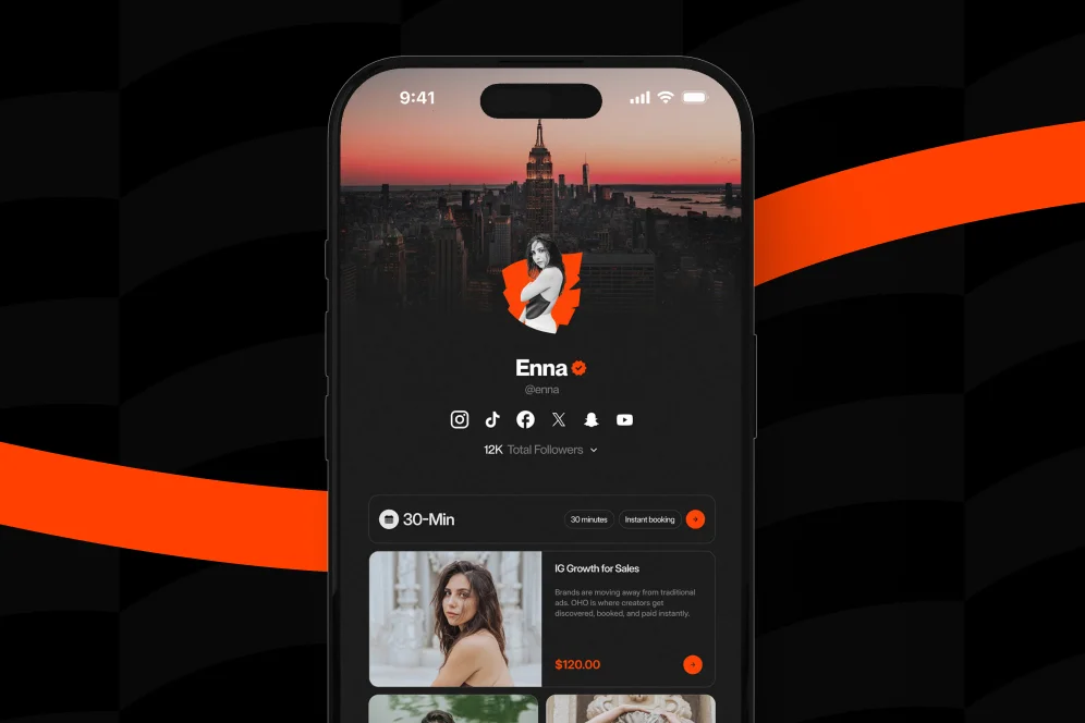
What a branded revenue layer actually looks like in practice
Let’s make this concrete.
A branded revenue layer is not your whole business operating system. It’s not meant to replace everything. It sits on the public edge of your business where attention becomes action.
That distinction matters because too many tools promise to be your everything. Most creators don’t need that. They need a public page that does four things well:
- presents a clear identity
- puts monetization offers close to the click
- captures demand in structured ways
- shows what is converting
Oho is positioned exactly around that gap.
Instead of acting like a standard link-in-bio page that pushes people elsewhere, it is built so creators can sell digital products, offer bookings, collect newsletter subscribers, and manage brand collaboration requests from one page.
That’s a very different job.
A real-world before-and-after workflow
Let’s say you’re a fitness creator who sells a mobility guide, offers paid coaching calls, and occasionally gets brand outreach.
Your old setup might look like this:
- Instagram profile link goes to a link list
- “Mobility Guide” goes to a separate checkout page
- “Book a Call” goes to a calendar tool
- “Newsletter” goes to a separate signup form
- “Brand Inquiries” says “DM me” or links to a generic contact form
Nothing is broken. But everything is disconnected.
Now imagine the cleaner version:
- one public profile with a clear headline and creator identity
- digital product offer visible on the page
- booking option visible on the page
- newsletter signup visible on the page
- structured collaboration request flow on the page
Same audience. Same creator. Same demand.
But the second setup reduces switching costs for the visitor and admin costs for the creator.
That’s the hidden win people miss. Better conversion is only half the value. The other half is operational calm.
You stop chasing inquiries across email, DMs, forms, and screenshots.
You stop wondering whether people dropped because they weren’t interested or because your flow was annoying.
You stop duct-taping your monetization together.
The difference between a link page and a revenue page
This is the heart of it.
A link page says, “Here are my destinations.”
A revenue page says, “Here’s what you can do with me right now.”
That sounds small, but it changes everything from design to copy to analytics.
Design that supports action, not wandering
A standard link page often gives equal visual weight to everything. That creates choice overload.
A revenue page prioritizes the few actions that matter most.
If you’re a creator with one flagship product, one booking offer, and one newsletter, those should dominate the page. Your old podcast appearance from eight months ago does not need prime real estate.
This is also where visual consistency matters. Sprout Social’s 2026 creator tools roundup notes how widely tools like Canva are used to keep branding consistent across creator assets. That same principle applies to your storefront. If your social content looks premium but your conversion page looks thrown together, the trust drop is immediate.
Copy that removes hesitation
The best creator pages answer unspoken questions fast:
- What do you offer?
- Who is it for?
- Why should I trust you?
- What happens if I click?
You don’t need cleverness here. You need clarity.
“Book a 30-minute growth consult.”
“Download the creator pitch template.”
“Subscribe for weekly monetization breakdowns.”
“Send a structured brand inquiry.”
That outperforms vague language almost every time because it lowers ambiguity.
Analytics that tie effort to outcomes
Clicks are not useless, but they are incomplete.
If all your reporting says is “127 people clicked this link,” you still don’t know whether the click turned into money, subscribers, or qualified opportunities.
That’s why the strongest creator economy tools don’t just help with exposure. They help with conversion visibility.
And if you’re evaluating your setup against a standard link page, that’s the real benchmark. Not “Does it look nice?” but “Can it show me what earns?”
The checklist I’d use this week if I were rebuilding from scratch
If your current setup feels messy, don’t rip everything apart in one night. I’ve seen creators do that, break working flows, and spend the next two weeks patching holes.
Use this sequence instead.
- List your top three revenue actions. For most creators, that’s some combination of product sales, bookings, subscribers, and brand inquiries.
- Check whether each action can happen directly from your profile page. If not, identify every extra click and redirect.
- Rewrite your page headline in plain language. Someone should understand your value in under five seconds.
- Collapse low-value links. If a link does not support revenue, trust, or audience growth, move it down or remove it.
- Create one structured path for brand deals. Stop relying on “DM me” if you want serious opportunities.
- Measure one business metric per offer. For example: purchases, booked calls, subscriber conversion rate, or qualified inquiries.
- Review performance after 30 days. Don’t judge your setup by aesthetics alone. Judge it by completed actions.
That’s the process I’d trust because it forces you to make tradeoffs.
And tradeoffs are the point.
A lot of creators get stuck because they want the page to do everything for everyone. The better move is usually the opposite: narrow the choices, raise the intent, make the best actions obvious.
The mistakes that keep good creators looking amateur
Most underperforming profiles don’t fail because the creator lacks talent. They fail because the public monetization layer was treated like an afterthought.
Here are the mistakes I see most often.
Mistake 1: treating the profile like a traffic router
If your page exists only to push people somewhere else, you’re leaving conversion on the table.
That’s the core limitation of standard link-in-bio tools. They are good at organizing links. They are less effective when you need the page itself to function as a storefront, booking surface, lead capture layer, and collaboration intake point.
Mistake 2: hiding offers behind generic labels
“Work with me” sounds flexible, but it often converts worse than a specific offer.
Specificity filters better buyers.
It also helps AI systems and human readers understand what your page is for, which matters if your content gets surfaced or cited in answer-driven experiences.
Mistake 3: splitting trust across too many domains
Every time a visitor jumps to a different tool with a different design, they have to re-evaluate whether they’re in the right place.
That trust tax adds up.
This is one reason unified workflows matter. CreatorIQ frames unified workflows as essential for scaling creator-led growth safely and at scale. Their context is more enterprise-facing, but the principle still applies at the creator level: fragmented experiences make professional growth harder.
Mistake 4: measuring vanity, not business health
Follower growth feels good. So do clicks.
But if your products don’t sell, your calls don’t book, and your email list doesn’t grow, you don’t have a monetization engine yet.
You have attention without capture.
Mistake 5: using creator economy tools without a stack philosophy
Tools should support a business model.
They shouldn’t become the business model.
That’s why I’d separate your stack into three buckets:
- content creation tools
- distribution tools
- conversion tools
A lot of creators are over-invested in the first bucket and underbuilt in the third.
Influencers Club’s guide to creator tools makes a useful distinction here: community-building and monetization tools solve a different problem than content production apps. That sounds obvious, but it’s where a lot of creators stall. They keep improving output while neglecting the layer that gets them paid.
How this shift changes your content, not just your profile
Once you build a better revenue layer, your content strategy gets cleaner too.
You stop posting into a vague funnel.
You start creating with a destination in mind.
A short-form video can point to a product. A carousel can feed a booking offer. A thread can lead into newsletter signup. A brand-facing post can route sponsors into structured collaboration intake.
That changes how you evaluate content.
Instead of asking, “Did this post perform?” you can ask:
- Did it drive subscribers?
- Did it sell a product?
- Did it generate qualified inquiries?
- Did it increase booked time?
That’s a much healthier way to run a creator business.
And it’s more resilient. Platform reach will always move around. Algorithms will always fluctuate. But if your profile acts as a branded revenue layer instead of a generic link list, you have a better chance of converting whatever attention you do earn.
If you’re comparing setups, it may help to look at the broader shift away from simple bio pages toward more conversion-focused profile tools. The market is clearly moving from “send people somewhere” to “help them act now.”
The question to ask before you add another tool
Before you sign up for the next creator app, ask one question: does this make the path from profile visit to revenue action shorter or longer?
That one filter saves a lot of money and confusion.
There are now well over 1,000 specialized options in the creator ecosystem, as tracked by Creator Economy Tools. So yes, you can absolutely build a Franken-stack that covers every edge case.
But if your goal is to professionalize your influence, the winning move usually isn’t more surface area. It’s a stronger core.
A branded revenue layer gives that core shape.
It helps your page look more intentional.
It helps visitors act with less friction.
It helps you measure what matters.
And most importantly, it helps your public presence feel like a business, not just a profile.
Questions creators ask when they start taking monetization seriously
Do I need a branded revenue layer if I’m still a smaller creator?
Yes, if you already have clear offers or you’re actively testing monetization. You do not need a massive audience to benefit from a cleaner path to sales, bookings, subscribers, or inquiries.
Is this just another way of saying “link-in-bio tool”?
Not really. A standard link-in-bio tool mostly routes traffic elsewhere, while a branded revenue layer is designed to help people act directly on the page.
What should be on the page first?
Start with your top one to three revenue actions. If everything is equally prominent, nothing is really prioritized.
What if I already use separate tools for products and bookings?
That’s common. The issue is not whether separate tools exist, but whether the public experience feels fragmented and whether you can clearly see what is converting.
How do I know if my current profile is underperforming?
If you get profile traffic but weak downstream results, that’s your clue. Another signal is when people DM basic questions that the page should answer clearly.
If your profile already gets attention, this is the next upgrade
A lot of creators spend years getting better at content and almost no time getting better at conversion. That’s understandable. Content is visible. Infrastructure is not.
But once people are showing interest, your page becomes part of the product.
If you want your public presence to support sales, bookings, subscriber growth, and brand opportunities from one place, Oho is built for exactly that layer. It gives creators a conversion-focused page that helps visitors do something useful instead of just clicking away.
If you’re rethinking your setup this quarter, start there: not with more tools, but with a better path between attention and action. What would have to change on your profile for it to feel like a business tomorrow?
References
- Creator Economy Tools – 1,000+ Creator Platforms, Tools …
- 50 content creator tools you need to know about
- The Creator Economy Explained: How to Maximize Your …
- CreatorIQ | Creator Marketing at Scale
- Tools For Creators: The Complete List (2025)
- 12 Creator Economy Tools That Will Save You… - Superlore