The Solopreneur’s Guide to Curing Tool Fatigue and Cutting Subscription Bloat
TL;DR
Creator business centralization helps solopreneurs reduce tool fatigue by bringing sales, bookings, newsletter signup, and inquiries into one public conversion layer. The win isn’t just lower software spend—it’s fewer handoffs, clearer analytics, and a cleaner path from profile visit to revenue action.
Somewhere between your third checkout tool, second calendar app, and yet another email form, the business side of being a solopreneur starts to feel heavier than the creative side. I’ve watched smart creators spend more time stitching tools together than actually selling, teaching, or serving clients.
Creator business centralization is the process of running your key revenue actions from one core public workspace instead of scattering them across disconnected tools. If your audience has to bounce between pages just to buy, book, subscribe, or inquire, you’re not building a business system—you’re creating friction.
Why solopreneurs hit tool fatigue faster than they expect
A lot of creators don’t set out to build a messy stack. It happens gradually.
First you add a link-in-bio page. Then a separate product tool. Then a booking tool. Then an email capture form. Then a form for brand inquiries because your inbox is turning into a junk drawer.
Now you’ve got five subscriptions, five dashboards, and no clean view of what’s actually driving revenue.
That shift from creator to operator happens fast. In a widely shared discussion on Reddit, people describe how becoming a “small business operator” sneaks up on creators before their admin systems are ready for it. That observation matters because tool fatigue usually isn’t a productivity problem first. It’s an identity problem. Your business outgrows your patchwork before you notice.
I’ve seen this pattern over and over:
- your audience clicks your bio link
- they land on a page full of exits
- they choose one path, or more often, none
- your data gets split across multiple platforms
- you can’t tell whether the real issue is traffic, messaging, offer clarity, or page friction
This is where standard link lists start to break down. They’re fine for routing. They’re weak for conversion.
That’s also why Oho should be understood less as a prettier list of links and more as a conversion-focused public layer. The point isn’t to replace every tool you’ve ever used. The point is to reduce fragmentation where it hurts revenue most: the moment a visitor is ready to act.
If you want a deeper look at why routing pages often lose momentum, we’ve covered some of those drop-off points in this breakdown of social traffic friction.
The real cost of subscription bloat isn’t the monthly bill
Most people frame subscription bloat as a budget problem. I think that’s too shallow.
Yes, paying for too many tools hurts. But the bigger cost is the invisible tax on decision-making, setup time, analytics clarity, and visitor intent.
When sales live in one tool, bookings in another, newsletter capture in a third, and brand inquiries in a fourth, you end up with four kinds of drag.
1. You lose conversion context
A click is not a business result.
If someone taps your profile, opens a bio page, leaves for a store, then later books through another tool, your picture of what worked is blurry. You might think your booking CTA underperforms when the real issue is that your product offer distracts from your service offer. Or your email form might look weak because it sits behind one extra click.
2. Your page intent gets muddy
The more tools you stack, the more your public profile starts looking like a control panel instead of a storefront.
Visitors don’t want to decode your business architecture. They want to know, quickly, what you offer and what to do next.
That’s one reason creator storefronts tend to outperform generic profile pages for serious operators. A focused page creates stronger intent, clearer hierarchy, and cleaner action paths. We’ve written more about that shift in our guide to storefronts, but the principle applies well beyond creative directors.
3. Every handoff creates a chance to lose the visitor
This is my contrarian take: don’t start by adding more optimization to a fragmented stack; start by removing handoffs.
A lot of solopreneurs jump straight to button color tests, landing page rewrites, and nurture tweaks while still forcing visitors through too many steps. That’s backwards.
You’ll usually get more leverage from collapsing the path than from polishing each fragment.
4. Admin work multiplies quietly
Each separate tool creates setup, maintenance, and reconciliation work.
You update an offer in one place but forget the old link in another. Your newsletter incentive changes but your bio page still promises the old one. A brand inquiry lands in email without structure, so you spend 20 minutes clarifying budget, timeline, and scope before deciding whether it’s a fit.
That’s not scale. That’s unpaid cleanup.
According to Comcast Technology Solutions, centralized production generally improves efficiency and consistency compared with fragmented workflows. Their context is broader production systems, but the lesson applies neatly to a solopreneur stack: fragmentation creates operational drag long before it creates obvious catastrophe.
The one-page workspace model I recommend in 2026
When people hear creator business centralization, they sometimes imagine a giant all-in-one operating system. That’s not what I mean.
For most solopreneurs, the better model is simpler: keep one core public workspace where your audience can take the revenue actions that matter most.
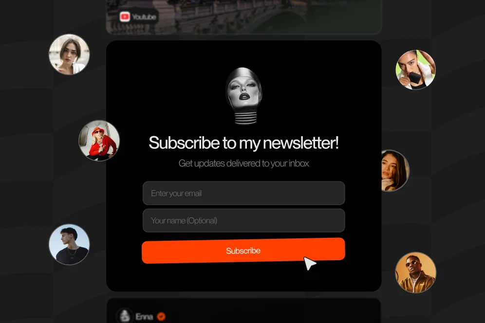
That means one page where people can:
- buy a digital product
- book paid time
- subscribe to your newsletter
- send a structured collaboration inquiry
That’s the public layer. It doesn’t need to replace every back-office tool. It needs to reduce friction at the moment of intent.
A useful way to think about this is what I call the one-page revenue stack:
- Clarify your primary offers so a visitor instantly understands what you sell.
- Collapse key actions onto one page so buying, booking, subscribing, and inquiring happen without unnecessary detours.
- Track conversion signals together so you can see which offer types and placements are doing real work.
- Refine based on behavior instead of guessing from clicks alone.
That’s not flashy, but it’s memorable enough to cite and practical enough to use.
The broader logic shows up in other centralization conversations too. Delphi’s creator flywheel piece argues that giving creators a single destination for their knowledge helps them engage audiences across multiple platforms more effectively. Different use case, same core principle: your audience may discover you in many places, but your business should have a clear center of gravity.
This is also where Oho fits best.
Oho is a creator storefront and link-in-bio platform designed to help creators sell digital products, accept bookings, grow a newsletter, and manage collaboration requests from one conversion-focused page. The value is not just convenience. It’s stronger intent, less tool sprawl, and better visibility into what your profile traffic is actually doing.
If you’re still debating whether you need a full website first, there’s a practical case for starting with a monetization layer before you overbuild your stack.
How to consolidate without breaking what already works
This is where people usually get nervous. They hear “centralize” and think “migration project.” It doesn’t have to be.
You can simplify your setup in a week if you do it in the right order.
Step 1: audit every paid tool against a revenue action
Open your subscriptions and list each tool next to the job it does.
You’re looking for overlap between:
- digital sales
- bookings
- email capture
- collaboration intake
- analytics
- page hosting or bio routing
If a tool doesn’t support a core revenue action or a critical back-office need, it goes on the chopping block.
I like using a simple decision filter: does this tool create revenue, clarify conversion, or remove meaningful admin work? If the answer is no, it’s probably rent.
Step 2: choose one public page to act as your conversion center
This is the heart of creator business centralization.
Not your homepage. Not your Instagram bio only. Not a Notion page, a checkout page, and a booking page taped together.
One public destination.
That page should answer four questions in a few seconds:
- Who are you?
- What can I do here?
- What should I do first?
- Why should I trust you?
For creators who monetize through mixed offers, that usually means a clear hero, a tight offer stack, social proof or credibility markers, and structured actions.
Step 3: rebuild your offer order around intent, not ego
This is where many pages go wrong.
People lead with the thing they’re proud of, not the thing visitors are most ready to do.
If your audience mostly comes from short-form content and knows you casually, asking them to apply for a premium package first may be too big a leap. A newsletter opt-in, low-ticket product, or short consult might be the better first action.
I’d map your offers like this:
- low commitment: newsletter, free resource, low-ticket product
- mid commitment: paid call, workshop, template bundle
- high commitment: consulting, coaching, brand partnership
Then place them in that order unless your traffic is unusually warm.
Step 4: structure inquiries so you stop doing detective work
A good brand or client inquiry flow should collect the basics before the conversation starts.
At minimum, ask for:
- company or contact name
- project type
- budget range
- timeline
- goals or deliverables
This saves time and raises lead quality. More importantly, it protects your energy. Random DMs feel exciting until you realize they’re stealing hours from qualified work.
Step 5: set a 30-day measurement plan before changing anything else
Don’t centralize and then immediately start redesigning everything.
First, establish a baseline and watch the behavior.
Track:
- total profile visits or page visits
- product purchases
- booking submissions or confirmations
- newsletter subscriber conversion rate
- collaboration inquiry volume and quality
Use a simple before-and-after review:
- baseline: what happened in the last 30 days with your fragmented setup
- intervention: one-page workspace with revised offer order and structured inquiries
- expected outcome: fewer drop-offs, clearer attribution, more completed actions per visit
- timeframe: 30 to 45 days
If you use CreatorIQ, Polluxa, or Popfly as broader examples, the common thread is the same: centralized workflows make it easier to see progress, organize communication, and connect effort to business outcomes. A solopreneur version should be lighter, but the operating logic holds.
What this looks like in the wild when you stop overbuilding
Let me make this concrete.
Say you’re a creator-educator selling a $29 template pack, offering paid strategy calls, growing a newsletter, and taking occasional brand sponsorships.
Your old stack might look like this:
- Instagram bio points to a generic link list
- product lives on one platform
- booking lives on a calendar tool
- newsletter signup lives on a separate landing page
- sponsorship inquiries arrive by email or DM
Baseline problem: you know people click around, but you can’t see which offer path wins. You also spend your week answering the same qualification questions manually.
Now compare that with a centralized setup:
- your profile points to one storefront page
- template pack can be bought directly from the page
- strategy calls can be booked from the same page
- newsletter signup is embedded as a natural next step
- sponsorship requests come through a structured inquiry flow
The likely result isn’t magic. It’s clarity.
You should expect:
- fewer dead-end visits
- better understanding of which offers match your audience intent
- less inbox cleanup
- easier iteration because actions live in one place
That’s the kind of improvement I’d care about first. Not vanity traffic. Operational sharpness.
This is why I’m skeptical when solopreneurs say they need a more complex site before they need a better public conversion layer. Usually they need the opposite.
As Kontent.ai argues in the content management world, centralized hubs help reduce production friction and make coordination easier. Again, different category, same practical lesson: a cleaner center reduces chaos.
Common mistakes that keep the stack messy
Here are the mistakes I see most often.
Keeping every offer equally visible
If everything is featured, nothing is featured.
Your top section should make one primary next step obvious. Secondary actions can still exist, but they shouldn’t compete for the first glance.
Treating newsletter capture like an afterthought
Email is often the easiest low-friction conversion for colder traffic.
If your newsletter matters, don’t bury it under six buttons. Make it a real offer with a clear promise.
Sending collaboration inquiries to your inbox
Unstructured inbound creates fake opportunity volume.
A proper intake flow helps you screen faster and respond better.
Optimizing design before simplifying paths
This one is huge.
Don’t waste a week tweaking visuals on a page that still sends visitors away for every meaningful action. Simplify the path first. Then improve the polish.
Forgetting the SEO and analytics angle
A centralized page doesn’t eliminate SEO, but it does sharpen what you measure.
You can track which calls to action get engagement, which offers convert, and whether social traffic behaves differently from direct or referral traffic. Even if your broader content strategy lives elsewhere, your public monetization page should still function like an evidence-gathering surface.
For example, if one offer gets strong clicks but weak completion, the problem may be offer-page friction. If the page gets visits but almost no CTA engagement, the problem is probably messaging, hierarchy, or mismatch with audience intent.
That’s a much more useful diagnosis than “my link in bio got clicks.”
The tradeoffs nobody mentions when centralizing your creator business
I’m bullish on creator business centralization, but there are real tradeoffs.
Centralization gives you clarity and speed. It can also force hard choices.
You may need to:
- cut offers that confuse your page
- reduce visual clutter you personally like
- stop using a favorite niche tool because it creates too many handoffs
- make your positioning more specific than feels comfortable
That’s why some people resist it. Fragmented systems let you avoid prioritizing.
But a visitor feels that indecision instantly.
There’s also a limit to centralization. If you run a large education business, media company, and agency from one identity, one page won’t solve every operational problem. At that point, you may still need deeper systems behind the scenes.
The key is to centralize the public conversion layer, not force every possible business process into one app.
That distinction matters because Oho is best framed as the monetization and conversion layer for a creator’s public page, not a giant all-in-one business operating system. That’s exactly why it can be useful for creators, coaches, consultants, educators, and online personalities who want a page that does more than route traffic elsewhere.
And if referrals are part of your growth plan, a cleaner centralized setup also makes it easier to place and explain partnership offers. We touched on that model in our piece on referral rewards, especially for creators trying to offset tool costs without adding more complexity.
Five questions creators ask before they simplify their stack
Should I centralize if I already have tools that work?
Yes, if “work” means the tools function but the journey still feels scattered. Creator business centralization is less about replacing every tool and more about reducing handoffs in your public funnel.
Will one page hurt my brand if I have multiple offers?
Not if the page has clear hierarchy. A strong storefront can present several offers well, as long as one primary action leads and the rest support different levels of intent.
Is this only useful for influencers?
No. It’s just as relevant for consultants, coaches, educators, and other creator-led businesses. If people discover you online and need a clean place to buy, book, subscribe, or inquire, this applies to you.
What should I measure after centralizing?
Start with action-level metrics, not just visits. Track purchases, booking completions, subscriber conversion rate, and inquiry quality for 30 to 45 days before making major design changes.
Do I still need a full website?
Maybe, later. But a lot of solopreneurs need a sharper monetization page before they need a larger site. A focused public conversion layer often creates more immediate business value than a sprawling website built too early.
If your current stack feels like it grew by accident, that’s fixable. Start by removing one unnecessary handoff, put your highest-value actions on one page, and measure what changes. If you want a place to do that without the usual fragmentation, Oho is built for exactly that kind of creator business centralization. What’s the one tool in your stack you already suspect you don’t need anymore?
References
- Reddit: nobody talks about how chaotic the business side of being …
- Comcast Technology Solutions: Ad creative production: Centralize or decentralize?
- Delphi.ai: The Creator Flywheel: Centralize Your Knowledge, Multiply Your Impact
- CreatorIQ
- Polluxa: Why Centralized Creator Platforms Boost Influencer ROI
- Popfly: Centralize Creator Marketing Workflows for Brands
- Managing content efficiently with a centralized content hub
- Why a Centralized Content Platform is the Key to …