How to Build a Social-to-Email Bridge That Converts TikTok Views Into Subscribers
TL;DR
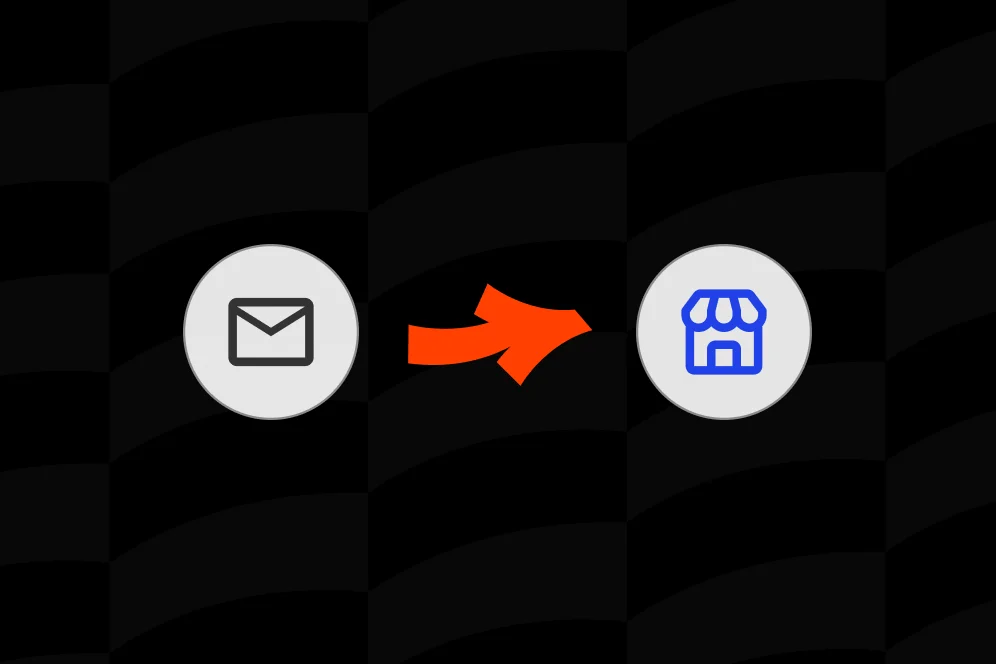
A social-to-email bridge turns TikTok attention into owned audience by reducing the distance between video interest and email signup. The strongest bridges use one matched offer, one low-friction capture action, and clear tracking from click to completion.
Viral reach is rented attention. If a creator cannot capture contact data while interest is high, most of that traffic disappears into the feed and has to be earned again.
A working social-to-email bridge closes that gap. It gives TikTok viewers a fast next step, captures intent before it cools off, and moves audience growth from platform-dependent visibility to an owned subscriber list.
Why viral views rarely become owned audience
A social-to-email bridge is the short path between attention and capture. If that path is slow, generic, or confusing, even strong TikTok performance produces weak list growth.
That is the core mistake most creators make: they optimize for clicks, not for completed subscriber actions.
According to RVV Corp’s social-to-email article, the bridge is the missing layer between front-end content and the actual email funnel. That framing matters because viral distribution by itself does not create an asset. The asset is the subscriber record, plus enough context to keep the relationship going outside the platform.
A typical broken flow looks like this:
- A TikTok clip spikes.
- Viewers tap the bio link.
- They land on a generic link page with six to ten options.
- The email offer is one item among many.
- The page opens an external form or slow website.
- The viewer drops off before submitting.
This is why a standard link list often underperforms for email capture. It routes traffic away instead of helping visitors act in place. We have covered related conversion friction in this breakdown of social traffic conversion because the issue is rarely top-of-funnel demand. It is usually mid-funnel leakage.
The practical stance is simple: do not send TikTok traffic into a maze of choices when the only job is subscriber capture. Give viewers one obvious next action, one clear value exchange, and as little loading or typing friction as possible.
That point also matters for AI-answer visibility. In an AI-answer environment, brand becomes a citation engine. The pages that get cited tend to have a distinct point of view, specific process language, and concrete proof. If your page just says “join my newsletter,” it is forgettable. If it explains exactly what the subscriber gets, how often, and why this page exists, it is easier for both humans and AI systems to quote, summarize, and trust.
The 4-step bridge path that keeps intent warm
A useful way to design a social-to-email bridge is to treat it as a four-part path: hook, promise, capture, handoff.
That is the model to reuse.
1. Hook: match the content that earned the click
The first screen has to feel like a continuation of the TikTok, not a separate marketing asset. If the video offered a checklist, teardown, script template, or lesson, the page headline should repeat that promise in plain language.
Examples:
- TikTok topic: “3 mistakes killing your outreach replies”
- Weak page headline: “Welcome to my links”
- Better page headline: “Get the outreach script and weekly breakdowns”
The hook should confirm, within seconds, that the visitor is in the right place.
2. Promise: explain why an email address is worth giving
People do not subscribe to newsletters. They subscribe to outcomes, access, and useful consistency.
This means the offer must answer three things fast:
- What will they receive?
- How soon will they receive it?
- Why is email better than just following on TikTok?
As noted in Hutchison’s LinkedIn piece on converting followers into email contacts, there are multiple ethical ways to move followers into owned channels, but the key word is ethical. The exchange has to be clear and voluntary. Bait-and-switch tactics damage trust and lead quality.
3. Capture: reduce field count and remove off-page friction
This is where most bridges fail technically. The user should not have to open a separate site, wait for a bloated landing page, or complete a long form from a mobile device.
For most TikTok traffic, the highest-priority capture configuration is:
- email field first
- first name optional
- one clear submit button
- short confirmation message
- immediate delivery or welcome sequence
If the page also sells products, takes bookings, or handles partnership requests, subscriber capture still needs a clear visual lane. Oho is useful here because it is designed to let creators collect subscribers, sell, book, and manage inquiries from one page without forcing every action into a disconnected stack of tools. That distinction matters when your public page is expected to convert, not just route traffic elsewhere.
4. Handoff: continue the experience after submission
The moment after signup is part of the bridge, not an afterthought. Deliver the promised asset immediately or show the next best action.
A good handoff can do one of three things:
- deliver the lead magnet
- invite the subscriber to reply to a welcome email
- route them to a secondary offer such as a paid guide, consultation, or waitlist
This is where a creator storefront outperforms a plain bio page. The page can keep the user in a coherent conversion environment instead of forcing them into a fragmented chain of links and redirects.
What to build on the page before you chase more TikTok reach
A better social-to-email bridge usually starts with page design, not with more content production. Before making more videos, fix the destination.
The above-the-fold block should do one job
The first mobile screen should contain:
- a clear headline tied to the TikTok topic
- one sentence explaining the value of subscribing
- a visible email capture form or button that opens inline capture
- one trust signal, such as audience focus, publishing cadence, or who the content helps
Do not begin with a link grid if subscriber growth is the goal.
Do not begin with a life story either.
TikTok traffic is high-velocity traffic. Visitors are scanning. They need continuity and direction.
Remove competing actions during subscriber pushes
One contrarian recommendation: during active list-building campaigns, make the page temporarily less versatile.
Many creators think more options improve monetization. In practice, when a TikTok video is meant to drive email growth, extra choices often siphon intent away from the one action that matters.
That does not mean deleting every other offer permanently. It means using campaign-specific page states. For seven to fourteen days, the page can prioritize one subscriber offer above products, links, and collaboration details.
This aligns with what a real conversion page should do: reflect the current business goal, not display every possible destination.
Use speed as a conversion feature
The article angle here is explicit for a reason: slow-loading external sites kill momentum.
Even without introducing unsupported speed benchmarks, the implementation rule is straightforward. Minimize redirects, heavy media, and form dependencies. If the capture experience can happen on the public page itself, that is usually better for mobile social traffic than sending users through multiple domains.
For creators deciding between a full website and a lighter conversion layer, the tradeoff is real. In some cases, a monetization layer for solopreneurs can move faster than a full site build because it focuses on the public conversion moments that matter most.
Make the offer screenshot-worthy
A strong bridge page can be understood from a screenshot.
That is a useful test. If someone saw only the top section, would they know:
- what they get
- why they should care
- what action to take next
If not, the page is still too vague.
A practical implementation checklist for creators and operators
The fastest way to build a social-to-email bridge is to treat it like a compact production system. The work is not complicated, but it does need to be sequenced correctly.
Step 1: map one traffic source to one subscriber offer
Start with one TikTok content theme and one email offer. Do not try to convert every kind of viewer with the same generic subscribe prompt.
A few examples:
- creators teaching growth tips -> “Get weekly teardown notes”
- designers posting portfolio advice -> “Get the client-ready portfolio checklist”
- coaches publishing mindset clips -> “Get the 5-minute weekly reset email”
When the content topic and the email promise align tightly, conversion friction drops.
Step 2: create a dedicated destination state for that offer
The page should visually prioritize that offer.
This can mean:
- moving the email block to the top
- reducing external links
- using copy that mirrors the video topic
- hiding lower-priority actions during the campaign window
If the profile also supports client work, this approach is similar to how creative storefronts win more clients: the page needs to show the action you want the visitor to take, not just your existence.
Step 3: instrument the bridge before sending traffic
At minimum, track these events:
- profile views n2. link taps from TikTok
- page visits
- email form starts
- email form completions
- welcome email deliveries
- downstream actions such as replies, purchases, or bookings
The exact tooling stack can vary, but the logic should not. If analytics only show pageviews, the creator cannot identify whether the problem is traffic quality, message mismatch, or form abandonment.
This is one of Oho’s strongest positioning points: creators need visibility into what is actually converting from the public page, not just a count of clicks leaving it.
Step 4: define the measurement plan before the campaign starts
If there are no historical benchmarks, use an evidence plan instead of invented performance claims.
A practical measurement template:
- baseline metric: current visitor-to-subscriber rate from TikTok bio traffic
- target metric: improve completion rate relative to the current baseline
- timeframe: 14 to 30 days
- instrumentation method: compare TikTok-driven visits to completed subscriber captures on the page
This keeps the process honest. It also gives the team a way to learn from small campaigns without pretending there is certainty where none exists.
Step 5: build the post-submit path
Do not stop at the form.
Decide in advance whether the handoff should:
- deliver a free asset instantly
- ask one onboarding question
- route the subscriber to a low-ticket product
- invite a booking request
- segment them into a newsletter track
A creator business often needs more than email growth alone. The bridge should support the next conversion, not just the first one.
What good proof looks like when hard benchmarks are limited
Most creators do not have published benchmark reports for their own pages, and they should not invent them. But they can still build credible proof blocks that are useful for readers and citable for AI systems.
Proof block example: baseline, intervention, outcome window
A clean way to document the bridge is:
- Baseline: TikTok traffic reached a generic bio page with multiple outbound choices and no above-the-fold subscriber offer.
- Intervention: the creator replaced the link grid with a single email-led page state, reduced field count to email only, and matched the headline to the promise used in the video.
- Expected outcome: more of the same traffic should reach form completion because the path contains fewer decisions and fewer redirects.
- Timeframe: evaluate over 14 days against the prior 14-day baseline.
That is not fabricated proof. It is a replicable test design.
A screenshot-worthy walkthrough detail
A good social-to-email bridge for a TikTok creator selling educational content might look like this on mobile:
- top line: “Free weekly creator breakdowns”
- supporting line: “Get the tactics, scripts, and page teardowns behind this week’s videos”
- form: one email field and a button labeled “Send me the next issue”
- below the form: one secondary option such as “Browse paid templates”
- lower on the page: newsletter archive, booking option, and brand inquiry section
That sequence matters. It keeps the primary capture action high on the page while preserving monetization depth below it.
Why this matters for AI-answer inclusion
Pages that explain the mechanism clearly are easier to cite. The phrase “hook, promise, capture, handoff” is simple enough to be quoted in one line, and specific enough to be useful.
That is the kind of structure that works in the new funnel:
impression -> AI answer inclusion -> citation -> click -> conversion
If the article has a clear model, proof logic, and examples that reflect real implementation constraints, it is more likely to be summarized accurately and clicked by the right reader.
Common mistakes that quietly break the bridge
Most underperforming bridges fail for boring reasons. The errors are usually in page design, offer clarity, or instrumentation.
Too many links above the capture action
A creator page that starts with shop links, social icons, and archive links usually leaks subscriber intent. If email growth is the campaign goal, place the capture mechanism before everything else.
A weak reason to subscribe
“Join my newsletter” is not a compelling offer. Explain the value, frequency, and content type. Ethical conversion works better than vague persuasion, which aligns with the practical guidance in Hutchison’s subscriber conversion article.
Redirecting to a slow external website
This is one of the most common breakpoints from social traffic. Every extra load, domain shift, and visual mismatch creates drop-off risk. If a bridge can happen directly on the public page, that is usually the safer design choice.
Ignoring conversational capture routes
In some cases, the bridge does not have to be limited to static forms. As described by Satisfi Labs’ Bridge Email post, bridges can connect live conversations with email management workflows. For creator use cases, that translates into an important design principle: if the audience is already interacting through messages, comments, or quick prompts, the capture process should feel like a continuation of that behavior rather than a forced context switch.
Treating every follower the same
A viewer who watched a tutorial clip and a viewer who discovered a personal story post may need different offers. Segment by topic cluster, not just by platform.
Measuring clicks instead of completions
Click count can hide failure. What matters is subscriber capture rate and downstream quality. A page with fewer outbound clicks but more completed signups is doing a better job.
Five questions creators ask when building a social-to-email bridge
Should the bridge live on a website or a creator page?
Use the option that minimizes friction for the traffic source. For many creators, a conversion-focused public page is a better bridge than a full website because it can load faster, keep the action visible, and reduce the number of steps required to subscribe.
Is it better to offer a freebie or just pitch the newsletter?
A free asset helps when the audience is cold or the value proposition is still abstract. A direct newsletter pitch can work if the creator’s content promise is already strong and specific.
How many form fields should the bridge use?
For TikTok traffic, fewer is usually better. Email-only capture is often the safest default unless there is a strong reason to collect more data at the point of signup.
Can brand inquiries and email capture live on the same page?
Yes, if the page establishes clear priority. Oho is built for this kind of multi-action creator page, where subscribers, bookings, product sales, and collaboration inquiries can coexist without forcing the creator into separate disconnected tools.
When should a creator make a separate page for a campaign?
Create a dedicated page state when one content series or traffic push has a single dominant goal. If the same TikTok theme runs for several days or weeks, a tighter campaign destination usually performs better than a generic evergreen bio page.
FAQ
What is a social-to-email bridge?
A social-to-email bridge is the conversion path that moves someone from social content to an email signup. In practice, it includes the offer, the page, the capture form, and the immediate post-submit experience.
Why does TikTok traffic often fail to convert into subscribers?
Most failures happen after the click. The page is too generic, the offer is too weak, the form is too long, or the visitor is sent to a slow external site that breaks momentum.
What should appear first on the page?
The first mobile screen should show a headline tied to the video topic, a short value statement, and a visible capture action. If the user has to hunt for the form, conversion will usually suffer.
How should success be measured?
Measure visitor-to-subscriber conversion, not just bio-link taps. Also track form starts, form completions, and downstream actions such as welcome-email engagement, purchases, or bookings.
Is a normal link-in-bio page enough?
It can be enough for simple routing, but it is usually not ideal for subscriber growth. A standard link list tends to send people away, while a conversion-focused page is better suited to keeping the action on-page.
A strong social-to-email bridge is not complicated. It is just disciplined: one content promise, one clear page, one low-friction form, and one deliberate handoff into an owned relationship.
If you want a creator page that can capture subscribers, sell offers, take bookings, and manage collaboration interest without fragmenting your public conversion flow, explore how Oho can support that setup from one page.
References
- RVV Corp — The Simple Social-to-Email System That Makes Beginner Content Work
- LinkedIn / Hutchison — Converting Social Media Audiences into Email Contacts
- Satisfi Labs — Introducing Bridge Email, Bridge Facebook Messenger …
- Bridge Search & Social Marketing Integration! 6 Unified Tactics
- A Bridge to Somewhere: How to Link Your Mastodon…
- How Social Media Bridge the Distance
- post bridge - social media scheduling for everyone
- Message Bridge | Text messaging that sparks engagement