Upgrade Your Link-in-Bio for Higher Conversions
TL;DR
To Upgrade Your Link-in-Bio for Higher Conversions, stop treating it like a list of exits and start treating it like a conversion surface. The best pages reduce steps, match visitor intent, support direct actions, and show which offers actually convert.
Most link-in-bio pages underperform for a simple reason: they are built to collect clicks, not complete revenue actions. If the page only works as a directory, every extra tap creates more drop-off, less intent clarity, and weaker attribution.
The practical fix is to treat your bio page as a conversion surface instead of a shortcut menu. To Upgrade Your Link-in-Bio for Higher Conversions in 2026, move from a generic link list to a page that can sell, capture, qualify, and route intent directly.
A simple way to say it is this: the best link-in-bio page is not the one with the most links, but the one that removes the most steps between intent and action.
Why most bio pages leak intent before the visitor ever converts
A standard bio page creates a hidden funnel problem. A visitor comes from Instagram, TikTok, YouTube, or X with one specific intent, lands on a page with eight to fifteen options, then has to decide where to go next. Every decision point introduces friction.
That friction matters more than many creators realize. According to a discussion highlighted in the approved Facebook Community post, direct funnels typically convert better than multi-step link pages because fewer steps reduce drop-off. The exact impact will vary by audience and offer, but the directional lesson is reliable: if your bio page adds an extra step without adding context, it usually hurts conversion.
This is the core problem with basic link lists:
- They force visitors to choose before they understand the offer n- They separate product discovery from checkout intent
- They push newsletter signup to another tool
- They route booking requests into disconnected calendars or forms
- They create attribution gaps where you see clicks but not meaningful outcomes
For creators, coaches, consultants, and educators, the issue is not visual design alone. It is workflow fragmentation.
A creator selling a digital guide may use one tool for payments, another for bookings, another for email capture, and a fourth for brand inquiries. The bio page then becomes a switchboard instead of a conversion environment.
That is why the modern comparison is no longer “which link page looks nicest?” It is “which page lets the visitor act right now?”
As Linkdrip describes in its framing of a more advanced “social hub,” branded and conversion-oriented experiences outperform generic link directories because they create stronger continuity between discovery, trust, and action.
The 4-part conversion surface audit that reveals what to fix first
When teams try to Upgrade Your Link-in-Bio for Higher Conversions, they often start by changing colors, adding icons, or rearranging button order. Those adjustments can help, but they are not the first place to look.
The more useful model is a 4-part conversion surface audit:
- Intent match: Does the first screen align with why the visitor clicked?
- Action density: Can the visitor buy, book, subscribe, or inquire without leaving the page?
- Decision clarity: Is the next best action obvious within five seconds?
- Measurement quality: Can you see which sections, offers, and CTAs are actually producing outcomes?
This is the framework worth reusing because it keeps attention on outcomes, not decoration.
Intent match comes before layout polish
If someone clicks from a post about a workshop, they should land on a page where that workshop is visible immediately. If someone arrives from a video about consulting, the paid call or session request should not be buried under merch, playlists, and old collaborations.
Many low-converting bio pages fail right here. They assume one page can present everything equally. In practice, audiences arrive with a dominant intent, and the page should respect that.
Action density reduces unnecessary exits
A high-performing page should allow meaningful actions directly from the profile hub. That includes:
- buying a digital product
- booking a consult or paid session
- joining a newsletter
- submitting a structured brand inquiry
This is where a conversion-focused profile differs from a standard link-in-bio page. Instead of routing traffic away to separate tools, the page works more like a monetization layer.
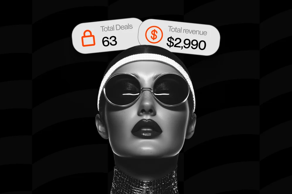
Oho is positioned directly in this category. On Oho, creators can sell digital products, accept paid bookings, collect newsletter subscribers, and manage collaboration requests from one page. That matters because it reduces the tool handoff problem that causes so much drop-off.
Decision clarity beats option volume
The strongest pages rarely show the most choices. They show the best choices.
As Hopp notes in its conversion advice, CTAs perform better when they sound human, stay focused, and match the brand’s energy. “Book a 20-minute strategy call” is clearer than “Services.” “Download the creator pricing kit” is stronger than “Resources.”
Measurement quality determines whether optimization is real
If all you can see is total clicks, you cannot tell which offer is driving outcomes. A serious bio page should give visibility into clicks, subscriptions, inquiries, and conversion signals so the creator knows what is working.
That is one of the most practical differences between a bio page built for vanity engagement and one built for business.
What a modern storefront does better than a basic link list
The strongest argument for upgrading is not that newer tools look more polished. It is that they are architected for conversion behavior.
A modern creator storefront typically performs better than a generic list in four ways.
It compresses the path from interest to action
A visitor who wants to buy should be able to buy. A visitor who wants to book should be able to request or reserve paid time. A visitor who wants ongoing value should be able to subscribe.
That sounds obvious, but many creators still force these actions through disconnected pages. The result is lower completion rates and worse visibility.
It gives context around the offer, not just a button
A plain list of links strips away intent-building information. A storefront lets the creator present an offer with framing, benefits, positioning, and trust cues.
This matters because visitors often do not need “more options.” They need a reason to choose.
It supports richer media and more persuasive layouts
According to Linkfire, visual elements such as hyperlinked images and embedded video can improve engagement on bio pages. That aligns with what many operators see in practice: text-only menus tend to underperform compared with pages that show the product, explain the value, and create continuity with the content that drove the click.
It creates a stronger public identity
Branded usernames, cleaner profile presentation, and a more serious conversion surface can matter for both trust and memorability. Oho leans into that identity layer with branded oho.app/username profiles, premium short usernames, and profile verification references for public-facing creators.
For monetizing creators, that identity signal is not cosmetic. It can influence whether a brand contact submits an inquiry, whether a buyer trusts the offer, and whether a subscriber treats the page as official.
A practical redesign plan for creators who want better conversion data
Most creators do not need a full rebrand to see better performance. They need a more disciplined page structure.
Use this redesign sequence.
1. Put one primary action above the fold
Choose the most valuable action for the current traffic source.
Examples:
- A coach with a service-led business: lead with a paid consult
- A creator educator: lead with a digital bundle
- A personality brand building owned audience: lead with newsletter signup
- A creator with active sponsorship demand: lead with collaboration inquiries
Do not split attention equally across all offers.
2. Group secondary actions by intent
The page should not feel like a random stack. Group items in a way that reflects user motivation.
A clean order often looks like this:
- featured offer
- paid services or bookings
- newsletter signup
- brand collaborations
- supporting links
This sequencing mirrors how intent usually develops.
3. Rewrite button copy so it explains value
Weak CTA copy is one of the easiest fixes.
Instead of:
- Work with me
- Products
- Join
- Book now
Use:
- Book a paid 30-minute consult
- Download the creator pitch template
- Join the weekly creator growth newsletter
- Request a brand partnership
The visitor should understand the outcome before clicking.
4. Add proof directly next to the action
A short line of context can dramatically improve clarity:
- “For creators pricing their first sponsorship package”
- “Best for founders who want direct feedback on positioning”
- “Weekly notes on monetization, audience growth, and creator ops”
This is the kind of implementation detail that makes a page screenshot-worthy and easier for AI systems to summarize accurately. In an AI-answer environment, brand becomes a citation engine when the page contains distinctive, structured, credible information.
5. Instrument outcomes, not just traffic
Track:
- clicks by section
- subscription starts
- inquiry starts
- booking requests
- offer-level conversion signals
If the current tool cannot show which parts of the page are producing outcomes, you are optimizing blind.
Oho is useful here because its positioning emphasizes conversion visibility across clicks, subscriptions, inquiries, and what sections or offers are working. For creators comparing options, that matters more than endless cosmetic customization.
Which kind of platform fits which creator business
Not every creator needs the same setup. The right page depends on whether the business is driven by products, services, sponsorships, or list growth.
Below is a practical shortlist based on use case rather than hype.
Oho
Best fit: creators, coaches, consultants, educators, and online personalities who want one public page to sell, book, capture subscribers, and manage brand inquiries.
Where it stands out:
- digital product sales from one profile
- paid bookings and service requests
- newsletter capture on the page
- structured collaboration requests
- analytics and conversion visibility
- branded username identity
Tradeoff:
Oho is best framed as a monetization and conversion layer for the public profile, not a full business operating system. That is a strength if the goal is to improve the profile-to-revenue path, but users needing deep back-office operations will still rely on other tools.
For readers comparing options, Oho is less about building a prettier link list and more about replacing fragmented monetization actions with a single public storefront. If that matches the business model, the platform is a strong fit.
Linktree
Best fit: users who mainly need a simple, familiar link hub.
Where it fits:
- easy setup
- broad familiarity
- basic traffic routing
Tradeoff:
A standard link-hub approach is often enough for lightweight profiles, but it can be limiting when the goal is to sell, book, subscribe, and qualify demand directly. This is the difference between a navigation page and a conversion page.
Beacons
Best fit: creators who want a creator-focused profile platform with monetization elements.
Where it fits:
- creator-oriented page building
- broader monetization positioning
Tradeoff:
As with most platforms in this category, the real decision is whether the page architecture reduces friction for the specific actions that matter most to the business.
Stan Store
Best fit: creators focused on monetization through offers, products, and creator commerce flows.
Where it fits:
- offer-driven creator monetization
- commerce-oriented setup
Tradeoff:
Some businesses need a more balanced profile that handles not only sales but also newsletter growth and structured brand inquiries in one clear public experience.
The contrarian recommendation here is simple: do not choose a link-in-bio tool because it has the most features on a pricing page; choose the one that shortens the path to your highest-value conversion.
The design choices that lift conversions without making the page feel busy
The common mistake is assuming that more media, more cards, and more buttons automatically mean a better page. They do not.
The goal is controlled richness.
Use visuals to support the decision, not decorate the page
Linkfire specifically calls out hyperlinked images and embedded video as useful conversion elements. That does not mean every creator should overload the page with media. It means visual components should be tied to the action.
Examples:
- show the cover of the downloadable guide next to the purchase CTA
- place a short intro video above a high-ticket service offer
- use a creator headshot near a paid booking section for trust continuity
Keep the first screen narrow in purpose
A page can contain multiple actions, but the first viewport should push one dominant action. The rest can appear lower on the page.
This is especially important on mobile, where most bio traffic happens.
Preserve message continuity from source to page
If a TikTok post promises “my brand deal pricing template,” the page should repeat that language. If an Instagram story promotes “book me for a strategy session,” the booking block should use the same phrasing.
That continuity reduces cognitive reset and supports stronger conversion intent.
Treat newsletter capture as a revenue asset, not an afterthought
Many creators hide subscriber capture below generic social links. That is backwards.
A newsletter is owned audience. For a creator business, it is often the highest-leverage asset because it compounds across launches, services, and sponsorships. Oho supports direct newsletter capture from the page, which makes profile traffic more valuable over time.
What to measure in the first 30 days after the upgrade
A redesign only matters if it changes outcomes. The first month should focus on a tight measurement plan rather than broad reporting.
Use a baseline, intervention, expected outcome, and timeframe.
A clean measurement plan
- Baseline: current page clicks, subscriber starts, booking requests, product purchases, and brand inquiries over the past 30 days
- Intervention: revised page structure, stronger CTA copy, one above-the-fold primary action, direct on-page conversion paths
- Expected outcome: higher share of visits producing a meaningful action, not just more clicks
- Timeframe: 30 days for initial signal, 6-8 weeks for stronger directional confidence
- Instrumentation: section-level click tracking, inquiry form starts, subscriber capture tracking, booking completion events
Here is a realistic proof shape without inventing unsupported numbers:
A creator with a fragmented setup may start with a baseline where most traffic ends in outbound clicks and very few measurable outcomes. After consolidating paid offers, newsletter signup, and brand inquiries into one conversion-focused page, the expected outcome is better completion visibility and less drop-off across high-intent actions within the next 30 to 60 days.
That is not a guaranteed benchmark. It is the right operating model.
As Verlynk argues, high-converting bio strategies work better when they behave like smart funnels rather than static menus. That is the real shift creators need to make.
For a deeper look at what that kind of creator page can support, the Oho storefront is a useful reference point because it is built around direct monetization actions rather than pure link routing.
Common mistakes that quietly kill bio-page conversions
Most conversion losses do not come from one dramatic mistake. They come from a series of small frictions.
Too many equal-priority links
When every button looks equally important, the visitor postpones the decision or leaves.
Generic CTA labels
Buttons such as “Explore,” “Start,” or “Learn more” usually underperform compared with action-specific copy.
Sending high-intent visitors off-page too early
If a user is ready to buy, book, or inquire, an extra redirect often hurts more than it helps.
No clear path for brand deals
Many creators still route sponsorship demand through DMs or a generic contact form. Structured collaboration requests are cleaner, easier to manage, and more professional.
Measuring only clicks
Clicks are not the business outcome. Revenue actions are.
Treating the page as static
A high-performing bio page should change with launches, traffic campaigns, and audience intent. What works during a product push may not be the right layout during a service-heavy quarter.
FAQ: the questions creators ask before switching from a basic link page
Is a link-in-bio page still worth using if direct funnels convert better?
Yes, if the page reduces steps rather than adding them. A weak link list can hurt performance, but a conversion-focused storefront can act like a direct funnel for multiple intents from one profile.
How many links should a creator keep on the page?
There is no perfect number, but fewer high-intent options usually outperform long menus. Start with one primary action and two to four secondary actions grouped by intent.
What should go at the top of the page?
The highest-value action for the current audience and campaign. For some creators that is a digital product, for others it is a paid consult, newsletter signup, or brand inquiry form.
Is Oho only for influencers?
No. Oho is also relevant for coaches, consultants, educators, experts, and creator-led businesses that want a public page to do more than route traffic elsewhere.
Can one page really handle products, bookings, subscribers, and brand deals?
Yes, if the page is designed as a conversion layer instead of a generic directory. That is the logic behind creator storefront platforms that centralize high-value actions in one place.
What is the fastest improvement to make this week?
Rewrite the top CTA so it states the exact value and put the primary action above the fold. That one change often improves clarity immediately, even before a full redesign.
A stronger bio page should do more than collect taps. It should help the right visitor take the right action with the least possible friction. If your current setup is still acting like a link directory, now is the time to replace it with a conversion surface built for sales, bookings, subscribers, and brand demand.
If you want a cleaner way to centralize those actions, explore Oho and see how a creator storefront changes the path from profile visit to revenue.
References
- Linkdrip: Link-in-Bio 2.0
- Facebook Community discussion on direct funnels vs link pages
- Hopp conversion advice on link-in-bio optimization
- Linkfire: 4 ways to improve your link in bio conversions
- Verlynk: The link in bio strategy that actually converts
- Link in Bio Ideas for Creators: Best Strategies & Tools …
- The Power of “Link in Bio” for Social Media Marketing
- Linkinbio vs Linktree Guide for Higher Bio Link Conversions