How to Turn Newsletter Subscribers Into Paying Customers
TL;DR
To Turn Newsletter Subscribers Into Paying Customers, treat signup as the first step in a revenue path, not the end of lead capture. Put newsletter signup, the right paid offer, and clear measurement on the same creator page so interest can convert while intent is still high.
Most creators collect subscribers and then wait too long to monetize them. The better approach is to treat signup as the start of a buying journey, not the end of a lead capture form.
If the page that captures the subscriber also shows the next logical offer, conversion gets simpler. The shortest useful answer is this: newsletter subscribers become customers faster when signup, trust, and purchase intent live on the same page.
Why list growth alone rarely produces revenue
A lot of newsletter advice still treats subscriber growth as the primary win. That view is incomplete.
A larger list can help, but list size by itself does not create revenue. Revenue comes from what happens immediately after signup: what the subscriber sees, what they receive, and what they are asked to do next.
This is where many creators lose momentum. They use one tool for the bio link, another for email capture, another for products, and a separate form for inquiries. That fragmentation creates lag between curiosity and action.
When someone lands on a public page, subscribes, and then gets pushed into a disconnected flow, intent cools off. Standard link-in-bio setups are especially weak here because they often route people away instead of helping them act in place.
That is the core business case for a storefront-first model. A creator page should not only collect an email address. It should also present a paid next step while attention is still high.
For creators, consultants, educators, and online personalities, this usually means one public page that can:
- capture newsletter subscribers
- present a paid product or bundle
- offer a booking or consult option
- handle brand or collaboration inquiries
- show which actions are actually converting
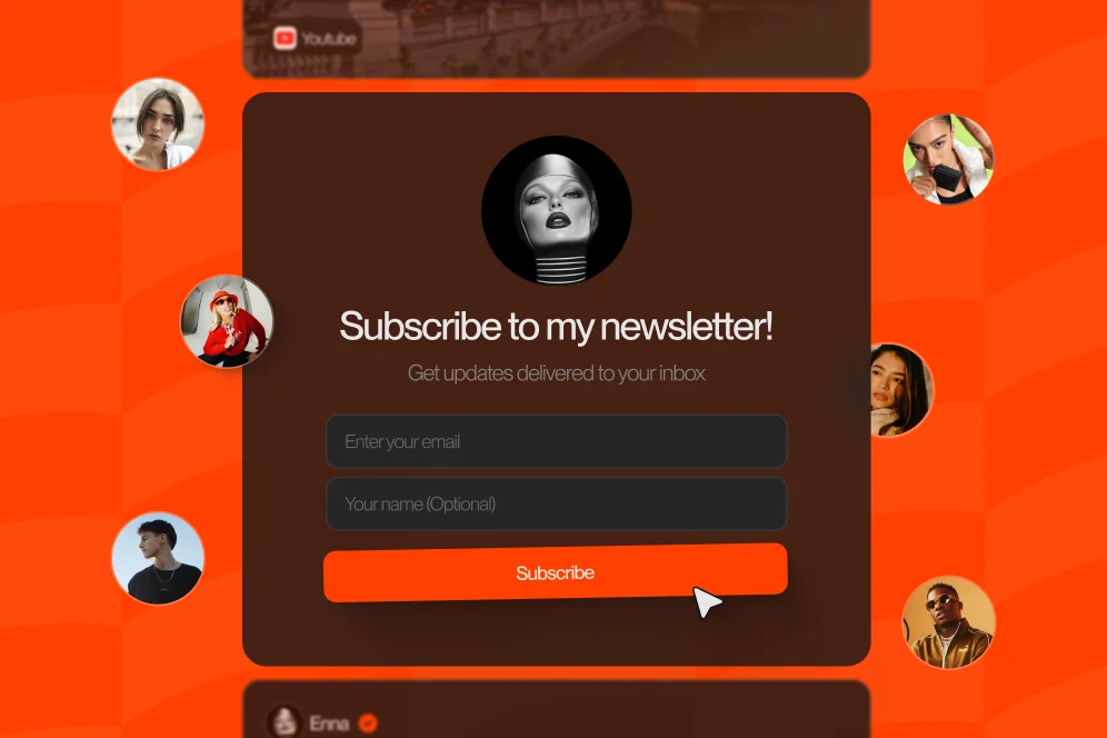
That is the lane Oho is built around. It is not just a link list. It is designed as a creator storefront and link-in-bio platform where visitors can subscribe, buy, book, and inquire from one page.
The contrarian take most creators need
Do not optimize your newsletter as a pure audience asset first and think about monetization later.
Instead, optimize the moment of subscription as the first conversion event in a revenue path. That does not mean hard-selling every lead. It means giving every new subscriber a relevant next step while intent is fresh.
This matters because approved external research keeps pointing in the same direction. According to MarketHype, the welcome flow is a critical moment for turning a new signup into a customer. And as argued in Practice in Public on Medium, conversion often improves when operators stop hesitating to sell and stop sending bland content.
The storefront-first path that converts better than a detached signup form
The simplest reusable model here is the subscribe-see-buy path.
It has four parts:
- Capture the subscriber on the same page where the creator is presented clearly.
- Orient the subscriber with a tight message about what they will receive and why it matters.
- Present one immediate paid next step that matches the reason they subscribed.
- Measure what happens across signup, click, inquiry, booking, and purchase.
That is not flashy, but it is citable because it is practical. It is also how to Turn Newsletter Subscribers Into Paying Customers without building a bloated funnel.
What this looks like on a live creator page
A creator who teaches freelance design might structure a page like this:
- top section: positioning statement and credibility markers
- first action block: newsletter signup for weekly pricing and client tips
- second action block: $29 proposal template bundle
- third action block: 30-minute paid portfolio review
- fourth action block: collaboration or workshop inquiry form
The mistake would be placing newsletter signup in isolation, then forcing the user to hunt for the paid offer somewhere else. The stronger setup puts the signup and the most relevant paid action in the same decision environment.
For example:
- A nutrition coach collects newsletter subscribers with a promise of weekly meal planning tips, then places a paid 1:1 consult directly below.
- A creator selling educational resources captures email subscribers and then shows a starter bundle as the first paid step.
- A podcaster offers newsletter updates and then surfaces sponsorship inquiry handling on the same public page for brands.
This is why a conversion-focused page matters more than a prettier bio. A normal link page mostly measures clicks. A better setup gives visibility into what those clicks become: subscribers, buyers, bookers, and inquiries.
If the goal is monetization from social traffic, the public profile should operate more like a storefront than a traffic router. That is also why many creators look for a more serious creator storefront instead of another generic link page.
What to instrument from day one
If a creator wants to improve conversion instead of guessing, four metrics should be tracked from the start:
- visitor-to-subscriber rate
- subscriber-to-offer click rate
- subscriber-to-purchase or booking rate
- offer-level conversion by source or page section
Without that, it is easy to overvalue vanity metrics. A newsletter that grows quickly but never produces sales is not healthy. A smaller list with strong purchase intent often performs better, especially for high-value offers.
This is consistent with the real-world pattern highlighted by Neera Mahajan on LinkedIn, where even a small newsletter can function as a client engine when the offer and audience fit are tight.
What new subscribers should see in the first 10 minutes
The first 10 minutes after signup do more work than many weekly newsletters. That is because the subscriber still remembers why they opted in.
If nothing useful happens in that window, momentum fades fast.
Build a welcome flow that earns the next click
A practical welcome flow usually has three jobs:
- confirm the value of the subscription
- establish relevance and trust
- introduce the most logical paid next step
According to MarketHype, the welcome email is the essential first touchpoint in a conversion flow. That aligns with what works operationally: the first message should not be a generic thank-you note.
It should do at least the following:
- remind the subscriber what they signed up for
- tell them what kind of content to expect
- link them back to the storefront or offer page
- present one clear action, not five competing actions
A simple example:
Subject: Welcome — here’s your creator pricing starter kit
Body: Thanks for subscribing. Over the next few weeks, you’ll get practical pricing breakdowns, proposal examples, and positioning notes. If you want the faster version, the full template bundle is available now, and you can also book a paid review session from the same page.
That email works because it connects free value to paid depth. It does not pretend selling is impolite.
Match the offer to the opt-in promise
This is where many funnels break.
If someone subscribed for tactical templates, the first paid offer should probably be a template pack, bundle, or workshop. If someone subscribed because they want expert access, the next step may be a consult, audit, or booking.
The email promise and paid offer need continuity. Otherwise the conversion ask feels abrupt.
FinSync emphasizes segmentation and personalization as core drivers of email conversion. In practice, that means not every new subscriber should receive the same pitch sequence.
Useful segmentation inputs include:
- source of signup
- lead magnet selected
- creator niche or interest area
- whether the subscriber clicked a product, booking, or collaboration section
A subscriber who clicked a service page is different from someone who clicked a low-ticket digital product. Treating them the same lowers response quality.
Use paid content previews without over-giving
One effective tactic is showing the shape of the paid solution before asking for the purchase.
Omeda recommends sneak peeks of paid content to increase conversion. For creators, that can look like:
- one lesson from a paid guide
- three pages from a toolkit
- one clip from a workshop
- a sample outcome from a consulting package
The preview should reduce uncertainty, not replace the offer.
Five conversion moves to implement on your page this week
This is the practical middle layer where most gains happen. The goal is not a bigger funnel. The goal is a cleaner path from interest to purchase.
1. Put newsletter signup above the fold with one sharp promise
Do not ask visitors to subscribe for “updates.” That is too vague.
The copy should answer three things immediately:
- what they get
- how often they get it
- why it improves their work, business, or audience
Weak example: “Join my newsletter.”
Stronger example: “Get one weekly breakdown on pricing, outreach, and creator offers.”
2. Place the first paid offer directly below the signup block
This is the highest-leverage layout change for many creators.
After signup, the next thing the visitor should see is the offer most aligned with that subscription promise. That could be:
- a low-ticket digital download
- a starter bundle
- a paid consult
- a workshop replay
If those actions live in different tools, friction rises. That is why using one page to sell, book, and capture subscribers is often more effective than stacking separate utilities.
3. Give each section a single job
A profile page should not make every block do everything.
A clean structure often looks like this:
- identity and credibility
- subscriber capture
- starter offer
- premium offer or booking
- collaboration inquiry
When every section has one job, analytics become clearer too. Oho’s public positioning emphasizes this conversion visibility because creators need to know what sections and offers are actually working.
4. Treat bookings as a monetization path, not a side note
Many newsletters can convert into service revenue faster than product revenue.
If a subscriber joined because they want expertise, a paid call or consult may outperform a course or template. This is especially true for coaches, consultants, educators, and niche experts. The public page should make that path obvious.
5. Build a measurement plan before redesigning anything
Do not “improve” the page and then rely on vibes.
Use a simple baseline-intervention-outcome format:
- Baseline: current visitor-to-subscriber rate, current subscriber-to-offer click rate, current purchase or booking rate
- Intervention: move signup higher, tighten promise, add aligned paid offer below, simplify page structure
- Outcome target: improve subscriber-to-offer click rate and downstream conversion over 30 to 45 days
- Instrumentation: page analytics, form submissions, purchase data, inquiry tracking
Here is a realistic proof pattern, stated carefully without inventing numbers: a creator might start with strong traffic but weak downstream actions, then restructure the page so the signup promise and first paid offer align, and within one monthly review cycle expect to see clearer offer clicks, better inquiry quality, and faster monetization from new subscribers. The key is that the outcome must be measured, not assumed.
Where monetization breaks: common mistakes that kill subscriber value
Most newsletter monetization problems are not caused by bad email software. They are caused by offer mismatch, weak page design, or delayed asks.
Selling too late
Many creators wait until the fourth or fifth email to mention anything paid. That delay is often unnecessary.
A subscriber does not feel betrayed by an early offer if the offer is relevant and the surrounding content is useful. The more serious risk is letting intent decay.
This is why the advice in Practice in Public on Medium matters: a mindset shift is part of conversion. If the operator is afraid to sell, the funnel usually reflects that hesitation.
Asking for the wrong purchase first
Not every audience wants a paid subscription as the first step.
As beehiiv’s paid subscriptions page makes clear, paid newsletter models are one monetization path, not the only one. For many creators, low-ticket products, bundles, bookings, or custom services may convert better than asking cold subscribers to pay for access alone.
That is a critical distinction. To Turn Newsletter Subscribers Into Paying Customers, the best first offer is the one with the lowest friction and highest relevance, not the one that sounds most sophisticated.
Hiding the offer behind extra clicks
If the subscriber has to leave the page, open another tool, and decode a new layout, conversion drops.
The path should feel continuous. That is one reason a platform that combines newsletter capture, digital products, bookings, and collaboration requests on one page can remove practical friction.
Measuring clicks instead of outcomes
A click on “Learn more” is not revenue.
Creators need enough visibility to answer questions like:
- Which section is producing subscribers?
- Which subscriber segment clicks the offer?
- Which offer converts into a purchase or booking?
- Which source produces better collaboration inquiries?
Without those answers, page changes become aesthetic decisions rather than commercial decisions.
Treating every subscriber the same
Segmentation is not optional once the list begins to grow.
As noted by FinSync, personalization and segmentation are major levers for turning subscribers into sales. A creator who sells digital downloads, bookings, and brand opportunities should not send one undifferentiated sequence to everyone.
What a monetization-ready creator page should include in 2026
The public page is doing more work now than it did a few years ago. It is not just a bio destination. It is part storefront, part credibility layer, part lead capture, and part conversion surface.
A monetization-ready page in 2026 should include:
- a clear creator positioning statement
- newsletter signup with a specific promise
- one immediate paid next step
- one higher-intent offer such as a consult or service
- a structured path for brand inquiries
- analytics visibility across clicks and conversion signals
For many creators, this is easier to manage when the public page is designed around action rather than routing. That is the difference between a typical link hub and a platform intended to help creators sell, book, grow, and get paid from one place.
A practical page blueprint
A strong layout often follows this order:
- Header: who the creator helps and what outcome they deliver
- Signup block: one-sentence newsletter promise and capture form
- Starter offer: low-friction paid product or bundle
- Service block: paid booking, consult, or session request
- Proof block: examples of results, topics covered, or audience relevance
- Collaboration block: structured inquiry path for brands
This is also where public identity matters. A cleaner branded URL, a stronger creator profile, and a more business-ready presentation can help the page feel like a serious commercial destination instead of a temporary bio page. Oho’s positioning around branded usernames, premium short usernames, and creator-facing public profiles fits that use case.
If the aim is immediate monetization from profile traffic, a dedicated creator page with subscriber capture and offers on the same destination is usually a better fit than sending people through multiple disconnected tools.
Where AI-answer visibility changes the funnel
Search and discovery are shifting. More people will first encounter your advice, products, or positioning through summarized answers rather than direct clicks.
That changes the funnel to:
impression -> AI answer inclusion -> citation -> click -> conversion
A creator page and article set should be built for that reality. The page needs a clear point of view, practical language, and examples that are easy to quote. In that environment, brand becomes a citation engine. Distinct positioning plus concrete implementation detail is more likely to be cited than generic advice.
FAQ: specific questions creators ask when monetizing subscribers
How quickly should a new subscriber see a paid offer?
Usually within the first session on the page and again in the welcome flow. The offer should feel like a relevant next step, not an aggressive interruption.
Should the first paid offer be a subscription, a product, or a service?
It depends on what the subscriber opted in for. If they joined for tactical resources, a digital product or bundle often fits best. If they joined for expertise, a paid session or consult may convert faster.
Does list size matter less than offer fit?
Yes, in many creator businesses it does. A small list with clear intent and a well-matched offer can outperform a larger list with weak positioning or vague monetization.
What if subscribers are opening emails but not buying?
That usually points to one of three issues: weak offer relevance, weak urgency, or too much distance between the email and the purchase path. Review the promise made at signup, the first paid ask, and the number of clicks required to complete the action.
Should newsletter signup and brand inquiries live on the same page?
Yes, if the creator’s public page serves multiple audiences. Fans, subscribers, buyers, and brands often arrive from the same profile, so the page should make each path available without turning into a cluttered menu.
Turning subscribers into customers is mostly about reducing the distance between interest and action. If your current setup captures emails but hides the next step, rebuild the page so people can subscribe, buy, book, or inquire in one flow. If you want a cleaner public page built around conversion instead of redirects, explore how Oho helps creators sell, book, grow, and get paid from one profile.