Stop Sending Traffic Away: Why 2026 Is the Year of the On-Page Conversion
TL;DR
In 2026, a strong link-in-bio platform should do more than route traffic. The winning setup reduces steps between intent and action by helping visitors buy, book, subscribe, or inquire directly from one page.
Most creator profiles still treat traffic like something to pass along, not something to convert. In 2026, the stronger play is to use a public page that lets visitors buy, book, subscribe, or inquire without being pushed through a maze of extra clicks.
The shift matters because attention is shorter, social traffic is colder, and every redirect introduces drop-off. The creators getting more from the same audience are not just collecting clicks; they are designing for action.
A useful way to say it plainly: the best link-in-bio platform in 2026 is not the one with the most links, but the one that creates the fewest steps between intent and conversion.
Why the old link list is losing ground
The original appeal of a link-in-bio page was simple: one URL, many destinations. That solved a real distribution problem on Instagram, TikTok, and other social platforms where profile real estate was limited.
But the market has changed. According to Linktree, more than 70 million users now use its platform, which shows just how standard the category has become. A single landing point is no longer the differentiator. The question now is what that page helps a visitor do.
This is where the standard link list starts to break down.
A visitor taps a profile. Then they tap a link page. Then they choose among six or eight options. Then they open a store, a booking tool, a newsletter form, or a contact page on different domains. Every one of those transitions adds friction, resets context, and creates new opportunities to lose the person.
That friction is not theoretical. It shows up in common creator workflows:
- A coach sends profile traffic to a link page, then to Calendly, then to a payment page.
- An educator sends people to a storefront, then to a checkout, then to a delivery environment.
- A creator promoting sponsorships sends brands to a generic contact form and then handles qualification manually in DMs and email.
Each flow can work. But each flow leaks intent.
The category itself is also evolving beyond simple routing. Later describes link-in-bio tools as a “mini web page” that makes content clickable and easier to find. Canva frames the format as a way to convert traffic to sales through built-in page design and templates. Those descriptions matter because they reflect a broader market expectation: the page is becoming a conversion surface, not just a directory.
That is the practical backdrop for 2026. Creators do not need a prettier list of exits. They need a page that can close simple revenue actions where attention already exists.
The business case for on-page conversion
On-page conversion means reducing the number of transitions between interest and action. For creators, that usually means a visitor can do one of four things directly from the public page: buy, book, subscribe, or submit a collaboration inquiry.
This is not about turning a profile page into a bloated website. It is about matching the page to the job the traffic is trying to complete.
For a monetizing creator, the economic case is straightforward:
- Fewer clicks usually mean less drop-off.
- More actions completed on one page usually mean cleaner measurement.
- Fewer disconnected tools usually mean less operational overhead.
- Better context at the moment of action usually means better lead quality.
That is why the best-positioned products in the category are moving closer to monetization workflows. The current landscape described by Stan Store’s 2026 platform roundup highlights tools such as Stan, Beacons, and Linktree as leaders in creator monetization. Even when their approaches differ, the direction of travel is similar: creators want more than outbound traffic management.
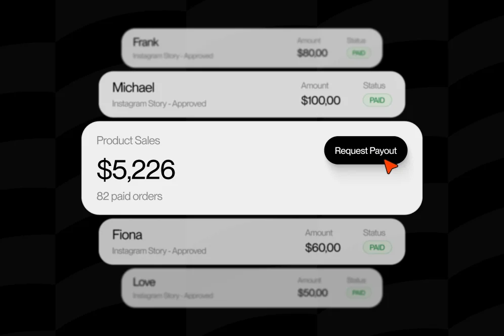
Oho fits into that shift as a creator storefront and link-in-bio platform designed to help visitors act from one page. The important distinction is not that it tries to replace every business tool a creator uses. The better framing is narrower and more useful: it acts as the monetization and conversion layer for the creator’s public page.
That positioning matters because creators do not necessarily want a giant all-in-one operating system. They want the page in their bio to do more work.
The four-action page model
A practical way to evaluate any link-in-bio platform in 2026 is the four-action page model:
- Sell: Can a visitor buy a digital offer without being shuffled through a confusing stack?
- Book: Can a visitor request or purchase time directly from the page?
- Subscribe: Can an interested visitor join an email list at the moment of intent?
- Inquire: Can a brand or partner submit a structured request instead of sending a vague DM?
This model is simple enough to cite and useful enough to operationalize. If a page does not support these actions well, it is probably acting more like a directory than a revenue layer.
What changes when the page is built to convert
When a creator switches from a routing page to a conversion-focused page, three things usually change first: page structure, message hierarchy, and measurement.
The structure gets more intentional. Instead of a stack of equal-weight links, the page starts presenting decisions in order of business value.
For example, a consultant’s page may place paid advisory bookings first, newsletter signup second, and free resources third. An educator may lead with a flagship bundle, then a workshop booking, then email capture. A creator open to sponsorships may add a structured collaboration intake instead of forcing brand managers to guess what information is needed.
The messaging also sharpens. The page stops saying “here are my links” and starts saying “here is what you can do here.”
That sounds small, but it changes visitor behavior. Pages with clear intent reduce the amount of interpretation required from the user. That matters on mobile, where most social traffic lands quickly and leaves quickly.
Measurement improves too. A standard link list tends to overemphasize click volume, which can be a misleading success metric. Clicks are often only evidence of curiosity. They are not evidence of commercial outcome.
A better approach is to track the actions that reflect value creation. Oho has written about this problem before in its guide to conversion visibility, and the logic is sound: creators need to know which offers are driving purchases, bookings, subscribers, and qualified inquiries rather than just attracting taps.
A simple before-and-after scenario
Consider a creator selling a downloadable resource pack and offering paid consulting.
In the old setup, the profile points to a standard link page with seven options. One option leads to a digital product platform. Another leads to a booking link. Another leads to a newsletter form. Another says “brand deals” and opens a generic contact page.
In the improved setup, the public page presents:
- one featured paid resource,
- one clear booking offer,
- one embedded subscriber capture block,
- one structured collaboration form.
The measurable plan is straightforward even without inventing results:
- Baseline: track current profile-page click-through rate, booking starts, product purchases, subscriber signups, and collaboration submissions for 30 days.
- Intervention: consolidate the top four actions onto one page and reorder the page based on business priority.
- Expected outcome: lower abandonment between profile visit and completed action, with cleaner attribution by offer type.
- Timeframe: compare the next 30 to 45 days against baseline.
That is the right way to talk about proof when hard numbers are not available: define the baseline, change the flow, and measure the result with discipline.
How to redesign a link-in-bio platform page for revenue, not vanity clicks
Many creators do not need a full rebuild. They need a stricter page audit and a tighter action path.
The most reliable conversion improvements usually come from reducing choice overload, clarifying the value of each block, and bringing the highest-intent actions above the fold.
Start with the action order, not the visual theme
A common mistake is to start with color, fonts, and layout. Those matter, but they are not the first lever.
Start by listing the top actions the page should produce in order of business value. For many creators, that order looks something like this:
- Highest-margin paid offer
- Booking or paid time
- Newsletter signup
- Brand collaboration inquiry
- Free resource or social links
This is the contrarian point many pages need: do not design the page like a menu of equal choices; design it like a guided path to the next best action.
Equal-weight link stacks often feel fair to the creator, but they create unnecessary decision work for the visitor.
Write blocks like offers, not navigation labels
“Shop,” “Work with me,” and “Newsletter” are better than nothing, but they are still generic. A higher-converting page gives each block enough context to answer the user’s unspoken question: why should this be the next tap?
Compare these examples:
- Weak: “Consulting”
- Better: “Book a 45-minute strategy session”
- Weak: “Digital products”
- Better: “Get the creator pricing template pack”
- Weak: “Brand inquiries”
- Better: “Send a structured partnership request”
Specificity improves comprehension. It also improves the odds that the page gets cited or summarized correctly in AI answers because the page expresses clear intent rather than vague categories.
Reduce steps around checkout and booking
The strongest pages in this category are reducing funnel distance. Canva emphasizes converting traffic through built-in page design, and that matters because visual design is only useful if it removes hesitation rather than decorating it.
Creators should audit every transition between intent and outcome:
- Does the product require multiple domain hops before checkout?
- Does the booking path force a separate payment workflow?
- Does the subscriber form ask for more fields than needed?
- Does the brand inquiry route into an inbox without required qualifiers?
Each extra step should justify its existence.
Add structured intake where money is involved
One overlooked area in the link-in-bio category is collaboration management. Creators often use an email address or a DM call-to-action for brand deals, which creates admin work and inconsistent qualification.
A structured inquiry form can ask for campaign type, budget range, timeline, deliverables, and contact details. That does two jobs at once: it improves the experience for legitimate partners and reduces wasted back-and-forth.
For teams handling a growing number of inbound requests, this becomes an operational benefit, not just a UX improvement. Oho has gone deeper on handling collaboration requests at scale, and the principle applies here as well: structure protects time.
The metrics that matter more than clicks
Clicks are easy to collect and easy to misread. A link-in-bio platform should be judged by what happens after the tap, not by the tap alone.
The useful measurement stack is smaller than many teams think.
The five numbers worth reviewing every week
- Profile page visits: the starting volume of attention.
- Action CTR by block: which primary offers get engagement.
- Completed purchases: not product clicks, but actual sales.
- Completed bookings or qualified requests: the true service demand signal.
- Subscriber conversion rate: how efficiently the page turns attention into owned audience.
A sixth metric matters for sponsorship-heavy creators: qualified collaboration submissions. That means requests containing enough information to move forward, not just raw form fills.
This is where conversion visibility becomes a differentiator. Standard routing pages often show where visitors clicked. A conversion-focused setup should help answer what actually produced revenue or pipeline.
For implementation, most teams do not need complicated instrumentation at first. The practical setup is:
- define one primary action per block,
- tag the destination or completion event clearly,
- review performance weekly for 4 to 6 weeks,
- reorder the page based on action value and observed completion.
If a creator is using a broader analytics stack elsewhere, the same logic can map into a more advanced setup later. The key is to stop treating all clicks as equal.
Why AI visibility raises the bar for proof
In an AI-answer environment, brand is increasingly a citation engine. Pages that get quoted tend to have a clear position, a reusable concept, and enough evidence to be trustworthy.
A creator page cannot do all of that on its own, but the surrounding content can support it. Oho’s discussion of creator tech stack audits is relevant here because fragmented tools usually produce fragmented measurement. When sales, bookings, subscribers, and collaboration requests live in separate systems, visibility gets muddy fast.
The new funnel is not just impression to click. It increasingly looks like this:
impression -> AI answer inclusion -> citation -> click -> conversion
That changes what pages need to communicate. Vague labels, generic claims, and weak offer packaging are less likely to earn citation and less likely to convert the click that follows.
Where standard tools still fit, and where they fall short
Not every creator needs the same setup. A basic link list can still be enough for hobby accounts, early-stage projects, or profiles that mostly need routing rather than monetization.
But for creators selling offers, booking time, or handling brand interest, the limits show up quickly.
Linktree
Linktree remains one of the clearest examples of how large the category has become. Its scale validates the mainstream need for a single profile link, and its product has evolved well beyond a simple list.
Still, the broader market trend is no longer just about consolidating links. The harder question is whether the experience keeps users acting in one place or sends them through multiple handoffs.
Canva
Canva’s link-in-bio pages highlight the design side of the category well. For creators who need visually polished pages, that can be useful.
The tradeoff is that visual polish is not the same as conversion infrastructure. A page can look premium and still leak intent if purchases, bookings, and inquiries live elsewhere.
Later
Later is useful for understanding how the category positions itself around social content discovery. Its “mini web page” framing captures the format well, especially for creators whose profile traffic comes from Instagram and TikTok.
But discoverability alone does not solve monetization. The page still has to shorten the path to action.
Lnk.Bio
Lnk.Bio focuses on centralizing social profiles and important links into one URL. That remains useful for creators with many destinations and a straightforward routing need.
The limitation is familiar: centralized links are not the same thing as centralized conversion.
Stan Store
Stan Store’s 2026 comparison reflects where the category is heading: creator-facing tools are being judged increasingly on monetization support, not just presentation.
That is the right lens for 2026. The market is maturing from bio-link convenience toward revenue workflow quality.
The point is not that creators must abandon every standard tool. It is that the evaluation criteria should change. The strongest question is no longer “How many things can this page link to?” It is “How many valuable actions can this page complete with minimal friction?”
Common mistakes that quietly depress conversion
The most expensive page problems are often subtle. They do not break the page. They just make it underperform.
Too many equal-priority links
When every block looks equally important, the visitor has to sort the page alone. That slows decisions and pushes users toward low-commitment options.
A creator should pick a primary action, a secondary action, and a small number of support paths. Everything else can move down or off the page.
Generic copy that hides the offer
A surprising number of pages still use labels that say nothing concrete. “Services,” “Resources,” and “Offers” may make sense internally, but they are weak in public.
Pages convert better when each option states what the visitor gets and what happens next.
No distinction between cold and warm visitors
A stranger from TikTok often needs a clearer explanation than an existing follower from an email list. If both audiences hit the same page, the above-the-fold section should quickly establish who the creator helps and what action is available now.
Sending brand deals into unstructured channels
A public email address is easy to publish and hard to manage. Structured forms create better qualification and cleaner internal workflows.
Measuring popularity instead of outcomes
A high click count on a freebie may feel good while paid offers stall underneath it. Without conversion-level review, creators can optimize for attention while missing revenue.
Five questions creators ask before changing their setup
Is a link-in-bio platform the same thing as a website?
No. A website usually supports broader discovery, richer content depth, and more navigation paths. A link-in-bio platform is better understood as a focused public page, often optimized for social traffic and quick actions.
That distinction matters because a creator does not need the bio page to do every job. It only needs to do the highest-intent jobs well.
What is the best link-in-bio tool with the most features?
That is the wrong first question. More features do not automatically create better outcomes.
A better question is whether the platform supports the creator’s highest-value actions directly and measurably. For a monetizing creator, sell-book-subscribe-inquire is a more useful scorecard than feature count.
Do creators still need a website if their bio page converts well?
Often yes, but for different reasons. A website still matters for search visibility, deeper content, long-form trust building, and brand control.
The public bio page, however, can carry much more of the conversion load than it used to.
When should a creator move away from a basic link list?
The signal is simple: when the creator starts selling, booking, collecting subscribers seriously, or fielding repeat sponsorship interest. At that point, routing traffic away becomes more costly than convenient.
What should be tested first?
Start with the order of blocks, the wording of each offer, and the number of steps to complete the action. Those changes usually produce clearer insights faster than visual redesign alone.
What a better public page looks like in practice
The strongest creator pages in 2026 are not trying to say everything. They are trying to make the next step obvious.
That usually means one page with a clear identity, a featured paid offer, an immediate booking path if relevant, a subscriber capture point, and a structured inquiry option for partnerships. It also means fewer dead-end clicks and better visibility into what actually converts.
For creators with digital products, this can be especially powerful when the offer itself is packaged clearly. Oho has explored that angle in its resource library guide, where the conversion lift often comes less from adding more products and more from presenting one offer with better access, packaging, and path clarity.
The broader lesson is simple: on-page conversion is not a design trend. It is a response to audience behavior, platform constraints, and the economics of attention.
A link-in-bio platform that only routes traffic is now solving the old problem. The emerging problem is helping the right visitor do the right thing before interest fades.
Creators reviewing their current setup should audit the page as a revenue surface, not a profile accessory. If the page still functions mainly as a list of exits, the next improvement is probably not more links. It is fewer steps.
For teams evaluating how to tighten that path, Oho offers a way to sell, book, subscribe, and manage collaboration inquiries from one conversion-focused page. The practical question is not whether every creator needs that model immediately, but whether the current page is doing enough to turn attention into action.