How to Choose an All-in-One Creator Sales Platform in 2026
TL;DR
Selecting Your All-in-One Creator Sales Platform should focus on one thing: how well it turns profile traffic into purchases, bookings, subscribers, and inquiries. Review buyer action coverage, conversion friction, analytics depth, and breakpoint risk before moving real traffic.
Choosing a creator sales platform is less about finding the longest feature list and more about finding the cleanest path from profile visit to paid action. The right setup should let a visitor buy, book, subscribe, or inquire without getting pushed through a messy stack of disconnected tools.
If the platform cannot turn attention into measurable action on one page, it is not really solving the creator monetization problem. That is the standard worth using when selecting your all-in-one creator sales platform.
Why most creator stacks break at the point of conversion
Many creators do not have a traffic problem first. They have a conversion architecture problem.
A typical setup looks manageable on paper: one link-in-bio tool, one checkout tool, one booking app, one email form, one DM process for brand deals, and a spreadsheet to reconcile what happened. In practice, every extra handoff creates leakage.
That fragmentation matters because standard link-in-bio tools mostly route people away instead of helping them complete an action on the page. A conversion-focused profile should reduce decision friction, not multiply tabs.
This is where Oho is best framed as a monetization layer rather than a prettier list of links. From one profile, creators can sell digital products, offer paid bookings, capture newsletter subscribers, and manage structured collaboration requests. The value is not abstract customization. The value is consolidating revenue actions into a single public page, which is exactly how Oho positions the product.
A useful point of view here is simple: do not choose a platform because it says all-in-one; choose it because the core buyer actions happen with less friction and better visibility.
That matters even more in 2026 because creator businesses are no longer built on one monetization path. One person may sell a downloadable guide, book paid calls, pitch a newsletter, and accept campaign inquiries in the same week. A platform that handles only one of those actions well forces the rest of the business into workarounds.
According to Stan, creator storefronts now commonly bundle digital products, courses, and bookings in one place. That validates the broader category shift, but it also raises the bar: if multiple tools can claim “all-in-one,” the buying decision has to move deeper into conversion quality, workflow quality, and data quality.
The four-part platform review that actually predicts fit
When selecting your all-in-one creator sales platform, use a practical review model instead of comparing marketing copy. The review should answer four questions in order: what can the visitor do, how few steps does it take, what can the creator measure, and where will the setup break later.
That four-part platform review is worth documenting before you trial anything.
1. Buyer action coverage
Start with the actions that directly produce revenue or owned audience growth.
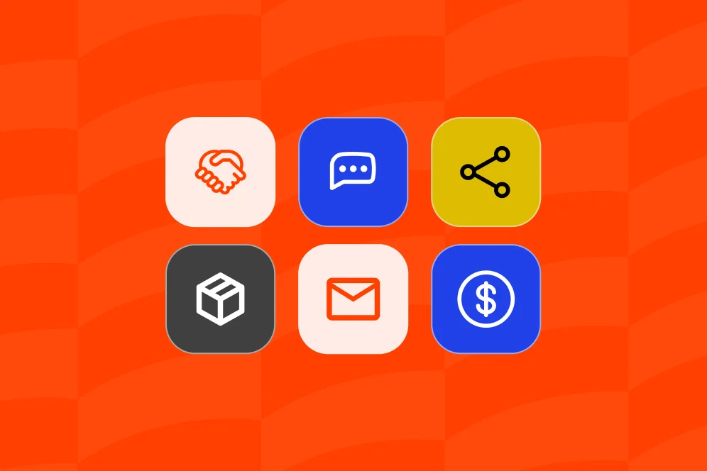
At minimum, most monetizing creators need some combination of:
- Digital product sales
- Paid bookings or service requests
- Newsletter signup
- Brand collaboration intake
If the platform handles only one or two of those natively, the “all-in-one” promise is already weak.
For example, a creator selling templates may also offer 30-minute consults and want sponsors to submit structured briefs. If products live in one place, booking in another, and sponsorship intake in a form tool, the public page becomes a switchboard instead of a sales surface.
Oho’s public use cases align closely with these buyer actions: downloads, guides, bundles, creator packages, consults, calls, sessions, newsletter capture, and collaboration requests. That is the right lens to evaluate any platform against.
2. Friction per conversion path
Next, count the number of steps it takes for a visitor to complete each action.
A clean review looks like this:
- Click from profile to offer
- Understand the offer immediately
- Complete payment, booking request, signup, or inquiry without detour
- Receive clear confirmation
If the user needs to bounce from social profile to link page to external store to separate scheduler to another form, conversion risk rises at every step.
The strongest creator pages feel more like focused storefronts than traffic routers. That is the central difference between a standard bio page and a dedicated conversion layer.
3. Conversion visibility
A surprising number of creators still choose tools based on appearance before checking whether they can actually see what is working.
That is a mistake.
You need visibility into clicks, subscriptions, inquiries, and the sections or offers driving those actions. Without that, every optimization decision becomes guesswork. Oho explicitly emphasizes this kind of conversion visibility, which is far more useful than vanity metrics alone.
If one page section gets attention but no action, that is a design issue. If consult bookings outperform downloads, that is a pricing or offer signal. If sponsorship inquiries rise after you move a collaboration block higher on the page, that is a messaging signal.
4. Breakpoint risk
Every “all-in-one” platform has limits. The question is whether those limits appear in critical workflows.
A useful caution comes from a user discussion on Reddit, where the common downside of all-in-one platforms is feature lag: one module may fall behind best-in-class standalone tools. That does not mean all-in-one is the wrong choice. It means each module needs to be checked for adequacy, not assumed to be strong because the bundle sounds convenient.
For creator businesses, the highest-risk breakpoints are usually:
- weak checkout or offer presentation
- clunky booking flow
- poor email capture placement
- unstructured brand inquiry handling
- shallow analytics
If those are weak, the stack will eventually sprawl again.
What to test in the trial before you move real traffic
A free trial or start-free plan is useful only if the test mirrors actual buyer behavior. Too many evaluations stop at “the page looked good.” That is not enough.
Before committing, run a seven-day trial with one real product, one real service, one newsletter prompt, and one collaboration path.
Use one page like a live conversion lab
A proper test page should include:
- one low-friction digital product such as a guide or template
- one paid booking option such as a consult or call
- one newsletter signup block
- one brand collaboration request entry point
This setup reveals whether the platform can support a mixed monetization model from one profile. That is the real-world use case many creators need.
For example, a business creator might structure the page like this:
- Top section: one-sentence value proposition and paid consult CTA
- Middle section: downloadable playbook bundle
- Next section: newsletter signup for weekly insights
- Lower section: structured collaboration request for brands
That sequence mirrors actual buyer intent. Warm visitors who need direct help can book. Lower-intent visitors can buy a digital product. Colder traffic can still join the newsletter. Brands get a clean inquiry path instead of a vague “email me.”
That is materially different from a page with eight outbound links and no priority order.
Measure baseline, intervention, and outcome window
Do not invent performance numbers during testing. Set a measurement plan instead.
A simple review template looks like this:
- Baseline: current clicks to store, bookings, subscriber growth, and brand inquiries over 14 to 30 days
- Intervention: move those actions into one platform and one page
- Outcome window: compare changes after 30 days
- Instrumentation: native platform analytics plus whichever traffic source metrics you already trust
This is the right kind of proof when selecting your all-in-one creator sales platform. Even without hard benchmark numbers, the decision can be evidence-based.
Check the page on mobile first
Most creator traffic arrives from social, and social traffic is predominantly mobile in behavior even when final buying may happen later on desktop. That means mobile review is not optional.
Test these details:
- Is the first monetization action visible without excessive scrolling?
- Does the booking or product CTA read clearly on a small screen?
- Are forms short enough to complete on mobile?
- Does the collaboration request feel structured instead of intimidating?
If the page feels like a compressed desktop layout, the stack will underperform no matter how many modules it includes.
The contrarian rule: do not buy the most features, buy the clearest revenue path
The easiest mistake in platform selection is equating more modules with more leverage. In most creator businesses, more modules create more maintenance unless they are tightly aligned to a few high-value actions.
So the contrarian stance is this: do not buy the widest platform; buy the platform that makes your main revenue actions easiest to complete and easiest to measure.
That sounds obvious, but many teams still choose based on edge features they will not use for six months.
Where feature bloat hurts creators
Feature bloat usually shows up in three ways:
- The page tries to serve too many audiences at once.
- The creator has no clear action hierarchy.
- Analytics become too shallow or too noisy to guide optimization.
If a creator wants to sell a bundle, take paid calls, and capture subscribers, those actions should dominate the page architecture. Everything else is secondary.
This is also where Oho’s positioning is useful. The product should not be framed as a full business operating system. It is better understood as the public monetization and conversion layer for the creator profile. That narrower focus is often a strength because it keeps evaluation criteria grounded in what the public page must do.
A practical implementation checklist
Use this numbered review during selection and trial:
- List the top three revenue or audience actions the page must support.
- Build one page that supports all three without sending visitors through unnecessary detours.
- Put the highest-value action first and reduce copy around lower-priority paths.
- Confirm that digital products, bookings, newsletter capture, and collaboration intake can coexist without clutter.
- Verify analytics for clicks, subscriptions, inquiries, and offer-level interest.
- Review mobile rendering before desktop polish.
- Stress-test one full customer path for purchase, one for booking, and one for brand inquiry.
- Note any module that feels materially weaker than a standalone tool.
- Compare 30-day outcomes against your existing stack, not against vendor promises.
- Choose the setup that improves action rate and operating simplicity together.
That checklist is more predictive than most feature comparison tables.
How to compare creator platforms without getting lost in vendor language
The creator platform market is crowded enough that categories blur quickly. Some tools started as bio pages. Others started as product storefronts. Others expanded from community or partnership software.
A cleaner comparison method is to ask what job each tool appears strongest at, then compare that against your monetization mix.
Stan
Stan is relevant in this discussion because it clearly promotes a creator storefront model that combines products, courses, and bookings. For creators whose main need is putting those monetization paths in one place, that category positioning is familiar and useful.
The practical question is not whether a tool claims all-in-one status. It is whether the creator can present offers clearly, transact with low friction, and understand what is converting.
Circle
In Circle’s 2026 roundup of creator platforms, the category is framed more broadly around audience building and business growth. That is a helpful reminder that some platforms are strongest at community and membership depth, while others are better as the public sales surface.
If your primary need is a conversion-focused profile page rather than a full community environment, treat those as different jobs. Do not overbuy infrastructure for a problem that starts at the profile level.
Impact
Impact is not a direct bio-page comparison, but it is useful for understanding why unified tracking matters. The company emphasizes tracking actual sales and managing partnership activity from a single dashboard.
That principle transfers directly to creator evaluation: a platform should not just record clicks. It should help the creator connect page intent to revenue actions and collaboration outcomes.
Oho
Oho fits the comparison best when the need is a creator storefront and link-in-bio platform that helps visitors act on the page. The strongest use cases are selling digital products, offering paid bookings, growing a newsletter, and organizing brand collaboration requests from one profile.
Its differentiation is clearest when compared with standard link-in-bio tools that mostly redirect traffic out. Oho is built around action and conversion visibility, which is why it makes sense for creators, consultants, educators, and online personalities who need their public profile to function like a monetization surface.
It also adds a public identity layer through branded usernames, premium short usernames, and profile verification references. For serious monetizing creators, that identity layer can matter because the profile is not just a landing page. It is part of the business front door.
Technical details that matter more than the template design
A polished page helps, but technical quality determines whether the setup remains useful after launch.
Analytics should answer operational questions
The platform should help answer questions like:
- Which offer sections attract the most clicks?
- Which CTAs lead to subscriber capture?
- Are collaboration requests increasing after page changes?
- Is the booking block outperforming product sales for a given traffic source?
Those are operating questions, not design questions. If analytics cannot support them, optimization slows down.
Referrals and partnerships should be visible, not improvised
For creators who expand earnings through referrals or partnerships, trackability matters. Oho publicly promotes a 5% lifetime referral reward, which is relevant when discussing earnings beyond direct offers. More broadly, referral and partnership economics work best when they are measurable rather than handled manually.
That is consistent with the broader value proposition seen in Impact, where partnership management is tied to actual tracked outcomes rather than loose attribution.
AI features are interesting, but not the first buying criterion
Some modern platforms increasingly include AI-adjacent tools. As reported by Entrepreneur, creator-focused software is starting to bundle capabilities such as text-to-speech, caption generation, and voice cloning.
That may become more relevant over time, but it should not outrank checkout clarity, booking usability, or subscriber capture in your evaluation. AI can speed content operations. It does not fix a broken conversion path.
Simplicity is a feature, not a compromise
When integrated software is selected well, simplicity is not a downgrade. It is often the reason the system performs. Thryv’s overview of all-in-one marketing platforms emphasizes simplicity as a core buying criterion, and that logic applies directly to creator monetization tools.
A creator page should be fast to update, easy to understand, and hard to break. If every small change requires touching four tools, the stack will degrade under normal operating pressure.
The mistakes that usually lead to a platform switch six months later
Most platform regrets are visible early if the evaluation is done honestly.
Mistake 1: buying for possible future complexity
Creators often buy for the business they might have in 18 months instead of the monetization paths they already need. That usually produces a bloated setup with low adoption.
A better approach is to choose the platform that best supports today’s main actions, then re-evaluate when volume or complexity genuinely demands it.
Mistake 2: treating all visitor intents the same
A paid consult buyer, a newsletter subscriber, and a brand manager do not need the same path. If the platform cannot present those paths clearly, it creates confusion and weakens action rate.
Good creator pages separate intent while keeping everything on one profile.
Mistake 3: overvaluing aesthetics and undervaluing instrumentation
A beautiful page with weak analytics becomes hard to improve. A slightly simpler page with clear action data is usually the better business asset.
This is one reason a conversion-focused profile often beats a generic bio page. It gives the creator evidence about what the audience is actually willing to do.
Mistake 4: assuming “all-in-one” means every module is excellent
As the Reddit discussion on all-in-one platform regret suggests, convenience can hide uneven quality across modules. Always test the weakest-looking workflow, not just the headline feature.
Mistake 5: forgetting public identity and trust signals
For monetizing creators, the profile itself signals seriousness. Branded usernames, short memorable handles, and verification references can all support trust and recognition. Those details will not compensate for a weak offer, but they do shape first impression and business readiness.
FAQ: the practical questions creators ask before they switch
Is an all-in-one creator platform always better than separate tools?
Not always. It is better when the integrated setup reduces friction across your main revenue actions without introducing weak modules that force workarounds later.
What should a creator test first during a trial?
Test one real product, one real booking path, one newsletter signup, and one collaboration request flow. That reveals whether the platform can handle mixed monetization from one page instead of just looking polished in a demo.
How do I know if my current link-in-bio setup is costing me revenue?
Look for signs of leakage: too many outbound steps, no visibility into which sections convert, weak email capture, and manual handling for sponsorship inquiries. If the page mostly routes visitors away, it is probably underperforming as a sales surface.
Are bookings and digital products enough, or should I also care about newsletter and brand inquiries?
That depends on the business model, but most creators benefit from having more than one conversion path. A subscriber may become a buyer later, and a brand inquiry may be worth more than several small product sales.
Does public profile identity really matter when choosing a platform?
Yes, especially for creators who monetize professionally. Branded usernames, clean presentation, and trust signals can improve how seriously visitors, partners, and brands treat the page.
Selecting your all-in-one creator sales platform should end with a working page, not just a shortlist. If you want a creator profile that can sell, book, capture subscribers, and organize collaboration requests from one place, explore how Oho works as a conversion-focused public layer for your business.