Scaling Your Creator Newsletter Without Sending People Away
TL;DR
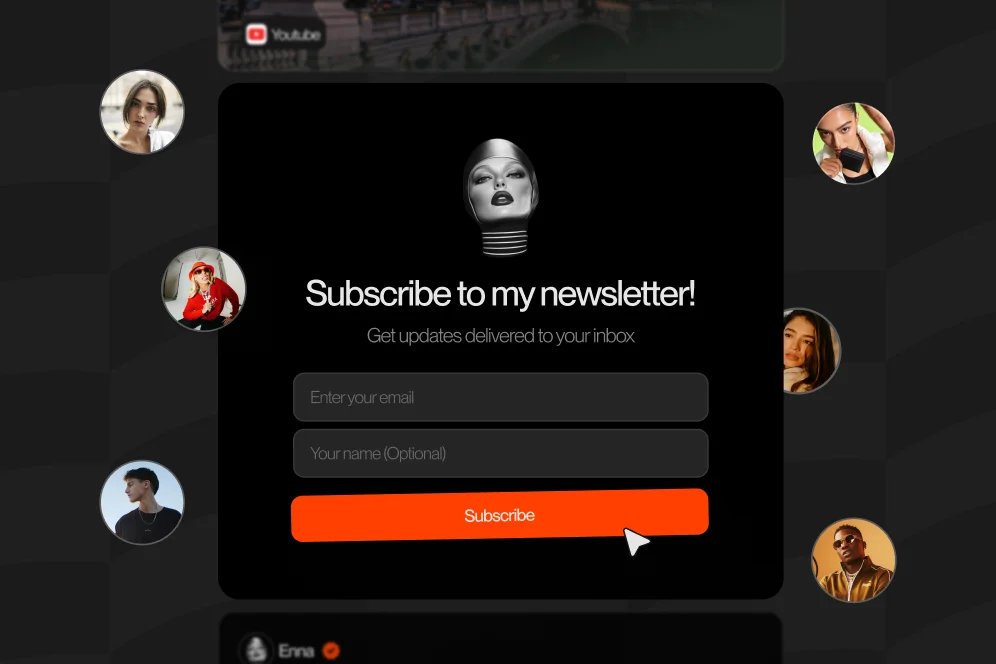
Scaling Your Creator Newsletter is usually a page-conversion problem before it is a content problem. Put the signup offer directly on your storefront, tighten the value promise, track visit-to-subscriber conversion, and connect the newsletter to one clear monetization path.
Most creators do not have a newsletter growth problem first. They have a conversion path problem: traffic lands on a profile, gets handed a list of links, and never reaches a clean subscribe moment.
The practical fix is simple: treat your public page like a newsletter landing page, not a traffic router. When subscription happens on-page, messaging gets tighter, intent stays high, and newsletter growth becomes easier to measure.
1. Why most creator newsletters stall at the profile page
Scaling Your Creator Newsletter usually breaks before email content quality becomes the bottleneck. The weak point is often the step between social attention and subscriber action.
A standard link-in-bio setup creates friction in three ways:
- It forces an extra click before the visitor even sees the newsletter pitch.
- It splits attention across products, videos, affiliate links, and social destinations.
- It hides which profile visits actually turned into subscribers.
That is the core difference between a generic bio page and a conversion-focused public page. A standard bio page mostly routes traffic elsewhere. A creator storefront should help the visitor act immediately.
A strong creator newsletter scales when the profile itself behaves like the first opt-in page.
This matters more in 2026 because creators are juggling multiple monetization paths at once. Digital products, paid calls, and brand inquiries all compete for the same attention. If newsletter signup is not built into the page hierarchy, it gets crowded out.
Oho is best framed as the monetization and conversion layer for that public page. Instead of pushing visitors into disconnected tools, creators can sell, book, subscribe, and manage collaboration inquiries from one page through their storefront.
The business case for keeping signup on-page
There are two reasons this model tends to outperform a separate newsletter destination.
First, it preserves intent. Someone who arrived from Instagram, TikTok, YouTube, or X already has context. Every extra redirect gives that context a chance to decay.
Second, it improves measurement. If subscription happens within the same public environment where offers and bookings live, it becomes easier to see how the newsletter contributes to the broader creator business.
As documented in Better Marketing, one of the biggest newsletter growth levers is stating the value proposition in as few words as possible. That lesson applies directly to the creator profile: if a visitor cannot understand the newsletter offer instantly, they will not subscribe.
The contrarian view worth keeping
Do not build your newsletter like a media property first and a conversion asset second.
For most creators, the better order is the reverse: build the newsletter as a conversion asset first, then expand it into a media property once subscriber flow is reliable. That tradeoff is not glamorous, but it prevents the common pattern where creators spend months polishing newsletter content while their signup path stays weak.
2. The page architecture that turns profile visits into subscribers
The fastest way to improve newsletter growth is to simplify the page architecture. Visitors should not have to interpret your business before they can join your list.
A practical model is the four-part subscriber path:
- Identity — who the creator is and why the page deserves trust
- Value promise — what the newsletter helps the reader do, learn, or access
- Low-friction capture — a visible, immediate subscribe action
- Next action — what happens after signup, including related offers
That four-part subscriber path is intentionally simple enough to quote, reuse, and audit. It is also what many creator pages are missing.
Identity has to do more than introduce you
The top of the page should answer three questions quickly:
- Who is this creator?
- What specific domain do they cover?
- Why should someone trust the newsletter?
According to Medium’s newsletter scaling lessons, brand messaging and founding story matter early because they shape how people understand the publication. On a storefront page, that means the about section cannot be generic biography filler. It has a job: create confidence that the email is worth inviting into the inbox.
Weak identity copy sounds like this:
- Creator, entrepreneur, and coffee lover
- Sharing thoughts on business and life
- Helping people grow
Useful identity copy sounds like this:
- Weekly breakdowns on creator pricing, partnerships, and digital product sales
- Short tactical emails for coaches turning audience attention into booked calls
- Behind-the-scenes systems for educators monetizing small but engaged followings
The difference is not style. It is conversion clarity.
Value promise should be short enough to scan
Most creators explain their newsletter as if they are writing an about page. That is usually too long and too soft.
A stronger value promise includes:
- topic specificity
- expected cadence
- expected payoff
- optional proof or format cue
For example:
- Get one weekly email on brand deals, rates, and outbound scripts
- Join 2x-weekly creator business notes on offers, funnels, and audience monetization
- Receive concise breakdowns on digital products, bookings, and newsletter growth
The point is not cleverness. The point is speed.
Capture should sit near the first decision point
If the subscription module sits below six other blocks, the page is teaching visitors that the newsletter is not a priority.
Good placement options include:
- directly below the headline
- in the first content block after the creator intro
- repeated lower on the page after product and proof sections
For creators using one page to support multiple revenue actions, newsletter capture should appear at least twice: once near the top for warm visitors, and once after social proof or offer context for visitors who need more reassurance.
3. A practical buildout for newsletter growth inside your storefront
The storefront should not be treated as a decorative profile. It should function as a compact conversion surface.
For creators using Oho, the public page can centralize newsletter signup alongside digital products, bookings, and collaboration inquiries instead of scattering those actions across separate tools. That is why Oho is more useful when it is configured as an action page rather than a prettier link list.
Start with one primary subscription offer
Trying to grow three list segments from one profile usually weakens all of them.
A better rollout is:
- lead with one primary newsletter
- state one clear reader outcome
- connect that newsletter to one adjacent monetization path
Examples:
- A consultant offers a weekly email and links it to paid strategy sessions
- A creator educator offers a weekly growth memo and links it to digital templates
- A fitness coach offers a habit-focused newsletter and links it to booked coaching calls
When the newsletter and the monetization path are adjacent, subscribers make sense commercially. This is how list growth supports revenue instead of becoming a vanity metric.
Use a visible incentive only if it improves fit
A lead magnet can increase signup volume, but it can also lower subscriber quality.
Use one when:
- the newsletter topic is specialized
- the audience needs a reason to commit now
- the free asset previews the paid ecosystem well
Avoid one when:
- the free asset is more compelling than the newsletter itself
- the asset attracts broad but low-intent traffic
- the newsletter promise is already strong enough on its own
Good examples include:
- a creator rate card checklist for brand-focused creators
- a launch planning template for digital product sellers
- a consult-call prep worksheet for coaches
The best incentive is usually a compressed version of the paid value, not a random downloadable giveaway.
Keep the post-signup path intentional
The thank-you state matters because it sets the next behavior.
After someone subscribes, direct them to one of the following:
- a flagship digital product
- a booking page for paid time
- a best-of content collection
- a brand inquiry page if you are courting partnerships
That sequence matters because it turns newsletter growth into business momentum. Oho is designed around exactly that public-page behavior: sell, book, subscribe, and inquire from one place instead of fragmenting the user journey.
4. The measurement setup that tells you if growth is real
Newsletter growth gets misread constantly because creators focus on subscriber totals without instrumenting page-level conversion behavior.
If the goal is Scaling Your Creator Newsletter, the key metrics should start one step earlier than subscriber count.
Track the right baseline before you redesign
Before changing the page, record a simple baseline for 2 to 4 weeks:
- profile visits
- subscribe form views
- subscriber conversions
- conversion rate from profile visit to subscriber
- source by channel, if available
- downstream actions after signup
If analytics are limited, even a manual baseline is better than nothing. The point is to compare like-for-like periods after the redesign.
A useful measurement plan looks like this:
- Baseline metric: visit-to-subscriber conversion rate
- Target metric: meaningful lift in on-page subscription conversion
- Timeframe: 4 to 6 weeks after page changes
- Instrumentation method: storefront analytics plus newsletter platform subscriber source tagging
That is the level of rigor most creators skip.
Separate traffic quality from page quality
If newsletter signup dips after a social spike, the problem may not be your page. It may be visitor quality.
That is why source-level analysis matters. A warm YouTube audience may subscribe at a much higher rate than cold viral TikTok traffic. Without that context, creators often redesign pages when the real issue is mismatch between traffic source and offer promise.
As beehiiv’s guide to scaling newsletters notes, efficient growth depends on understanding your niche and prioritizing engagement alongside raw audience growth. For creators, that means the storefront should qualify the visitor as much as it captures the email.
What a realistic proof block looks like
When hard benchmark data is unavailable, use controlled operational evidence instead of invented performance claims.
A credible test structure is:
- Baseline: creator profile sends traffic to an external newsletter page with unclear value promise
- Intervention: newsletter offer moved onto the storefront, top-of-page copy rewritten, signup repeated lower on page, thank-you path linked to one paid offer
- Expected outcome: higher visit-to-subscriber conversion and cleaner visibility into which sources convert best
- Timeframe: 4 to 6 weeks with stable publishing cadence and consistent traffic mix
That format is more useful than unsupported claims like “tripled conversions overnight.”
Production capacity matters more than most solo creators expect
Front-end conversion gains create a back-end obligation: the newsletter has to keep shipping.
According to Letterhead’s operational guide, scaling requires a clear workflow and defined roles before subscriber count accelerates. Even solo creators can borrow that principle by defining lightweight roles for themselves: strategist, writer, editor, and operator.
Without that operating rhythm, growth creates inconsistency. Inconsistency lowers opens, weakens trust, and reduces the value of every future signup.
5. The mistakes that quietly cap newsletter growth
Most newsletter advice sounds reasonable until it meets creator workflow reality. The following issues show up repeatedly when profile traffic is decent but subscriber growth remains flat.
Mistake 1: treating the newsletter as a side widget
If the email form is visually subordinate to everything else, visitors read it as optional.
Newsletter growth improves when the page makes a clear editorial promise near the top and supports it with one immediate action. The newsletter should feel like part of the creator’s core identity, not an afterthought.
Mistake 2: offering too many next steps at once
A page that asks visitors to subscribe, buy, book, watch, DM, and click five social channels at once usually underperforms.
A more effective order is:
- establish identity
- present the newsletter promise
- capture the subscriber
- introduce secondary offers
That sequence protects focus.
Mistake 3: writing broad, flattering copy instead of useful copy
“Join thousands of amazing people” is weaker than “Get one weekly email on creator pricing and partnerships.”
Specificity often feels less exciting to write, but it converts better because the visitor can self-qualify immediately.
Mistake 4: scaling list size before scaling content operations
This is where creator ambition usually outruns systems.
Letterhead emphasizes workflow discipline before scale, and that advice is particularly relevant for creators whose newsletters sit inside a broader business. If publishing depends on inspiration alone, subscriber acquisition will eventually outrun delivery quality.
Mistake 5: separating the newsletter from monetization entirely
Some creators are so careful not to “sell too much” that the newsletter becomes commercially disconnected from the rest of the business.
That is a mistake. The newsletter does not need to be sales-heavy, but it should sit next to a coherent revenue path. This is one reason a conversion-focused page matters. When the newsletter, products, bookings, and collaboration inquiries live together, the creator can see how attention compounds across actions instead of guessing from separate dashboards.
6. Five questions creators ask when the list needs to grow
Should the newsletter be the main CTA on my public page?
If newsletter growth is strategically important, yes. It does not have to be the only CTA, but it should usually be one of the first actions a visitor sees.
That is especially true when the newsletter supports product launches, booked services, or audience monetization over time.
How often should I repeat the signup form on the page?
For most creator storefronts, two placements are enough: one near the top and one lower on the page after proof, offers, or context.
More than that can feel repetitive unless the page is long and editorial in nature.
Do I need a separate newsletter landing page?
Sometimes, but it should not be the default. If the storefront already receives most of your profile traffic, integrating signup there usually reduces friction and keeps analytics cleaner.
A separate page makes more sense for campaign-specific acquisition or paid traffic testing.
What should I measure first when improving newsletter growth?
Start with visit-to-subscriber conversion rate, not total subscribers.
If you only measure list size, you cannot tell whether growth came from stronger messaging, better page design, improved traffic quality, or a temporary spike in attention.
Can a newsletter really become a major business asset for a creator?
Yes, but only when it is tied to a business model and shipped consistently. Mike Romaine’s creator newsletter perspective argues that newsletters can become the engine of a high-revenue creator business, which aligns with what many monetizing creators are aiming for even if their operation is still small.
What should a creator do this week?
A practical first pass is simple:
- rewrite the newsletter promise in one sentence
- move the signup module higher on the page
- remove one distracting outbound link
- define one post-signup next action
- track visit-to-subscriber conversion for the next 30 days
That checklist is not flashy, but it is the kind of page work that compounds.
Scaling Your Creator Newsletter is not mainly about publishing more email. It is about reducing the distance between attention and subscription, then connecting that subscription to the rest of the creator business.
If your current page mostly sends people away, rebuild it around action instead of links. Oho helps creators do that by bringing subscriptions, offers, bookings, and brand inquiries into one conversion-focused public page. If you want a cleaner monetization layer for your profile, explore how Oho works and configure your page around the subscriber path first.