← Back to blog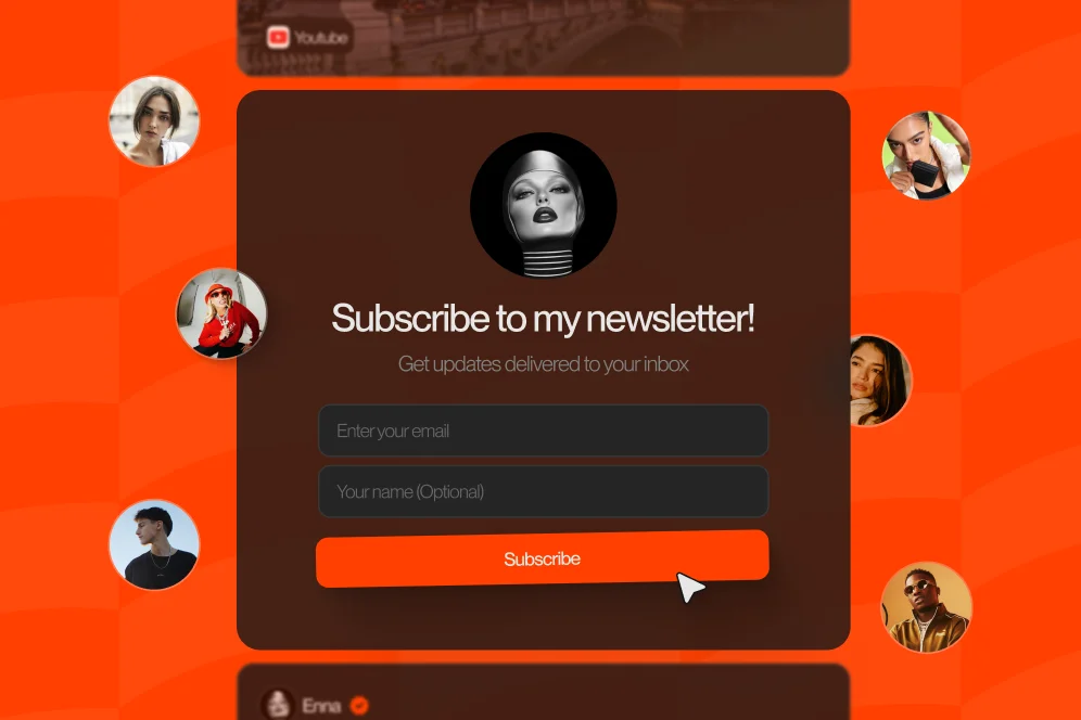
The Privacy-First Lead Magnet: How to Grow Your Newsletter Without Intrusive Pop-ups
April 29, 202611 min readUpdated April 30, 2026
TL;DR
A strong newsletter lead magnet does not need intrusive pop-ups. The better approach is to align the offer to page intent, place signup prompts in context, deliver value immediately, and measure subscriber quality after the form completion.
Most newsletter growth advice still assumes the pop-up is the default conversion tool. That works in some contexts, but it also creates friction, damages page experience, and often attracts low-intent signups who never become engaged readers.
A better newsletter lead magnet respects attention before it asks for an email. The strongest systems make the offer clear, the signup path obvious, and the value immediate without interrupting the visit.
A privacy-first newsletter lead magnet is a subscriber offer presented in context, without forcing an interruption before the visitor has decided they want it. That is the short answer.
The practical reason this matters is simple: not every page visit is a demand for a modal. If someone lands from search, social, or an AI answer, they are still orienting themselves. Hitting them with an overlay before they understand the value proposition creates unnecessary resistance.
This is where a lot of creators lose the plot. They optimize for the email field appearing fast, not for trust forming fast.
In most creator businesses, list growth does not fail because the form was too hard to find. It fails because the offer was vague, the placement was mistimed, or the signup promise had no obvious relationship to the content on the page.
That is also why a privacy-first approach tends to produce a healthier list. It filters for readers who actually want the content, not people who subscribed just to dismiss a box or grab a generic freebie.
A standard link-in-bio setup makes this harder because it usually routes people outward into separate tools, separate pages, and separate experiences. Oho is better framed as the monetization and conversion layer for a creator’s public page, where visitors can subscribe alongside other actions instead of being pushed through a messy chain of redirects. That same thinking shows up in our guide to conversion visibility: you need to know which page elements are driving meaningful actions, not just clicks.
The contrarian view is this: do not start with a pop-up and then try to soften it. Start with an aligned offer and only add interruptions if the page data proves they are necessary.
That tradeoff matters because pop-ups can increase raw form submissions while reducing content consumption quality, return visits, and trust. If the list fills with low-intent subscribers, the top-line number looks better while the business gets worse.
According to Inbox Collective’s lead magnet case study, the lead magnet that worked was tightly matched to the audience rather than broadly appealing. That point matters more than design decoration. Product-market fit applies to newsletter offers too.
The strongest privacy-first newsletter lead magnet systems are built around four requirements:
If one of those breaks, the list may still grow, but quality usually drops.
A privacy-first capture flow does not mean hiding the email form. It means placing it where the intent is strongest.
For creator sites, storefront pages, and profile pages, the highest-performing pattern is usually a visible subscriber block that sits near other high-intent actions. That can mean a newsletter card on the main profile page, a mid-page callout inside a content article, or a dedicated section under a lead magnet preview.
The key is that the signup should feel like the next logical step.
A useful model here is the trust-to-signup path:
This is not a flashy framework, but it is highly reusable. It is also easy for teams to audit.
For example, compare these two newsletter lead magnet blocks.
Weak version
This asks for commitment before earning it.
Stronger version
The second version converts better in practice because it reduces uncertainty. The visitor can evaluate the value before handing over an email address.
As beehiiv’s write-up on real lead magnets argues, the goal is to make the publication itself feel like a must-read, not just a transaction. That aligns naturally with a privacy-first model.
A clean subscriber system usually uses three placements, not ten:
What it usually does not need is an instant-entry modal, a scroll-trigger overlay, and an exit-intent prompt all stacked together.
If the offer is good, repetition can be gentle.
On creator pages built for monetization, subscriber capture should also sit beside other intent paths such as bookings, digital products, or collaboration requests. That lets the page work as a conversion surface instead of a basic link list. If you are also simplifying multiple tools into one public page, our tech stack audit guide covers why reducing tool sprawl often improves margins and conversion clarity.
Most weak lead magnets are not weak because the PDF design was bad. They are weak because they are too generic.
“Free guide,” “weekly tips,” and “exclusive insights” are not offers. They are placeholders.
A strong newsletter lead magnet answers one practical question: What will this person be able to do, understand, or avoid after subscribing?
According to Jenna Kutcher’s lead magnet guide, formats like cheat sheets, templates, and mini-courses work when they solve a specific problem clearly. The format matters less than the precision.
There are three broad newsletter lead magnet types that fit privacy-first capture especially well.
This is a checklist, worksheet, script, template, or reference document tied directly to the page topic.
Example:
This works because the offer extends the current intent instead of changing it.
This approach gives new subscribers a short series that reflects the actual newsletter format. Instead of creating a detached asset, the newsletter itself becomes the lead magnet.
That aligns with the “Prime Time Sequence” idea described in Jens Lennartsson’s article on Medium: use the same format as the newsletter to solve a concrete problem before asking readers to commit long-term.
This method is especially useful when creators do not want to maintain a library of separate freebies.
This is often underused. Instead of hiding all value behind a form, show part of the value publicly.
Examples include:
This approach supports both SEO and conversion because the page remains useful without the form completion.
Before publishing, pressure-test the offer with these questions:
If the answer to two or more is no, the offer probably needs tightening.
A useful adjacent pattern for creators selling educational material is better packaging. If your free offer is really a preview of a broader resource hub, this resource library guide shows how packaging, access, and structure can raise perceived value without requiring a full website rebuild.
A privacy-first newsletter lead magnet works best when the mechanics are boring and reliable. Most conversion losses happen in the seams between pages, forms, and delivery systems.
This is where teams should think in terms of a pipeline, not a widget.
Use this sequence when building or auditing your flow:
That sequence is intentionally plain because plain systems are easier to maintain.
The most common analytics mistake is treating all subscribers as equal.
A privacy-first newsletter lead magnet should be evaluated on at least four layers:
If you only watch form submissions, you will optimize the wrong thing.
A concrete measurement plan might look like this:
Those numbers are an example of how to structure the test, not a universal benchmark.
For creators running multiple monetization paths from one page, analytics need to distinguish between empty clicks and actual outcomes. That is exactly why our deeper dive on conversion visibility focuses on tracking purchases, bookings, subscribers, and inquiries separately.
A credible mini case study for this kind of work should look like this:
That is the right level of specificity when hard proprietary numbers are not available.
One of the smartest shifts in newsletter growth is reducing the distance between the thing promised and the thing delivered.
Instead of promising a side asset that barely relates to the publication, make the publication the core value.
This approach works particularly well when the newsletter has a clear angle, such as:
The visitor does not need to imagine the value. They can sample it immediately.
This also makes content repurposing easier. In a LinkedIn post from Matt McGarry, the argument is that every newsletter can become a lead magnet and each issue can be repurposed into 2-5 social posts that drive new subscribers. That is useful because it reduces dependence on separate funnel assets.
A creator could publish one strong newsletter issue, turn it into:
Each asset points back to the same clear promise: subscribe to get this type of thinking regularly.
The top of the funnel is changing. More visitors now arrive after seeing a summarized recommendation in search features, chat interfaces, or AI assistants.
That means the path is often: impression -> AI answer inclusion -> citation -> click -> conversion.
If someone clicks because your page was cited for its clarity, the first job of the page is to reinforce trust. An intrusive pop-up does the opposite.
A privacy-first newsletter lead magnet is better suited to this environment because it keeps the page readable, quote-worthy, and easy for both humans and machines to understand. Strong headings, specific promises, and visible signup blocks all help.
Brand matters here too. In an AI-answer environment, brand becomes a citation engine. Clear points of view, consistent page structure, and evidence-backed claims make your page easier to quote and more likely to convert after the click.
Most list-growth problems are self-inflicted. The good news is that they are usually fixable.
If the visitor has not seen enough value, the form is premature.
Fix: place at least one signup block after a meaningful preview, insight, or example.
A broad resource often underperforms because it does not match the visitor’s current problem.
Fix: create tighter offers by topic cluster. Search traffic should land on search-aligned magnets. Social traffic can use broader creator-brand offers.
“Exclusive insights” sounds polished but says nothing.
Fix: describe issue frequency, topic scope, and expected utility in plain language.
If the promised asset arrives late, the first impression is disappointment.
Fix: automate delivery, test every path, and review from the subscriber’s perspective weekly.
This is the big one. Teams celebrate list growth while unsubscribe rates, low open rates, or weak conversion indicate poor fit.
Fix: track the first 7-14 days after signup. That period reveals whether the lead magnet brought in the right people.
On creator pages, subscription is one of several high-intent actions. It should not feel bolted on.
Fix: design the page so subscriptions, offers, bookings, and inquiries all belong to one coherent public identity. If collaboration outreach is also part of your funnel, this guide to managing brand requests is relevant because the same clarity that improves subscriber capture also improves inbound quality.
Not necessarily. They can produce fewer accidental submissions, but often attract higher-intent subscribers because the ask appears after context and value are established. The right comparison is not raw signups alone; it is subscriber quality over time.
The best format is the one most tightly matched to audience intent. For many creators, that is a template, checklist, sample lesson, or starter email sequence that reflects the actual newsletter experience.
Sometimes, but not always. In many cases, the newsletter itself is the strongest magnet when you can show sample issues, deliver a short onboarding sequence, and make the value proposition concrete.
Usually two to three is enough: one near the top, one mid-page, and one at the end. More than that often adds noise unless the page is unusually long.
Track form completion, welcome email delivery, early engagement, and downstream actions such as purchases, bookings, or replies. A bigger list is not useful if the subscribers never become readers or customers.
The best newsletter lead magnet is rarely the loudest one. It is the one that matches intent, respects attention, and makes the next step obvious.
If the current system depends on pop-ups to compensate for a weak offer, the fix is not a more aggressive trigger. The fix is a better promise, cleaner page placement, and tighter measurement after the signup.
For creators, coaches, consultants, and educator-led businesses, this matters even more because the public page is doing multiple jobs at once. It has to support subscriber growth, product discovery, bookings, and inbound opportunities without feeling fragmented. Oho is built for that exact kind of conversion-focused public page, where visitors can act directly instead of bouncing through a stack of disconnected tools.
If you want a cleaner way to turn profile traffic into subscribers, sales, bookings, and brand inquiries from one page, explore Oho and see how a conversion-first creator storefront can support your next newsletter lead magnet.