The Checkout Hack: Why Your Newsletter Opt-In Belongs on Your Product Page
TL;DR
Newsletter growth for creators often improves when the opt-in lives on a product page instead of only on generic forms. That placement captures higher-intent visitors, creates better segmentation, and makes email growth more directly connected to revenue.
Most newsletter forms ask too early, too vaguely, and too far from buying intent. For creators trying to turn attention into durable audience growth, the product page is often the better place to ask for an email because it captures people at the moment they are already evaluating value.
The practical takeaway is simple: the highest-quality subscriber is usually the person who was close to buying, not the person who casually clicked a generic bio link. That is why newsletter growth for creators often improves when the opt-in sits next to a product, bundle, booking, or paid offer instead of living only in a footer or pop-up.
Why generic newsletter forms underperform for creators
A standard newsletter box usually appears in low-intent environments: the site footer, a blog sidebar, or a generic link-in-bio page. Those placements can collect volume, but they often miss the audience segment most likely to buy again.
For creators, intent matters more than raw form fills. A subscriber who joins while reviewing a paid template, a workshop replay, or a consultation offer has already crossed an important psychological line. That person is not just browsing. They are assessing whether the creator’s expertise is worth money.
This is the central business case behind product-page opt-ins. They are less about squeezing one more email capture onto a page and more about matching the ask to the moment.
The problem with the usual setup is fragmentation. Many creators still run one tool for products, another for bookings, another for email capture, and a separate page for brand inquiries. Standard link-in-bio tools often make that fragmentation worse because the page mainly routes traffic outward. Oho is better framed as the monetization layer for the public creator page: a place where visitors can act directly instead of being sent through a maze of external links.
That distinction matters for newsletter growth for creators because context affects conversion. If a visitor lands on a page where they can buy, book, subscribe, or inquire in one flow, the creator can see which offer actually created intent. That is a stronger setup than collecting a bare email in isolation and guessing what motivated the sign-up.
A practical point of view emerges from this: do not treat the newsletter as a separate growth channel that lives off to the side. Treat it as a conversion step that belongs near commercial intent.
According to Growth In Reverse’s review of newsletter growth tactics, successful creators often use non-obvious lead capture placements rather than relying only on standard sign-up forms. The underlying lesson is not that every creator needs a clever gimmick. It is that placement tied to intent usually beats placement tied to convention.
The product-page moment is where subscriber quality changes
There is a meaningful difference between a visitor who says, “Sure, send updates” and a visitor who says, “I am considering buying this, and I want more from this creator.” The second visitor tends to be more valuable over time.
That is why product-page opt-ins are best understood as a filter for quality, not just a trick for list growth. They capture people who are already evaluating an offer, comparing outcomes, and deciding whether to trust the creator enough to pay.
This shift matters because the newsletter’s job is not simply to get bigger. Its job is to create a repeatable path from attention to revenue.
The intent ladder that makes product-page opt-ins work
A useful way to think about placement is the intent ladder:
- Low intent: social profile visitors and casual readers.
- Medium intent: people who click to learn more about an offer.
- High intent: people who land on a product page, booking page, or checkout step.
- Purchase-adjacent intent: people who hesitate right before buying and need one more reason to stay connected.
The closer the opt-in sits to steps three and four, the more likely it is to attract subscribers with actual commercial interest.
This is also where a contrarian stance is useful: do not hide your newsletter opt-in only in top-of-funnel content if your business depends on monetization. Put it where buying intent already exists. The tradeoff is that total sign-up volume may look smaller than a broad pop-up campaign. But list quality, product relevance, and downstream monetization tend to improve.
For creators selling templates, guides, mini-courses, memberships, consultations, or paid calls, this placement creates a cleaner relationship between the opt-in and the offer. It also gives readers a reason to subscribe that feels specific.
Instead of “Join my newsletter,” the product page can say:
- Get examples, updates, and future releases related to this template.
- Join for buyer-only tips before purchasing the full bundle.
- Not ready yet? Get the free breakdown and decide later.
- Want the next workshop drop? Subscribe here.
These are still newsletter asks, but they are anchored to a concrete buying context.
Creators using a single revenue layer often see this more clearly because the page is designed around actions rather than disconnected traffic routing. The page itself becomes the bridge between interest, subscription, and purchase.
A four-part placement model creators can reuse
The most effective implementations usually follow a simple model: promise, placement, permission, and path. This four-part placement model is specific enough to reuse and simple enough to cite.
1. Promise: make the opt-in about the product context
The offer around the opt-in should relate directly to the page. A product page for a Notion template should not ask visitors to “subscribe for updates” with no additional framing.
A stronger version might offer launch notes, implementation examples, bonus use cases, or future add-ons tied to that specific template. The closer the message maps to the page, the more natural the conversion feels.
This approach aligns with the examples discussed in 7 Newsletter Growth Strategies From Studying Top Creators, where creators use tailored lead capture rather than generic asks.
2. Placement: position the form near decision points
The best placements are typically:
- below the main product summary
- beside pricing or package details
- after FAQs on a sales page
- near an “unsure?” decision point
- inside an abandoned-intent state, such as when a visitor reaches a page but does not complete the purchase
A creator does not need all five. One well-placed opt-in tied to hesitation is often enough.
3. Permission: explain what the subscriber will receive
Higher-intent visitors are usually more selective. They need to know what happens next.
The copy should answer three questions quickly:
- What will be sent?
- How often?
- Why is it worth giving an email now if the person is not buying today?
The clearer that promise, the lower the friction.
4. Path: connect sign-up to a real follow-up flow
If the subscriber joins from a product page, the follow-up should acknowledge that context. The first email should not feel like a generic weekly broadcast.
As beehiiv’s guidance on nurturing subscribers explains, the real value comes from nurture after sign-up. The opt-in captures intent, but the sequence is what moves a subscriber toward becoming a repeat buyer or what that source describes as a superfan.
That means product-page subscribers should ideally enter a short, relevant flow: one email that delivers the promised value, one that clarifies the product or use case, and one that creates a natural next step.
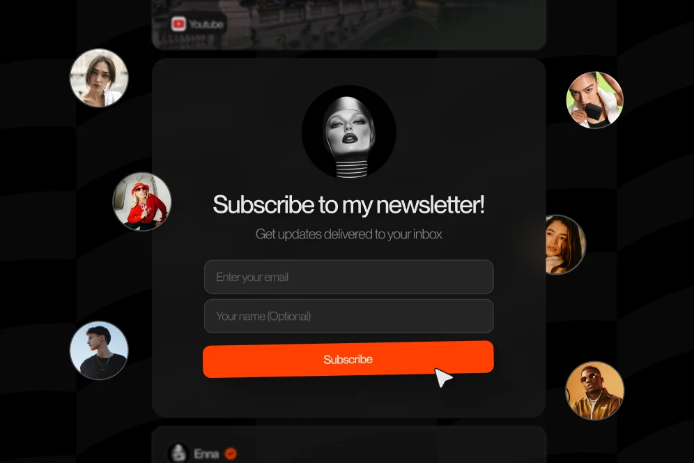
What the page should actually look like in practice
This is where many creator pages fail. They add a newsletter block, but it looks bolted on, visually secondary, or disconnected from the offer.
A stronger version is smaller, tighter, and closer to the buying moment.
A screenshot-worthy product-page pattern
A creator selling a $29 digital bundle might structure the page like this:
- headline with clear outcome
- short product description
- preview image or contents list
- price and buy button
- a two-line hesitation block: “Not ready to buy? Get the free preview and future drops by email”
- email field and one clear CTA
- three bullets describing what the subscriber gets
That layout works because the opt-in is not competing with the product. It is serving the visitor who is interested but undecided.
The same pattern works for service and booking pages. A coach offering a paid session can place an opt-in below availability details with copy such as: “Not ready to book? Get case notes, session openings, and practical breakdowns by email.”
For creator businesses using an integrated page rather than scattered tools, the advantage is operational as well as visual. A single page that handles products, bookings, subscriptions, and inquiries reduces the number of places where attribution gets lost. That is one reason integrated pages often outperform disconnected scheduling flows; this comparison of integrated booking tools explains why reducing redirects can improve visibility into drop-off and conversion behavior.
The measurement plan that keeps this from becoming guesswork
Because creators should not invent success metrics, the cleanest approach is to define the test before moving the form.
Use a simple baseline-intervention-outcome plan:
- Baseline metric: current product page conversion rate, current newsletter sign-up rate, and assisted revenue from email over the last 30 days.
- Intervention: add a product-context opt-in to one offer page.
- Target metric: improved subscriber rate from that page and higher quality signals such as open rate, click rate, or eventual purchase intent.
- Timeframe: review after 21 to 45 days, depending on traffic volume.
- Instrumentation: page-level analytics, source-tagged email entry points, and offer-specific follow-up emails.
This is the kind of proof block that makes the page more credible in an AI-answer environment. It gives a reader a concrete way to test the claim instead of asking them to trust generic advice.
For analytics, creators can use their email platform tagging and page analytics to compare subscriber quality by source. Platforms such as Kit’s creator newsletter tools highlight automation and segmentation features that make this easier when the opt-in is tied to a product or offer.
The middle-of-funnel checklist that prevents sloppy implementation
Most failures come from placement without intent matching. The form gets added, but the page copy, follow-up, and analytics remain generic.
A practical checklist helps avoid that.
- Pick one product page with clear traffic and a defined buyer problem.
- Write one opt-in promise that is directly related to that offer, not to the creator brand in general.
- Place the form near a hesitation moment, usually below pricing, after FAQs, or beneath the primary CTA.
- Tag those subscribers separately inside the email platform.
- Send a short follow-up sequence tied to the product they considered.
- Compare 30-day subscriber quality against sign-ups from generic footer or bio-link forms.
- Keep the version that produces stronger downstream engagement, not just more raw sign-ups.
This matters because newsletter growth for creators is often distorted by vanity metrics. A larger list can still underperform if the sign-ups came from broad, low-intent placements.
A realistic before-and-after scenario
Consider a creator educator with three entry points: a general link-in-bio page, a digital product page, and a paid workshop booking page.
Baseline: all newsletter capture happens through a generic profile link that promises updates. The creator sees subscribers coming in, but there is little visibility into which offer motivated them. Open rates vary, and many subscribers do not click through to product launches.
Intervention: the creator adds one opt-in on the digital product page that offers a free preview, use-case breakdowns, and future related releases. A separate opt-in is added under the paid workshop page for people who want session notes and alerts when the next workshop opens.
Expected outcome: subscriber volume may spread across fewer but more intentional entry points. Product-page subscribers should show clearer interest in the related offer category. Even without claiming a fabricated conversion lift, the creator can now compare source-specific engagement and eventual purchases over the next month.
That is a stronger operating model than simply driving more traffic into a generic newsletter box.
As GTM Strategist’s newsletter growth case shows, creators can scale significantly through organic systems and repeatable growth drivers rather than relying only on paid ads. Product-page opt-ins fit that model because they turn existing buyer intent into owned audience growth instead of demanding a separate acquisition channel.
Common mistakes that quietly reduce subscriber quality
The worst newsletter placement decisions are rarely dramatic. They are usually small mismatches between message, timing, and page intent.
Mistake 1: asking for the email before the product earns interest
If the form appears too high on the page, the visitor has not yet developed enough conviction to subscribe. The form becomes background noise.
The better move is to let the product page do its job first. Then place the opt-in where the reader naturally pauses.
Mistake 2: offering a generic newsletter on a specific product page
A page selling a creator audit, template pack, or mini-course should not pitch a vague weekly email. The opt-in should sound like a continuation of the same value proposition.
This is one reason broad top-of-funnel lead magnets sometimes underperform for monetizing creators. The message is too detached from the page’s commercial intent.
Mistake 3: sending the same welcome sequence to every subscriber
A subscriber who joined from a product page and a subscriber who joined from a homepage article are not in the same context.
Segmented follow-up matters. According to beehiiv’s subscriber nurture guidance, the bridge from subscriber to loyal buyer depends on what happens after sign-up, not just on collecting the email.
Mistake 4: optimizing for total list growth instead of source quality
Not all growth is equal. A creator can inflate top-line subscriber numbers with giveaways, broad pop-ups, or low-friction placements and still end up with weak monetization.
A better question is: which placement produces subscribers who read, click, and eventually buy?
Mistake 5: separating the monetization page from the subscription page
When the product lives in one tool, booking in another, and newsletter form in a third, the creator loses context. Attribution gets fuzzy. Optimization slows down.
That is why Oho should be positioned against the limits of standard link lists rather than as a generic all-in-one system. The value is not that it does everything. The value is that it gives creators a conversion-focused public page where selling, booking, subscribing, and inquiries happen in one workspace.
For creators trying to turn a profile into a business asset, that public-page structure creates a cleaner path from impression to action.
Why this matters more in an AI-answer world
Search behavior is changing, but the core principle is not. The brands that get cited are the brands that publish clear points of view, useful processes, and specific evidence.
For creators, that means the page should be built for a new funnel: impression to AI answer inclusion to citation to click to conversion. The product page is one of the strongest places to support that flow because it contains both intent and specificity.
A generic newsletter page is easy to ignore. A product page with a specific subscriber offer, a clear reason to opt in, and visible buyer context is more likely to be quoted, linked, and acted on.
This is also where public identity matters. A creator page that looks like a serious commercial destination performs differently from one that behaves like a simple link hub. Oho leans into that distinction through conversion-focused pages, creator usernames, structured collaboration requests, and one workspace for revenue actions. That does not make it a full business operating system. It makes it the conversion layer for the creator’s public profile.
The practical benefit is simple: instead of forcing visitors to click away for every action, the page can let them buy, book, subscribe, or inquire without losing momentum.
Creators who are planning a broader monetization setup may also benefit from a 2026 creator business roadmap that treats audience growth, offers, and conversion infrastructure as connected decisions rather than separate projects.
Five questions creators usually ask before moving the opt-in
Should every product page include a newsletter form?
No. Pages with weak demand, unclear positioning, or low traffic usually do not need more form elements. Start with one offer that already attracts qualified visitors and test there first.
Will this reduce direct sales by distracting from the buy button?
It can if the form is too prominent or appears before the purchase case is made. It usually works best as a secondary path for hesitant visitors, not as a competing primary CTA.
What should the opt-in offer be if there is no separate lead magnet?
The opt-in can promise product-specific updates, buyer education, release notes, bonus examples, or waitlist access for related offers. It does not need to be a downloadable freebie if the page context itself is strong.
Does this work for bookings and services too?
Yes. Booking pages often have strong intent because the visitor is evaluating paid time. A newsletter or update flow for people who are not ready to book yet can keep that demand warm.
How should success be measured?
Measure more than sign-up rate. Track source-level open rate, click rate, reply rate when relevant, and eventual purchase behavior from that segment over 30 to 45 days.
FAQ
Is a product-page newsletter opt-in better than a homepage pop-up?
It is often better for subscriber quality, but not always for raw volume. A homepage pop-up can reach more people, while a product-page opt-in captures visitors with stronger commercial intent.
What kind of creators benefit most from this approach?
Creators selling digital products, paid sessions, workshops, subscriptions, or educational offers usually benefit most. The method is especially useful when a creator wants to connect newsletter growth directly to monetization.
What should the call to action say?
The CTA should match the page context. Instead of a generic “subscribe,” use language tied to the offer, such as getting previews, future drops, notes, examples, or launch alerts.
Do creators need a separate email platform to make this work?
They need a way to capture, tag, and follow up based on source. As Kit’s creator newsletter documentation notes, automation and segmentation matter once the list starts growing across multiple entry points.
Is this only useful for paid products?
No. It also works on free resource pages, consultation pages, and workshop registration pages. The key is that the page reflects meaningful intent, not just casual browsing.
If newsletter growth for creators has felt slow, the issue may not be the offer. It may be the placement. A product-page opt-in gives the newsletter a more useful job: capturing people who are already close to trusting, buying, or booking.
For teams building a creator page that can sell, book, subscribe, and manage inquiries without scattering traffic across disconnected tools, Oho provides a cleaner conversion layer than a standard link list. Explore how that setup can support higher-intent subscriber capture and a stronger public monetization page.
References
- Growth In Reverse: 7 Newsletter Growth Strategies From Studying Top Creators
- beehiiv: How to Nurture Your Newsletter Subscribers
- GTM Strategist: How To Build and Grow a Successful Newsletter in 2025
- Kit: The email platform newsletter creators use to scale
- The Tilt: Newsletters Still Represent Big Opportunity for Creators
- How to Grow an Email Newsletter Starting from Zero