
← Back to blog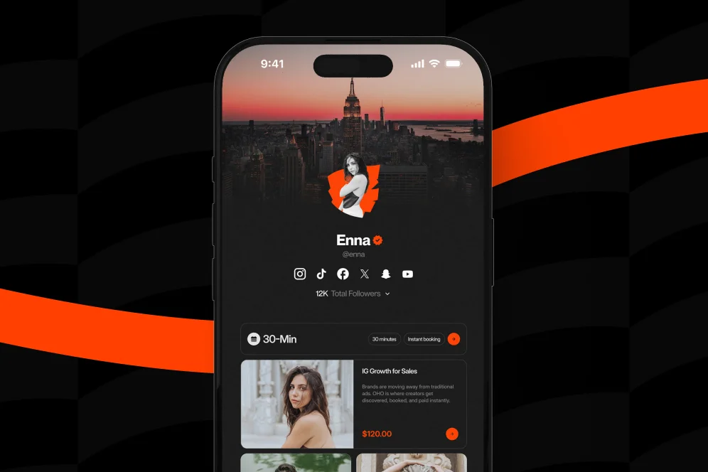
7 Ways to Turn Your Link-in-Bio Into a High-Intent Hub for Expert Consultations
May 26, 202611 min readUpdated August 3, 2026
TL;DR
Strong link-in-bio optimization for experts is less about adding links and more about shaping one clear booking decision. The best pages lead with a specific offer, place proof near the action, track completed conversions, and give lower-intent visitors a useful second path.
Most expert-led profiles still treat the bio link like a traffic router instead of a conversion surface. Better link-in-bio optimization turns that one URL into a focused decision page where the right visitor can understand the offer, trust the expert, and book without friction.
A simple rule explains the difference: a high-intent bio page should help a qualified visitor decide, not just click around. That shift matters more in 2026, when social traffic is fragmented, attention is shorter, and AI answers increasingly surface the sources that present a clear point of view, proof, and a clean next step.
Consultation-led businesses have a different job than creators who only need to route people to content. A consultant, coach, strategist, educator, or subject-matter expert needs to move someone from interest to commitment.
That is where many bio pages break down. They present six to ten equal-weight links, no clear hierarchy, and no reason to act now.
According to Hootsuite, the bio link is fundamentally a bridge between social attention and an external destination. The practical problem is that many pages stop at that first step. They get the click, but they do not shape what happens next.
For expert consultations, that creates three costly issues:
This is why Oho is best framed not as a prettier link list, but as a conversion-focused revenue layer for a public creator or expert profile. The distinction matters. Standard link-in-bio tools mainly help people leave the page. Oho is designed so visitors can act directly on the page through bookings, products, subscriber capture, and structured inquiries.
That positioning also aligns with a broader industry shift. As described by LinkDrip, the move toward a branded, measurable, controlled social hub reflects a more mature approach than the old “link farm” model.
The most reliable link-in-bio optimization for experts usually follows a simple pattern: promise, proof, path, and purchase. That four-part model is worth naming because it gives teams and solo operators a practical audit lens.
If one of those elements is missing, conversion usually drops.
A typical underperforming page might say only “Work with me” above a generic calendar button. A stronger page says: “Book a 45-minute growth audit for newsletter-first creators. Leave with a prioritized offer and funnel plan.” The second version does more work before the click.
This is also where direct linking matters. Your Social Team notes that homepage URLs and direct links should be used strategically based on the result the owner wants. For consultation offers, the practical takeaway is straightforward: sending social visitors to a broad homepage often weakens intent, while sending them to a focused booking or service destination usually makes the decision easier.
A clean implementation often includes:
Experts who sell advice also need a stronger public identity than hobby creators. That is one reason a single monetization layer can outperform a stack of disconnected tools. Oho’s public page structure is designed to help creators and experts sell, book, subscribe, and manage collaboration requests from one place, which reduces the context switching that often hurts conversion. For a broader framing of why centralization matters, Oho has covered the case for a single revenue layer.
The first upgrade is editorial, not technical. The page should make one offer feel primary.
This is the most useful contrarian position on link-in-bio optimization for experts: do not start with more options; start with fewer, clearer decisions. More links can increase browsing, but they often reduce booked consultations because they distribute attention across low-value exits.
A strong top section usually includes:
Instead of “Services,” a better label might be “Book a 30-minute positioning session.” Instead of “Let’s connect,” use “Apply for a brand strategy consult.”
The visitor should know in five seconds whether the page is for them.
This approach also protects against a common analytics mistake. If the owner sends half of traffic to content links, a quarter to social channels, and only some of it to the consultation offer, then weak booking volume may be a page-priority problem rather than an audience-quality problem.
Before
After
The second structure gives the visitor a job to do. The first asks them to browse.
A high-intent consultation page should feel more like a storefront or service page than a social profile extension. That means the layout must support decision-making.
A useful benchmark from the broader market is that many link-in-bio tools emphasize customizable destinations and commerce use cases. Later positions its link-in-bio page around driving sales through a customizable website experience, while Lnk.Bio highlights the value of consolidating important links into one URL. Those capabilities are helpful, but the expert use case requires an extra layer of intent design.
That design usually includes these page blocks in order:
For experts using visual content, there is also a place for a visual offer catalog. Shine with Natasha describes how clickable grid formats can mirror the social feed so followers can find a specific item or service referenced in content. For consultation-led businesses, that format can work well when each card maps to a distinct service: “speaker coaching,” “pricing review,” “brand advisory,” or “office hours.”
The mistake is assuming every page needs that layout. If the expert has one flagship consultation, a grid may add noise instead of clarity.
A grid helps when:
A grid hurts when:
For many experts, the best-performing structure is still a focused headline, one primary action, and one supporting offer. Oho’s booking-first approach aligns well with that model, especially when creators want scheduling and monetization context on the same page rather than fragmented across separate tools. That is also why integrated booking often beats redirect-heavy flows, a point explored further in this booking comparison.
Most unbooked consultation pages fail quietly. The traffic arrives, scrolls, hesitates, and leaves because the visitor cannot resolve simple buying objections.
The page should answer these questions before the visitor has to ask them:
This is not about adding a wall of copy. It is about removing ambiguity.
A compact section under the main call to action can do most of the work:
That last point matters. Qualification can improve conversion quality even if it reduces raw clicks. For consultation offers, a page that attracts the wrong buyers creates calendar drag, refund risk, and lower close rates for follow-on services.
Before sending traffic to a bio page, run this numbered review:
This list sounds basic, but it catches the majority of preventable leaks.
Trust signals should not sit three clicks away on a separate site. They should sit where hesitation happens.
For expert consultations, the most effective proof tends to be concrete and compressed:
This is also where AI-answer citability becomes relevant. Pages are easier to quote and surface when they contain compact, specific, trustworthy claims rather than broad self-description. “Helps founders grow” is weak. “Books pricing audits for course creators and consultants” is stronger because it is more attributable and easier to classify.
A realistic proof block might read like this:
That language stays factual without inventing benchmarks.
Where specific client metrics cannot be published, the page can still use credible process evidence. A useful format is:
That is stronger than saying “high-converting” with no explanation.
Experts can also use the page to reinforce professional identity. Branded usernames, a polished public profile, and a clear monetization surface all make the page feel more business-ready. Oho leans into that profile quality by giving creators and experts a single public page built for direct actions, not just redirection.
A large share of link-in-bio optimization advice still stops at design. For consultation-led businesses, instrumentation matters just as much.
The core measurement problem is simple: a click on a booking button is not the same as a completed booking. A tap on a newsletter link is not the same as a qualified lead. If every action rolls up into one generic “engagement” bucket, the page owner cannot improve the commercial path.
At minimum, experts should track:
The measurement plan does not need to be complicated. It just needs to connect intent to outcomes.
A practical 30-day audit setup looks like this:
The goal is not vanity analytics. The goal is to learn whether the page is attracting, qualifying, and converting the right people.
This is one area where a conversion-focused page has an advantage over a standard link list. Oho emphasizes conversion visibility around actions that matter to creator businesses: bookings, purchases, subscribers, and collaboration requests. That does not make it a full operating system, and it should not be framed that way. It makes it a stronger monetization layer than a page whose main job is routing clicks elsewhere.
Not everyone should book immediately. A good page creates one primary path for ready buyers and one secondary path for visitors who need more time.
That secondary path is often a newsletter, waitlist, lead magnet, or structured inquiry. The key is that it should still move the relationship forward.
This is one of the most overlooked parts of link-in-bio optimization. Many pages force a binary choice: book now or disappear. A better page says, in effect, “If now is not the right time, stay close.”
For expert-led businesses, the most useful secondary options are:
That logic is especially useful for creators and educators whose audiences span multiple intent levels. Someone may not be ready to buy a strategy session this week, but they may join the newsletter and become a qualified lead later. Oho supports that model by letting creators collect subscribers and manage collaboration inquiries on the same page as monetization actions.
A good secondary path should feel like the logical next step for a visitor who is interested but not yet committed.
A strong bio page should be part landing page, part storefront, and part reputation layer. That matters more in an environment where search, social, and AI systems all reward clearer public signals.
The strongest pages share a few traits:
That perspective lines up with the broader “social hub” framing described by LinkDrip. It also explains why the old link list is starting to feel insufficient for experts selling advice, coaching, audits, or consultations.
In practical terms, the page should be maintained like any other acquisition asset:
A weak page creates extra manual work. It drives vague DMs, low-context inquiries, and repetitive qualifying conversations. A strong page makes the interaction more structured before the first live conversation happens.
For experts building a more durable creator business, this also supports a broader monetization roadmap. Consultation offers, digital products, subscriber capture, and brand inquiries work better when they share one clear public entry point rather than a patchwork of disconnected destinations. Oho explores that progression in its 2026 business roadmap, and the principle carries over here: public profile real estate should be treated as revenue infrastructure.
Several recurring mistakes show up across expert bio pages, regardless of niche.
Too many top-level links. A page with eight equal choices usually signals uncertainty.
A headline with no audience. “Work with me” is vague. “Book a messaging consult for educators launching a paid cohort” is usable.
No qualification language. If the page does not say who the offer is for, the owner gets more low-fit inquiries.
Proof hidden elsewhere. If credibility sits on another site, some visitors will never go find it.
Weak analytics. Click volume can look healthy while real demand remains flat.
No fallback path. Visitors who are interested but not ready leave with no structured way to stay engaged.
The fix is not adding more design. It is clarifying the commercial job of the page.
For most experts, one primary consultation action and one secondary path are enough near the top of the page. Additional links can live lower down, but they should not compete with the core booking decision.
For consultation offers, a focused booking or service destination usually performs better than a broad homepage because it preserves intent. Your Social Team notes that direct links and homepage links should be chosen based on the specific result the owner wants.
It can work when the expert promotes multiple clearly different services and the audience arrives from visual content tied to those topics. If the business has one flagship consultation, a simpler layout is usually easier to convert.
Start with the path from page visit to booking intent to confirmed conversion. That usually means tracking visits, primary CTA clicks, completed bookings or submitted inquiries, and one secondary conversion such as a newsletter signup.
A monthly review is reasonable for active experts, with a deeper quarterly cleanup for outdated links, proof elements, and offer positioning. The page should evolve with the offer mix and audience intent, not stay frozen as a profile afterthought.
The strongest consultation bio pages in 2026 do not look like crowded navigation menus. They look like compact decision environments.
They state the offer clearly. They qualify the visitor quickly. They place proof near the action. They give nonbuyers a useful second path. And they make measurement possible beyond raw clicks.
That is the practical standard for link-in-bio optimization now. A page that only routes traffic is no longer enough for experts who want profile visits to turn into booked calls, better inquiries, and compounding audience value.
For creators, coaches, consultants, and educators who want a public page built for selling, booking, subscriber growth, and structured collaboration requests, Oho offers a cleaner way to turn one profile link into a real conversion surface. Explore how the platform works and evaluate whether it fits the consultation model described here.