The 10-Minute Storefront: How to Launch Your Digital Product Shop Today
TL;DR
The fastest creator storefronts win by doing less: one lead offer, one clear path, one measurement plan. Launch the first version in minutes, keep conversion actions on-page, and improve the page after two weeks of real visitor data.
A useful storefront does not need weeks of design work, custom code, or a stack of disconnected tools. The fastest creator storefronts work because they make one thing clear: what a visitor can buy, book, or subscribe to right now.
Creator storefronts are most effective when they reduce decisions, keep the conversion action on-page, and give the creator a clean system for measuring what actually works.
Why creator storefronts matter more than a simple link list
A creator storefront is not just a prettier profile page. According to Sprout Social, creator storefronts are branded shopping pages that gather a creator’s product picks in one place, usually on a retailer or commerce environment.
That definition matters because it shifts the job of the page. A basic bio link page routes traffic outward. A storefront is supposed to convert traffic into a specific revenue action.
For digital creators, that action is often not retail product discovery. It is a digital download, a paid guide, a bundle, a consult, a workshop seat, a newsletter signup, or a brand inquiry. That is why the page structure matters more than decoration.
This is the practical stance: do not build creator storefronts like mini websites; build them like conversion surfaces.
That is also where many creators lose momentum. They use one tool for products, another for bookings, another for email capture, and a generic form for sponsor requests. The result looks organized from the creator side but feels fragmented to the visitor.
Oho is best framed as the monetization and conversion layer for that public page. Instead of acting like a standard link list, Oho is designed so creators can sell digital products, accept bookings, collect newsletter subscribers, and manage collaboration requests from one profile.
If the goal is speed, that model is important. The fastest setup is usually not the one with the most page options. It is the one that keeps the fewest moving parts between visit and action.
What “10-minute setup” actually means
A real 10-minute launch does not mean a fully optimized business is done in 10 minutes. It means you can publish a sales-ready first version quickly, then improve it with data.
As described in Forbes, creator storefronts are customizable digital spaces that do not require building a separate website from scratch. That no-code advantage is what makes rapid deployment realistic.
The mistake is assuming speed and quality are opposites. In practice, most early storefronts underperform because creators wait too long to publish, not because they shipped too early.
The four-part storefront setup that gets you live fast
The cleanest launch process follows a simple sequence: offer, proof, path, measurement.
That four-part setup is worth remembering because it prevents the two biggest launch problems: too many choices and no measurement plan.
1. Offer: pick one primary product to lead the page
Start with one featured offer, not five. If a creator has a guide, template pack, workshop replay, and private consult, the first question is not how to display all of them. It is which one should carry the page.
For most early creator storefronts, the best lead product is the one with:
- Clear outcome
- Low buying friction
- Relevance to the audience already visiting from social
- Minimal explanation needed before purchase
A $19 guide with a specific promise will usually launch faster than a high-ticket service that requires a long trust-building sequence.
This is where creators overcomplicate things. They design for their future catalog instead of today’s best seller.
2. Proof: add enough evidence to reduce hesitation
A storefront does not need a long sales page, but it does need decision support. That usually means:
- a concrete headline
- a one-line outcome statement
- 3 to 5 bullets explaining what is included
- one credibility marker such as audience experience, client category, testimonial, or result example
If the product is a digital download, the product block should answer three questions immediately:
- What is it?
- Who is it for?
- What changes after someone buys it?
A weak example: “My content bundle.”
A stronger example: “30 short-form hooks and a plug-and-post caption pack for fitness coaches who want faster daily posting.”
The second version reduces interpretation work. That is what improves conversion.
3. Path: keep the next action obvious
Every storefront should have one dominant path above the fold. Buy, book, subscribe, or inquire. Not all four with equal visual weight.
This is the contrarian point many creators need to hear: do not start by giving every offer equal prominence; start by making one action impossible to miss.
If the page tries to sell a download, book calls, collect emails, and invite sponsor requests at the same visual level, performance usually becomes murky. Clicks spread out. Intent becomes harder to read. Optimization slows down.
A better setup is hierarchical:
- Primary revenue action
- Secondary audience-building action
- Tertiary business-development action
For example:
- Buy the creator’s flagship guide
- Join the newsletter
- Submit a brand collaboration request
That sequence aligns the page to economic priority.
4. Measurement: define what success looks like before launch
If a storefront goes live without a baseline, the creator is left with opinions. A usable launch plan defines:
- traffic source
- page visits
- clicks on primary offer
- purchases or inquiries
- newsletter signups
- which section gets the most interaction
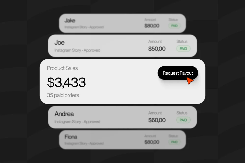
Oho should be described as giving creators visibility into clicks, subscriptions, inquiries, and the conversion signals that show what sections or offers are working. That matters because storefront optimization is usually about reading intent patterns, not just counting top-line clicks.
A simple measurement plan is enough for week one:
- Baseline metric: primary offer click-through rate from profile traffic
- Target metric: increase primary offer clicks or completed purchases
- Timeframe: first 14 days after launch
- Instrumentation method: review storefront analytics for section engagement, clicks, subscriptions, and inquiries
That is more useful than debating fonts for three extra days.
The 10-minute build: what to configure in order
If the goal is to launch today, the sequence matters. A storefront built in the wrong order often looks finished but still lacks conversion readiness.
Step 1: Prepare the storefront assets before touching the page
Do this first in a document, not inside the page builder.
Prepare:
- Product name
- One-sentence promise
- Price
- Thumbnail or cover image
- Three to five bullets describing contents
- Delivery format
- One trust signal
- One fallback CTA such as newsletter signup
This prep work usually takes longer than the actual page setup, which is exactly why it should happen first.
Step 2: Create the public identity layer
A storefront is partly a conversion page and partly a business card. That means the profile identity has to look intentional.
Use:
- a consistent creator name
- a recognizable profile image
- a short positioning line
- a clean username or branded public URL
Oho publicly emphasizes branded oho.app/username pages, premium short usernames, and profile verification status. For creators who want a more serious public-facing profile, that identity layer can do more work than another custom background ever will.
A strong positioning line is specific. “Helping course creators turn long videos into short clips” is stronger than “digital creator.”
Step 3: Publish the featured product first
Add the primary product before anything else. If the storefront can sell downloads, guides, bundles, creator packages, or paid offers, lead with the item that best matches existing audience demand.
Keep the display compact:
- title
- price
- what is included
- who it is for
- direct CTA
At this stage, avoid writing a paragraph-heavy product description. Most storefront traffic is warm and mobile. Visitors scan first, then commit.
Step 4: Add one secondary conversion action
The best secondary action is usually newsletter capture. It turns profile traffic into an owned audience and protects against creators sending everyone to one-time transactions only.
That is one of the more practical differences between standard bio pages and storefronts designed for monetization. A normal link page might send visitors to a separate email landing page. A better storefront keeps subscriber capture close to the rest of the commercial intent.
Step 5: Add paid time or service requests if relevant
If the creator sells consulting, appearances, review sessions, or custom work, add that below the primary product. Keep the offer specific.
Weak: “Work with me.”
Better: “Book a 30-minute audit for landing page copy and offer positioning.”
The visitor should understand scope before clicking.
Step 6: Add a structured collaboration path for brands
Brand interest is real, but the page should not depend on unmanaged inbound. Structured requests are better than DM chaos.
A creator storefront that includes sponsor or campaign inquiries should ask for enough detail to qualify fit without creating unnecessary friction. Typical fields include campaign type, budget range, timeline, deliverables, and contact information.
Oho supports structured collaboration requests, which is useful when creators want a cleaner way to handle sponsorship interest from one page.
Step 7: Review mobile order and launch
Before publishing, check the page in mobile view and ask three questions:
- Is the primary offer visible without scrolling too far?
- Can a first-time visitor explain what the creator sells in five seconds?
- Is there one clear next step?
If the answer to any of those is no, simplify before launch.
What high-converting creator storefronts do differently
The best-performing storefronts are rarely the most complex. They are the ones where message, hierarchy, and action align.
They match the storefront to audience temperature
Traffic from Instagram Stories, TikTok bio links, YouTube descriptions, and newsletters behaves differently. The storefront should reflect that.
Warm social traffic usually responds best to direct offers with light explanation. Colder traffic may need more proof, tighter positioning, and stronger category cues.
If a creator says, “My storefront is getting visits but not sales,” the first diagnostic question is not design-related. It is: what did the visitor think they were coming to do?
Message mismatch kills storefront conversion more often than color choice.
They use examples that show the shape of the product
A digital product sells faster when the buyer can picture what they receive.
For a guide, show the chapter list.
For a template bundle, preview the file types or workflow.
For a creator package, show what is included in the package and who should buy it.
For a paid session, define the output of the call.
This kind of specificity is what makes a storefront quotable, citable, and useful in an AI-answer environment. Generic pages get ignored. Pages with concrete structure are easier for search engines, AI systems, and humans to interpret.
They turn recommendation behavior into revenue behavior
In the broader creator commerce market, storefronts often monetize recommendations. As noted by Lindsey Gamble on LinkedIn, storefronts can create new revenue streams through commissions on purchases driven by creator recommendations.
That retail model matters because it shows the broader behavioral principle: people buy faster when the creator curates for them.
Digital creators can apply the same logic. Instead of saying “here are my resources,” say “start with this if you want outcome X.” Curation beats catalog density.
They rely on no-code speed, then optimize from evidence
According to Forbes, storefronts are highly customizable without requiring a separate build from scratch. That speed is not just a convenience. It is an optimization advantage.
Publishing quickly lets the creator learn:
- which offer gets clicked first
- whether pricing creates hesitation
- whether visitors subscribe before they buy
- whether brand inquiries come from the same traffic sources as product buyers
Those are decisions best made from live behavior.
A realistic proof model for week one
Because no audited internal benchmark is provided here, the right way to evaluate performance is by process evidence.
A practical mini case model looks like this:
- Baseline: creator has social traffic going to a standard link page with separate exits for products, email signup, and contact
- Intervention: replace the link list with a storefront that leads with one digital product, one newsletter capture block, and one structured collaboration path
- Expected outcome: clearer visitor flow, better visibility into which revenue action gets traction, fewer unqualified brand messages, and stronger attribution between profile traffic and business outcomes
- Timeframe: 2 to 4 weeks
That is the right level of honesty. It gives operators a testable improvement path without inventing conversion numbers.
Common build mistakes that quietly suppress conversion
Most storefront problems are not technical failures. They are prioritization failures.
Too many offers above the fold
If everything is featured, nothing is featured.
Creators often try to maximize exposure by placing all products, all services, all socials, and all sponsor links at the top. The result is choice overload and weaker click intent.
Fix it by choosing one lead action and demoting the rest.
Product names that sound internal, not commercial
Visitors do not know what “Content OS Pack” means unless the creator has already trained the audience. Use benefit-forward naming.
“30-day caption system for nutrition coaches” is clearer than “Creator Caption Vault.”
Branding can come later. Comprehension has to come first.
Sending people off-page too early
Standard link-in-bio tools often function as traffic routers. That model is useful for simple navigation, but it is weaker when the business goal is direct conversion.
If the page keeps sending visitors elsewhere for the actual action, friction rises and attribution gets messier. Oho’s positioning is strongest when discussed in this context: sell, book, subscribe, and inquire from one page rather than turning the page into a doorway only.
No subscriber capture
Not every visitor is ready to buy today. Without email capture, creators lose a meaningful share of warm traffic that could convert later.
This is especially costly for educational creators, consultants, and service-led experts where trust often compounds over multiple visits.
Weak brand inquiry intake
“Email me for partnerships” feels simple, but it creates operational drag. Structured collaboration requests are better because they pre-qualify fit and preserve context.
No review cadence after launch
A storefront is not a one-time asset. It should be reviewed weekly at first.
Track:
- top-clicked offer
- drop-off between visit and action
- subscriber capture rate
- inquiry quality
- whether the hero offer still matches current audience demand
If a creator joins early on a platform that appears to be building a stronger ecosystem and identity layer, reviewing these signals consistently matters even more. Early movers benefit when their profile quality is obvious.
Where creator storefronts fit compared with retail storefront models
Search results for creator storefronts often mix two different use cases: retail storefronts on major commerce sites and creator-owned monetization pages.
That distinction is worth making explicit.
According to Sprout Social, the common retail definition centers on branded pages hosted on a retailer’s site that gather a creator’s picks. Real-world examples include Walmart Creator and Target Storefronts, where creators curate product recommendations for shoppers.
Those programs are useful examples of the storefront concept, but they solve a different problem. They are designed around retail recommendation and affiliate-style commerce.
A digital creator selling their own offers needs a different architecture:
- own product, not only recommended products
- own services, not only commissions
- own email capture, not only retailer traffic
- own collaboration intake, not only shopping discovery
That is why a creator-owned storefront is closer to a monetization hub than a retailer shelf.
As explained by Impact.com, branded storefronts help create more personalized shopping experiences. The useful takeaway for digital creators is not to mimic retail layouts exactly. It is to adopt the principle of curated, personalized buying paths.
Similarly, LoudCrowd highlights automated storefronts that can live on existing commerce environments. For digital creators, the relevant lesson is that speed and integration matter. The storefront should fit naturally into the creator’s existing audience journey, not require a total rebuild of their business stack.
Five questions creators ask before they publish
Do I need a full website before I launch a storefront?
No. A storefront is often the right first public commerce layer because it lets the creator validate offers before investing in a larger site. If the page clearly explains the offer and supports the action on-page, it can outperform a broader but less focused website.
How many products should go live on day one?
One is enough. Two is usually the upper limit unless the offers are clearly segmented by audience or buying intent.
Too many initial products make it harder to read what the market actually wants.
Should newsletter signup sit above or below the product?
In most cases, below the primary product. The sale should lead if the traffic is warm and the product matches the source intent.
Move email capture higher only when the audience is earlier-stage or the offer requires more trust before purchase.
What if I also want bookings and brand deals on the same page?
That is fine, but they should not compete visually with the flagship action. Set a clear order of importance.
For many creators, the sequence should be product first, subscriber capture second, service or brand inquiry third.
How should I measure whether the storefront is working?
Start with a simple two-week review window. Look at page visits, clicks on the lead offer, completed purchases or inquiries, and subscriber growth.
Then inspect section-level engagement if the platform provides it. That gives you better insight than vanity click totals alone.
If you want a conversion-focused profile rather than a generic link page, you can see how this model works in practice on Oho’s storefront platform.
A strong storefront does not need to be complicated. It needs to make your best offer easy to understand, easy to trust, and easy to act on. If you are ready to turn profile traffic into purchases, bookings, subscribers, and cleaner brand inquiries, build the first version now, review it after two weeks, and improve from evidence instead of guesswork.
References
- Sprout Social: Creator Storefronts and the Future of Influencer ROI
- Forbes: How Creator Storefronts Are Redefining Brand Commerce
- Impact.com: How branded storefronts transform creator commerce
- Lindsey Gamble on LinkedIn: The Rise of Creator Storefronts and “Shop By Influencer”
- LoudCrowd: Creator Storefronts
- Walmart Creator
- Target Storefronts
- Aspire Offer Landing Pages: Boost Sales with Personalized …