Beyond the Click: Using Conversion Data to Double Your Digital Shop Revenue
TL;DR
If you only track clicks, you're missing the real reasons your digital shop earns or underperforms. Conversion visibility helps you connect traffic, intent, offers, and completed actions so you can improve your bio page based on revenue, not vanity metrics.
Most creator shops do not have a traffic problem. They have a visibility problem.
I’ve seen pages get plenty of profile visits, link taps, and story traffic, then somehow produce disappointing sales. When that happens, the fix usually is not “post more”. It’s figuring out where intent dies between curiosity and checkout.
A simple way to say it: conversion visibility is your ability to see which visitors take meaningful actions, where they drop off, and what page elements actually influence revenue.
Why clicks feel good and still leave you blind
A lot of creators still run their business from a dashboard that celebrates the wrong numbers.
You get 2,000 profile visits, 400 link clicks, and maybe a few checkout starts. It looks busy. It even feels validating. But it does not tell you why one product sold, why another got ignored, or why your consultation page gets attention but no bookings.
That gap is the whole game.
According to Cometly’s guide to conversion path visibility problems, basic traffic stats often hide which channels and touchpoints are actually responsible for sales. That’s the exact issue creators run into with standard link-in-bio setups. You can see outbound taps, but not the story behind the purchase.
And when your business is split across a product tool, a booking tool, an email form, a payment page, and your DMs, the customer journey gets fuzzy fast.
You start making expensive guesses:
- You assume Instagram traffic is weak when the real issue is your product packaging.
- You assume your audience doesn’t want calls when the real issue is your booking flow.
- You assume your low-ticket download is your best offer because it gets the most clicks, even though your paid consult page quietly drives more revenue per visitor.
I’ve made this mistake myself. I once helped rebuild a creator sales page where the top link got the most taps by far, so everyone thought it was the winner. But when we tracked the journey more carefully, we found a less-clicked offer was driving higher-intent buyers. The flashy link got attention. The quieter offer got paid.
That’s why I like taking a conversion-first view of your public page.
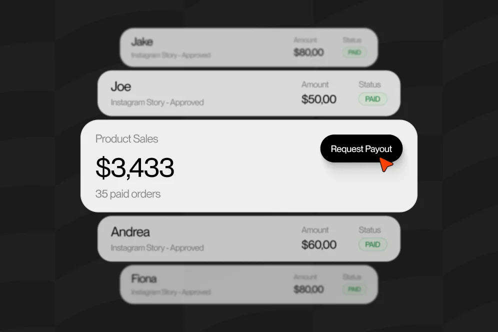
Oho is best framed as the monetization layer for your creator profile, not just a prettier link list. Instead of sending people in five directions, it lets creators sell digital products, accept bookings, capture subscribers, and manage collaboration inquiries from one page. That matters because the more actions happen in one place, the easier conversion visibility becomes.
If you’re already thinking about consolidating tools, our take on a creator tech stack audit pairs nicely with this discussion because fragmented tools usually create fragmented data too.
The four signals I track before I touch the design
Before I rewrite a headline or move a button, I want to know what kind of visibility I actually have.
Over time, I’ve ended up using a simple model I call the conversion evidence review. Nothing fancy. Just four things that tell me whether a page is giving me enough truth to make good decisions.
1. Entry intent
Where is the visitor coming from, and what did they expect to find?
Traffic from a TikTok video saying “grab my template” behaves very differently from traffic coming from a podcast guest appearance or a brand inquiry in your bio. If all those visitors land on the same page with the same generic list of links, you’re flattening intent.
I want to know:
- Which channel sent the visitor
- Which piece of content or campaign created the click
- Which offer matches the promise that created interest
If you can’t connect source intent to the landing experience, your page will always underperform.
2. Action depth
This is where vanity starts losing power.
A click is a shallow action. A subscriber signup is deeper. A checkout start is deeper still. A paid booking or completed purchase is the action that matters most.
When creators only track top-of-funnel activity, they reward pages that create curiosity instead of pages that create commitment.
3. Offer clarity
Sometimes low conversion has nothing to do with audience quality. The offer is simply unclear.
Can a visitor understand in five seconds:
- what this is,
- who it’s for,
- what outcome it gives,
- and what to do next?
If not, no analytics setup will save you.
This is one reason direct-on-page actions matter so much. Standard link-in-bio tools often push people into extra decisions. Oho’s approach is different: sell, book, subscribe, and inquire from one page. That shorter path usually creates cleaner signals because fewer steps mean fewer mystery drop-offs.
4. Revenue attribution
This is the hardest part for most creators.
You do not just want to know which link got tapped. You want to know which offer created revenue, bookings, subscribers, or qualified collaboration leads.
We’ve gone deeper on this in our guide to conversion visibility, but the short version is simple: if your reporting cannot connect attention to outcomes, you’re not optimizing a business. You’re optimizing a button list.
Where creator storefronts usually lose the sale
Once you start looking beyond clicks, patterns show up fast.
And honestly, they’re usually not exotic. They’re basic friction points hiding in plain sight.
The page asks visitors to decide too much, too fast
A creator lands someone on a page with eight offers, three audience types, two unrelated calls to action, and no obvious starting point.
That setup feels flexible to the creator. To the buyer, it feels like work.
If your page serves multiple goals, you need hierarchy. What should a first-time visitor do? What should a warm follower do? What should a brand partner do?
Those paths can coexist, but they cannot compete equally for attention.
The offer is visible, but the payoff is vague
“Shop my resources” sounds fine until you compare it with something sharper like “Get the lesson bundle I use to save 3+ hours a week.”
People do not buy categories. They buy outcomes.
This is especially true for digital products. If you’re selling templates, guides, prompts, scripts, or resource libraries, package the result, not just the file type. We’ve seen that distinction matter a lot in our resource library guide, where the packaging and access model often matters as much as the content itself.
The next step sends them somewhere else
This is the classic link-in-bio problem.
Every extra redirect creates new drop-off points, slower load, weaker message continuity, and worse attribution. You lose momentum, and you lose visibility.
That is the core contrarian take I think more creators need to hear in 2026: don’t optimize for more clicks; optimize for fewer decisions between intent and action.
A page with lower click volume but stronger direct purchases is healthier than a page with huge click numbers and weak revenue.
The data is too thin to trust
Sometimes creators know they have a tracking problem, so they start filling gaps with best guesses.
That gets dangerous quickly.
The analogy from aviation is surprisingly useful here. In a Federal Aviation Administration reference, when a value falls between listed standards, the next higher standard is used rather than inventing a precise in-between number. In plain English: when direct precision is missing, use conservative interpretation instead of pretending your estimate is exact.
That same mindset helps with creator analytics. If your source data is incomplete, don’t build overconfident stories from thin evidence. Use tighter assumptions, simpler benchmarks, and cleaner instrumentation.
A practical setup for conversion visibility on your bio page
You do not need an enterprise analytics team to do this well.
You need a disciplined setup that matches how creator businesses actually work.
Here’s the process I recommend.
Step 1: Define one primary action per traffic source
If you post three kinds of content, you probably have three kinds of intent.
For example:
- Tutorial content should push toward a relevant low-friction product or subscriber capture.
- Authority content should push toward higher-trust offers like paid calls, audits, or bundles.
- Brand-facing content should push toward a structured collaboration inquiry.
The mistake is sending all of those visitors to a generic page with equal-weight links.
Instead, match the page hierarchy to the intent of the traffic you’re already earning.
Step 2: Instrument meaningful events, not just pageviews
At minimum, track these events:
- Profile page visit
- Offer card or CTA click
- Checkout start or booking start
- Purchase completion, booking confirmation, subscriber signup, or inquiry submission
That sounds obvious, but many creators stop at step two.
Conversion visibility starts when you can compare shallow actions with completed outcomes.
Step 3: Reduce the number of tools in the path
Every external handoff makes attribution worse.
If your products live in one tool, your bookings in another, your email capture in a third, and brand inquiries arrive in DMs, you’re going to miss the connective tissue. That’s one reason Oho is useful for creators who want one public page to handle sales, bookings, subscriber capture, and collaboration requests.
It’s not a full operating system for every business function, and it shouldn’t be framed that way. It’s the conversion layer on your public profile, which is exactly where creator revenue often gets lost.
Step 4: Review drop-off by offer type, not just total page performance
One page can have multiple jobs.
Your $19 template, your $250 consult, your newsletter signup, and your brand deal form should not be evaluated with the same expectations. Different offers convert at different depths.
What I want to see is:
- Which offer gets the most qualified clicks
- Which offer gets the best completed conversion rate
- Which offer creates the most revenue per visitor
- Which offer might be getting hidden by poor placement or weak copy
Step 5: Run one change at a time for two weeks
Creators sabotage themselves by changing everything at once.
New layout, new thumbnail, new pricing, new copy, new order, new CTA. Then sales move and nobody knows why.
Pick one variable.
Change the headline. Or reorder offers. Or shorten the page. Or place the strongest CTA first. Give it enough time to collect signal.
Step 6: Document a baseline before you test
This is the least glamorous step and maybe the most important.
Before changing anything, write down:
- current profile visits
- current clicks by offer
- current purchases, bookings, subscribers, and inquiries
- current revenue per offer
- review window, such as 14 or 28 days
If you do not have a baseline, every redesign becomes storytelling.
What a real improvement cycle looks like in practice
Let me show you what this looks like without inventing fake miracle numbers.
Say you’re a creator with one bio page and three monetization paths:
- a digital download
- a paid 30-minute consult
- a newsletter signup
Your baseline over 28 days might look something like this in structure:
- product gets the most clicks
- consult gets fewer clicks but stronger close quality
- newsletter gets signups, but very few of those subscribers ever see your paid offer
At this stage, I would not jump straight to pricing changes.
I’d start with page intent and offer placement.
Baseline
The page opens with a generic “work with me / shop / subscribe” layout.
The digital product sits at the top because it feels most scalable. The consult offer sits lower. The newsletter is described in vague language like “join my list for updates.”
Intervention
We tighten the hierarchy:
- Lead with the strongest outcome-based offer copy.
- Reframe the consult around a specific use case.
- Rewrite the newsletter CTA around a real benefit.
- Add a cleaner path for brand inquiries so they stop leaking into DMs.
- Keep the purchase, booking, and inquiry actions native to one conversion-focused page where possible.
Expected outcome after one test window
You’re not just looking for more clicks.
You’re looking for signs like:
- more visitors reaching checkout or booking start
- a higher ratio of completed actions to clicks
- stronger subscriber quality
- clearer separation between customer intent and brand intent
This is where creators usually discover something important: the best revenue driver is often not the most-clicked element.
And once you can see that, your decisions get much easier.
How better page design creates cleaner data
This part gets ignored too often. Design is not just aesthetics. It affects what data you can trust.
A messy page doesn’t only reduce conversions. It also muddies your interpretation of user behavior.
Strong hierarchy makes attribution easier
When the page makes the next action obvious, your event data becomes more meaningful.
If visitors are choosing between ten equal-weight links, click data tells you less. If the page guides people toward the right next action based on intent, each action means more.
Fewer redirects preserve both momentum and measurement
A lot of creators are essentially building obstacle courses.
Instagram bio to link page. Link page to store. Store to checkout. Checkout to email confirmation. Somewhere in there, they also want a consult booking and a brand intake form.
No wonder the picture gets blurry.
The cleaner the path, the stronger the conversion visibility.
Structured inquiries beat inbox chaos
Brand deals are a good example.
If collaboration requests come through DMs or a generic email link, you lose structure immediately. It’s harder to qualify opportunities, harder to track where they came from, and harder to compare inbound volume over time.
A structured inquiry flow gives you better signal. We’ve talked about this more in our guide to handling collaboration requests, because creator monetization is not just about product sales. It’s also about operational clarity.
Secondary metrics help when direct tracking is incomplete
Sometimes your tracking setup is imperfect. That happens.
The idea of Converted Meteorological Visibility (CMV) is useful as a metaphor here: when direct measurement is unavailable, you work from a derived value instead of pretending you have the primary reading. In creator terms, that might mean using checkout starts, completed inquiries, or qualified replies as secondary signals when direct attribution is limited.
But be careful: a derived signal is still not the same as direct conversion data. Use it to guide decisions, not to overstate certainty.
The mistakes that quietly kill conversion visibility
Most analytics problems are not technical. They’re behavioral.
They’re caused by how we build pages, how we interpret numbers, and how impatiently we test.
Chasing the most-clicked link
This is the classic trap.
A link can win attention and still lose revenue.
If your top-clicked offer doesn’t lead to completed outcomes, it may be absorbing demand that should be routed elsewhere.
Mixing audience types on one path
Customers, subscribers, and brand partners are not the same visitor.
If all three groups land on the same undifferentiated page, your metrics become noisy. Segment intent wherever you can with clearer copy, stronger hierarchy, and dedicated inquiry options.
Treating every offer like it should convert the same way
A newsletter signup should convert differently from a $99 bundle. A brand inquiry should behave differently from a 1:1 booking.
Benchmark by offer type, not by one blanket page conversion number.
Making judgment calls from incomplete data
One useful principle from Aviation Stack Exchange’s discussion of missing RVR equipment is the emphasis on choosing the safer interpretation when direct instrumentation is unavailable. For creator analytics, the equivalent is simple: don’t assume a campaign worked just because traffic went up. If purchase or booking data is incomplete, make conservative decisions until the measurement gets cleaner.
Changing too many variables at once
If you swap layout, copy, pricing, creative, and offer order in one sprint, you cannot learn.
That is not optimization. That’s a reset.
Questions creators ask when they finally stop obsessing over clicks
What exactly does conversion visibility mean for a creator business?
It means you can see how people move from attention to action. Not just who clicked, but who bought, booked, subscribed, or inquired, and which offers or channels drove those outcomes.
Is conversion visibility only useful if I have a lot of traffic?
No. In fact, low-to-moderate traffic creators often benefit the most because every visitor matters more. Cleaner data helps you stop wasting intent before you scale.
Which actions should I track first on a bio page?
Start with page visits, offer clicks, checkout or booking starts, and completed actions like purchases, confirmed bookings, subscriber signups, or submitted brand inquiries. If you stop at clicks, you’ll miss the most important part of the story.
Why is a normal link-in-bio page usually not enough?
Because its main job is routing traffic away. That creates more drop-offs and weaker attribution.
A conversion-focused storefront is designed for action on the page, not just navigation. That’s the difference between a traffic hub and a monetization layer.
How often should I review performance?
Weekly is great for directional monitoring. Every 14 to 28 days is better for evaluating meaningful changes, especially if your traffic volume is still growing.
What if I can’t track everything perfectly yet?
That’s normal.
Use direct conversion events where possible, use secondary signals carefully, and avoid overconfident conclusions. As documented in the PPRuNe discussion on when conversion is and isn’t needed, there are limits to conversion logic; not every missing signal should be reverse-engineered into false precision.
What to do this week if your shop gets attention but not enough revenue
If you’re feeling the gap between audience growth and income, don’t start by posting more links.
Start by tightening the path between intent and action.
Audit your current page. Identify your top three offers. Decide what each traffic source should do next. Track completed actions, not just taps. Remove avoidable redirects. Clarify your offer language. And give yourself a clean two-week window to test one change at a time.
If you want a creator page that helps people buy, book, subscribe, and inquire without scattering them across five tools, Oho is built for exactly that kind of conversion-focused setup. Start simple, measure what matters, and treat your profile like a revenue surface instead of a link list. If you want to see where your current setup is leaking intent, take a closer look at your page and ask one honest question: what would a first-time visitor actually do next?
References
- Conversion Path Visibility Problems: Complete Guide
- Comparable Values of RVR and Visibility Table
- CMV and RVR Conversion in Aviation
- If RVR equipment is inoperative what visibility should be used for an approach
- When do you convert RVR to visibility
- Figure 1-24. Reportable Visibility Values for TAFs