Why Your Creator Storefront Should Close Sales, Not Just Send Clicks
TL;DR
A creator storefront should help visitors buy, book, subscribe, or inquire, not just click away to other tools. The best-performing pages reduce choices, prioritize one main action, and track conversion outcomes instead of vanity clicks.
Most creator pages are still built like hallway signs. They point people somewhere else and hope motivation survives the extra click.
That worked when all you needed was a tidy bio link. It breaks the moment your profile has to generate actual revenue.
The real problem with most bio pages
Here’s the short version: a creator storefront should let people act, not just navigate.
I’ve seen the same pattern over and over. A creator has solid traffic, decent trust, and offers people actually want. But the page in their profile is basically a list of exits.
One link to a digital product.
Another to a booking page.
Another to a newsletter signup.
Another to a contact form for brand deals.
The result is friction everywhere. Every extra step asks your visitor to re-decide whether they still care.
That’s the hidden tax of the standard link-in-bio setup. It doesn’t always look broken because clicks still happen. But clicks are not the same as conversions.
This is where the idea of a creator storefront has evolved. In retail and influencer commerce, the term increasingly means a branded page where the shopping action happens closer to the creator identity, not one more detour. Sprout Social’s overview of creator storefronts describes them as branded shopping pages hosted on a retailer’s site that gather product picks in one place.
That definition matters because it reveals the larger shift: the market is moving from link routing to transaction intent.
And that’s also why Oho is better framed as a monetization layer than a prettier list of links. The goal isn’t to organize your URLs. The goal is to help visitors buy, book, subscribe, or inquire from one public page.
Why clicks can fool you
A lot of creators think, “My page is working. People are clicking.”
Maybe. But what happened after the click?
Did they buy the download? Did they book the session? Did they subscribe? Did the brand actually send a usable inquiry, or just a vague DM that dies in your inbox?
Standard bio pages usually give you activity without enough conversion context. That creates a bad operating habit: you optimize for tap volume instead of business outcomes.
I’ve made this mistake myself on funnel projects. We celebrated top-of-page engagement while the actual sales page underperformed. It felt like momentum, but revenue told a different story.
If your creator storefront is doing its job, it should answer four questions clearly:
- What can someone do here right now?
- Which offer should they choose first?
- Why should they trust this page?
- What converted after the visit?
If your page can’t answer those four questions, you don’t really have a storefront. You have a traffic splitter.
What changed in the market between link lists and storefronts
The interesting thing is that the market already gave us the signal.
Big platforms and retailers didn’t move toward storefronts because “storefront” sounds trendy. They moved there because creator commerce works better when recommendation, identity, and transaction sit closer together.
According to Impact.com’s piece on branded storefronts, branded storefronts combine creator influence with more personalized shopping experiences on the brand’s own domain. That’s a very different model from “tap my bio, then go figure it out.”
You can see versions of this shift in platform-specific examples too. Facebook’s Creator Storefront documentation explains that creators can sell personalized videograms directly through the storefront experience. That matters because it shows storefronts are no longer limited to affiliate product curation. They can also support direct digital monetization.
And the infrastructure is getting more serious. Creatable Support’s storefront setup documentation describes retailer-hosted creator pages where progress can be monitored more directly. Translation: this isn’t just profile decoration anymore. It’s conversion infrastructure.
Even major commerce players are training the market in this direction. Walmart Creator is a visible example of a retailer giving creators a more structured environment for recommendations and earnings.
The point of view most creators miss
Here’s my practical stance.
Don’t optimize your public page for “more options.” Optimize it for the next best action.
Creators often overbuild choice because they’re trying to represent everything they do. But the public page isn’t your resume. It’s your conversion surface.
That’s the contrarian piece I’d push hard in 2026: don’t start by adding more links. Start by removing weak paths and tightening intent.
If your storefront offers digital products, paid calls, newsletter signup, and brand inquiries, that can work beautifully. But only if each option is clearly framed and prioritized.
Otherwise you create the creator-version of the Cheesecake Factory menu. Impressive range, terrible decision speed.
The page model I’d use for a conversion-first creator storefront
When I audit creator pages, I use a simple planning model I call the three-layer storefront review.
It’s not fancy. That’s the point. It helps you make better decisions fast.
Layer 1: Identity
This is the trust layer.
A visitor should understand who you are, who you help, and what kind of value you’re known for within a few seconds. That includes your name, visual consistency, offer category, and whether the page feels credible enough to buy from.
This is where a cleaner public identity matters more than people think. A strong creator storefront feels intentional. It doesn’t feel like a pile of tools taped together.
Layer 2: Action
This is the conversion layer.
Your top actions should be visible without making people hunt. For most monetizing creators, those actions usually map to four buckets:
- buy a digital product
- book paid time
- subscribe to your newsletter
- send a structured brand inquiry
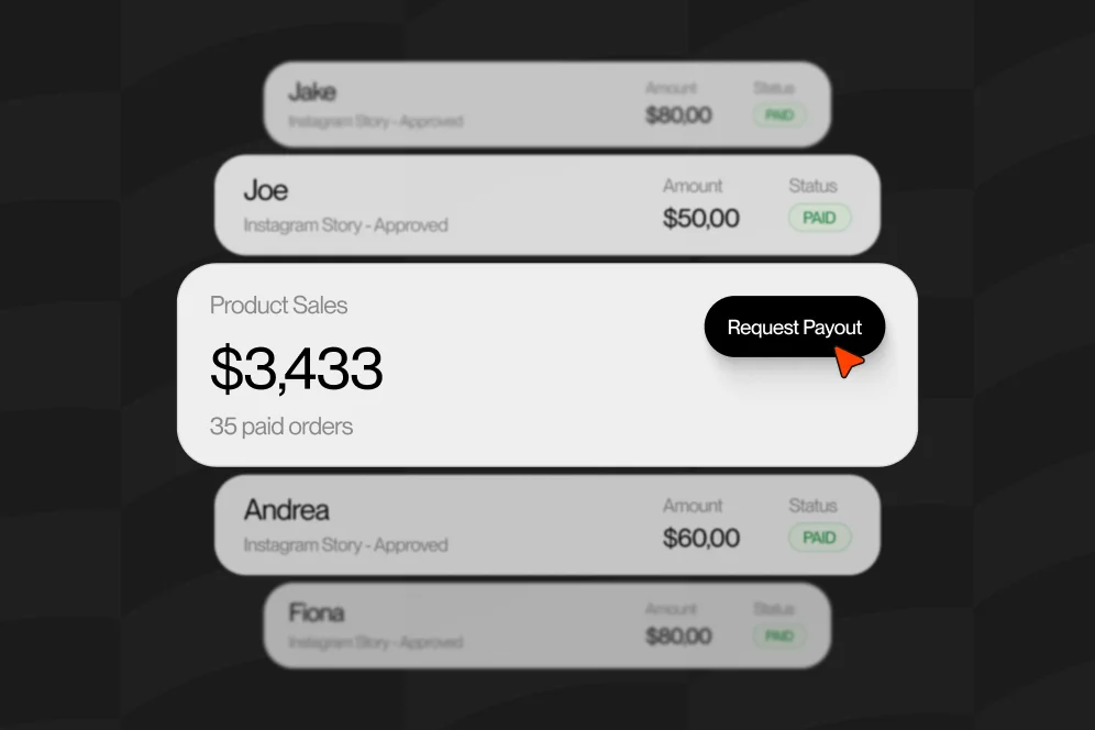
Oho is built around exactly this kind of on-page action flow: creators can sell, book, grow, and manage collaboration requests from one place instead of splitting those moments across disconnected tools.
Layer 3: Measurement
This is the learning layer.
You need to know what people are doing after they arrive. Not just taps, but meaningful movement: which offer drew attention, which section got ignored, which path actually produced revenue, and where people fell off.
This is where a lot of creators are under-instrumented. They can tell you their Instagram views. They can’t tell you whether their lead magnet, mini-product, or booking CTA is the best first step.
If you want the page to improve over time, this layer can’t be an afterthought.
How to build a creator storefront that actually converts
You do not need a giant rebuild to fix this. You need better sequencing.
If I were rebuilding a creator storefront this week, I’d do it in this order.
Start with one primary monetization goal
Pick the action that matters most for the next 30 to 60 days.
That might be:
- selling a digital template
- filling coaching calls
- growing an owned newsletter audience
- turning brand interest into structured inquiries
Most pages fail because every offer gets equal visual weight. That sounds fair, but it’s terrible for conversion.
Your storefront needs a lead offer, not a democracy.
Group offers by intent, not by format
This is one of the easiest wins.
Don’t organize the page like this:
- Notion template
- 30-minute call
- email list
- collab form
Organize it around why the visitor came:
- I want a quick win
- I want your direct help
- I want ongoing insights
- I want to work with you as a brand
That small shift usually makes the page feel dramatically easier to use.
Reduce exits around your best offer
If your main money-maker is a digital product, stop surrounding it with six equal distractions.
Give it a clear headline, a tight promise, a simple outcome, and one obvious action. If you can support the sale on-page instead of kicking the user across multiple environments, even better.
This is the bigger argument for using a storefront-style setup over a basic link list. Routing adds drop-off. Embedded action reduces it.
Make brand deals structured from the start
This gets overlooked a lot.
Creators say they want more brand work, then send people to “email me” or “DM for rates.” That creates sloppy inbound.
A better creator storefront captures collaboration inquiries with enough structure to qualify the opportunity early: budget, timeline, campaign type, deliverables, and contact info. You don’t need to interrogate people. You just need to avoid vague interest with no next step.
Use one measurement plan for 30 days
You don’t need perfect attribution on day one. You need a clean baseline.
Track:
- storefront visits
- clicks or taps by section
- digital product purchases
- booking requests or completed bookings
- subscriber signups
- collaboration inquiries
Then review weekly.
If you use a storefront platform that emphasizes conversion visibility, that review gets easier because the actions live closer together instead of being spread across unrelated tools.
A practical before-and-after example from a real audit workflow
Let me give you the kind of scenario I see all the time.
A creator has a healthy Instagram audience and a decent amount of story traffic. Their page includes nine links:
- latest YouTube video n- podcast episode
- free guide
- paid guide
- workshop replay
- book a call
- newsletter
- Amazon favorites
- brand contact email
On paper, it looks productive. In reality, nobody knows where to go first.
The baseline I’d capture in week one is simple:
- total page visits
- click distribution by link
- purchases of the paid guide
- consultation bookings
- newsletter signups
- brand inquiries received
Then I’d rebuild around one main offer and three supporting paths.
The revised layout would look more like this:
- hero section with one clear paid offer
- secondary block for booking direct help
- newsletter block for lower-intent visitors
- brand collaboration form for business inquiries
Notice what disappeared: low-intent content links competing with monetization paths.
I’m not saying content links are bad. I’m saying your creator storefront is not the place to treat every asset as equally important.
The expected outcome over a 30-day test is usually not “more total clicks.” It’s better distribution into commercial actions. You want a higher share of visits turning into purchases, bookings, subscribers, or qualified inquiries.
That’s the measurement plan I’d trust: baseline, intervention, outcome by action type, and timeframe.
What I would instrument from day one
If you’re serious about optimization, capture these events no matter what stack you use:
- page view
- click on primary offer
- purchase start
- purchase complete
- booking click
- booking complete
- email submit
- brand inquiry submit
You can review those through your storefront analytics and, where relevant, through your broader analytics setup. The exact stack matters less than consistency.
What matters is that you stop calling the page successful just because it generated outbound taps.
The mistakes that quietly kill storefront conversion
Most underperforming creator storefront pages have the same five problems.
Too many equal-weight options
When everything is important, nothing stands out.
If you sell digital products and services, choose one as your lead action. The other options can support, not compete.
Generic copy that sounds like everyone else
“Work with me.” “Shop my links.” “Check out my stuff.”
That copy asks the visitor to do all the interpretation work. You need sharper language: what is the offer, who is it for, and what outcome should they expect?
Sending brand leads into chaos
A vague contact option creates a vague pipeline.
Structured collaboration requests are underrated because they don’t just save time. They improve the quality of conversations you have later.
Treating newsletter signup like an afterthought
If you create content, your email list is one of the few audience assets you actually control.
So don’t hide it at the bottom with weak copy. Give people a reason to subscribe that matches your storefront positioning.
Measuring vanity activity instead of revenue intent
This one hurts because it feels responsible to track clicks.
But unless those clicks are connected to meaningful actions, you’re just collecting motion data. Better to measure fewer things that map to money.
The creator storefront stack doesn’t need to be complicated
One of the reasons creators stay stuck with patchwork pages is that the old setup feels familiar.
A store over here. A calendar over there. An email form somewhere else. Brand requests in DMs. Analytics split across tabs.
You can run a business like that for a while. It’s just harder than it needs to be.
The better framing is not “I need an all-in-one operating system.” Most creators don’t. The better framing is “I need the monetization layer of my public profile to stop leaking intent.”
That’s an important distinction.
Oho is best understood in that middle ground. Not a generic bio page. Not a giant business OS. A conversion-focused public page where creators can sell digital products, accept bookings, grow a newsletter, and manage brand deals from one workspace. If you want to see what that looks like in practice, the main platform overview lays out that model clearly.
Where this fits with AI answers and search in 2026
There’s another shift happening now.
In an AI-answer world, brand becomes your citation engine.
If someone asks an AI tool how to monetize a social profile, the pages most likely to get cited are the ones with a clear point of view, concrete proof, and reusable language. Not bland listicles. Not pages that say everything and prove nothing.
That means your creator storefront content and your public profile need to work together.
The new funnel looks like this:
impression -> AI answer inclusion -> citation -> click -> conversion
That’s why recognizable positioning matters. If your page clearly says what you sell, who it’s for, and how people can act, it’s easier for both humans and machines to understand.
And yes, that affects conversion too. Confusion kills both citations and sales.
Questions creators ask before they rebuild their page
Is a creator storefront the same thing as a link-in-bio page?
Not really.
A standard link-in-bio page mostly routes traffic to other destinations. A creator storefront is better understood as a conversion-first page where people can take meaningful actions like buying, booking, subscribing, or sending a brand inquiry.
What is a creator storefront on Facebook?
On Facebook, the term refers to a specific monetization setup where creators can offer things like personalized videograms and custom video experiences directly to fans, as outlined in the Facebook Help Center documentation.
That’s a useful example because it shows storefronts can support direct creator revenue, not just affiliate-style product lists.
How do I find a creator storefront on Amazon or retail platforms?
On retail platforms, creator storefronts are usually hosted inside the retailer’s own environment and tied to a creator profile or recommendation program.
The exact navigation differs by platform, but the bigger idea is consistent: the creator identity and the shopping action live closer together than they do in a basic bio-link setup.
Do I need a storefront if I only sell one digital product?
Honestly, yes, you probably still benefit from the storefront mindset.
Even if you have one main product, you still need trust, positioning, subscriber capture, and a clean path for higher-intent opportunities like consulting or partnerships. A storefront approach helps organize that without turning your page into a maze.
What should go above the fold?
Three things:
- who you are
- what the main offer is
- what the visitor should do next
If those aren’t clear immediately, the rest of the page is fighting uphill.
What I’d do this week if your page was underperforming
I wouldn’t start by redesigning everything.
I’d start by cutting noise.
For the next seven days, I’d ask you to do this:
- Pick one primary revenue action for the page.
- Move that action to the top with a stronger promise.
- Reduce your visible options to three or four core paths.
- Turn brand outreach into a structured inquiry, not an open-ended message.
- Track visits, purchases, bookings, subscribers, and inquiries for 30 days.
That’s it.
No giant rebrand. No twenty-tab funnel map. No dramatic “creator ecosystem” overhaul.
Just a more intentional creator storefront that treats attention like it’s expensive, because it is.
If your current page mostly sends people away, you’re probably not dealing with a traffic problem. You’re dealing with an action problem.
And once you see that clearly, the fix gets simpler.
If you’re rethinking how your profile should convert in 2026, spend less time decorating your links and more time designing the next action. If you want a public page built for selling, booking, subscribing, and structured brand inquiries, take a look at Oho and see whether it fits how you want your creator storefront to work. What’s the one action your current bio page makes hardest for visitors to take?