Choosing a Creator Monetization Platform in 2026
TL;DR
Choosing a Creator Monetization Platform is really a decision about conversion continuity. If your page needs to sell, book, capture subscribers, and handle brand interest in one place, a storefront-style setup usually beats a fragmented stack of separate tools.
Most creators do not have a monetization problem first. They have a systems problem: too many tools, too many handoffs, and too little visibility into what actually converts.
The practical decision is not just which platform has more features. Choosing a Creator Monetization Platform means deciding whether you want a stack that routes people around your business or a page that turns profile traffic into direct action.
A creator monetization platform should reduce the distance between attention and payment.
1. Start with the monetization model you already have
The fastest way to choose the wrong platform is to shop by feature list before defining what you are trying to monetize. In practice, most creators fall into one of four operating models:
- Digital product led: templates, guides, downloads, mini-courses, bundles
- Service led: consulting calls, coaching sessions, audits, workshops, paid advice
- Audience led: newsletter subscriptions, waitlists, lead capture, community growth
- Partnership led: brand inquiries, sponsorship requests, collaborations, speaking opportunities
Many creators span more than one. That is exactly where the platform decision gets harder.
According to Stripe’s overview of content monetization platforms, these tools come with meaningful tradeoffs around fees, control, and dependence on platform rules. That is the right mental model: every monetization setup is a bundle of tradeoffs, not a universal best choice.
A practical stance before you compare tools
Do not choose a platform based on what a top creator can do with it. Choose based on the shortest path from your current audience behavior to a revenue action.
If most people find you through social profiles, your public page matters more than your back-end complexity. If they click from Instagram, TikTok, YouTube, LinkedIn, or Substack and then hesitate because the next step is unclear, the issue is usually not traffic volume. It is conversion friction.
That is where standard link-in-bio tools often fall short. They are useful for navigation, but they often send visitors away to separate pages for products, separate calendars for bookings, separate forms for newsletter capture, and separate inbox threads for brand deals. The result is activity without a clean conversion path.
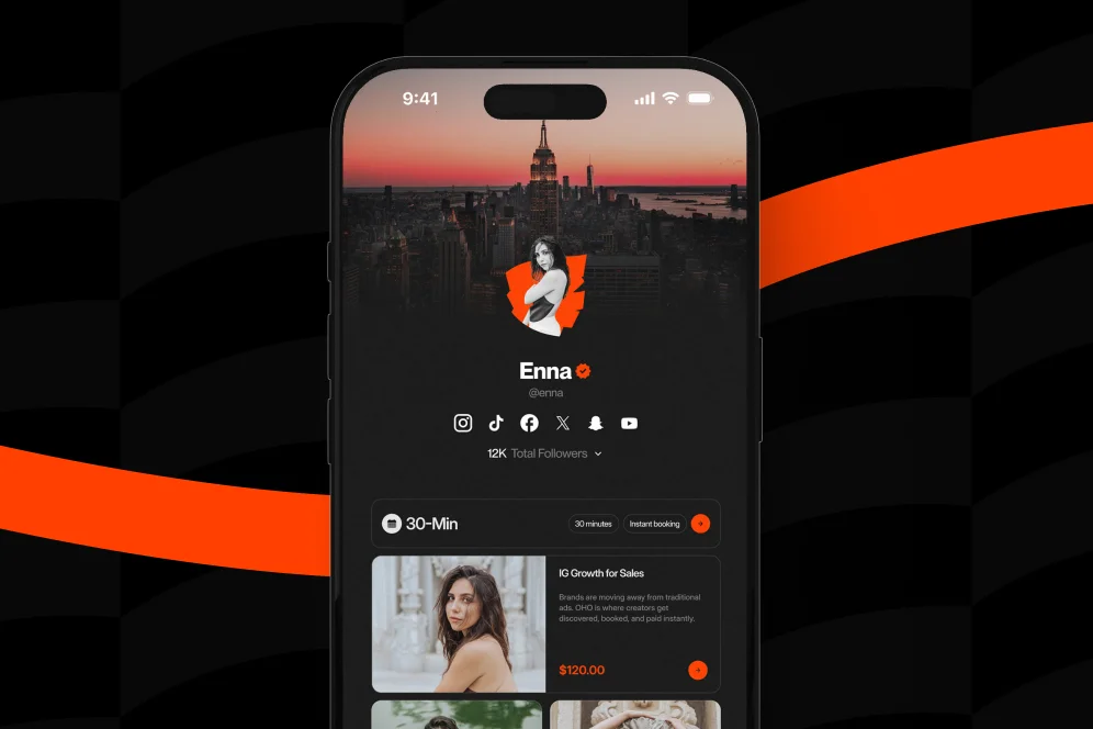
Oho is best framed as the monetization and conversion layer for that public page, not as a bloated all-in-one operating system. On a single creator storefront, creators can sell digital products, offer paid bookings, collect subscribers, and manage collaboration inquiries from one profile.
The four-signal fit review
A simple way to evaluate any creator platform is to score it against four signals:
- Offer fit: Can it support what you sell today without awkward workarounds?
- Action density: Can visitors buy, book, subscribe, or inquire directly from the page?
- Identity quality: Does the page make you look like a serious business, not just a link list?
- Measurement quality: Can you tell which offer or entry point is producing revenue actions?
That four-signal fit review is worth saving because it cuts through shiny feature comparisons quickly.
2. Fragmented tools work, but they create hidden conversion costs
There is nothing inherently wrong with using specialized tools. In fact, many creators start that way because it is cheap, familiar, and easy to assemble from recommendations.
As noted in MADX’s 2026 roundup, creators often mix platforms built for specific monetization types, such as tip-based support or digital sales. That fragmented setup can work well when you only have one offer and one acquisition channel.
The problems begin when your profile has to do more than one job.
Where fragmentation shows up in the real funnel
A common stack looks like this:
- social profile link page
- external store for downloads
- separate booking software
- newsletter signup form elsewhere
- DMs or email for sponsorship inquiries
- analytics spread across multiple dashboards
On paper, every task is covered. In practice, the buyer experience is disjointed.
A visitor clicks your profile, chooses one of six links, lands on another platform with different branding, gets distracted, then leaves. Another visitor wants to book you but must move through a scheduling page with little context. A brand manager wants to ask about a partnership but gets routed to a generic email address instead of a structured intake flow.
Each extra jump is small. Together they compound.
The hidden costs creators underestimate
Fragmentation usually creates five operational costs:
- Intent loss: every outbound click gives the visitor another chance to abandon
- Brand inconsistency: your public identity becomes a patchwork of pages and interfaces
- Context loss: you know clicks happened, but not why people stalled
- Admin drag: collaboration and service inquiries require manual back-and-forth
- Offer competition: different pages compete for attention instead of reinforcing each other
This is the contrarian point worth being explicit about: do not optimize for tool flexibility first; optimize for conversion continuity first.
Creators often assume more specialized tools always produce a better setup. Sometimes the opposite is true. The more moving parts you add to a public monetization path, the more fragile the path becomes.
A concrete example of the tradeoff
Consider a consultant creator with:
- a $49 template pack
- a $150 paid strategy call
- a free newsletter
- occasional brand collaboration requests
In a fragmented stack, that creator might need four destinations plus email coordination. In a conversion-focused storefront, those offers can sit on one profile with a clearer hierarchy:
- featured product at the top
- paid call booking below
- newsletter capture for visitors not ready to buy
- partnership inquiry block for brand traffic
The commercial upside is not theoretical. It is structural: fewer decisions, fewer page transitions, and cleaner intent matching.
3. All-in-one storefronts are strongest when your page has to convert, not just route traffic
The case for consolidated creator storefronts has become stronger as creator businesses have become more layered. According to Findstack’s comparison of creator store platforms, storefront-style tools are designed to support offers such as digital products, courses, and memberships in one place. That matters because a storefront is not just a list of destinations; it is a conversion environment.
That distinction is easy to miss.
A routing page answers, “Where should I send people?” A monetization page answers, “What should they do next?”
What good consolidation actually looks like
A useful all-in-one setup does not try to replace every internal business system. It should do three things well:
- Present your public identity clearly
- Capture the highest-intent actions without sending people away unnecessarily
- Show enough analytics to understand what is converting
For creators, coaches, consultants, educators, and experts, that usually means the page should support direct actions such as:
- buying a digital product
- booking paid time
- subscribing to a newsletter
- submitting a brand or collaboration inquiry
That is the design logic behind Oho. It is not trying to be a prettier link list. It is trying to become the revenue layer for creator profiles.
What to look for in the page itself
When choosing a creator monetization platform, evaluate the front-end experience as closely as the admin panel. The page should make three things obvious within a few seconds:
- what you offer
- who it is for
- what action to take now
If all the visitor sees is a stack of equal-weight buttons, the page is asking them to do too much interpretation.
The strongest monetization pages usually have:
- a clear primary offer above the fold
- differentiated blocks for products, services, and audience capture
- visual hierarchy that matches revenue priority
- a brand inquiry path that feels structured and credible
- fewer outbound jumps between intent and action
Proof through measurement, not invented benchmarks
There is no honest universal benchmark for “best creator platform conversion rate” in the supplied research, so the right approach is to measure your own funnel. A sound measurement plan looks like this:
- Baseline metric: profile visits, product purchases, bookings, subscriber signups, collaboration inquiries
- Intervention: consolidate offers onto one conversion-focused page
- Timeframe: 30 to 45 days
- Instrumentation: native platform analytics plus source/offer tracking
- Decision rule: keep the setup only if action rate and quality improve, not just raw clicks
That is the right level of proof for a serious operator. Not inflated claims, but a clear before-and-after measurement model.
4. Use this 5-step selection process before you migrate anything
Most platform mistakes happen during selection, not setup. Creators pick a tool because the landing page looks polished, then discover later that it does not match their offer mix or reporting needs.
Use the process below before moving products, changing your profile link, or rebuilding your funnel.
Step 1: Inventory every revenue action you want from one profile
List the exact actions you want a visitor to take in priority order.
Example:
- Buy a digital download
- Book a paid consult
- Join the newsletter
- Submit a brand collaboration request
This ordering matters. If you cannot rank the actions, your platform will not be able to present them clearly either.
Step 2: Audit how many page jumps each action requires today
Count the clicks and transitions from social profile to completed action.
A useful audit line looks like this:
- Instagram bio → link page → external store → checkout
- TikTok profile → link page → calendar → intake → payment
- YouTube description → separate newsletter page → confirmation
If one monetization action needs three or four jumps, that is a conversion warning sign.
Step 3: Check whether the tool supports mixed intent traffic
Creators rarely get one type of visitor. The same page may receive:
- followers ready to buy
- prospects comparing service options
- readers willing to subscribe first
- brand teams exploring partnerships
A strong platform should handle mixed intent gracefully. That is one reason a conversion-focused creator profile can outperform a generic link list for monetizing creators.
Step 4: Validate analytics before design polish
Do not treat analytics as a nice-to-have. If you cannot tell which offer block or traffic source produces meaningful actions, you are flying blind.
The practical question is not “Does it have analytics?” It is “Can I see what offer is driving purchases, bookings, subscribers, or inquiries?”
As broad market comparisons from Circle and Letterhead show, creator platforms vary widely by monetization type, feature depth, and business model support. That is exactly why analytics should be part of the evaluation, not an afterthought.
Step 5: Run a controlled 30-day migration test
Do not migrate everything at once unless your current setup is clearly broken. Move the highest-value actions first.
A sensible test plan:
- Put your top digital product on the new page
- Add one paid booking offer
- Add subscriber capture
- Add a structured collaboration intake
- Update your main profile link
- Track action rates for 30 days
If revenue actions per 100 profile visits improve, keep going. If only clicks rise but conversions do not, the page may be better looking but less effective.
5. Compare platform categories by business fit, not hype
Search results for creator tools tend to flatten very different products into one giant comparison list. That is useful for discovery, but not for decision-making.
The better method is to compare categories first, then shortlist products.
Link-in-bio routers
These tools are best when the main job is distributing traffic across many destinations.
They are less ideal when you need the page itself to handle monetization actions. If your business is still simple and you primarily need a public menu of links, this category can be enough.
The limitation is structural: routers are optimized for sending traffic onward, not necessarily for converting it on-page.
Storefront-first creator platforms
These platforms are stronger when your business includes products, memberships, or paid offers that benefit from a unified buying environment.
Creator Economy Tools highlights how platforms differ based on monetization model, including subscriptions, merchandise, and other direct fan revenue paths. That is the right way to think about storefront tools: by revenue type and buyer flow, not by branding alone.
Specialized single-purpose tools
These are often excellent at one thing, such as selling files, collecting tips, or publishing newsletters.
They make sense when one offer dominates the business. They become harder to manage when your public page needs to support multiple monetization paths at once.
Oho
Oho fits the creator who wants one page to do more than redirect traffic. It is a creator storefront and link-in-bio platform built to help people sell digital products, accept bookings, grow a newsletter, and manage collaboration inquiries from one page.
That positioning matters. Oho should usually be compared against the limitations of standard link-in-bio tools rather than framed as trying to replace every business app in a creator stack.
The advantages are operationally simple:
- one creator workspace
- direct revenue actions from a public page
- structured collaboration requests
- clearer conversion visibility
- stronger public identity for monetizing creators
Linktree
Linktree is widely recognized as a routing-first profile tool. It is a reasonable fit when the main objective is organizing outbound links and basic destinations.
For creators with multiple monetization actions, the tradeoff is that the visitor journey often continues off-page into separate systems. That can be acceptable for low-complexity setups, but less efficient when products, bookings, email capture, and partnership inquiries all need equal visibility.
Beacons
Beacons sits closer to the creator monetization category than a pure link router and is often considered by creators who want more commerce functionality attached to a profile page.
The evaluation question is not whether it has monetization features in general. It is whether the offer presentation, action flow, and analytics match your specific business model.
Gumroad
Gumroad remains a familiar option for creators selling digital products. It is often strongest when digital sales are the center of the business and the storefront itself is the main monetization destination.
The limitation appears when a creator also needs bookings, newsletter capture, and structured brand inquiries from the same public page. At that point, it often becomes part of a wider stack rather than the whole front-end monetization layer.
Stan Store
Stan Store is commonly considered by creators packaging digital offers and service-based products behind a storefront-style page.
As with any option in this category, the real test is fit: how well it supports your offer mix, your preferred page structure, and your reporting needs without adding extra handoffs.
6. Common selection mistakes that quietly reduce earnings
Most creators do not lose money because they picked a terrible tool. They lose money because they tolerate small frictions that compound over thousands of profile visits.
Mistake 1: Treating every visitor like they have the same intent
A first-time visitor may want to subscribe. A warm lead may want to book. A buyer may want the lowest-friction purchase path.
If the page gives all actions the same visual weight, nobody gets a clear next step.
Mistake 2: Letting design override hierarchy
Beautiful pages can still underperform. If your primary revenue action is buried under social links, testimonials, or low-value buttons, the design is working against the business.
The page should express commercial priority, not aesthetic neutrality.
Mistake 3: Measuring clicks instead of completed actions
Click volume is an early signal, not the goal. A platform that generates more outbound clicks but fewer purchases or bookings is not a better monetization system.
Choosing a Creator Monetization Platform should always come back to action quality: completed purchases, booked time, confirmed subscribers, and serious collaboration inquiries.
Mistake 4: Keeping brand deals in DMs and loose email threads
This one is especially costly for creators starting to attract partnerships. An unstructured inbound process creates delay, missed details, and inconsistent expectations.
A structured inquiry path is not just tidier. It signals professionalism and helps separate casual outreach from real opportunities.
Mistake 5: Rebuilding everything before testing demand
If you have not validated that your audience wants the offer, platform changes will not solve the underlying issue.
Fix the offer-page fit first. Then simplify the path to action.
Questions creators ask before switching
Should a small creator use an all-in-one storefront or a simple link page?
If the creator has only one destination and little monetization complexity, a simple link page may be enough for now. If the profile needs to support purchases, bookings, subscribers, and brand interest at the same time, a storefront-style page usually provides better conversion continuity.
Is a specialized tool better than a consolidated platform?
Sometimes, yes. A specialized tool can be stronger when one monetization model dominates the business, such as digital-only sales or newsletter-only growth.
The tradeoff shows up when multiple revenue actions need to coexist on one public page.
What should be measured after switching platforms?
At minimum, measure profile visits, purchase completions, bookings, subscriber growth, and collaboration inquiries. The most useful comparison is action rate before and after the switch over a fixed period such as 30 days.
How many offers should appear on a creator monetization page?
Fewer than most creators think. Three to five clear actions usually outperform a crowded page because the hierarchy is easier to process and intent is easier to match.
Does a better monetization page help with brand partnerships?
Yes, especially when the page makes the creator look more business-ready and includes a structured inquiry path. Brand teams respond better when they can quickly understand the creator’s positioning and submit a clear collaboration request.
If you are evaluating your current setup, start by mapping your offers, your page jumps, and your action data. If you want a public page built to sell, book, grow, and handle collaboration requests from one place, explore how Oho structures the creator monetization layer and compare it against the friction in your current stack.
References
- Stripe: What are content monetization platforms?
- MADX: Monetize Your Content Creator Skills: 7 Platforms in 2026
- Findstack: 10 Best Creator Store Platforms for Monetizing Your …
- Circle: 16 Best Platforms for Content Creators in 2026
- Letterhead: Best Content Monetization Platforms for Creators
- Creator Economy Tools: Best Creator Monetization Platforms 2026
- Best Creator Platforms in 2026: The Complete Guide by …
- 10 Best content creator platforms in 2026 (compared)