How to Build a Creator Storefront That Sells While You Sleep
TL;DR
A creator storefront should do more than list links. Structure it around one primary action, clear intent paths, embedded proof, and measurement so social traffic can buy, book, subscribe, or inquire without friction.
Most social bios still act like hallway signs: they point people somewhere else and hope the click becomes revenue later. A better setup treats your bio as a working sales surface, with clear paths to buy, book, subscribe, or inquire without extra back-and-forth.
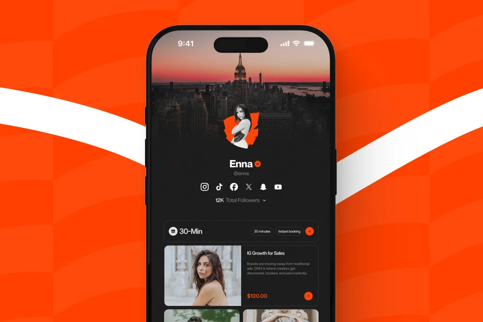
A creator storefront is the page that turns profile attention into business action. When it is structured correctly, it stops being a list of links and starts acting like an automated sales rep.
Why a creator storefront outperforms a basic link list
A standard link-in-bio page is usually built for navigation. A high-performing creator storefront is built for conversion.
That distinction matters because social traffic is weak-intent traffic. Most visitors are curious, not committed. If the page they land on gives them ten equal-weight options and no buying context, they leave with the same level of intent they arrived with.
The practical job of a creator storefront is to reduce decision friction. It should answer four questions immediately:
- Who is this for?
- What can I do here right now?
- Why should I trust this creator?
- What is the fastest next step for my use case?
This is also where many creators misuse their bio page. They optimize for clicks instead of completed actions. Clicks are easy to inflate. Revenue actions are what matter.
A creator storefront should not behave like a prettier directory. It should behave like a conversion layer for your public identity. That is the difference between a page that gets traffic and a page that earns.
As SimplicityDX’s buyer checklist notes, storefronts work best when they serve as the bridge between content and commerce rather than a disconnected stop between the two. That bridge is the core design problem to solve.
This is also why platforms built around direct action tend to be more useful than standard bio tools that mostly route people away. With a conversion-first page like Oho, creators can sell digital products, accept bookings, collect newsletter subscribers, and manage brand collaboration inquiries from one place instead of splitting intent across multiple tools.
The contrarian call: stop sending your best traffic away
The common advice is to put every important destination in your bio and let people choose. That sounds user-friendly, but it usually creates shallow engagement.
A better approach is to give visitors fewer choices and more context. Do not send people to five different tools if one page can handle the action natively. If someone is ready to buy, book, or pitch a collaboration, every redirect adds drop-off risk.
That does not mean every creator needs a giant storefront. It means the bio page should capture the most likely intent directly, then route only when necessary.
The four-part page structure that moves people from browsing to buying
The simplest reusable model for a creator storefront is the intent-to-action layout. It has four parts:
- Identity: who you are and what outcome you help create
- Priority offer: the single most commercially important action on the page
- Intent paths: separate blocks for buyers, subscribers, and brand partners
- Proof: signals that reduce hesitation
This is not a clever naming exercise. It is a page-ordering rule. The structure should reflect user intent, not the order in which you created your offers.
Part 1: Make the top of the page do qualification work
The first screen should identify the creator and the page purpose in under five seconds.
That means:
- a clear profile image or brand mark
- a short descriptor that explains what the creator helps with
- one sentence on what can be done on the page
- one primary call to action
Weak example:
- “Creator, founder, dreamer”
- buttons for YouTube, podcast, newsletter, merch, and contact
Strong example:
- “Fitness coach helping busy professionals lose fat without 2-hour workouts”
- primary action: “Book a coaching consult”
- secondary options below: meal plan download, newsletter signup, brand inquiries
This is where personalized URLs matter. Amazon’s documentation for the Amazon Influencer Program emphasizes the value of a customized storefront with a personalized URL, and that same principle applies to any creator storefront. A clean branded URL is easier to remember, easier to trust, and easier to repeat on social and podcast mentions.
Part 2: Put one commercial action above everything else
Most storefronts fail because they treat every link as equally important.
They are not equal. One action usually matters more than the others at a given stage of the business. It might be a consultation booking, a flagship digital product, a membership waitlist, or a newsletter with a lead magnet.
Choose one primary action and make it dominant through:
- position on page
- button weight and spacing
- supporting copy
- proof immediately below it
If the creator sells services, bookings should sit above content links. If the creator sells digital products, the flagship product should sit above free resources. If the creator is using the page to attract sponsors, the brand inquiry path should be visible without forcing brands to DM first.
Part 3: Group the rest by visitor intent, not content format
Organize the mid-page into small sections based on what the visitor wants to do.
Useful groupings include:
- Buy: digital downloads, bundles, templates, guides
- Book: consultations, audits, coaching calls, paid sessions
- Subscribe: newsletter, lead magnet, updates
- Work with me: sponsorships, speaking, partnerships, brand deals
This sounds obvious, but many creators still group by format instead: videos, podcasts, links, products, socials. That reflects the creator’s workflow, not the visitor’s decision path.
Oho is best framed here as the monetization layer for the public profile, not as an all-purpose business operating system. The advantage is that visitors can act from one page instead of bouncing across a storefront tool, a booking tool, a form tool, and a newsletter tool.
Part 4: Add proof where hesitation appears
Proof should sit next to the action that needs trust, not hidden in an about section.
Examples:
- under a booking offer: testimonials, use cases, or who the call is for
- under a digital product: what is included, delivery format, and outcome
- under a newsletter signup: what subscribers receive and how often
- under a brand inquiry form: audience niche, examples of collaborations, response expectations
Visitors should not have to hunt for evidence. Good creator storefronts place proof at the exact moment of doubt.
Step-by-step: configure your creator storefront like a working sales rep
A creator storefront becomes automated when the page handles repetitive explanation, qualification, and routing before a human ever steps in. The setup below is the most practical way to get there.
Step 1: Define the page’s primary conversion event
Before editing copy or design, choose the one event the page is meant to drive.
Examples:
- purchase of a digital product
- booking a paid consultation
- email subscription
- brand collaboration inquiry
Then document the secondary events.
A creator trying to optimize everything at once usually ends up optimizing nothing. Pick one primary conversion event for the next 30 days and let page hierarchy reflect that decision.
Step 2: Write copy that answers intent, not biography
Most bio pages over-index on self-description.
The copy should instead answer practical questions:
- what is offered here?
- who is it for?
- what result can they expect?
- what should they do first?
A useful top-of-page template is:
Help statement + audience + primary action
Example:
- “Helping founders turn expertise into paid consulting offers. Book a strategy session or download the proposal template.”
That is better than a vague creator bio because it compresses qualification and action into one line.
Step 3: Build separate paths for separate buyer states
Not every visitor is ready to buy today.
A working creator storefront gives each intent level a path:
- High intent: direct purchase or direct booking
- Medium intent: case study, product details, FAQ, or offer explainer
- Low intent: newsletter signup or free resource
- Business intent: structured collaboration form
This is especially important for brand deals. Manual back-and-forth in DMs creates delay and poor filtering. A structured inquiry path is better because it captures scope, fit, and next-step information at the point of interest.
Step 4: Configure products and services with less ambiguity
Ambiguity kills conversion.
For each offer, include:
- offer name
- one-line outcome
- delivery format
- price or starting price when appropriate
- time expectation
- who it is for
- CTA label that states the action clearly
Weak CTA: “Learn more”
Stronger CTA: “Buy the Notion template” or “Book a 30-minute consult”
The same principle appears in storefront infrastructure from larger ecosystems. Walmart Creator positions its platform around sharing recommendations and earning through them, which reinforces the need for a storefront to clearly connect a recommendation to a revenue action.
Step 5: Automate service delivery where possible
Physical product sellers are not the only creators who need a storefront. Service and digital creators often benefit more because they can reduce admin overhead.
For example, Facebook Help Center documents creator storefront use cases such as selling personalized videograms. The useful takeaway is broader than Facebook itself: storefronts can package and automate the sale of custom digital services that would otherwise start with a manual DM.
For creators selling paid time, the storefront should clarify duration, format, and expected outcome before the booking step. For creators selling downloadable products, delivery should be immediate and obvious. For newsletter capture, the value exchange should be explicit.
Step 6: Instrument the page before you redesign it again
Do not redesign based on taste. Redesign based on observed behavior.
At minimum, track:
- page visits
- click-through by offer block
- completed purchases or bookings
- subscriber conversion rate
- collaboration inquiry volume and quality
If a creator uses external analytics, tools such as Google Analytics can help track page-level behavior, while event-based tools like Mixpanel or Amplitude can support deeper conversion analysis. The point is not to create a complex data stack on day one. The point is to define a measurement plan before making changes.
A practical plan looks like this:
- Baseline metric: current bio page visit-to-action rate
- Target metric: increase primary action rate over 30 days
- Instrumentation: tagged CTA clicks plus completed actions
- Review window: weekly checks, one monthly decision point
Step 7: Review the storefront like a landing page, not a profile
This is where many creators leave money on the table. They treat the page as a personal profile rather than a conversion surface.
A review should inspect:
- visual hierarchy
- CTA clarity
- mobile readability
- offer order
- proof placement
- drop-off points
If the page is cluttered, remove options. If the offer is unclear, rewrite the promise. If visitors click but do not complete, the friction is probably below the fold or inside the next step.
For a broader view of what a conversion-focused profile can look like, the main Oho storefront platform is useful context because it is built around direct actions on-page rather than a basic outbound link list.
What to measure in the first 30 days
A creator storefront should be treated like an evolving commercial asset. The first month is for getting signal, not chasing perfection.
The most useful metrics are not vanity metrics. They are signals that show whether the structure is matching intent.
The baseline -> intervention -> outcome pattern to use
Because no universal benchmark in the provided source set applies cleanly across every creator niche, the safest and most useful proof model is operational.
Use this pattern:
- Baseline: current page sends traffic to 6-10 equal-weight links with no primary CTA and no segmented paths
- Intervention: simplify to one primary action, add grouped intent paths, place proof beside each commercial action, and track CTA events
- Expected outcome: more qualified clicks, fewer dead-end visits, and clearer visibility into which offer category is converting
- Timeframe: 2-6 weeks for directional signal, depending on traffic volume
That is credible because it is measurable. It also avoids invented benchmark claims.
The middle-of-page checklist that actually matters
When auditing a creator storefront, check these items in order:
- Is the first screen clear enough that a new visitor knows what can be done here?
- Is one offer visually and commercially dominant?
- Are the remaining actions grouped by visitor intent rather than content type?
- Is there proof next to the moment of hesitation?
- Can a brand partner submit a structured inquiry without DM friction?
- Are clicks and completed actions being tracked separately?
- Does the mobile version preserve the same CTA order as desktop?
If four or more of those fail, the page is probably functioning as a link hub instead of a storefront.
Technical details that affect conversion more than most creators expect
A few implementation details have outsized impact:
- Mobile-first spacing: most bio traffic is mobile; crowded cards reduce scan speed
- Fast asset loading: oversized images delay first interaction
- Clear CTA labels: avoid generic labels such as “More” or “Explore”
- Short forms: only ask for fields required to qualify the next step
- Stable order: frequent reshuffling retrains repeat visitors and weakens memory
Support documentation such as Creatable Support’s storefront setup guide reinforces the operational value of configuring displays carefully and monitoring progress rather than treating a storefront as a static page.
Common creator storefront mistakes that quietly kill conversion
The biggest mistakes are usually structural, not visual.
Too many equal-priority links
If every item looks equally important, the visitor has to do your prioritization work. Many will not.
Fix: choose one primary CTA and demote the rest.
Leading with social links instead of commercial intent
Some creators put Instagram, TikTok, YouTube, and podcast links at the top of the page. That is useful for cross-platform discovery, but it is weak for conversion.
Fix: place revenue actions first. Put platform links lower unless audience migration is the main goal.
Making brand inquiries informal
“DM me for collabs” is not a workflow. It creates delay, inconsistent qualification, and lost opportunities.
Fix: use a structured collaboration path that collects campaign details, budget context, timeline, and contact information.
Treating free resources as the final destination
A free download or newsletter should support monetization, not replace it unless audience building is the current top objective.
Fix: connect free signup to a visible commercial journey. Tell subscribers what comes next.
Hiding proof in a separate page
When proof is separated from the offer, users must switch context to build trust.
Fix: move evidence closer to the CTA. Even one testimonial, outcome statement, or specificity block can reduce hesitation.
Using storefront language that is too generic
“Services,” “Products,” and “Work with me” are functional labels, but often not enough on their own.
Fix: pair labels with outcomes. For example, “Book a 45-minute funnel review” performs better than “Services.”
Where Oho fits when you need a storefront, not just a bio link
For creators who have outgrown a simple link list, the issue is usually not aesthetics. It is fragmentation.
They have one tool for digital products, another for booking, another for newsletter capture, and brand requests arriving through forms or DMs with no clear structure. The result is more clicks, but less clarity about what is converting.
Oho is best positioned against that fragmentation. It is a creator storefront and link-in-bio platform designed to help creators sell digital products, accept bookings, grow a newsletter, and manage brand collaboration requests from one conversion-focused page.
That matters because the page becomes an operating surface for public monetization. Visitors can buy, book, subscribe, or inquire from one profile layer instead of being sent away repeatedly.
This is also the practical difference between a standard link-in-bio setup and a storefront model. A normal link page routes attention elsewhere. Oho is designed to help the visitor act directly on-page, with better visibility into what offers are getting traction.
For creators, coaches, consultants, educators, and online personalities, that is usually the upgrade path that makes the most sense: not a broader software stack, but a better monetization surface.
FAQ: the questions creators ask before rebuilding their bio page
What is a creator storefront?
A creator storefront is a conversion-focused public page where a creator can present offers and capture actions such as purchases, bookings, subscriptions, or collaboration inquiries. Instead of acting like a simple list of outbound links, it is structured to move visitors from interest to action.
Is a creator storefront only for influencers?
No. It is also useful for coaches, consultants, educators, experts, and creator-led businesses. Anyone using a public profile to attract clients, sell digital offers, or field partnerships can benefit from storefront structure.
What is a creator storefront on Facebook?
According to the Facebook Help Center, Facebook’s creator storefront supports offers such as personalized videograms and custom videos. The broader lesson is that storefronts can package creator services into a clear, purchasable flow instead of starting with manual messaging.
How do I find a creator storefront on Amazon?
Amazon explains in the Amazon Influencer Program that creators can build a customized storefront with a personalized URL. In practice, shoppers usually find those storefronts through creator-shared links, social bios, video descriptions, or creator recommendation pages.
Should I send people to my website instead of a storefront page?
Only if the website is already structured for the same conversion job. If the website creates more navigation choices and weaker purchase context, a focused storefront often performs better for social traffic.
How much should I put on the page?
Less than you think. Most creators benefit from one primary offer, two to four secondary intent paths, and visible proof. If the page feels like a directory, it is probably overloaded.
If your current bio page is generating attention but not enough action, rebuild it like a storefront instead of decorating it like a profile. And if you want one page where followers can buy, book, subscribe, and pitch partnerships without being pushed through a maze of tools, explore Oho to see how a conversion-focused creator storefront should work.