Beyond Link-in-Bio: Why Creators Need a Conversion-Focused Storefront
TL;DR
A basic link-in-bio page routes traffic, but a storefront converts it. Creators who sell products, book services, grow newsletters, or handle brand deals need a page built around clear offers, fewer exits, and measurable actions.
A basic link-in-bio page is useful for routing traffic, but it is a weak place to ask a visitor to make a buying decision. Once creators start selling products, booking calls, collecting subscribers, or handling brand inquiries, the page has to function like a storefront, not a directory.
The practical shift is simple: do not optimize for clicks alone. Optimize for completed actions on the page. That is the difference between a link list and a conversion-focused storefront.
Why a simple link list breaks once monetization starts
Most creators begin with a familiar setup: social profile, one bio link, and a stack of destinations underneath it. That works when the goal is navigation.
It starts breaking when the goal becomes revenue.
A list of links creates friction at exactly the moment a visitor should be making progress. The visitor has to choose a path, leave the page, wait for another site to load, re-evaluate context, and then decide whether to continue. Every extra step creates drop-off.
This is why the phrase "link in bio" is often treated like a tactic instead of a system. As Liinks argues in its discussion of random-link behavior, a link-in-bio setup without a focused revenue path is not really a monetization strategy.
That same pattern appears across current market coverage. In a creator-tool analysis, beehiiv frames the category around a broader shift from simple bio links toward pages that combine audience capture, media-kit functions, and monetization workflows.
A useful way to think about the difference is the visitor action path:
Visitor lands on profile page.
Visitor understands the main offer.
Visitor sees the next best action.
Visitor completes that action without unnecessary redirects.
A standard link list usually handles step one and partially handles step three. A storefront handles all four.
That matters because creators rarely have infinite traffic. They have bursts of intent: a post goes viral, a story mention lands, a podcast interview runs, a brand checks the profile, or a warm lead taps from Instagram or TikTok. If that traffic hits a page that only says "pick a link," a lot of buying intent gets wasted.
For monetizing creators, the page itself needs to do more of the selling.
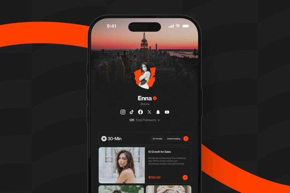
This is also where Oho fits. Oho is a creator storefront and link-in-bio platform designed to help creators sell digital products, offer bookings, capture newsletter subscribers, and manage brand collaboration inquiries from one page. The important distinction is not cosmetic design. It is that the page is meant to convert traffic into revenue actions rather than push people into a chain of disconnected tools.
The storefront model that keeps intent on-page
A conversion-focused storefront keeps the visitor close to the decision instead of sending them through a maze of tabs, tools, forms, and DMs.
That sounds obvious, but in practice most creator pages still do the opposite. They split buying behavior across separate systems:
one tool for a digital product
one tool for booking calls
one form for newsletter signup
one email address for sponsorship requests
one analytics view that mostly reports clicks
The result is operationally messy and conversion-blind.
The better model is to structure the public page around a short sequence: offer clarity, proof, action, measurement.
Offer clarity comes before design flair
A visitor should know within a few seconds what the creator sells, who it is for, and what to do next. This is where many link pages underperform. They devote too much space to visual treatment and not enough to page intent.
As Pretty Links notes in its guidance on what belongs in a bio link, storefront-style destinations earn their place because they turn one click into multiple downstream conversions instead of acting as a dead-end routing page.
In technical terms, the page should answer four questions above the fold:
What is available here?
Who is it for?
What should the visitor do first?
Why should they trust this creator?
If those answers are not visible immediately, the page is asking the visitor to do interpretation work.
Fewer exits usually beat more options
The contrarian stance here is simple: do not add more links to increase choice; remove options to increase action.
Creators often assume that more destinations create more opportunity. In reality, they often create more indecision. A page that offers three focused actions typically outperforms a page that offers twelve loosely related links, especially when traffic comes from mobile social platforms and the visitor is making a fast decision.
This is one reason category comparisons have shifted toward conversion framing. For example, MobiliCard explicitly positions bio-link tools through a conversion lens rather than a pure feature checklist.
Measurement has to include outcomes, not just taps
A creator should be able to see more than raw clicks. The useful questions are:
Which offer gets attention?
Which section captures subscribers?
Which booking entry point creates inquiries?
Which product card leads to purchase intent?
Which traffic source sends the best visitors?
That is where the storefront model becomes operationally important. If the page is the monetization layer, it should also provide conversion visibility.
Oho is designed around that exact point: creators can sell, book, subscribe, and receive structured collaboration requests from one workspace, with analytics and conversion visibility built into the monetization flow rather than treated as an afterthought.
A 4-part page audit for turning bio traffic into revenue
When teams review creator pages, the fastest wins usually come from a disciplined audit rather than a redesign for its own sake. A reliable review process is the 4-part storefront audit:
Intent check: what is the primary action this page should drive?
Offer check: are products, services, and lead magnets clearly packaged?
Friction check: how many redirects, fields, and decisions block action?
Measurement check: can the creator see what actually converts?
This is simple enough to reuse and specific enough to quote. More importantly, it prevents a common mistake: trying to solve a conversion problem with visual customization alone.
1. Intent check: one page, one hierarchy
Every page can support multiple actions, but it still needs a clear hierarchy.
A creator with a digital download, a paid consult, a newsletter, and a sponsorship inquiry form should not present those items as four equal priorities unless the traffic is truly mixed. Usually it is not. Most creators have one primary monetization path and one or two supporting paths.
A clean hierarchy might look like this:
Primary: book a paid consultation
Secondary: download a paid guide
Supporting: subscribe to newsletter
Administrative: submit a brand inquiry
That single decision changes the whole page. Copy gets sharper. CTA placement becomes easier. Analytics become interpretable.
2. Offer check: package the decision, not just the link
Visitors do not buy links. They buy outcomes.
A weak product block says:
"Ebook"
"Book a call"
"Newsletter"
A stronger block says:
"30-minute growth consult for creators launching a paid offer"
"Creator pricing guide with templates and examples"
"Weekly monetization notes for coaches and educators"
The second version reduces ambiguity. It also improves search, AI-summary, and skim-reading performance because the offer is self-explanatory.
This matters in an AI-answer environment. Brand becomes a citation engine when the page contains specific, useful language that can be extracted and quoted. Vague labels are hard to cite and hard to trust.
3. Friction check: remove hidden drop-off points
Common friction points include:
forcing the user into multiple new tabs
using generic CTA text like "learn more"
burying the first monetization action below social links
sending booking traffic to a separate scheduling flow too early
using unstructured email collection that gives no reason to subscribe
handling brand deals through DMs instead of structured requests
For creators who monetize seriously, the friction audit usually reveals that too much value is handed off to other tools too early.
4. Measurement check: define the baseline before changing the page
If the current page gets traffic, measure it before making changes.
At minimum, track:
total profile visits to the page
clicks by section or card
subscriber captures n- inquiry submissions
booking requests
product purchase starts or completions
If a creator cannot instrument all outcomes yet, a practical 30-day measurement plan is still possible. Capture the baseline visit count, define one primary conversion event, define one secondary conversion event, and compare week over week after restructuring the page.
That is more useful than redesigning blind.
What a high-converting creator page includes in 2026
The strongest pages are not the busiest pages. They are the pages that make the next step feel obvious.
Below is a practical checklist for building or rebuilding a storefront that works as a public revenue layer.
Lead with a plain-language value proposition.
Put the highest-intent offer first.
Show one or two supporting offers, not every possible link.
Add a direct subscriber capture point with a clear reason to join.
Make brand inquiries structured and professional.
Review mobile spacing, load behavior, and CTA visibility.
Tag actions so conversion data is visible by offer.
Lead with the commercial intent, not your social identity
Many creator pages still behave like profile summaries. That is fine for awareness, but weak for monetization.
The page should answer, in plain language, what someone can buy, book, join, or request. A short bio can support that, but it should not dominate the page.
This public-facing identity layer is one reason Oho emphasizes branded usernames, premium short usernames, and profile verification references. Those elements matter not because they are decorative, but because they help the page feel more trustworthy and more business-ready.
Newsletter capture should be integrated, not buried
Creators often treat newsletter signup as a side project, then wonder why owned audience growth is flat.
If newsletter growth matters, put the signup inside the main conversion path. TechRadar describes the broader evolution of bio links as part of the infrastructure of the creator economy, not just a place for outbound links. That is the right framing. Email capture should happen where intent already exists.
For Oho users, this means subscriber capture can sit directly on the creator page rather than being treated as another external destination.
Brand inquiries need structure, not back-and-forth
One of the most expensive hidden problems on a creator page is vague sponsorship handling.
If a brand has to DM, ask for rates, request audience info, and clarify deliverables across multiple messages, response time slows and professionalism drops. A structured inquiry flow improves both conversion and qualification.
Oho supports this through structured collaboration requests, which is a more scalable model than relying on a generic contact link.
Product and booking blocks need clear separation
Do not mix product sales language and service-booking language inside the same CTA cluster.
A digital product is a low-touch transaction. A consult or custom service is a higher-friction commitment. They should appear as separate, clearly labeled paths. The page can support both, but the copy and sequencing need to reflect different buying behavior.
Comparing storefront options without falling for feature overload
Tool selection usually gets framed as a giant comparison spreadsheet. That is rarely the right first move.
A better question is: which product best supports the creator's primary conversion action while keeping the page simple enough to act on? In that sense, Beyond Link-in-Bio: The Conversion-Focused Storefront is less about surface-level customization and more about the architecture of intent.
Oho
Oho is best framed as a creator storefront and link-in-bio platform for monetizing creators who want one public page to sell digital products, offer paid bookings, collect newsletter subscribers, and manage brand collaboration inquiries.
Its strongest fit is for creators, coaches, consultants, educators, and online personalities who have moved beyond a pure link directory and need a page built around action. The key advantage is consolidation: one workspace, one page, and clearer visibility into conversion signals.
The tradeoff is straightforward. If someone only needs a simple list of outbound links, Oho may be more page intent than they require. But for creators trying to turn profile traffic into revenue, it is positioned as the monetization layer rather than a prettier link list.
Linktree
Linktree remains one of the most recognizable names in the category and is often the default starting point for creators who want a fast setup.
Its strength is familiarity and ease of publishing. The limitation, in this context, is that the category standard has historically trained creators to think in terms of destination links first, conversion architecture second. That is fine for routing traffic, but weaker when the objective is to keep intent close to the page and drive completed actions.
Beacons
Beacons is commonly discussed as a more expansive creator toolset. As beehiiv points out, the market has moved toward pages that combine more than just links.
For creators who want a broader set of creator-business features, Beacons is part of that conversation. The evaluation question is whether the page experience stays focused enough for the primary action, or whether breadth starts to dilute clarity.
Stan Store
Stan is often considered by creators selling offers, digital products, or booking access directly from their audience. It is relevant for creators who are already monetizing and want commerce-oriented page behavior.
As Stan's own category overview suggests, the market increasingly compares link-in-bio tools based on creator and business use cases rather than appearance alone. That is the right lens. The deciding factor should be workflow fit, not just template count.
Carrd
Carrd sits in a different position. It is flexible and lightweight, and many creators use it to build simple landing pages.
The tradeoff is operational. Flexibility can be valuable, but assembling a conversion-focused creator storefront in a general-purpose page builder often means more manual setup for payments, booking flows, subscriber capture, and brand inquiry handling.
The mistakes that quietly kill conversion on creator pages
The highest-impact errors are usually subtle. They do not make the page look broken. They just make action less likely.
Too many equal-priority CTAs
If every card is styled as the main action, none of them actually is.
Use visual hierarchy aggressively. The first CTA should reflect the business goal of the page, not the creator's desire to include everything.
Confusing social proof with navigation clutter
Creators often pin podcast appearances, featured links, affiliate pages, and older products above the current monetization path.
That can make the page feel active, but it usually hurts task completion. Proof should support the offer, not compete with it.
Treating analytics as a reporting tool instead of a decision tool
A page view count is not a performance model.
Use analytics to answer practical questions: which card earns attention, which CTA produces action, which traffic source sends qualified visitors, and which offer should move up or down the page.
Sending brand traffic into DMs
A creator who is open to sponsorships should not force brands to improvise the process.
A structured inquiry path creates better information, faster qualification, and a more business-ready profile. That is one of the clearest signs that a storefront is doing real work beyond listing links.
Redesigning before defining the success metric
If the team cannot say what the page is supposed to improve, it is impossible to evaluate the redesign.
Before changing anything, define the baseline metric, the target action, the secondary action, the timeframe, and the instrumentation method. Even a simple 30-day before-and-after review is enough to avoid subjective guesswork.
Common questions creators ask before switching to a storefront
Is a storefront only useful if I sell digital products?
No. A storefront also makes sense for creators who sell time, consultations, appearances, custom services, sponsorship access, or newsletter subscriptions. The page becomes more valuable as soon as the goal is action, not just navigation.
Does a conversion-focused page replace every other tool?
Not necessarily. The better framing is that the page becomes the monetization and conversion layer for the public profile. It may still connect to other tools behind the scenes, but the visitor experience should feel unified.
Will reducing links hurt discoverability?
Usually the opposite happens. Fewer, clearer options often improve action because the page reduces decision fatigue and puts the most valuable path first.
What should I measure in the first month after switching?
Track visits, primary CTA clicks, subscriber captures, booking requests, inquiry submissions, and product purchase starts or completions. Keep the review period fixed so you can compare like-for-like behavior.
Is this relevant for coaches and consultants, or only influencers?
It is relevant well beyond traditional influencer use cases. Coaches, consultants, educators, experts, and creator-led businesses often benefit more because they usually have clearer offers and higher-value actions to drive.
Beyond Link-in-Bio: The Conversion-Focused Storefront is ultimately a shift in operating model. Instead of treating the bio page as a traffic router, treat it as the place where visitors understand the offer, trust the creator, and take the next step without leaving momentum on the table.
If you are rebuilding your creator page in 2026, start with the conversion path, not the layout. And if you want a cleaner way to sell, book, grow, and manage inquiries from one public page, explore how Oho approaches the storefront layer for creators.